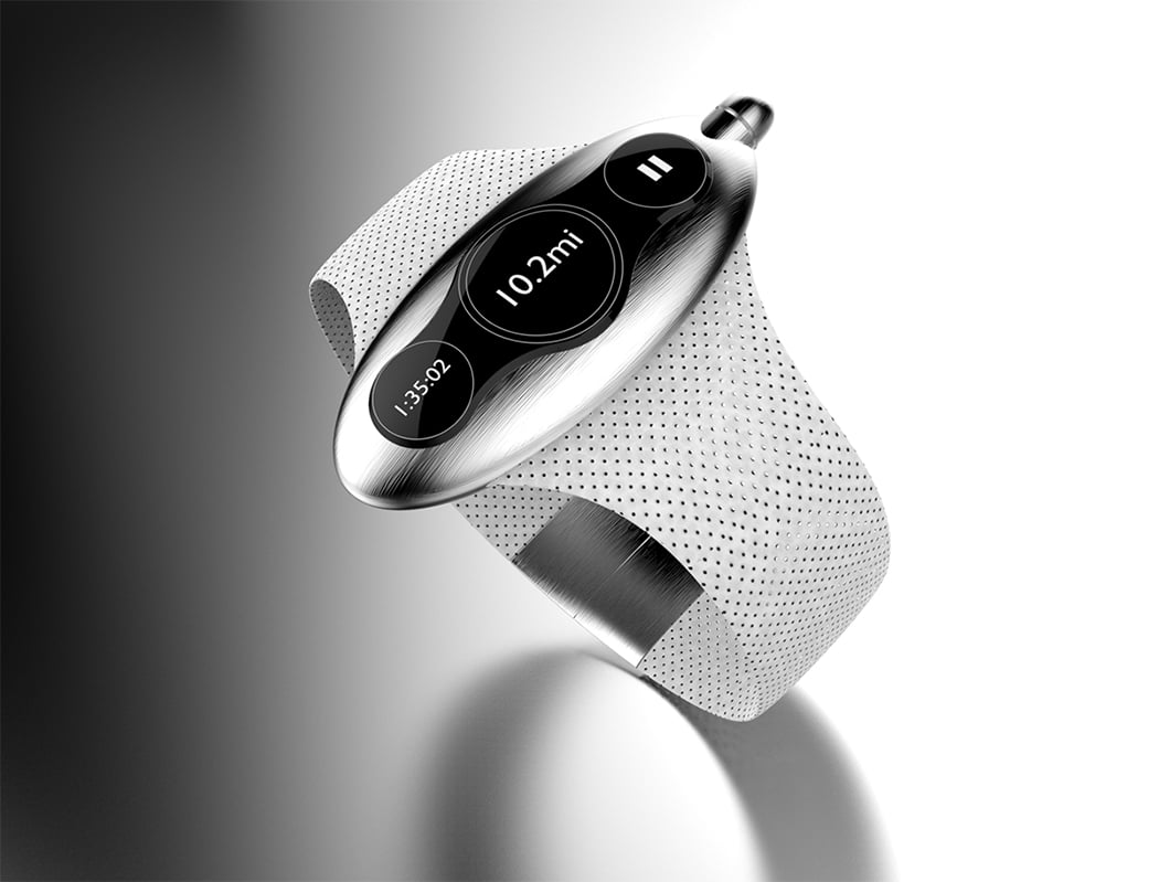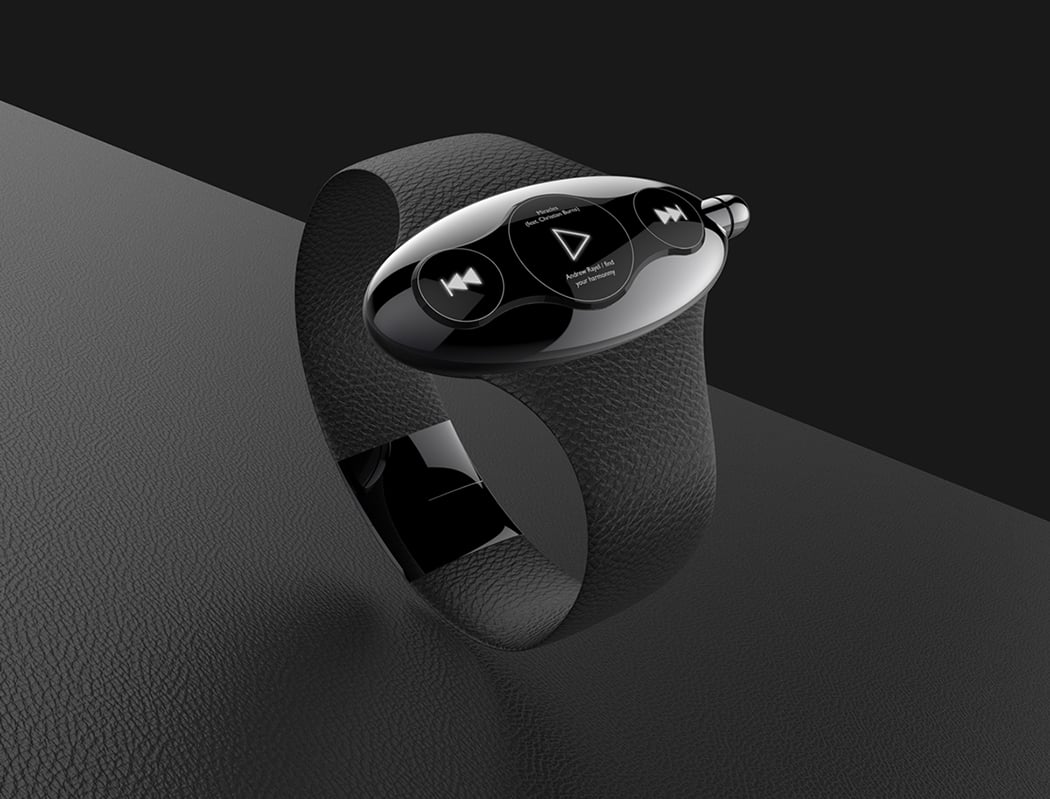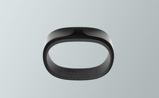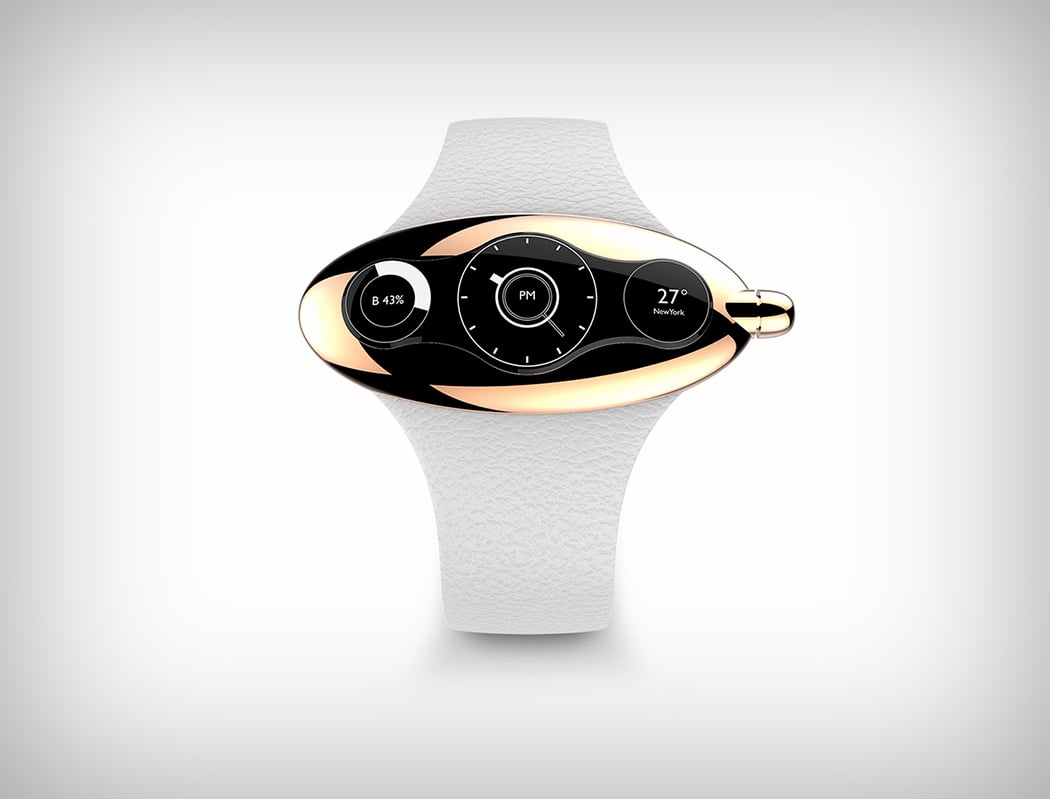
Here’s some food for thought. Why does the screen on the smartwatch have to imitate the regular square or round face of a wristwatch? One screen means only one piece of information at a time. The Ergo watch does something quite daring in this regard. The Ergo watch has a single screen, but it’s unique design allows it to split into three different units while displaying information.
The watch comes in an ellipsoid metal outer body with quite a lot of space outside the screen. The ‘caterpillar’ screen is a merge between three circles, allowing it to display a single thread of information, or three separate threads of information. Obviously, this would probably need a completely different UI and OS. I’m wondering how anyone would view photos on this, but from the images, it looks to be an black and white e-ink screen, like the Pebble, putting this concept in the basic/lower tier of smart wearables. And if that’s the case, may I say, this concept’s definitely the most unique one out there!
Designer: Jeabyun Yeon

