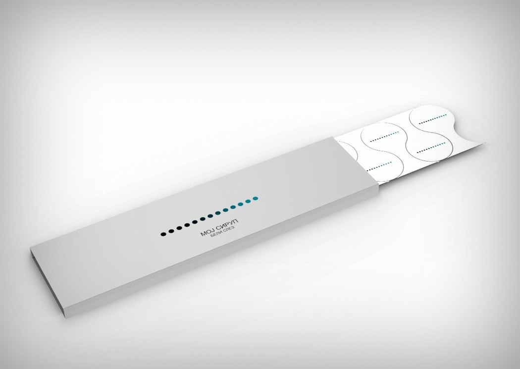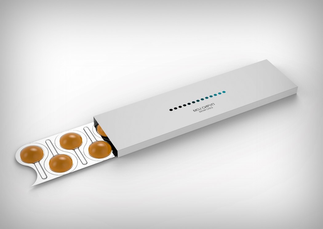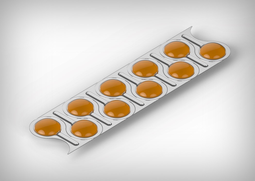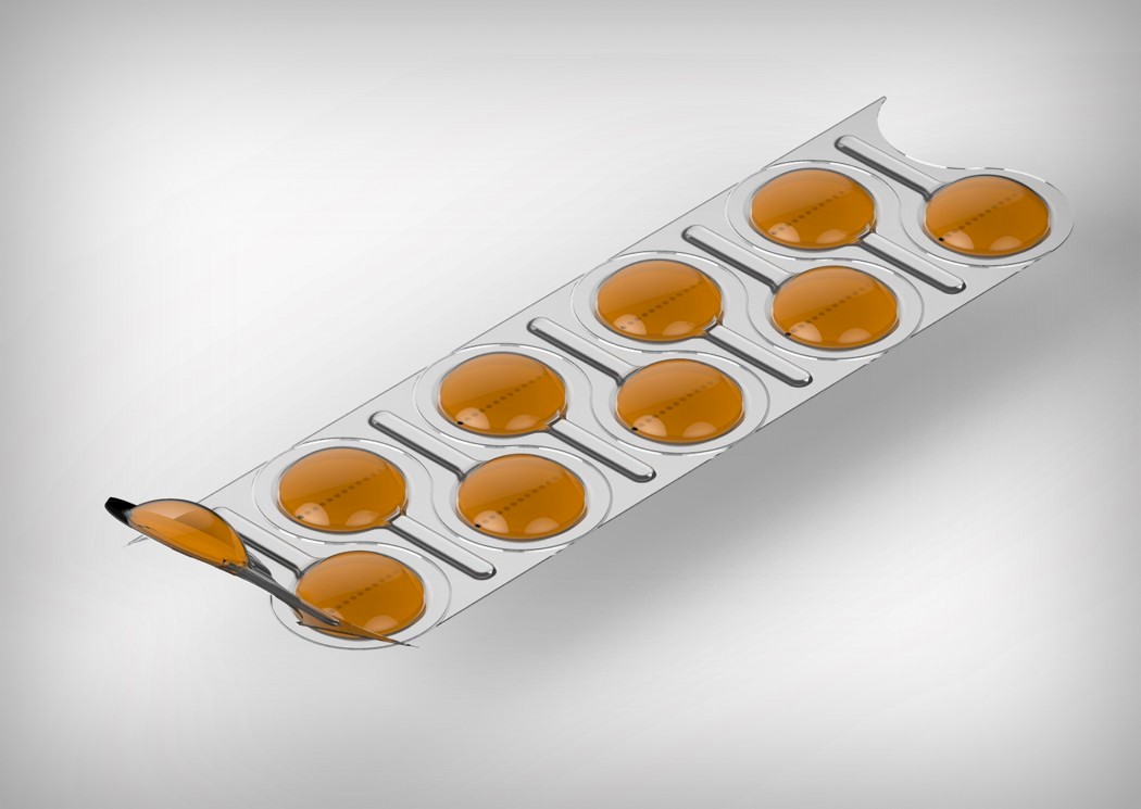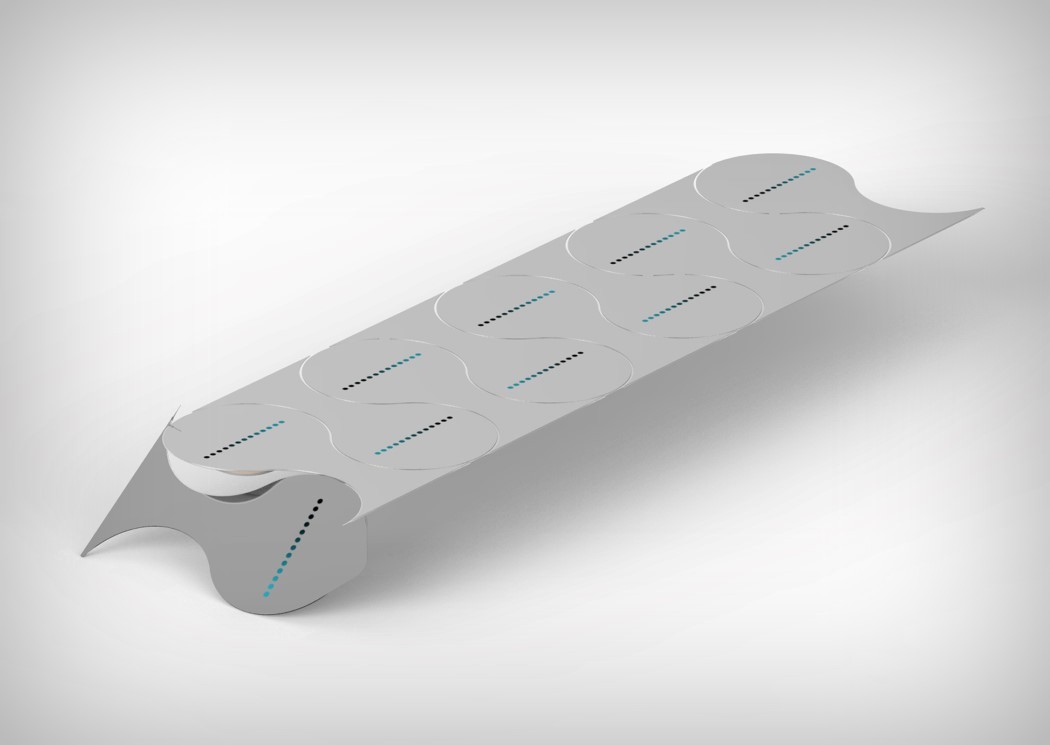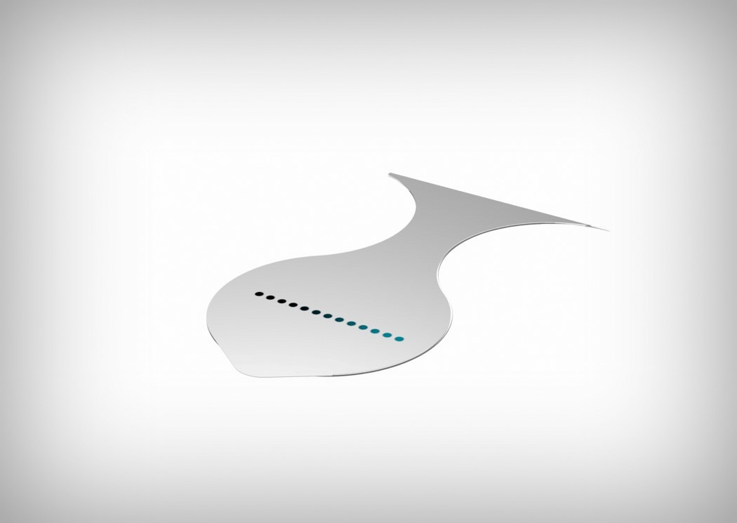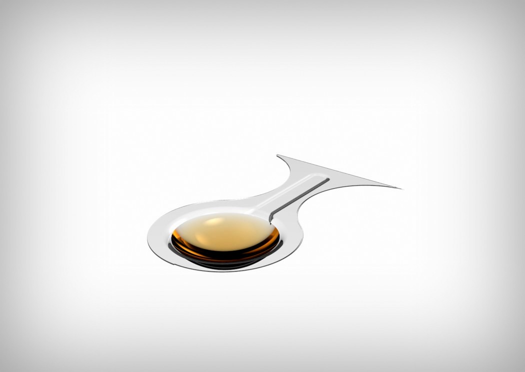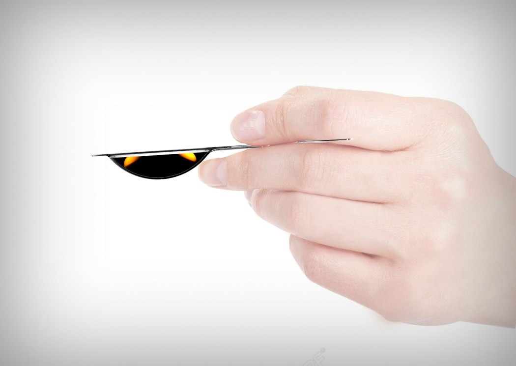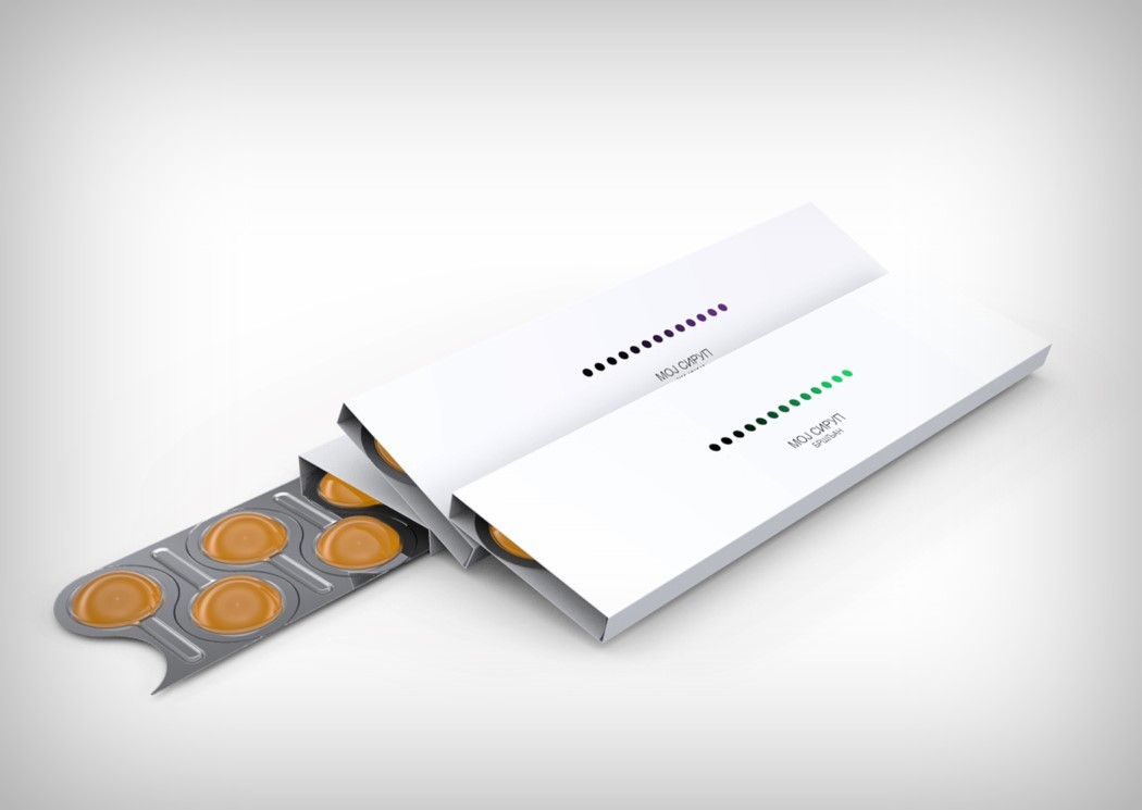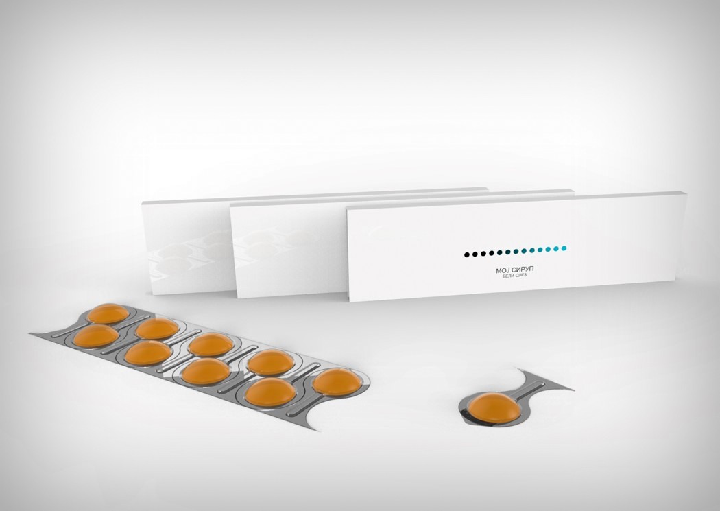
Medicinal Syrup bottles look daunting. Scary names, ominous looking liquid, and the bottle’s no-nonsense shape makes medicine consumption look like a scary ordeal. There’s also no standardized dosage system. People often confuse teaspoons with tablespoons, and vice versa. The Moj Syrup packaging does to syrups what blister packs did to pills. Singular doses sealed into elegantly designed spoon shaped blips not only makes for regulated consumption, but also makes the syrup look friendly and appealing. Let’s hope we see these on the shelves soon!
Designer: Snežana Jeremić
