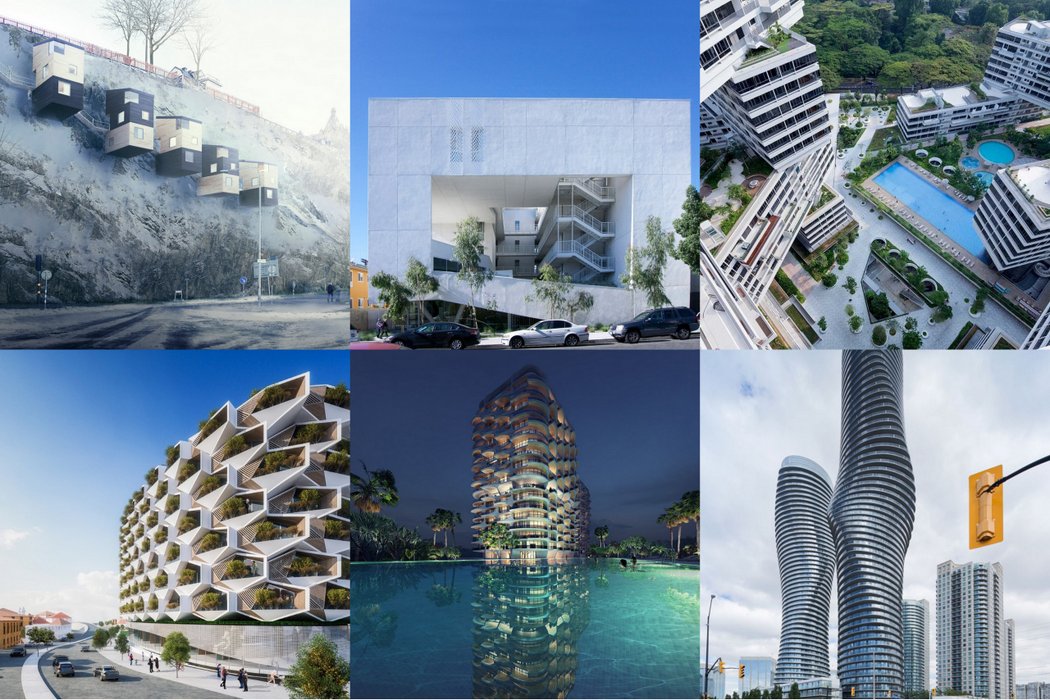
We’ve got a complete mixed bag of architecture styles here today. A few ambitious iconic high-rises, some buildings that have more of a social connect. One thing that binds them all together is that all of them are highly inspirational! Go ahead, scroll now, bookmark later!
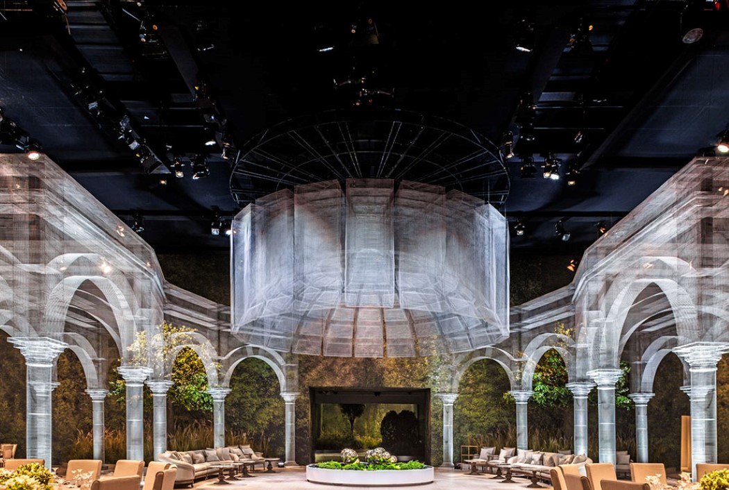
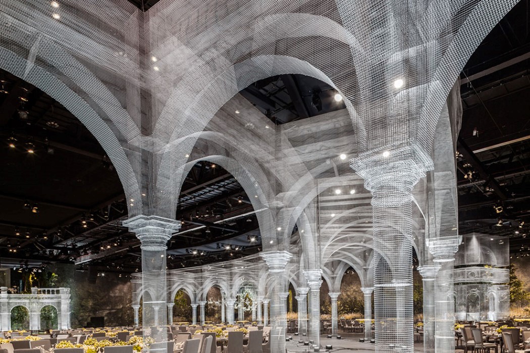
1. If there’s something that truly blurs lines between sculptural and structural design, it’s the Wire Pavilion by Eduardo Tresoldi and Designlab Experience. This piece of mind-melting work is made entirely out of metal wire. It looks almost as if an AutoCAD model came to life!
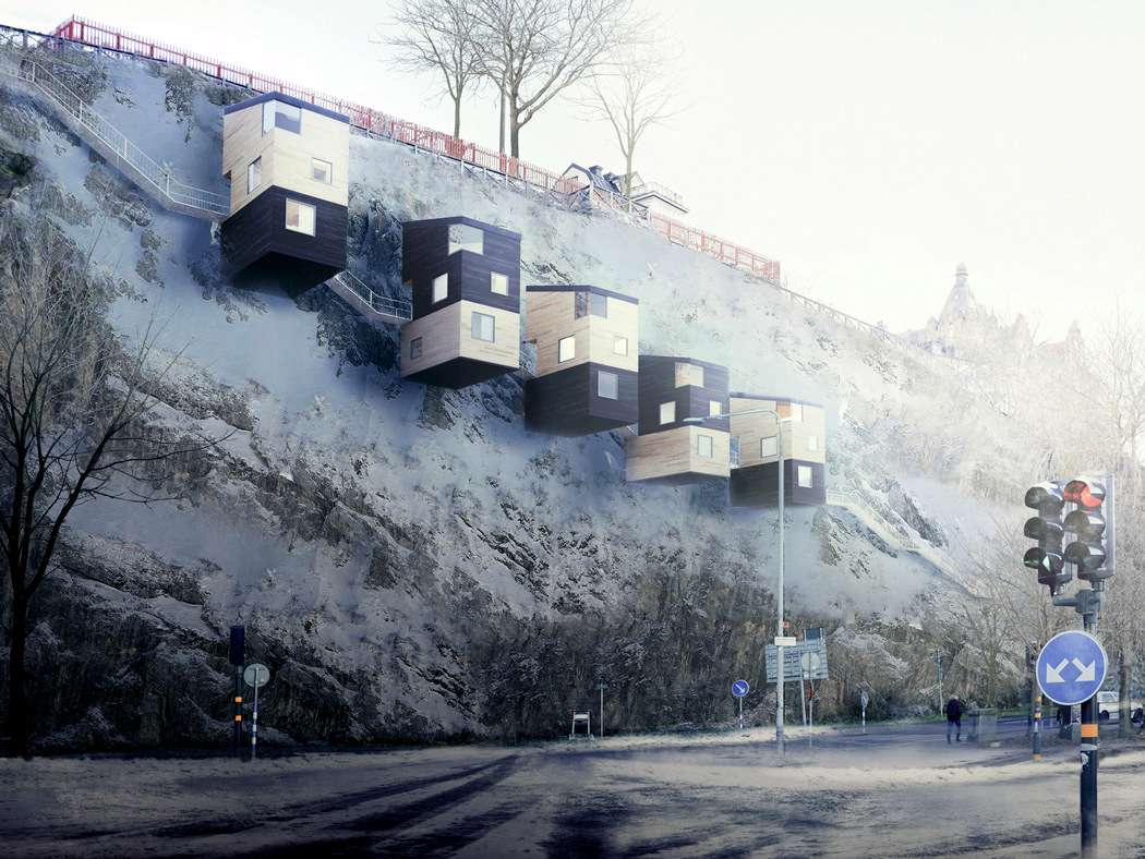
2. I swear, if I could life in a tree-house as an adult, I’d legit do that without batting an eyelid. It’s a good thing Swedish firm Manofactory designed these cliff-houses for adults to live in, that give us pretty much the same adrenaline rush as a tree-house would… Made with lightweight wood, these vertically suspended homes would actually be pretty thrilling to live in! Of course the designs will have their limitations with sources for water, electricity supply & making sure the cliffs chosen have close to no signs of soil erosion, but if planned well it is a step into innovative futuristic architecture.
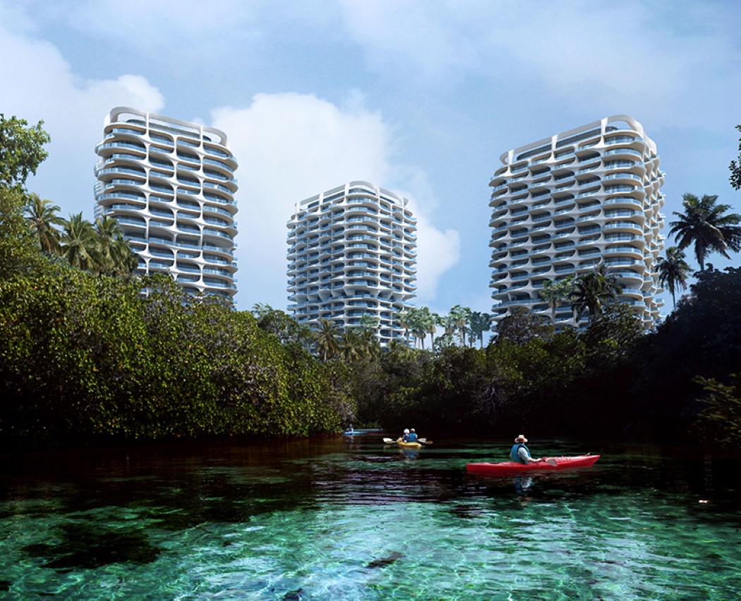
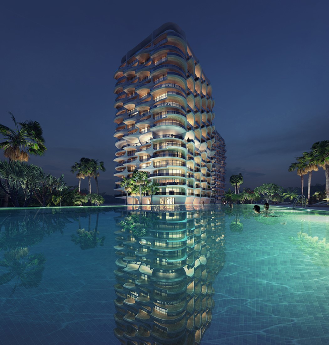
3. The late Zaha Hadid made some great buildings, but if reality is any indication, they’ve been pretty brutal on the environment. Grand design can sometimes take a toll on the ecosystem. However, the firm Zaha Hadid Architects is now working towards being environemtally responsible while continuing to uphold the legacy of the ‘First Lady of Architecture’. Instead of building something beautiful with the iconic Zaha Hadid style irrespective of the repercussions, the Alai residency located on the Mayan riviera in Mexico has an element of ecologically aware design. Aside from ensuring that ecological impact is kept to a minimum, Zaha Hadid Architects plan to landscape a woodland nature reserve, together with the replanting of coastal wetland to protect and enhance the riviera’s mangroves.
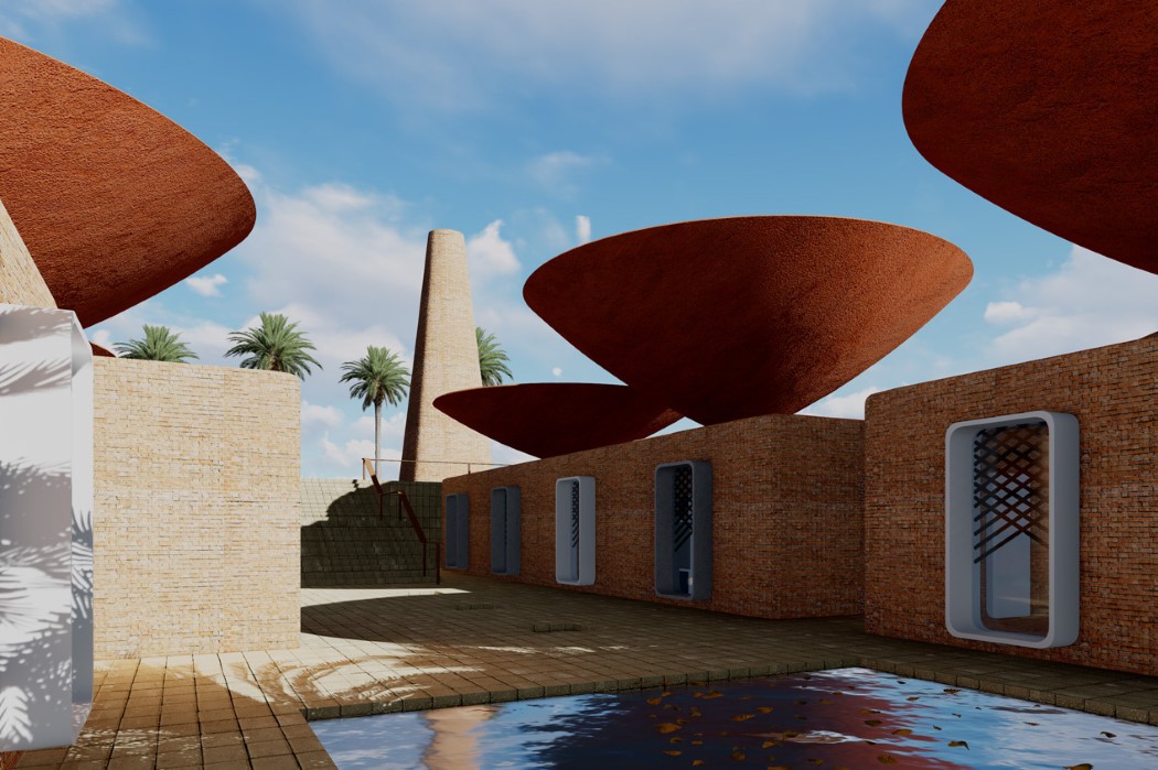
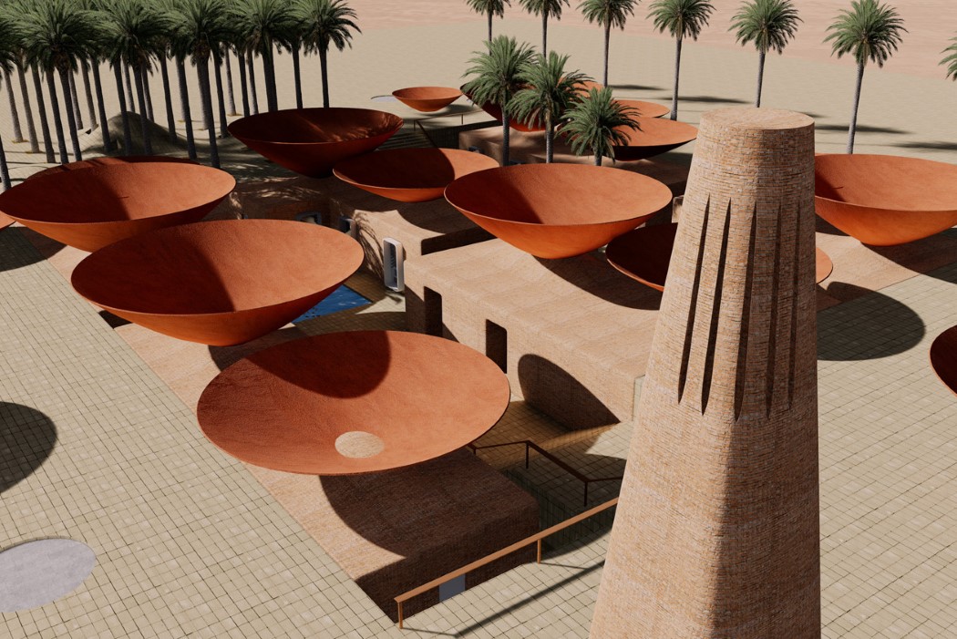
4. BM Design Studios designed these concave shaped roofs at the Primary school for Iran that win our hearts not just for being iconic, but for being iconic with a rather ingenious purpose and innovative technique. These terracotta satellites are too cool for school, as they funnel in rainwater, effectively harvesting it for use, given Iran’s arid climate while also using terracotta’s cooling properties to act as a natural air conditioner for the classrooms. What better way of influencing kids to be sensitive to sustainable living than exposing them to study & grow in a space like this one?
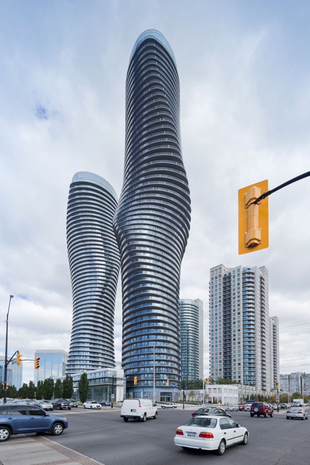
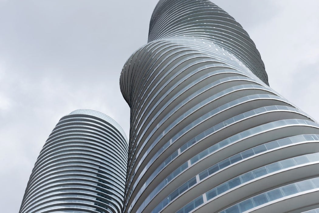
5. It’s completely believable that these rather curvaceous towers by MAD Architects were referred to by local residents as the Marylin Monroe towers. I’m not kidding, this is absolutely true! Can you disagree though. For starters, I can’t take my eyes off these incredible highrises too! Located in Mississauga, Ontario, Canada, the Absolute skyscrapers look almost molded by the wind!
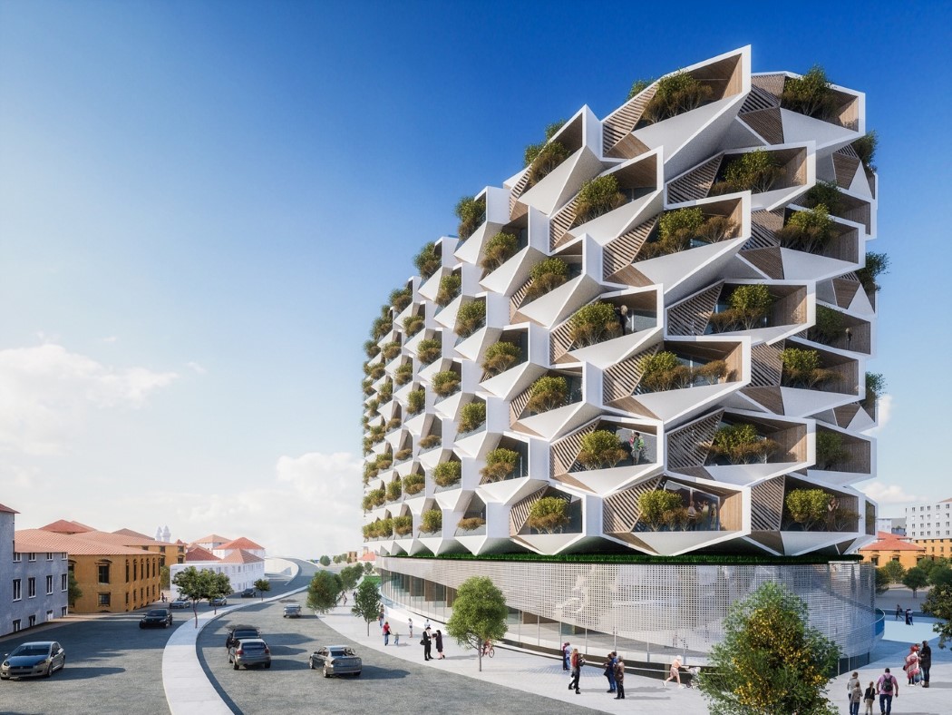
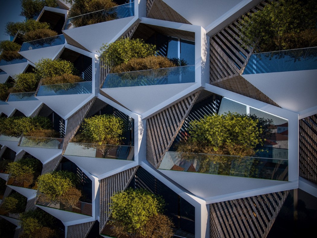
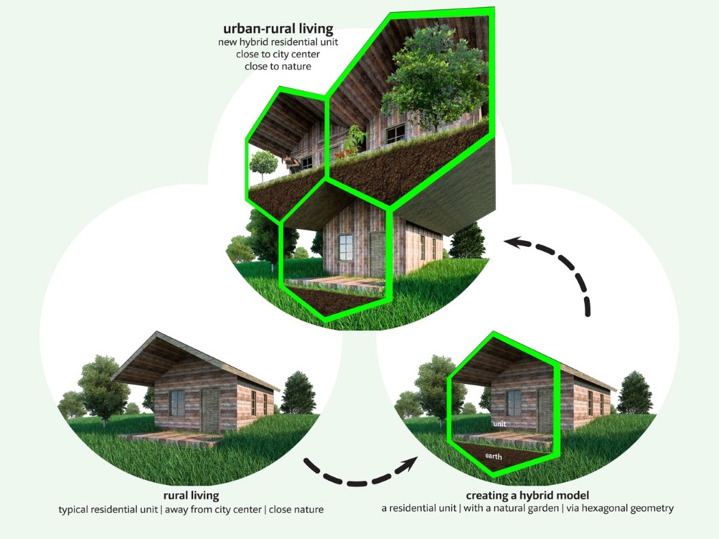
6. What looks like a beehive-esque building from afar is actually just very clever design. The honeycomb pattern is known to provide structural integrity, but look closely at the hexagon. Truncate the bottom bit off and you have a traditional house shape! The Urban Rural habitation by Eray Carbajo actually rely on the hexagon shape to provide housing space on the upper half of the hexagon, and a soil bed on the lower half, allowing each flat to effectively have their own greenery-laden porch, just like a rural settlement!
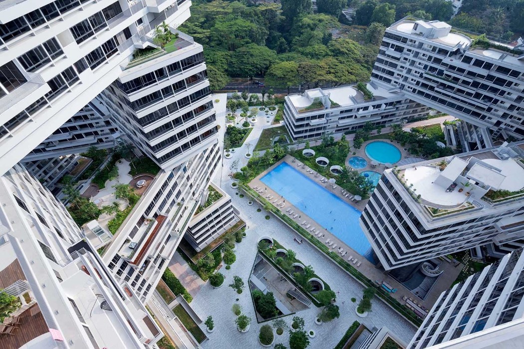
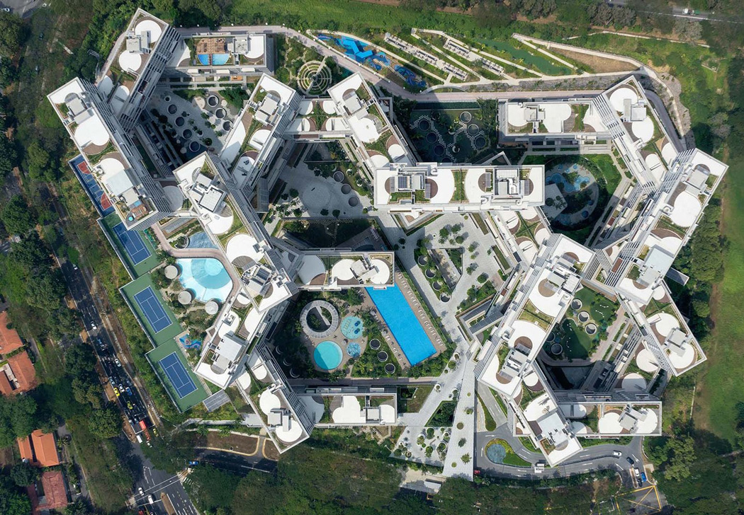
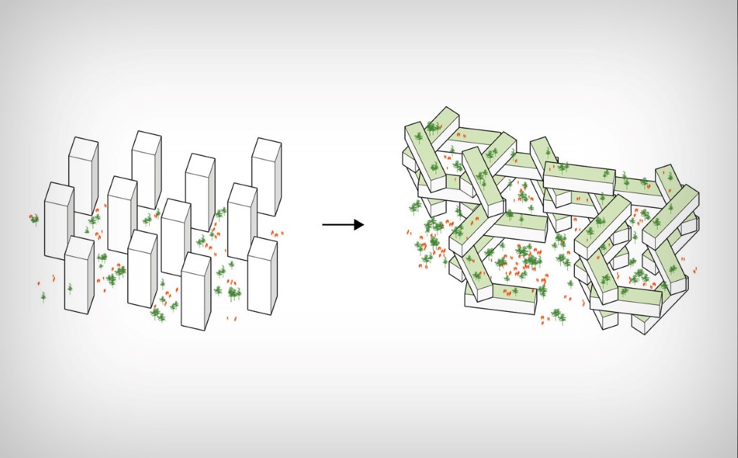
7. If Habitat 67 by Moshe Safdie explored layering individual living cells in a seemingly randomized fashion, the Interlace by Ole Scheeren does that with entire towers. Instead of keeping towers vertically, they’re stacked horizontally in a honeycomb fashion (recurring theme? maybe!), not only fitting more residences in the same area, but also creating a series of cantilevered zones that become terrace gardens in themselves. Mind blown!
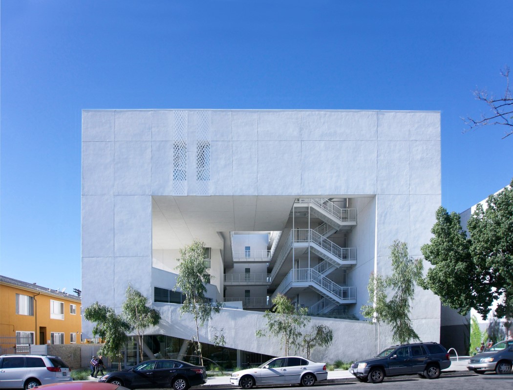
8. This building embodies out-of-the-box thinking with inside-the-box construction! Designed to be an affordable home for veterans in LA, this community building titled The Six (possibly because of the six sided cube it looks like) was built by Brooks+Scarpa with the aim to provide a residential space for veterans, who occupy 3% of the population, but 11% of the homeless population in Los Angeles.
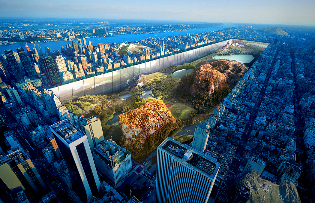
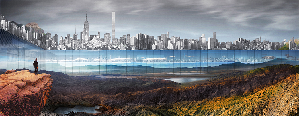
9. Definitely the most crazy architectural attempt out there, the Central Park expansion project by Yitan Sun & Jianshi Wu does something pretty smart. The large number of skyscrapers surrounding the park has destroyed the view for park goers, blocking the city’s skyline, as well as the sunrise and sunset. The solution? Line the entire part’s boundary with massive mirrors, giving it the illusion of infinity! Easier said than done, though…
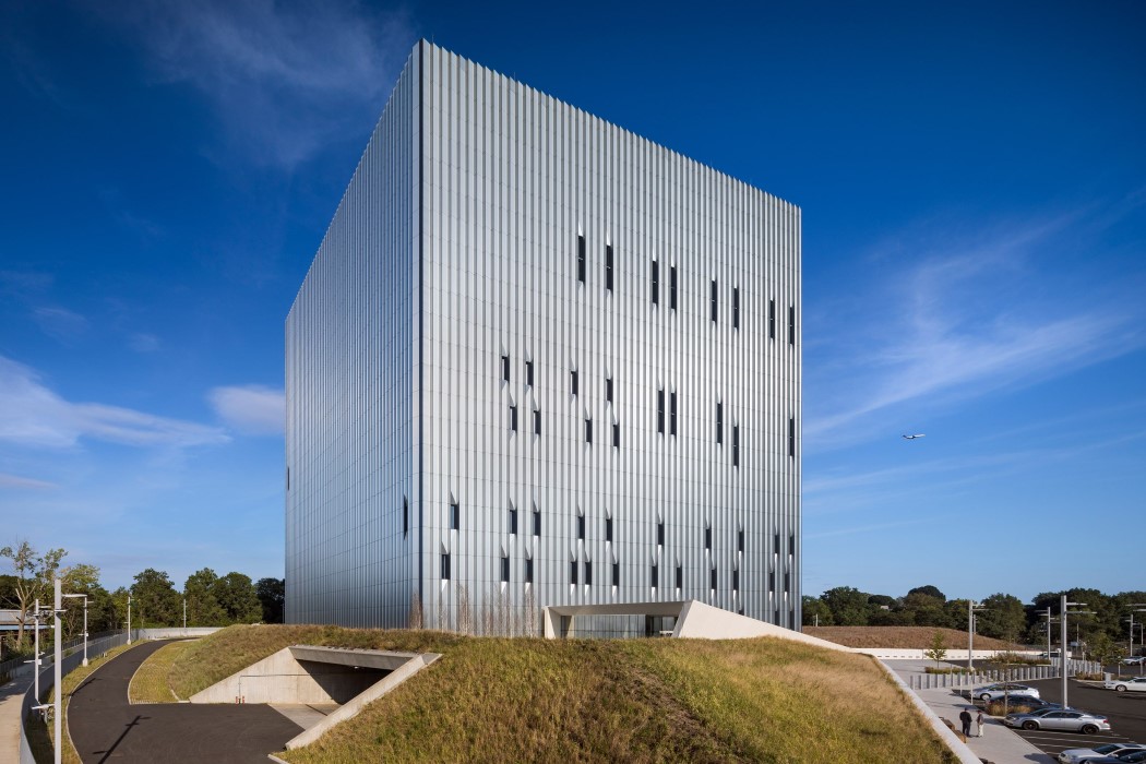
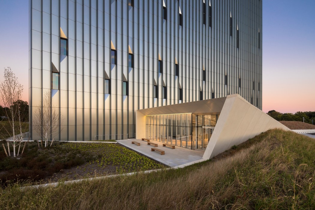
10. What essentially is a flat, cube shaped building by Skidmore, Owings & Merrill (SOM), gets an entirely different dynamic the minute the faces of the cube get a sawtooth texture. Interesting, yet rather closed off, if you’re still wondering why this building has a seemingly no-trespassers vibe to it, it’s because it is a high-security emergency facility located in Bronx, NY, designed to strengthen the city’s 911 service by being a back-up facility for a remotely located primary call center.
Co-Authored by Khyati Seth

