Joseph Joseph’s kitchen products have all my love for just being the most sensibly designed objects of food preparation ever. They take products and elevate them to completely different standards, winning hearts as well as design awards. Call me biased, but not many companies pay this much attention to the most unnoticeable areas of potential design intervention, and in a way that seems so simple and intuitive, you’ll never even need a user-manual (look at the designs we’ve covered before to see what we mean).
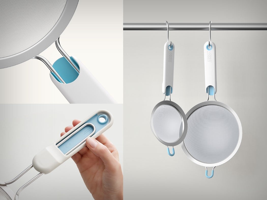
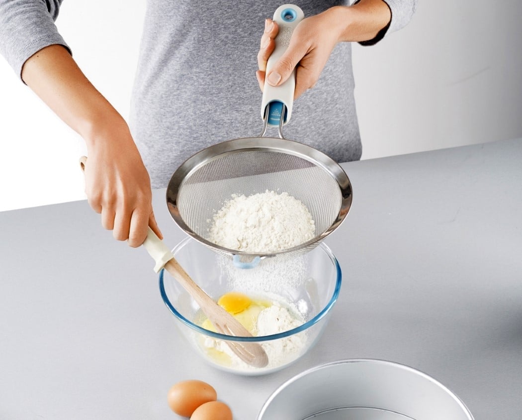
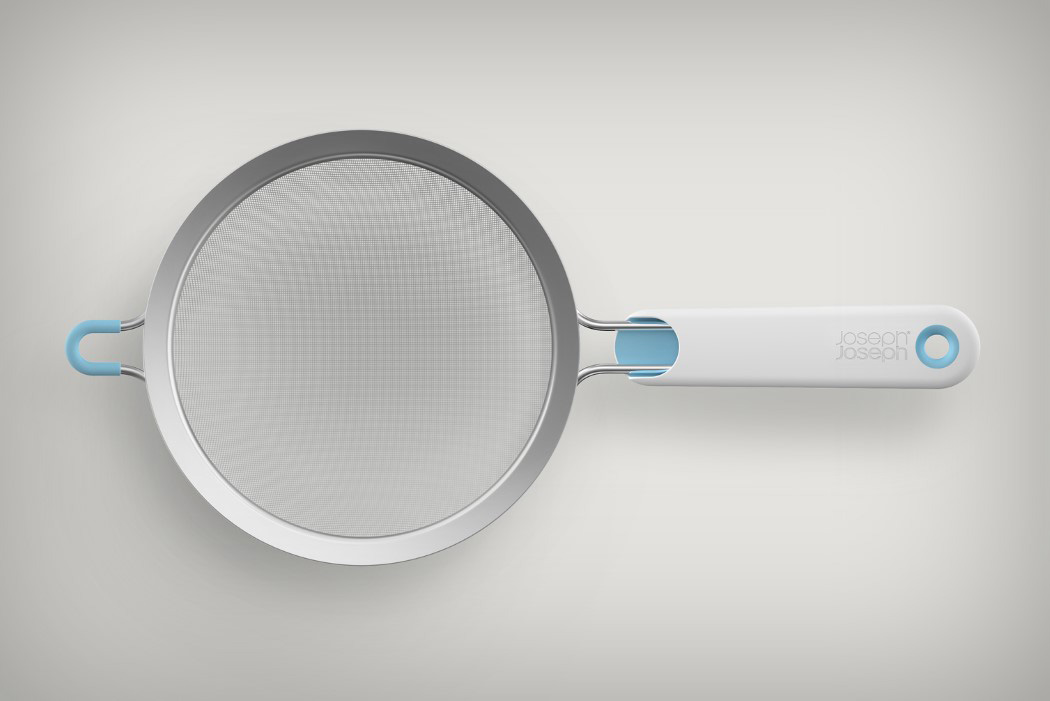
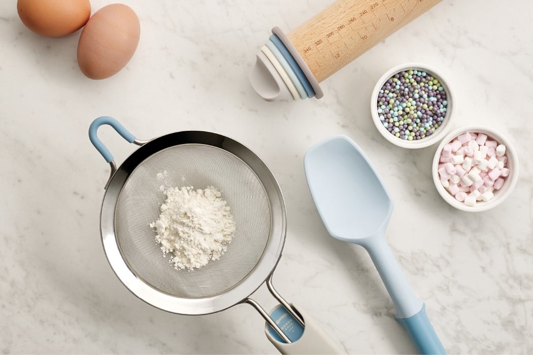
With the Shake-It Sieve, Joseph Joseph tries to not just help us sift through ingredients effectively, but also in a way that’s so stupidly simple, I’m angry at other companies for not thinking of this earlier! The sieve comes with a loosely fitted handle that slides up and down. What do you use it for? Why, you shake the handle back and forth, getting the sieve to move to and fro, every now and then colliding with the handle. The collision mimics the tapping action we do against sieves to get them to sift faster… except the two-handed job now becomes a one-handed job, so you can even more quickly prepare that deliciously decadent chocolate cake that Buzzfeed told you about.
Designer: Equals Design for Joseph Joseph

