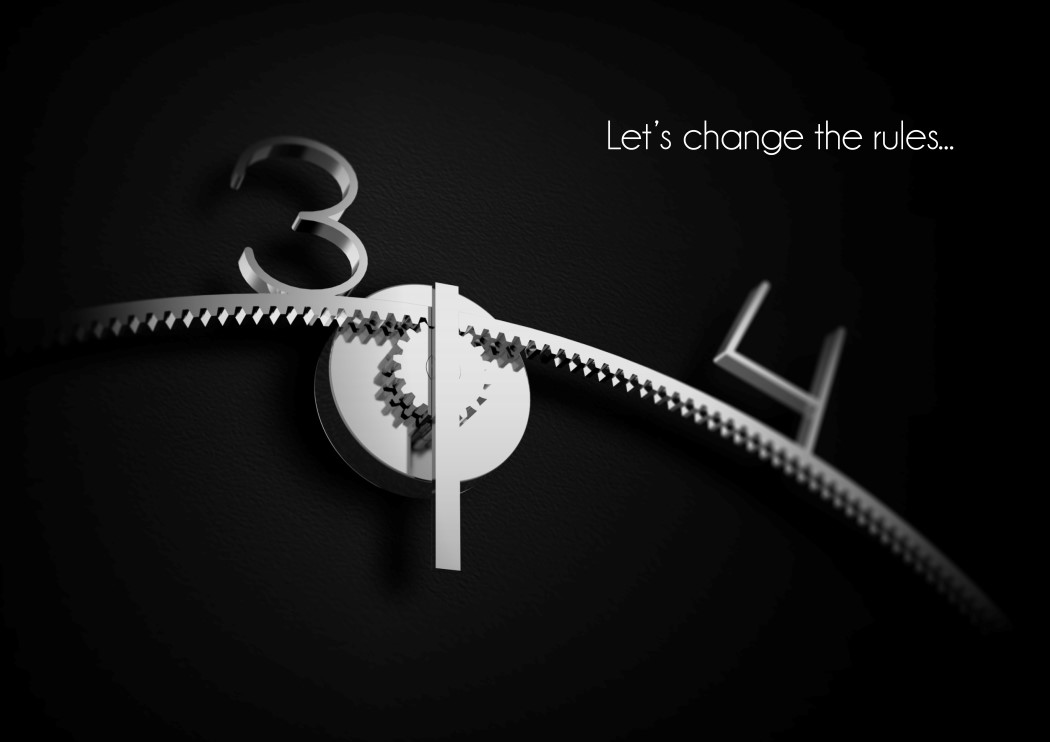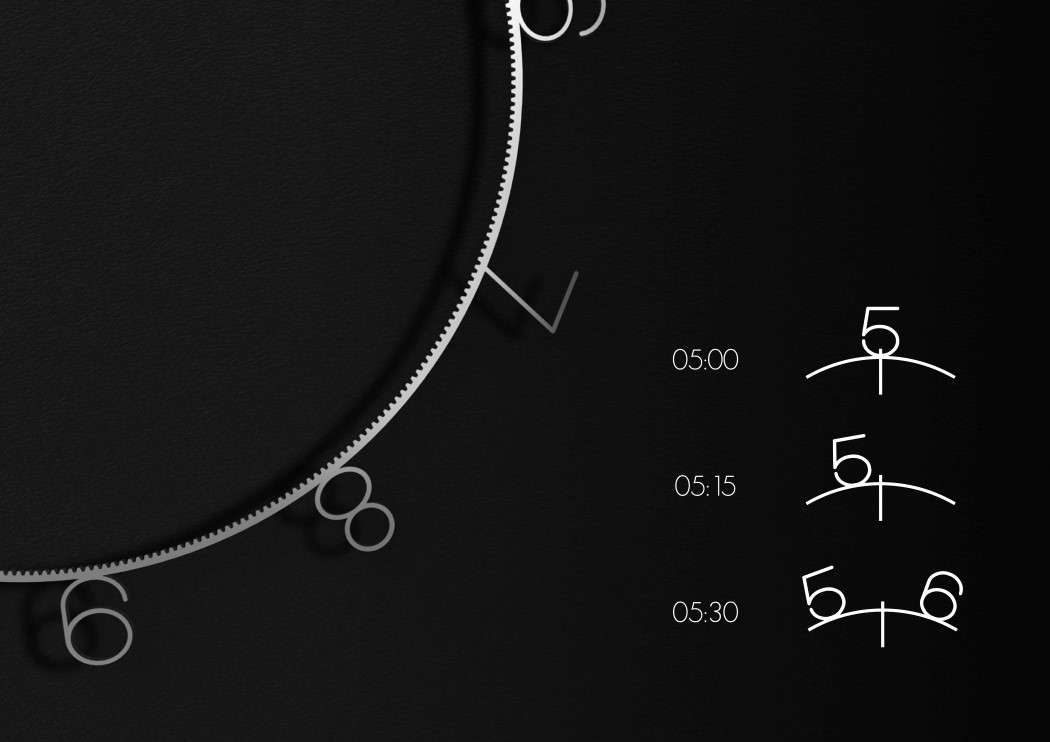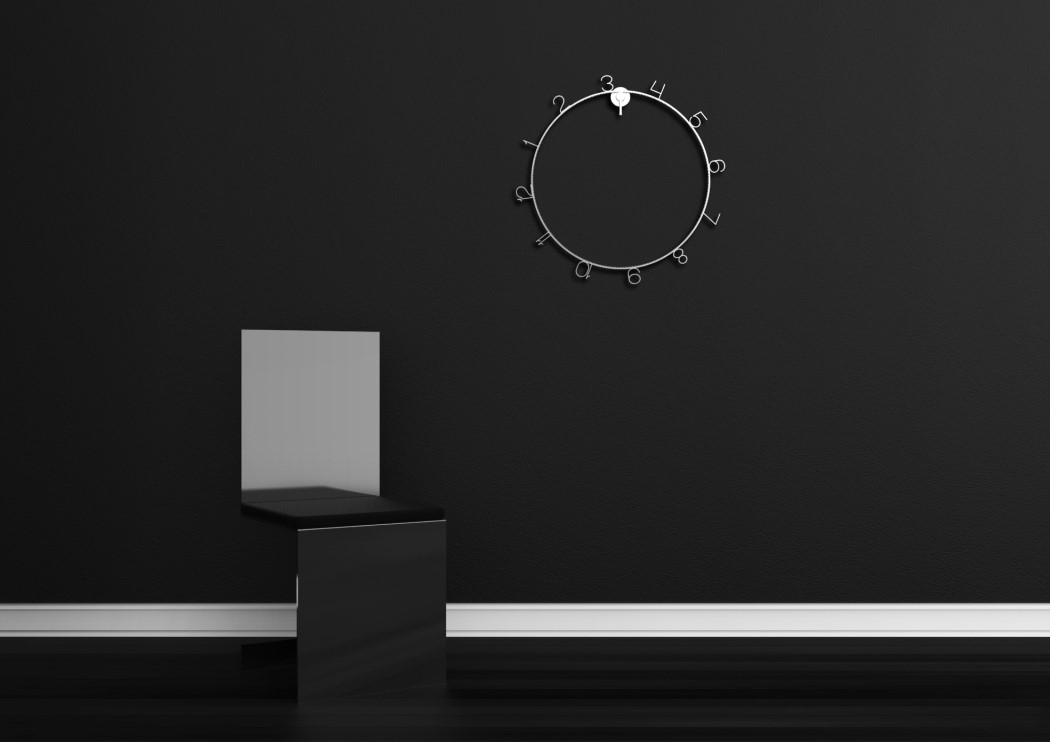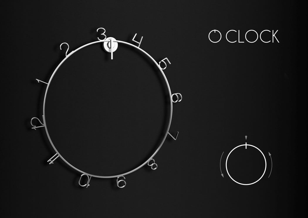
The OClock retains the cyclical quality of time, but challenges the notion that you need hands to tell it. Just using two gears, the clock lets an outer ring rotate while an axis lets you tell the time by reading its position on the outer ring.
The OClock explores an extreme form of minimalism that literally reduces the appearance of a product to something that’s almost not there. The two rotating gears are all that’s needed to tell the time, and reading the time isn’t particularly difficult either. The axis on top plots the journey between two numbers that are shaped into the outer ring. The position of the axis allows you to determine the time to the nearest handful of minutes. There’s no way of timing the seconds on the OClock, but then again, you don’t need to because it isn’t what the OClock set out to do. What the OClock however DID set out to accomplish was to present itself as a timepiece that challenges the notion of telling time using the conventional hand system, and to do it while maintaining a beautiful minimal aesthetic that is sure to enrich any wall it hangs on!
The O Clock is a winner of the Red Dot Concept Design Award for the year 2017.
Designer: Mike Simonelli
