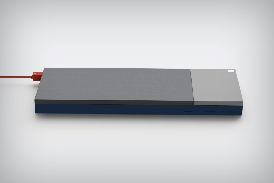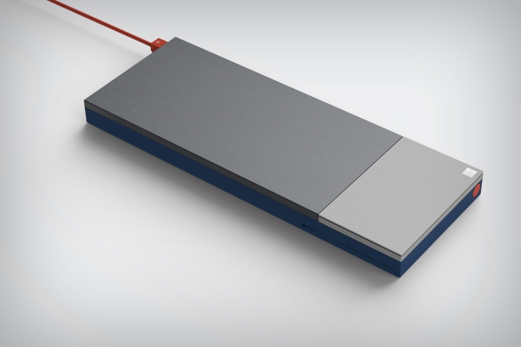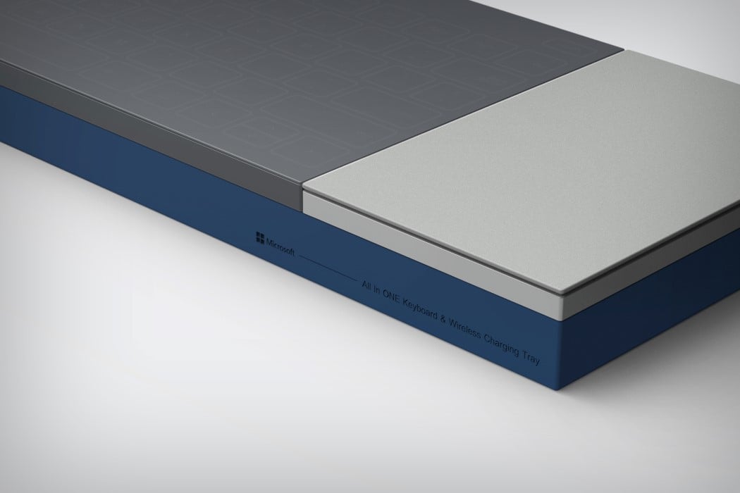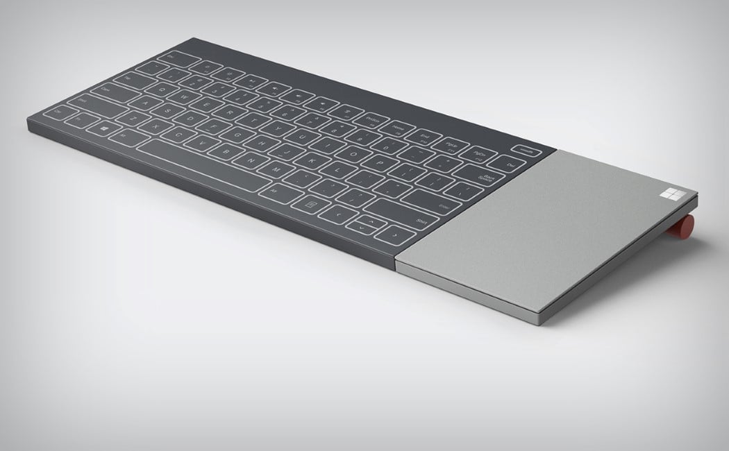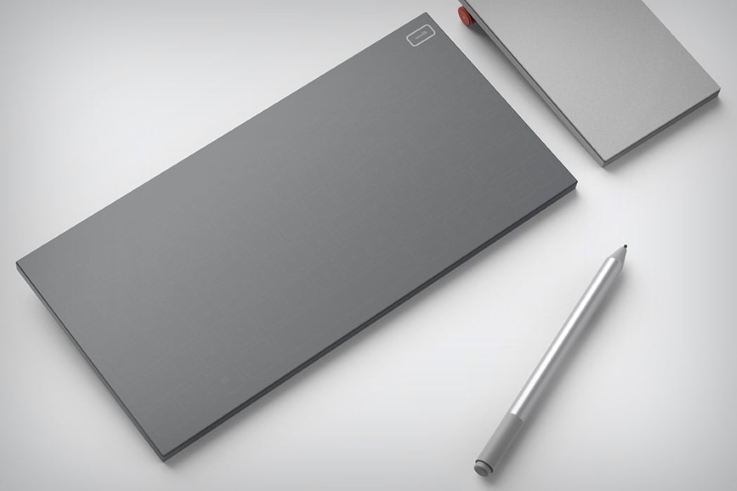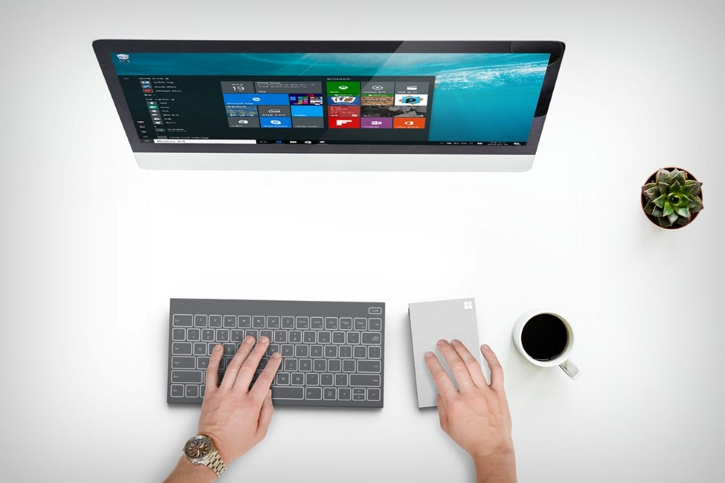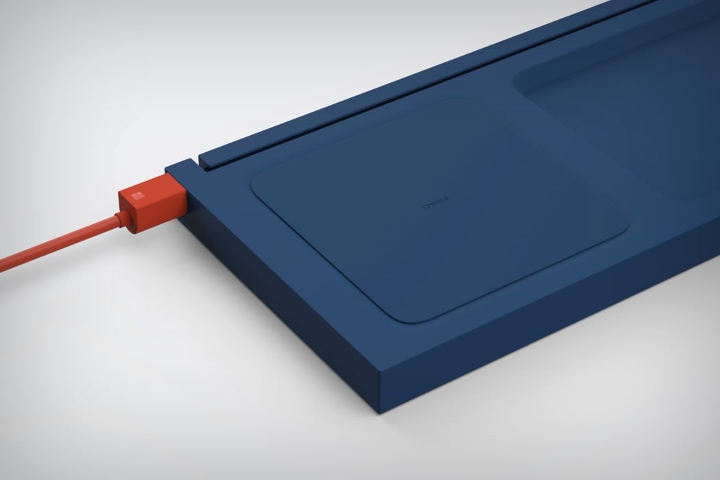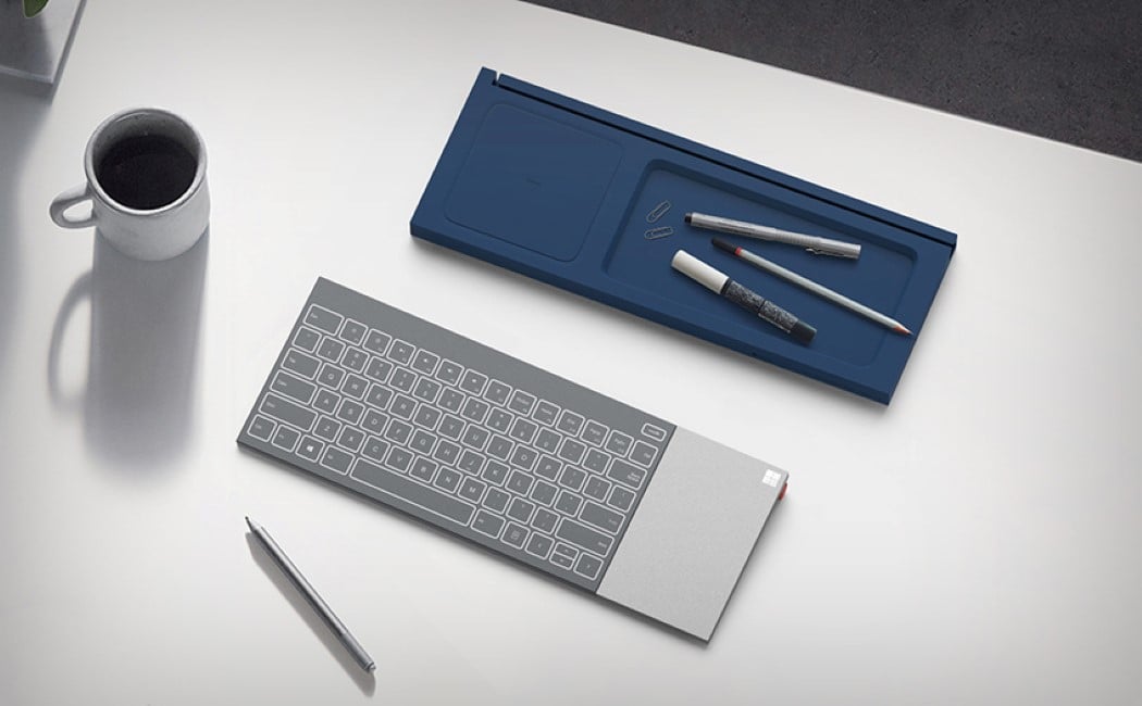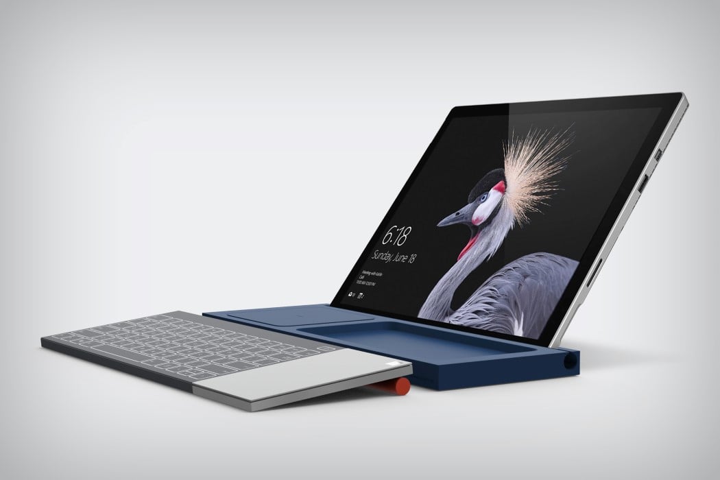
It’s funny how Microsoft’s new product design language is plain and simple visible in its logo. Clean geometric shapes, no fluff, no nonsense. If you look at Microsoft’s tablet, keyboard, or even its phones, you’ll see it. Seokmin Jang and PDF Haus cleverly caught on that trend and made what I can only assume is the most visually different and useful keyboard of all time. The All In One Keyboard comes with this unusual design that looks funny first, but makes a world of sense later. Fitting inside its cuboidal frame is a keyboard, a trackpad, and a wireless charging dock (that not only charges the keyboard but even your smartphones).
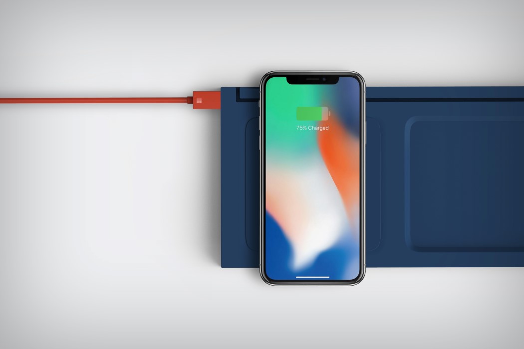
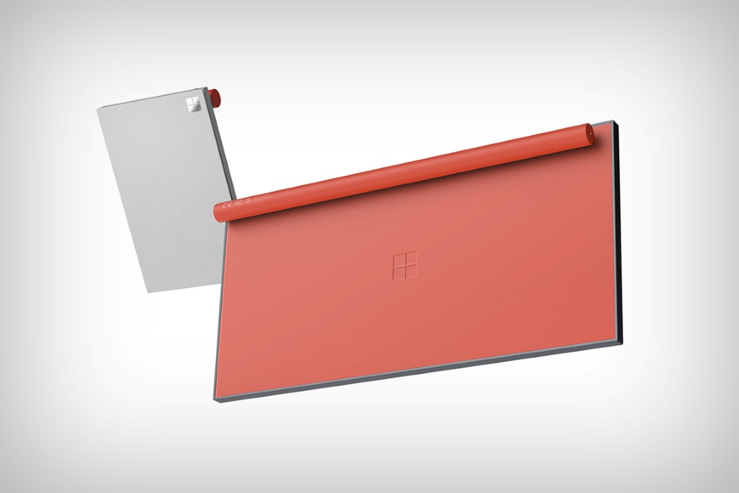
The keyboard uses capacitve ‘feather’ touch to remain sleek and svelte. A cylindrical member at its bottom positions it at just the correct angle to allow you to type with ease. You can use the trackpad alongside to work even faster. It uses the Microsoft Surface’s stylus, allowing you to attain a level of precision you normally wouldn’t get with your finger on a trackpad. The extra touch is the wireless charging dock, that lets you place your phone on it, and even doubles up as an office tray, allowing you to place stationery in the empty space on the right. In doing so, the All In One Keyboard elevates itself from being just a piece of tech, to being a product that looks at the context of work and office very carefully… which is what all productivity tools should do, right?
Designers: Seokmin Jang & PDF Haus
