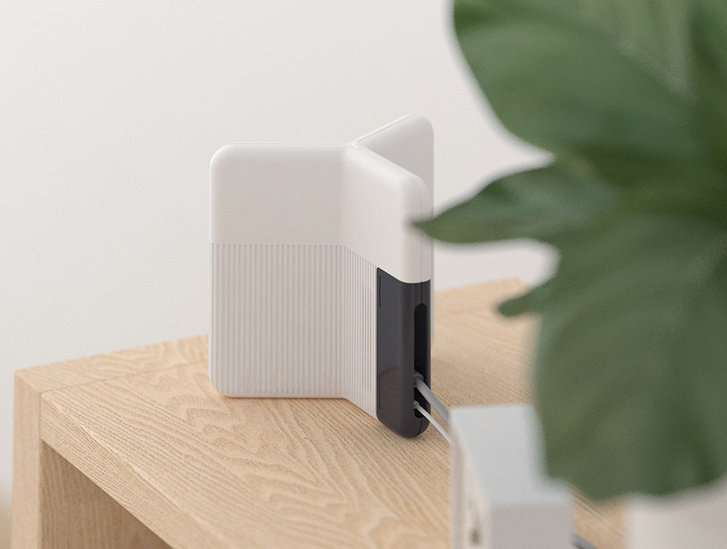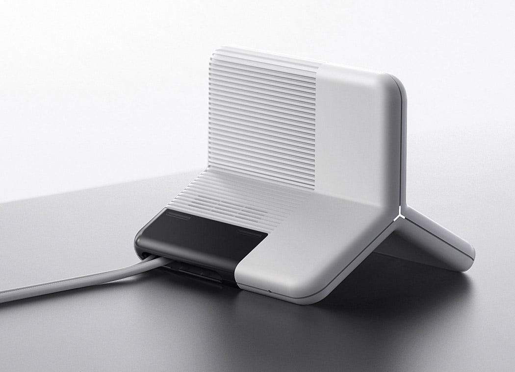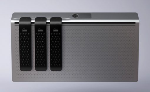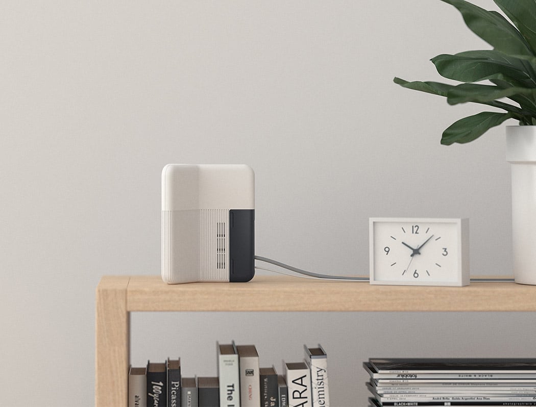
The Y router begs the question WHY?! Specifically, WHY are all routers so dang ugly! Seriously, I just moved into a new apartment over the weekend… spent a ton of time making it look spectacular… only to kill my vibes when the internet company came to install my wireless router. YUCK. Lucky for me, I was able to hide the unsightly monster. However, we shouldn’t have to. That’s the idea behind the model Y.
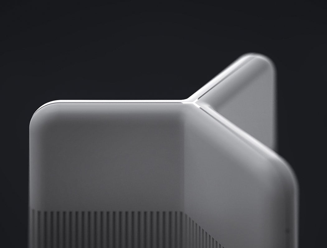
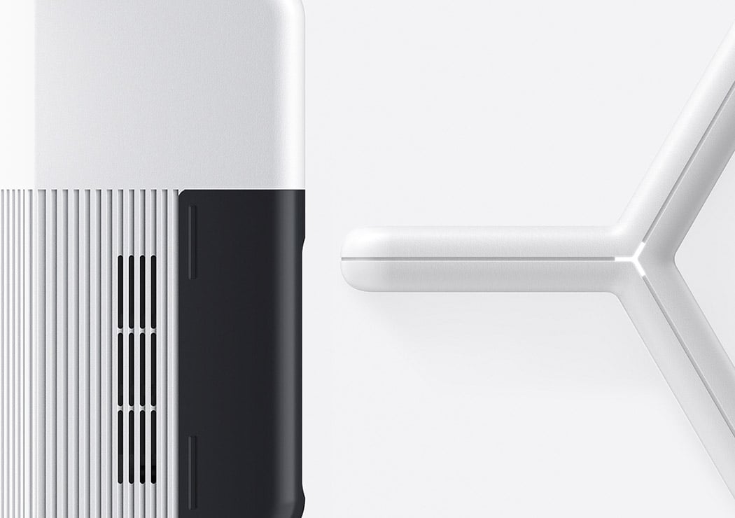
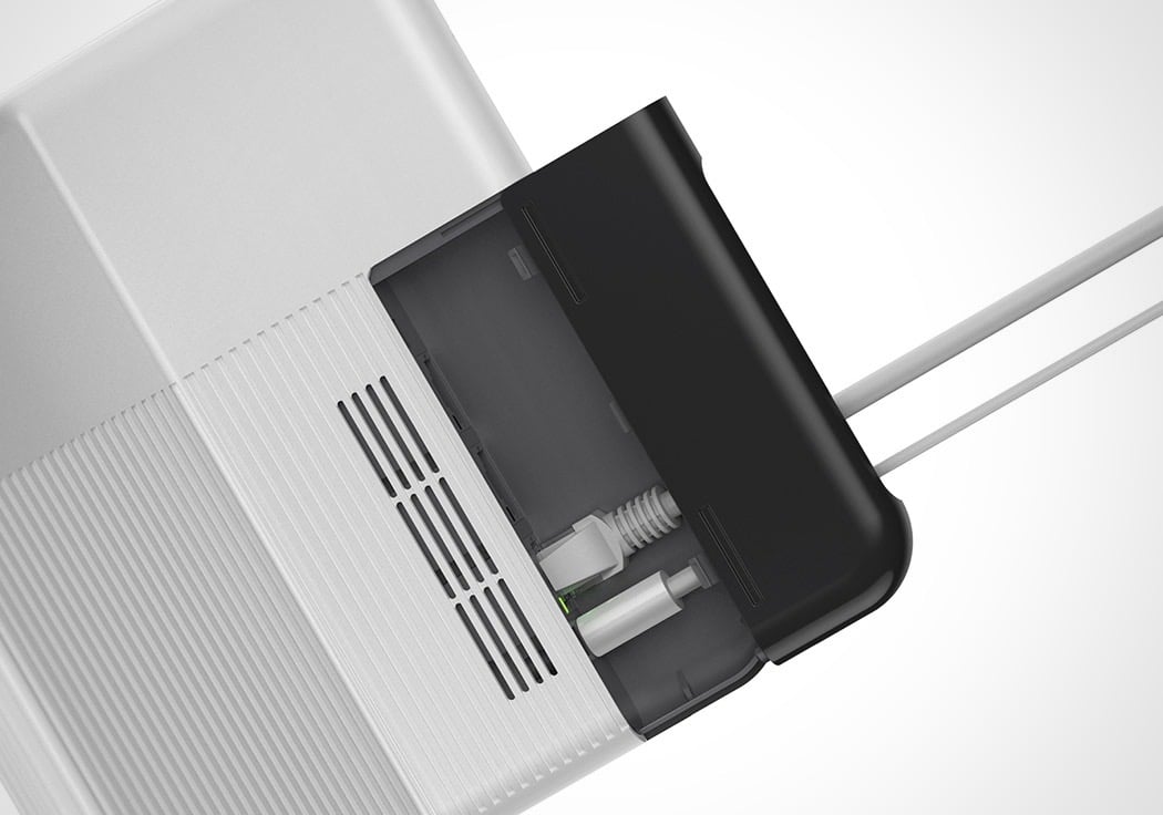
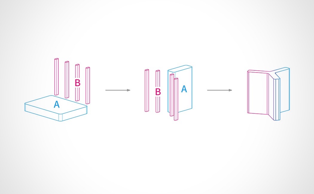
Unlike the antiquated box/antenna form, Y’s triangular shape is at once minimalistic, sculptural and functional. Its internal parts have been reorganized in a more sensible way that keeps the antenna contained and protected. Better yet, one section of the triangle is dedicated to cable storage! You can actually tuck away any extra cord directly into the device. Until Mark Zuckerberg gets thats universal internet idea off the ground, I NEED this in my life!
Designer: Ninety Studio
