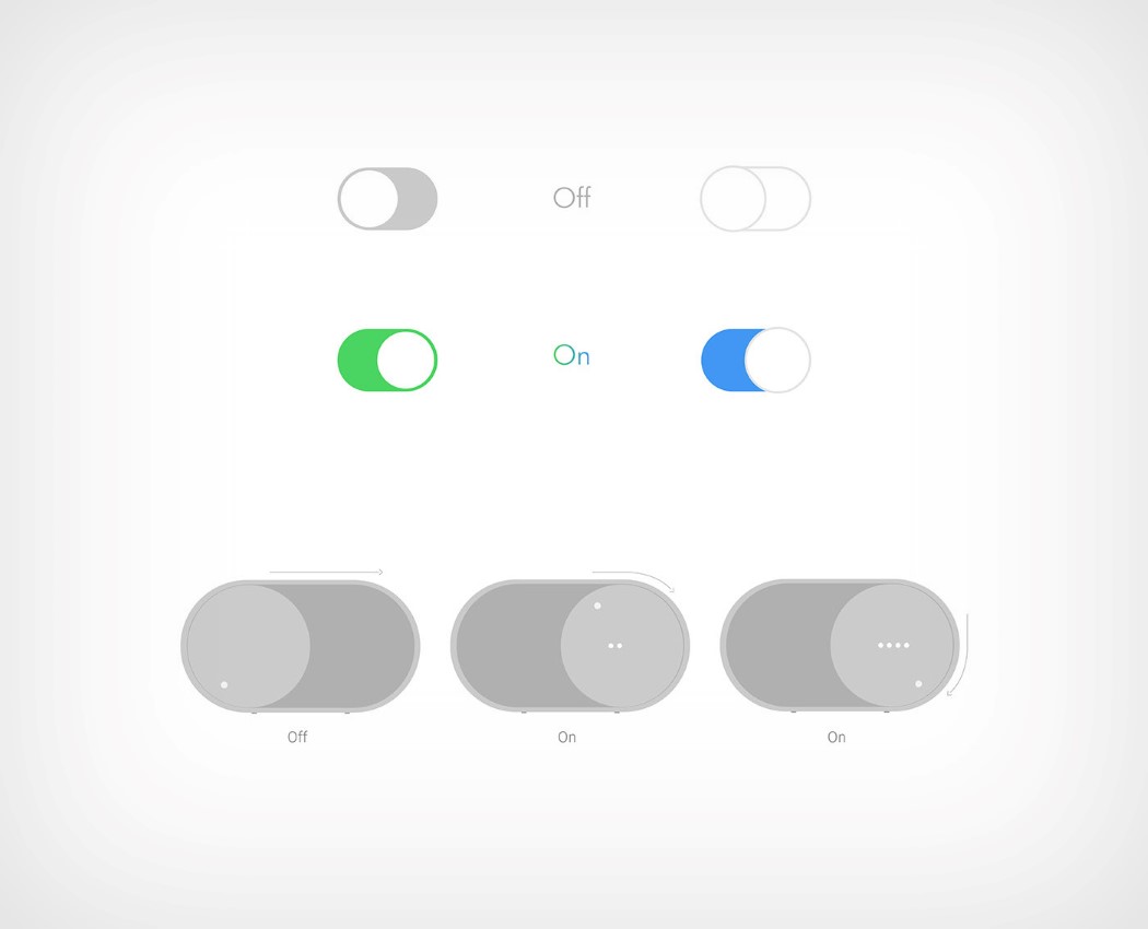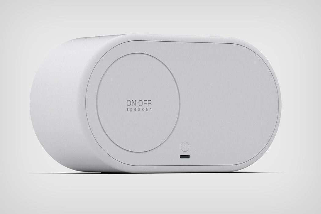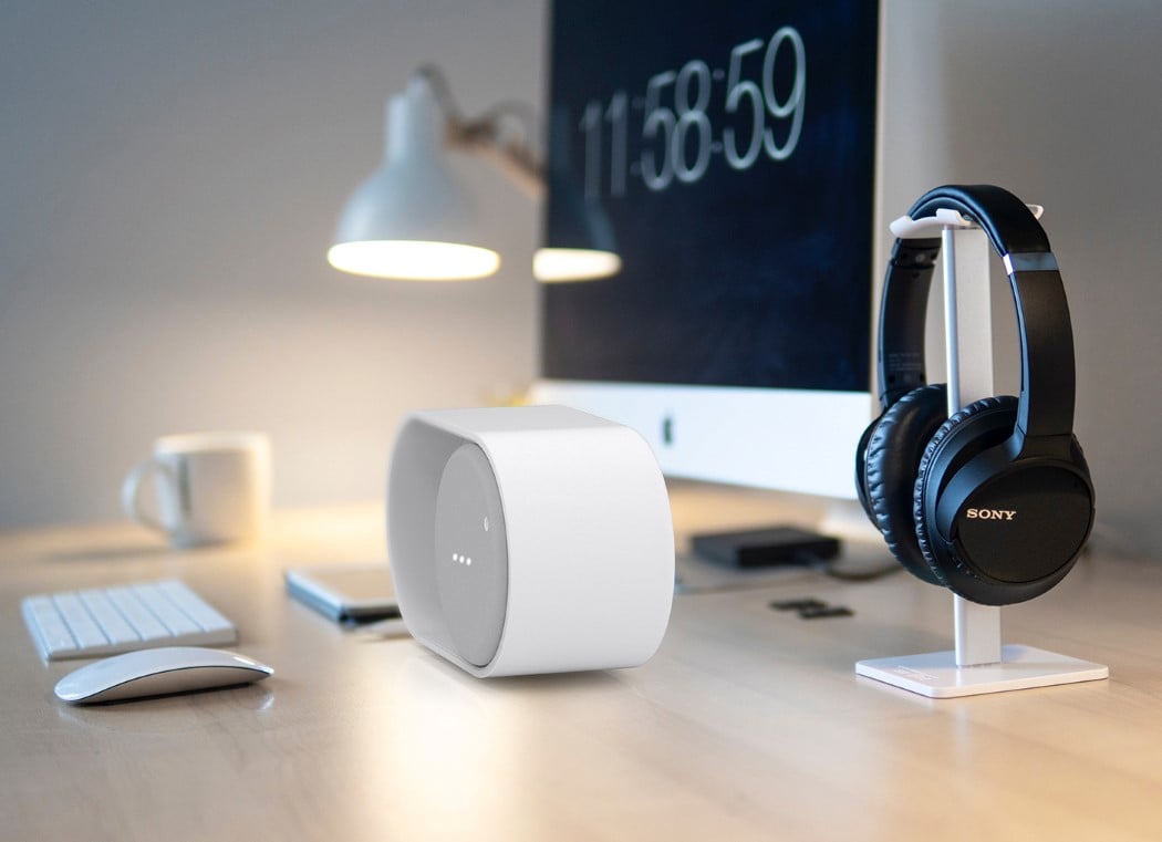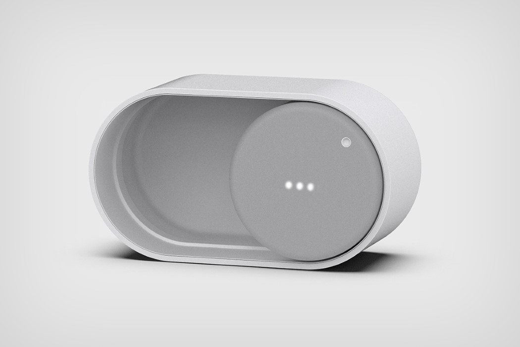
The shape of the ONOFF speaker needs literally no introduction if you’ve ever used a gadget in the past 5-10 years. Ever been around a smartphone, a tablet, or even a laptop? Chances are you’ve seen something quite similar. The toggle-switch UI. Found in most Settings areas of apps, websites, and systems, the toggle-switch lets you switch on or off a feature… and is ubiquity makes it a perfect visual metaphor for being on or off. Yongha Yang took that digital UI and turned it literally into the most physically enjoyable wireless speaker.
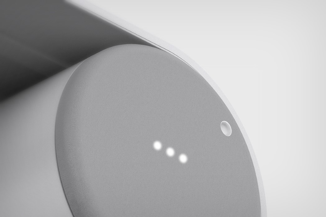
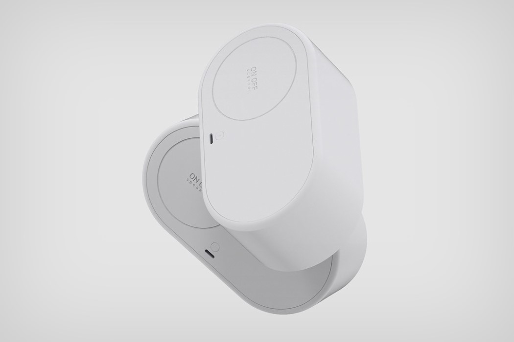
Meet the ONOFF. Chances are you’ll never need a manual for using it. Its interaction is just incredibly simple and intuitive enough to grasp literally the moment you see it. The circular speaker sits inside a capsule-shaped housing, sliding left and right. When the speaker’s on the left, it’s off, and conversely, shift the speaker to the right and it switches on… just like the virtual toggle switch. The speaker rotates too, allowing you to control the volume, while LEDs inside it light up in Google Home Mini fashion to tell you what volume you’re listening at. Simple, sophisticated, and just downright sensible!
Designer: Yongha Yang
