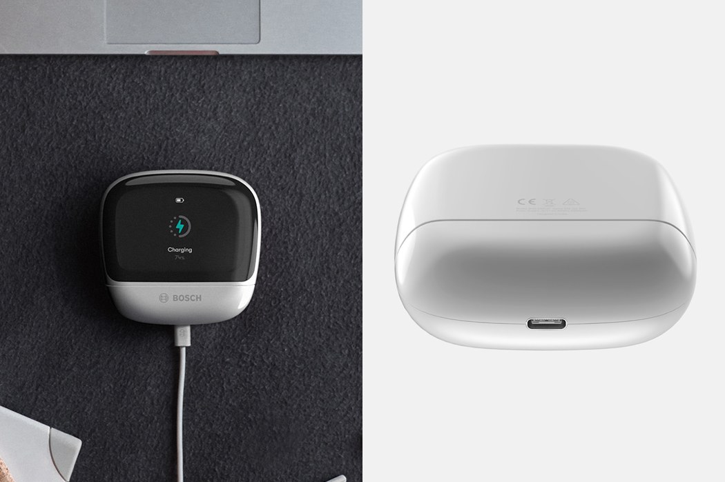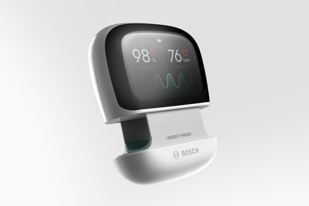
An oximeter is a fundamental device when monitoring health, however, it’s fair to say that far more time has been invested into its function, as opposed to its form. Whilst this design decision is rather understandable, it does leave a lot of room for improvement, and one which Kenko takes full advantage of!
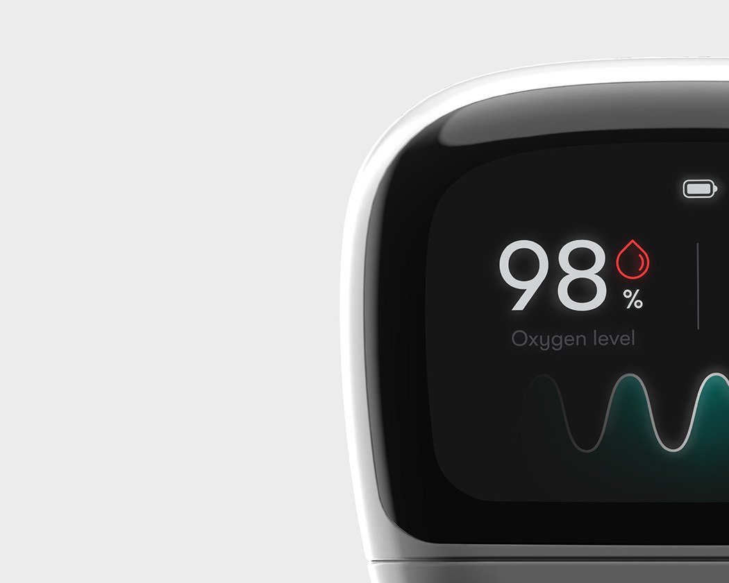
Kenko laughs in the face of the stereotypical aesthetic of medical products, as it instead carries a stigma-free, far more approachable design style. However, it isn’t just the aesthetics that have received a revamp… the entire user experience has been redesigned; the raised detector gives the user a tactile indication of where to position their finger, whilst the silicone insert can be removed for effective cleaning! Another of Kenko’s features that is rarely seen on a more conventional Oximeter is the OLED Display that provides the user with pointers and information regarding the seamless operation of the device!
Designer: Anish Shakthi
https://vimeo.com/275556460
“Designed to fight the social stigma associated with conventional medical products. Thanks to it’s “gadget” aesthetic, it seamlessly blends into the world we live in today,” Shakthi told Yanko Design.
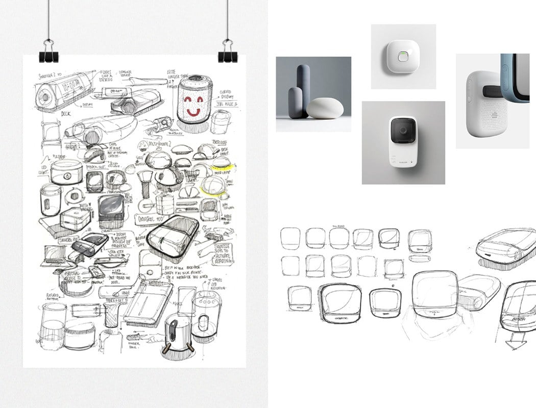
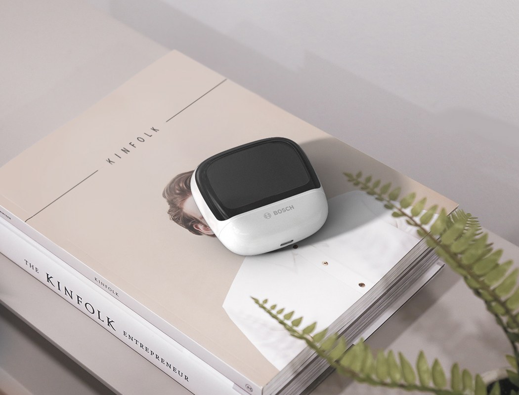
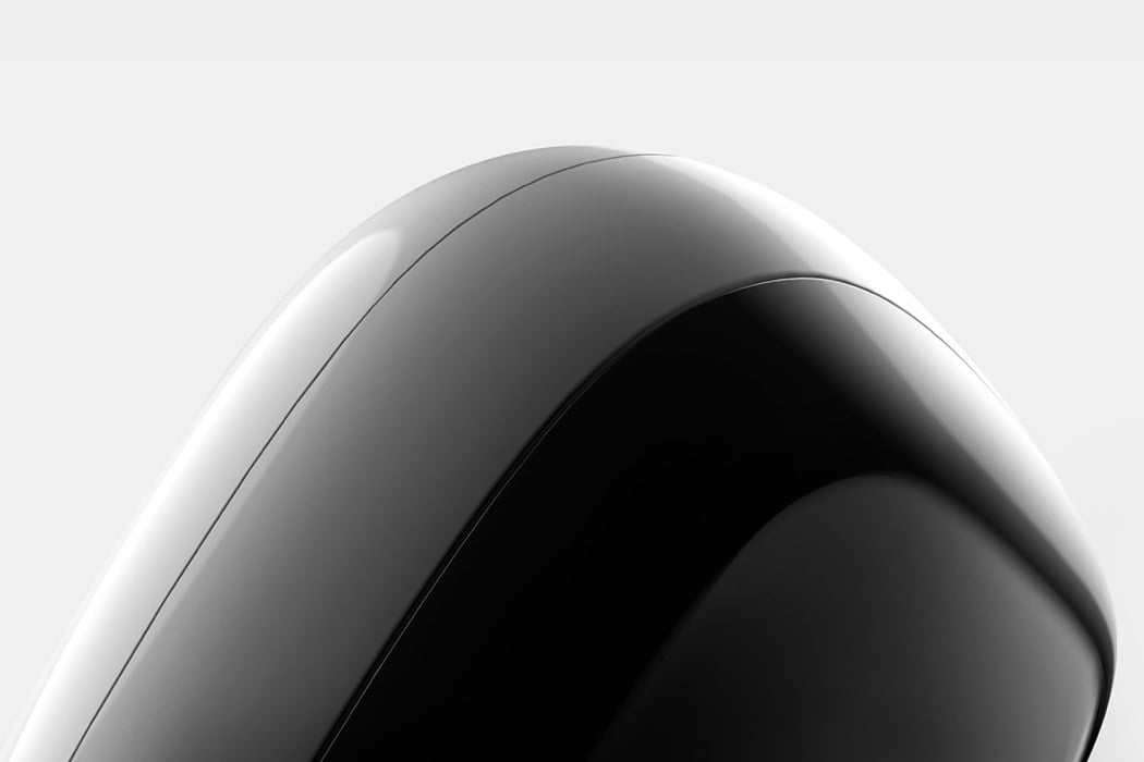
The curves make it appear friendly and the soft form sits well in the palm of your hand.
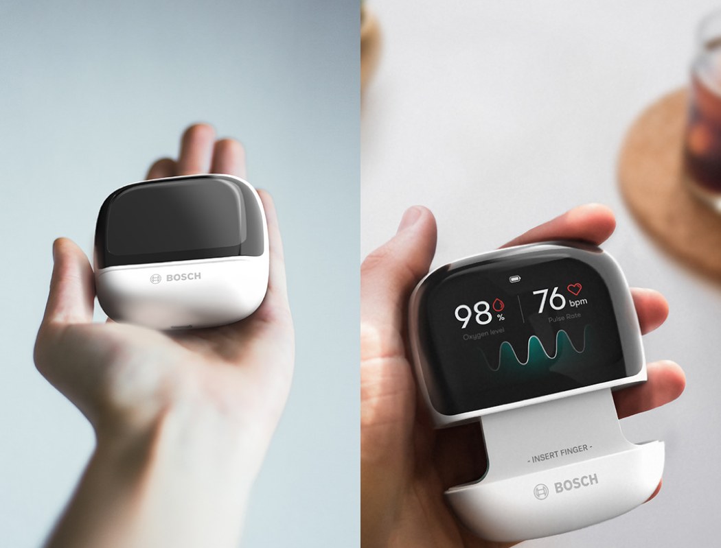
The bottom slides down to reveal the Photo-detector and the LED lights.
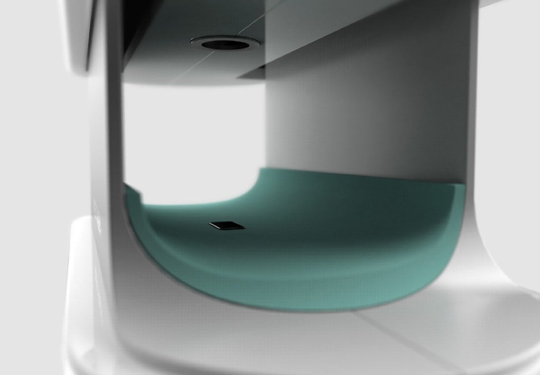
The raised detector gives you a tactile indication as to where to place your finger. In addition, the silicon pad is shaped to grip your finger well.
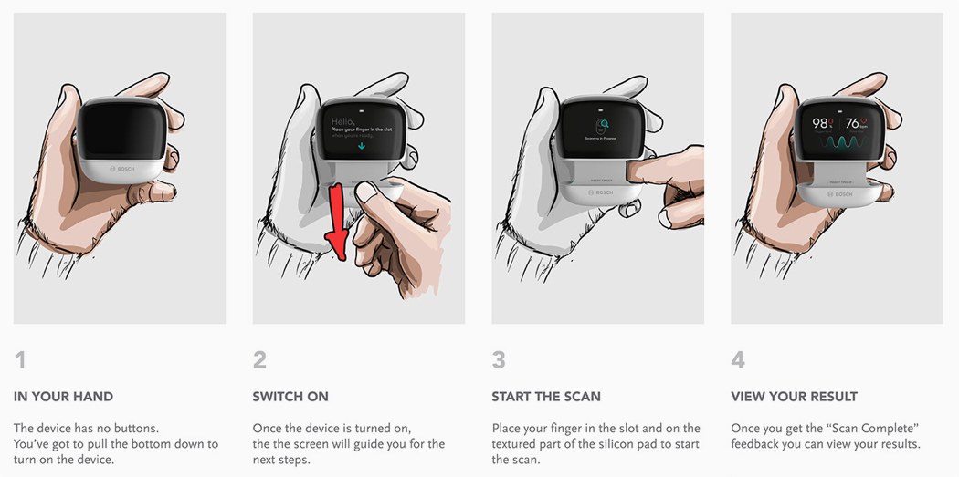
Works great for both left and right handers thanks to the opening on both sides of the device.
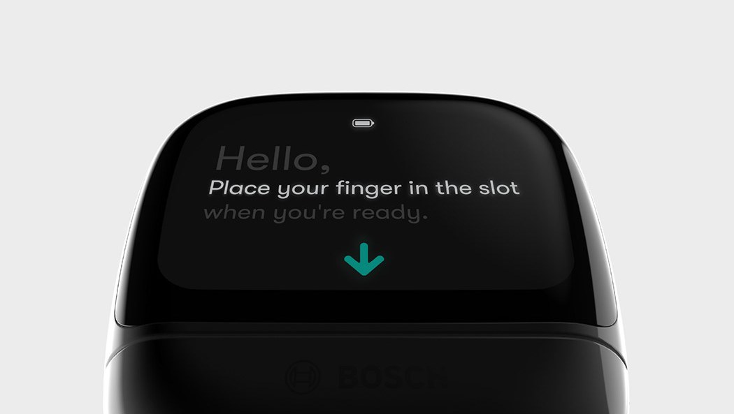
The OLED display is the main source of information and interaction with the device. Provides you information on how to use the device and is there when you need it.
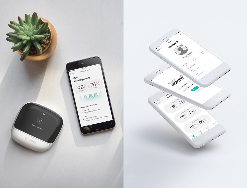
The app tracks all of your readings and gives you health suggestions based on your conditions.
