Keyshot’s Material Graph offers the ability to go beyond simply tweaking a material’s color, roughness, or refractive index. If Keyshot’s material library is a restaurant menu-card, the material graph is literally the most versatile salad bar you’ve ever seen. You can pick and choose various aspects of different materials, creating a visually gorgeous mishmash of nodes and blocks to ‘build’ a material that looks stunningly real. I’m probably making it sound complicated, but here’s the truth – it really isn’t. All you need is a little patience and the ability to spot how your material reacts when you make changes to it in the material graph. Combine them and in no time, you’ll have a material that behaves exactly the way you want it to… because it was designed to!
Read further to see how to build this aged, oxidized, grungy material in Keyshot’s Material Graph. You can use this technique to make all sorts of material variants, like rusted iron, oxidized silver, or even aged bronze that’s turning green around the crevasses.
UNDERSTANDING THE BASICS
Imperfections form a major part of what makes a render photorealistic. Scratches, dust, fingerprints, dirt accumulated in tiny corners, signs of aging, all this plays a heavy role in making the eyes believe what they see. You seldom see a phone without some smudges on its screen, or a table without a bit of dust or scratches, or a leather bag without patina. Imperfections are what make life real and embracing them is a great way to make your 3D renders feel “life-like”.
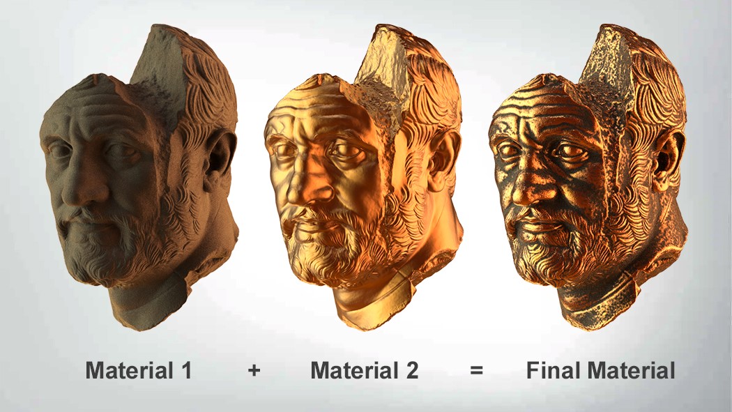
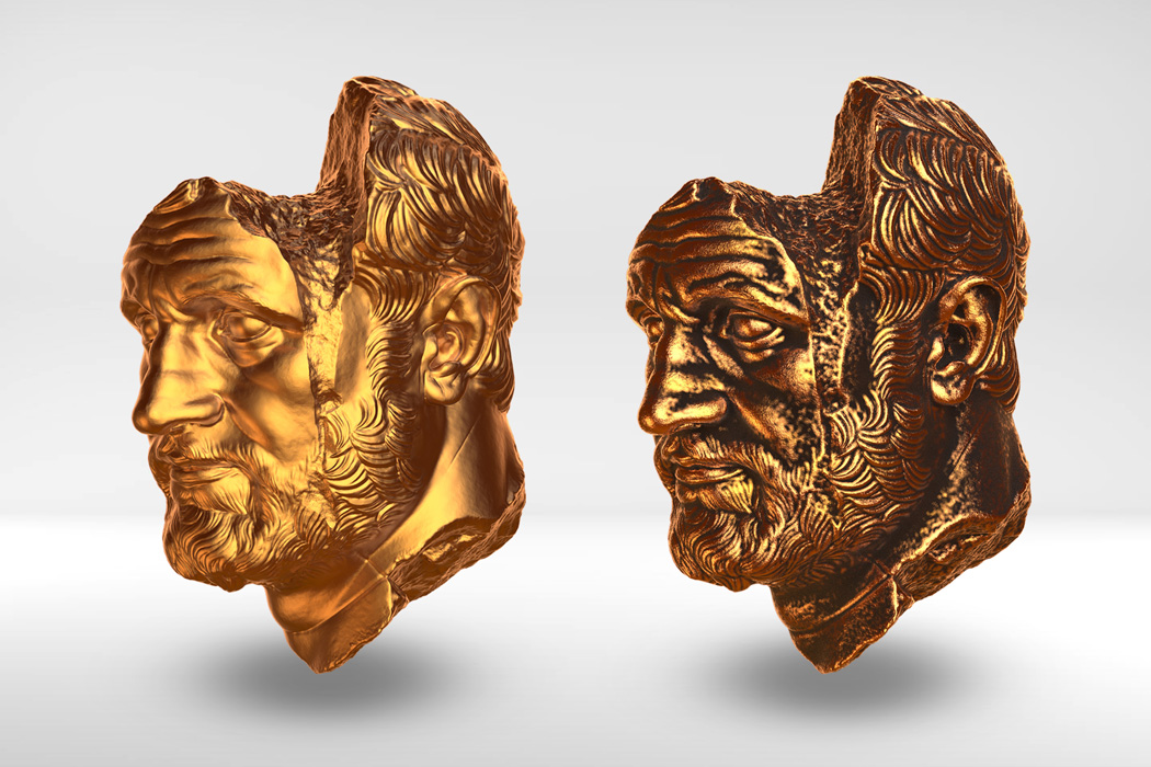
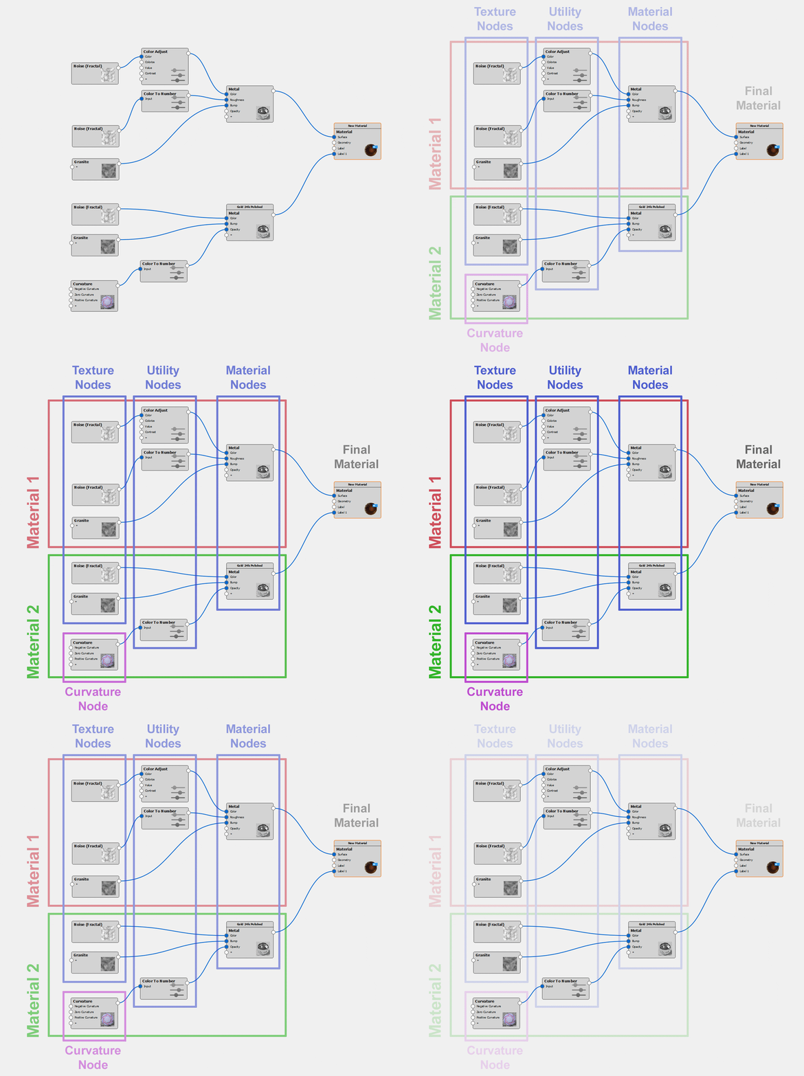
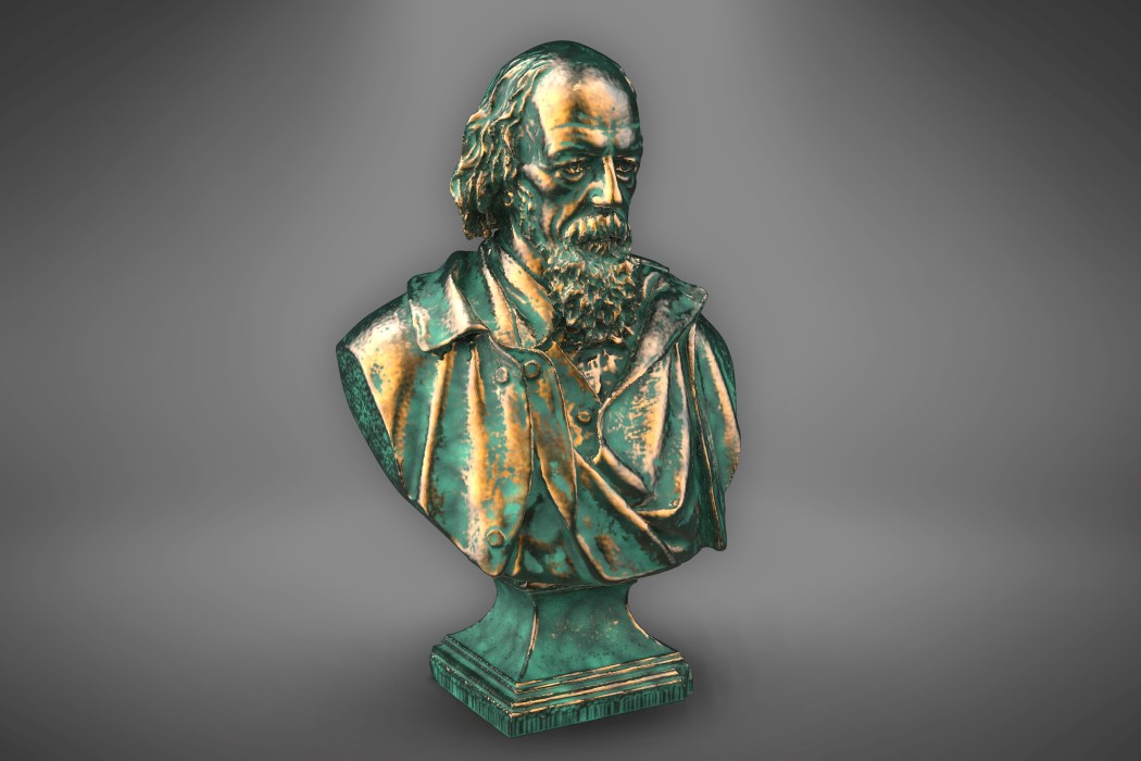
The best way to look at this complex material is by splitting it into its subsequent parts. If you look at the image above, or the material graph below, you see two broad materials. Material 1 is an old, aged, dirty brownish metal, Material 2 is a shiny, golden/bronze metal. Once you create these two materials, it’s just a question of adding them together in a way that allows the right metal to show up in the right place. I’ll explain how we do that, but first, let’s create the two materials.
Before we begin, I’ve set up my scene using a model of the Bearded Man, downloaded for free from Three D Scans. Fun fact, the model is a scanned historic artifact titled ‘Portrait of a Bearded Man’ made in Marble back in the Hellenistic Period in 150 B.C. Greece. It’s perfect for our aged material because it has a stony texture with a stunning amount of detail that causes the material to look incredibly realistic. Remember that your material will only be as good as your model. A model with real-world imperfections will result in a material that’s believable and realistic.
Once you’ve set the scene up with the model, start by opening the material graph and making the old metal first. The key is always factoring imperfections into the model, so rather than just using the same color and roughness throughout, we’ll use texture maps to make sure the color and roughness of the old metal are inconsistent. Similarly, drop a texture into the Bump section too (with a low bump height) to create that undulating imperfect surface. The material interprets these texture images as data to control its properties. Depending on the whites and blacks and greys in the texture maps, the material has high or low roughness, or a higher or lower bump. Play around with the values to get a dark, rough-ish metal with barely any reflectivity… and then make Material 2, which is just the opposite.
Since Material 1 is the base material, Material 2 will sit on top of it as a layer… or in Keyshot parlance, a Label. Right-click in the empty space and create a new metal material, with image maps controlling its color, roughness, and bump. Apart from the bump, which essentially stays the same in both materials, the color and roughness are fundamentally the opposite. Where Material 1 is rough and dark, Material 2 is shiny and golden. Once you’ve made Material 2, link it to the Final Material Node using the Label option. What you now have is a shiny metal ‘coating’ sitting on top of a dirty, rusty metal. Now we control which parts of the model appear dark and rusty, and which parts appear shiny and metallic!
EXPLORING THE MATERIAL GRAPH’S CURVATURE NODE
If you’ve ever taken a walk in the mud with sneakers on, you’ll notice something interesting. The mud gets right into the gaps of your sneaker’s tread pattern. The surface of the sole may stay clean, because it’s constantly rubbing against the ground, but the mud that gets into the negative spaces of your sneaker sole stays there until you clean it out properly. Interestingly enough, that’s exactly what we’re doing with this old, aged material too. We’re sort of keeping the ‘outer surface’ clean and shiny, while allowing the dents, cracks, gaps, and holes to be dirty… and we’re doing this using the Curvature Node.
Simply put, the Curvature Node splits your model into three types of surfaces – Convex surfaces, Concave surfaces, and Flat surfaces. When you connect this node to Material 2’s opacity, what you’re basically doing is making Material 2 visible in certain parts of the model, and invisible in other parts. The Curvature Node comes with three primary controls. One for Negative Curvature or concaves, one for Zero Curvature or flats, and one for Positive Curvature or convexes. What we want is for the shiny material to be visible on all convex surfaces, and the dirt to sort of be lodged into the tough-to-clean concave surfaces. By assigning the color white to the Positive control and the color black to the Negative (and even the Flat) control, you effectively control Material 2’s opacity, making it visible only in convex parts like the tip of the nose, the eyeball, etc. Everything else immediately appears dark and dirty, thanks to the underlying Material 1. You can periodically click on the Curvature Node and press the C key to toggle the preview of the black and white colors instead of the old and new materials.
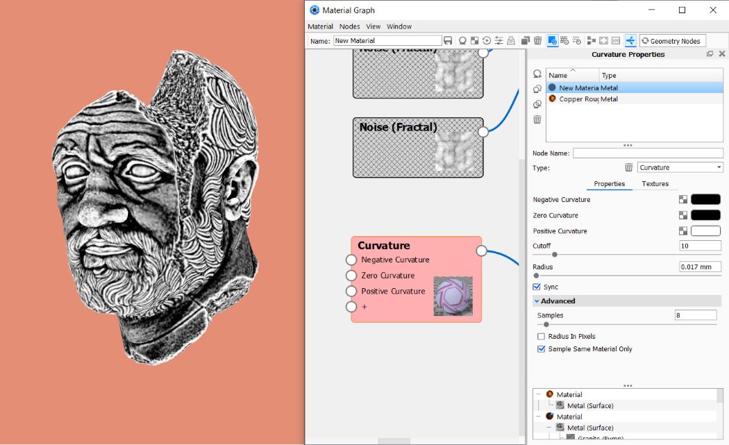
The Curvature Node also has other controls that let you tweak the output. The Cutoff control basically determines how Keyshot treats the flat surfaces. If there’s a surface that’s almost flat, a high Cutoff value tells Keyshot to treat it as flat. Similarly, if your cutoff is at 0, Keyshot looks at every polygon accurately with no tolerance. Similarly, Radius controls clusters of polygons. A larger Radius value blurs the gap between the blacks and whites, while a smaller radius allows the difference to be sharper. Meanwhile, make sure you un-check the Radius In Pixels box. (That allows the radius to change depending on how much you zoom in or out, and we don’t want that)

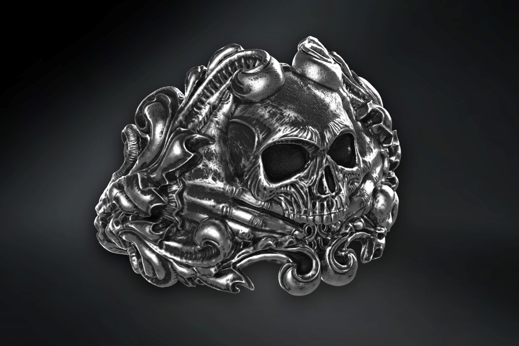
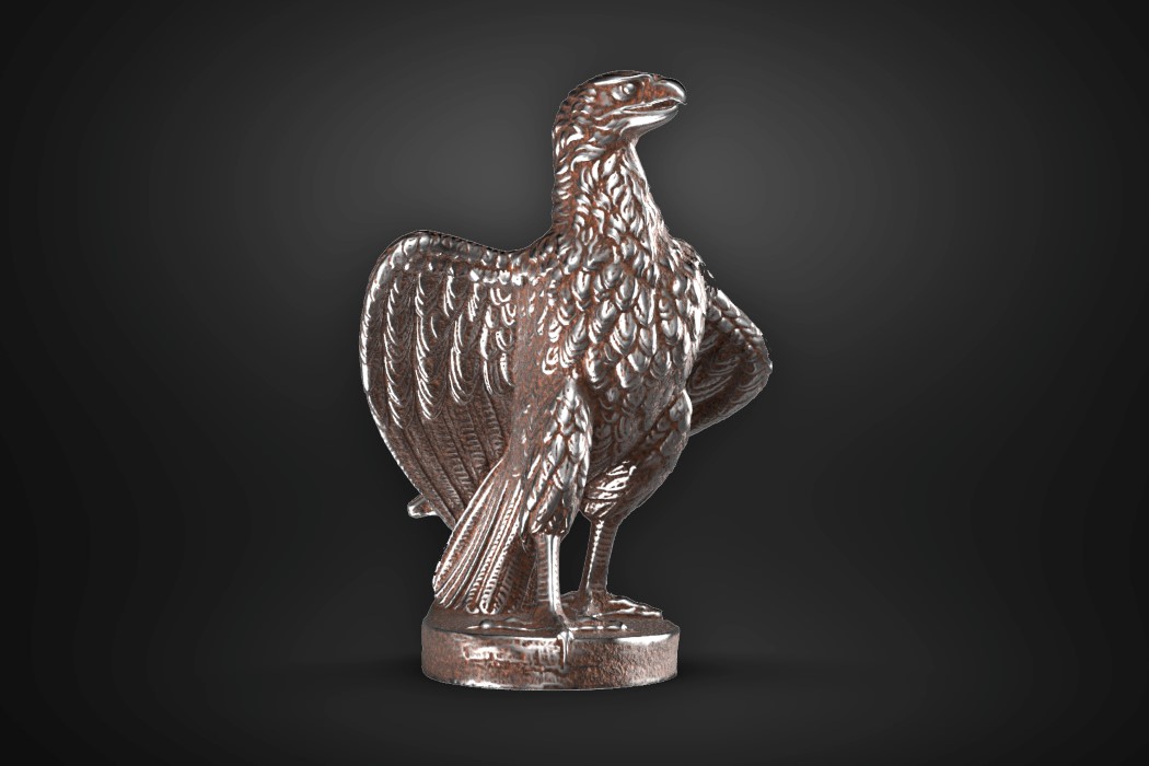
Add some dramatic lights and Voila, you’ve got yourself an aged, old metal! If you followed along and built your own version yourself, that’s amazing! If not, just tinker around with the file we made by downloading it here. You could also watch this video by Esben Oxholm who uses this technique to make rusted iron. Similarly, you can use this process to make aged variations of materials yourself, like oxidized silver, greenish oxidized bronze, or your very own rusted metal. Scroll down to check out some results below, and hit us up on Instagram if you’ve got any suggestions for other materials you want us to make tutorials for!
Click Here to Download the Material!

