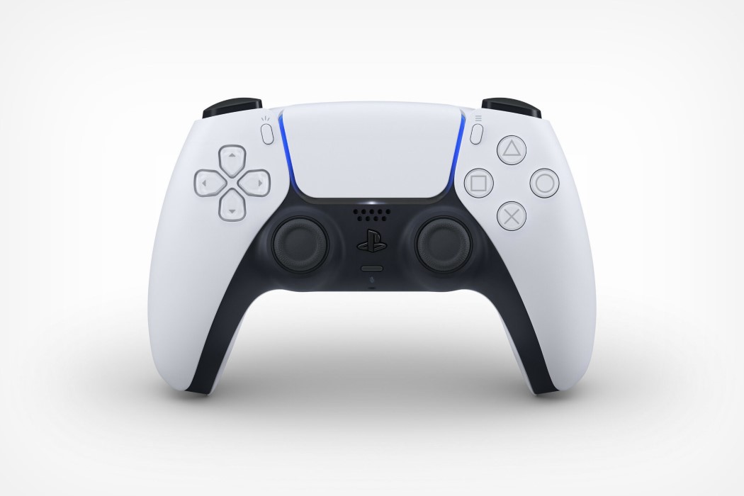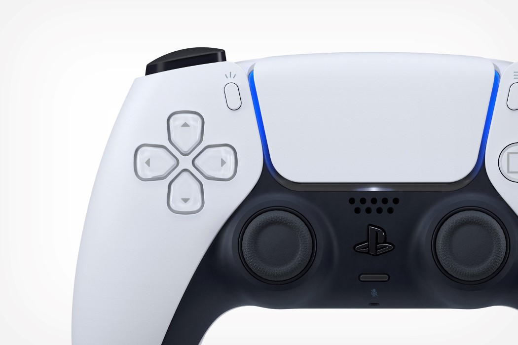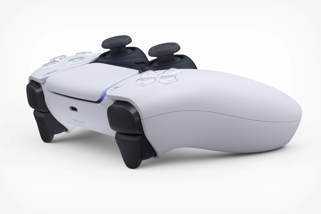
I’ll be honest, the new PS5 controller design is giving me slight Portal/Stormtrooper vibes with its flowy, organic, split-surface black/white design. Released as a set of images that would have probably debuted at E3 if it hadn’t been for this damned virus, the Dual Sense controllers for the PS5 are quite an upgrade or deviation, depending on how you look at it. If you ask me, it looks like someone made the old controller wear a white tuxedo and gave it a shave plus a dab of cologne… figuratively speaking, of course.
The PS5 Dual Sense controllers bear more of a resemblance to the Xbox Series X controllers if you ask me, given its ergonomic design and dual-tone finish. I can’t help but wonder what the design brief behind Sony’s upgrade was, but I do like how clean it looks. As per an official blog post from Sony, the new controller should look smaller and feel lighter than its predecessor. Among some notable upgrades are the presence of the light-bar on the top of the controller rather than the front, a switch to USB-C, and a built-in microphone array that lets you have conversations with other players without the need of a bulky headset. Sony’s also been working on better haptic feedback, and one of the Dual Sense’s most interesting features is the presence of variable tension in the L2 and R2 trigger buttons that become harder or easier to press based on what you’re doing in the game. Imagine a trigger on a handgun being easier to press, versus a trigger on an assault rifle or shotgun offering a significant amount of resistance. Sounds incredible, doesn’t it?!
Sony’s yet to release info on its pricing, availability, and color-variants, but that should come well before the PS5’s expected end-of-year release date… and given what the PS5’s images look like, it’ll be quite a role-reversal to have a gaming controller that looks SIGNIFICANTLY better than the console itself, no?
Designer: Sony


