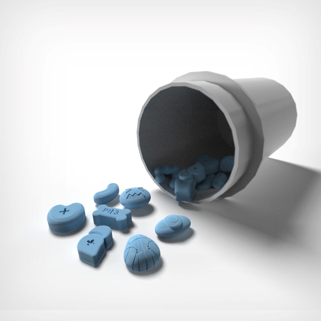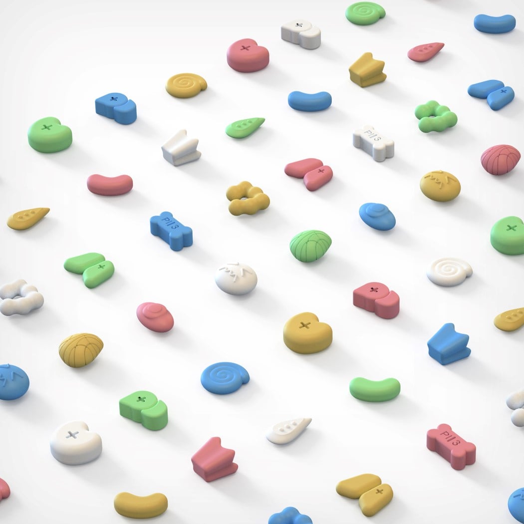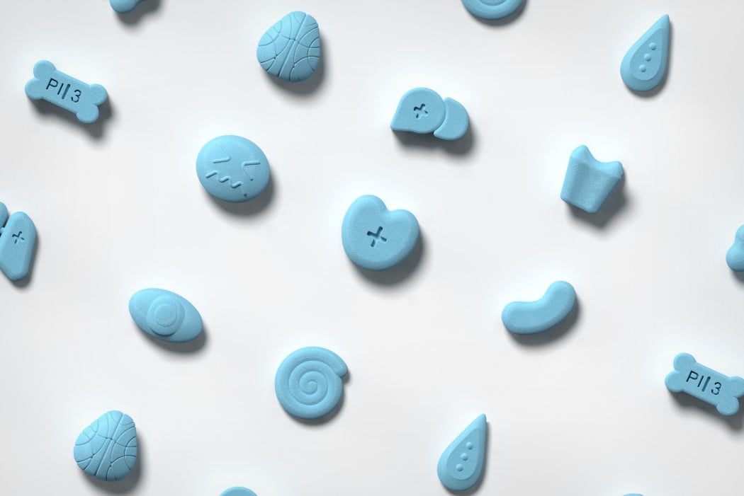
I’m not particularly committed to the name Pimoji (pills + emoji), but the idea is clever enough to have won an A’ Design Award this year.
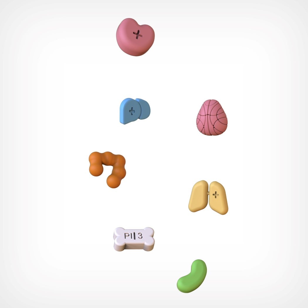
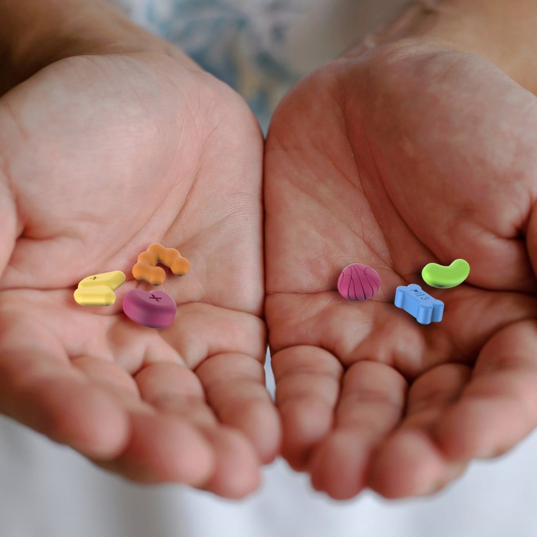
The concept behind the Pimoji tackles the two biggest problems of taking meds. Firstly, the ambiguity, given that almost all medicines look the same and their names are usually a complicated bunch of characters that often don’t convey anything, and secondly, the fact that the very act of taking medicines feels slightly daunting, and can often seem scary to most. The Pimoji’s solution to both those problems is simple, and between you and me, pretty innovative! Design each pill around an emoji-esque representation of the ailment they’re trying to cure. Heart meds are shaped like hearts, bone-strengthening meds are shaped like bones, toothache tablets are shaped like teeth, and the list goes on (let us know if you can correctly identify the tablet shapes!) The pills come in cute shapes that make it easy to know what medicine you’re taking, while somewhat making it feel like you’re eating fun-shaped candy, not medication!
The Pimoji is a winner of the A’ Design Award for the year 2020.
Designer: Jong Hun Choi
