MUJI is a success story that started as a local Japanese phenomenon and thanks to a unique vision on production, market, identity, etc… grew to become a universal brand and an icon in the design world. MUJI’s simplicity easily creates a color pallet that can be followed through in your home, with the Japanese attention to detail transforming a simple product design to a piece of art almost. It is this quintessential essence of products, minimalized to their core functionality with aesthetics that amplify their purpose, no wonder MUJI has a dedicated global fan-following that can’t get enough. This collection shows individual pieces by such designers/fans of MUJI who have created designs that are definitely worthy of being a part of the MUJI family!
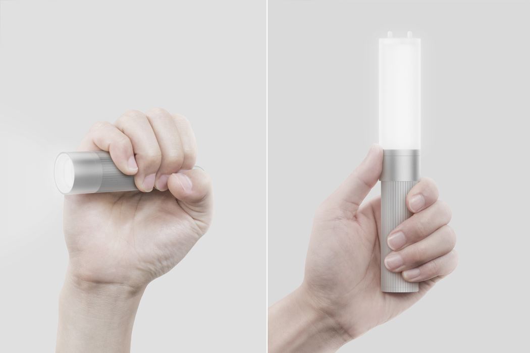
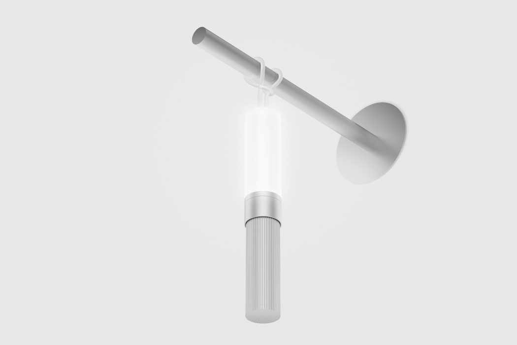
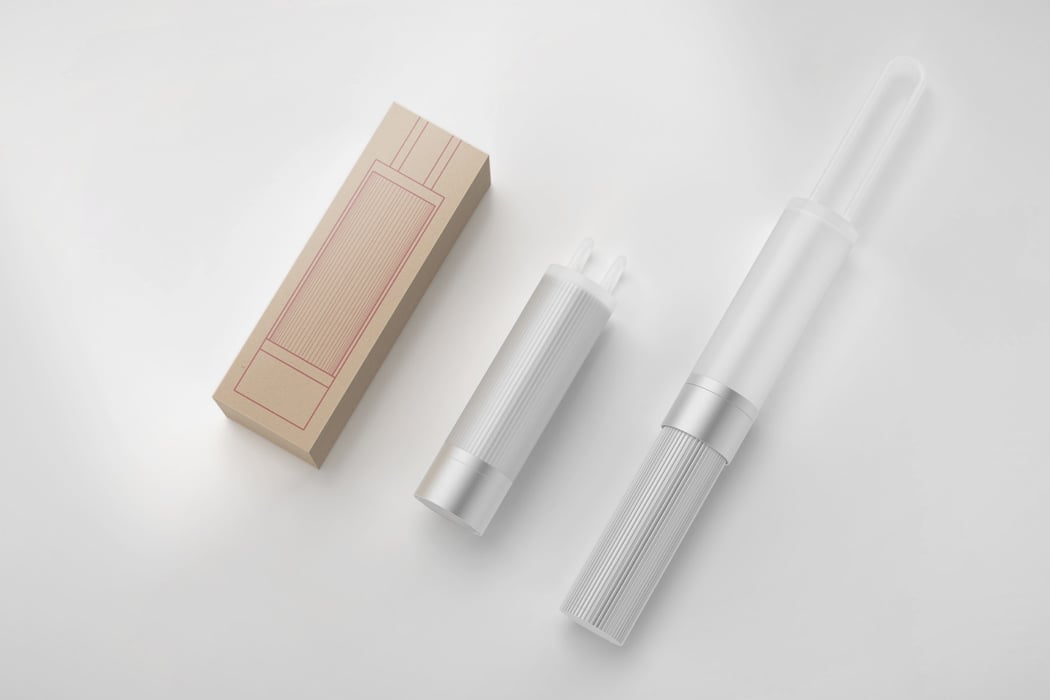
Rich Park and Soohun Jung of BEBOP Design used metal extrusion, an incredibly precise and easily controlled manufacturing process to create this Aluminum Light. The minimal design language was designed to be scalable for MUJI, where it can be applied to a new line of products, and possibly even develop a system where different products can share the same components to maximize production efficiency. Aluminum Light takes advantage of silicone’s great tensile strength through an integrated strap. The silicone strap can be stretched to be wrapped and hang itself for an overhead light. When using the product as a flashlight, simply wear it as a wrist strap to prevent drops. The hygienic and tactile nature of the material makes it a great grip for a flashlight. And its translucent finishing diffuses the light evenly to be used as a lamp. A hidden screw mount is used to attach and detach the silicone light diffuser on either the front or back of the aluminum “head”, where the flashlight becomes a lamp and vice versa. Simple, multifunctional, modular – the Aluminum Light is designed to be a part of the Muji Family!
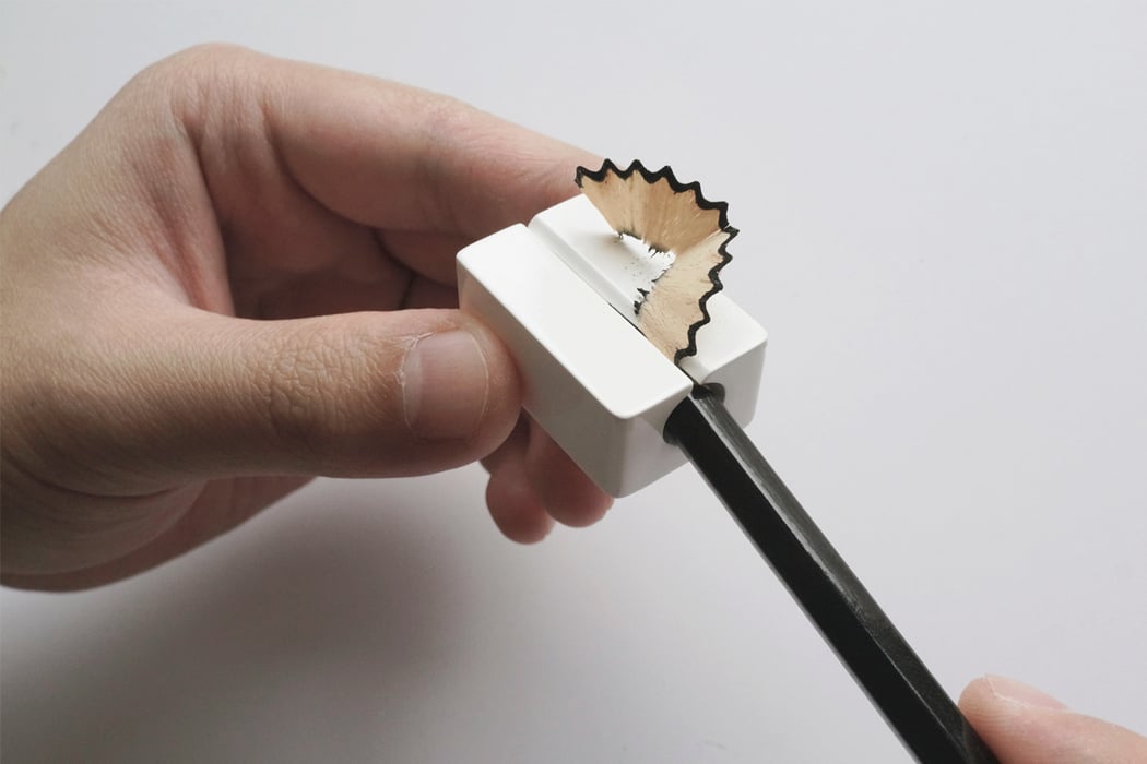
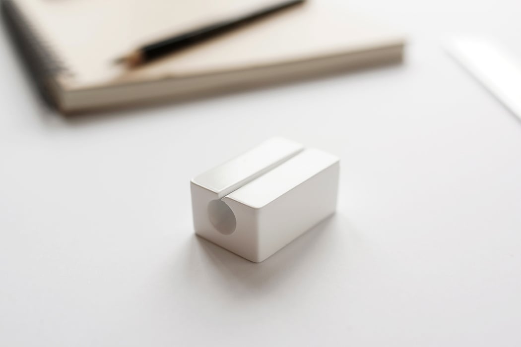
Bryan Wong and Chengtao Yi’s Zirconia Sharpener is the epitome of minimal design. This 2017 A Design Silver Award Winner is a sharpener and nothing else but the beauty of it lies in the use of materials, in this case, zirconia. We always sharpen our pencils – be it for note-taking or sketching. A pencil sharpener made with this level of beauty and durability is functional hence leads to desirability. The design is honest, thoughtful, simple, and analog with the blade and body are made from zirconia and fused into a single unibody block. By utilizing zirconia’s material property, the blade doesn’t need to be changed and offers a smooth sharpening experience. Almost poetic, this is a sharpener worth keeping with you forever.

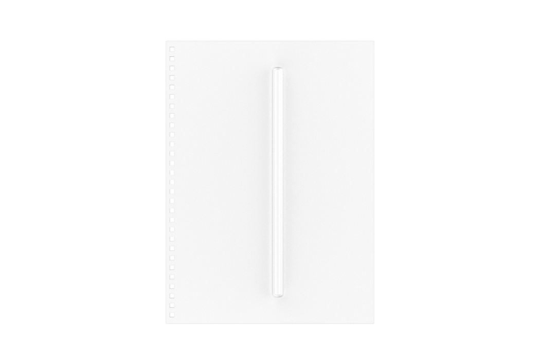

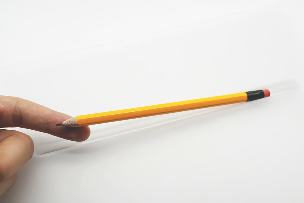
After getting the sharpener right, let’s get the humble pencil the homage it deserves. Chengtao Yi realized that unlike most of the pens, pencils do not have a clip, which makes for very annoying user experience. He believes the pencil and notebook are made to be together. So he designed a notebook that has room for a pencil. Pencil Note is a notebook with a simple plastic (PC) cover that can house a standard pencil of almost any kind. The bulge on the cover provides the room and tightly secures the pencils. It also makes sure the pencil can be easily taken out. The translucent cover creates a frosted and vague silhouette of the pencil inside, almost looking like a health bar in video games, indicating how much of the pencil has been used.
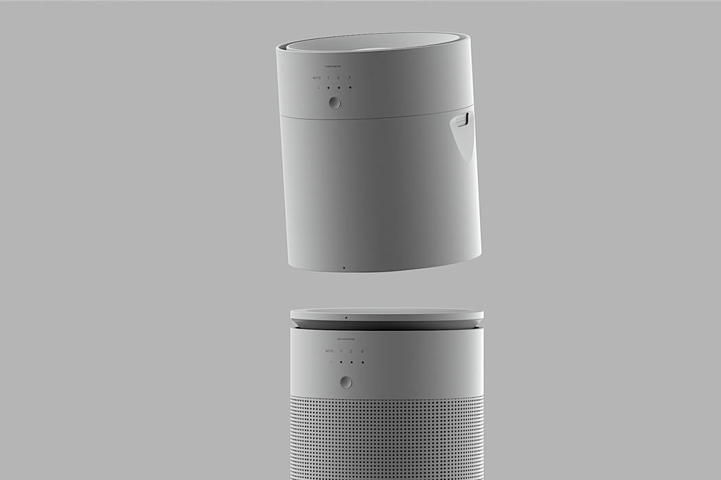
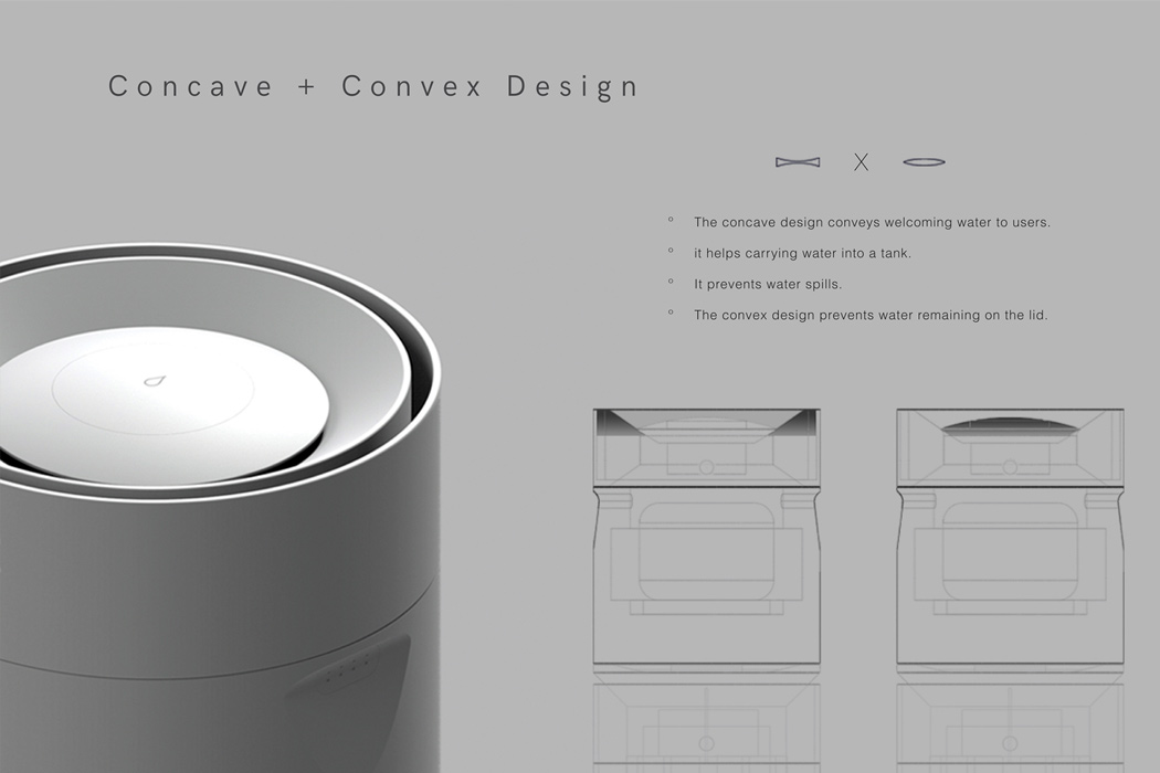
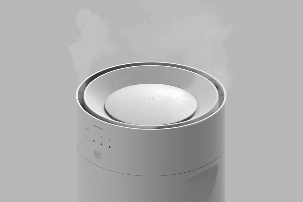
Masamaro Fujiki started his design process with the question – why do we need a 2-in-1 air purifier with a humidifier? The multifunctionality of this design causes a very bulky form. Masamaro’s solution is to create an appliance that can do the functionality of both while operating separately from each other as well. The Air Purifier + Humidifier enables you to convert your room into the perfect environment by separating purifier function and humidifier functions. Winter nights keep your humidifier close while the purifier works the room from a corner, balancing the aesthetics of the room!
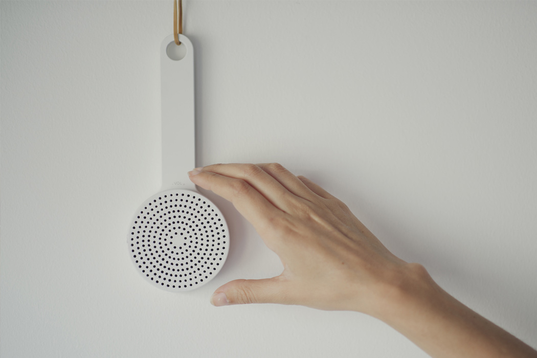
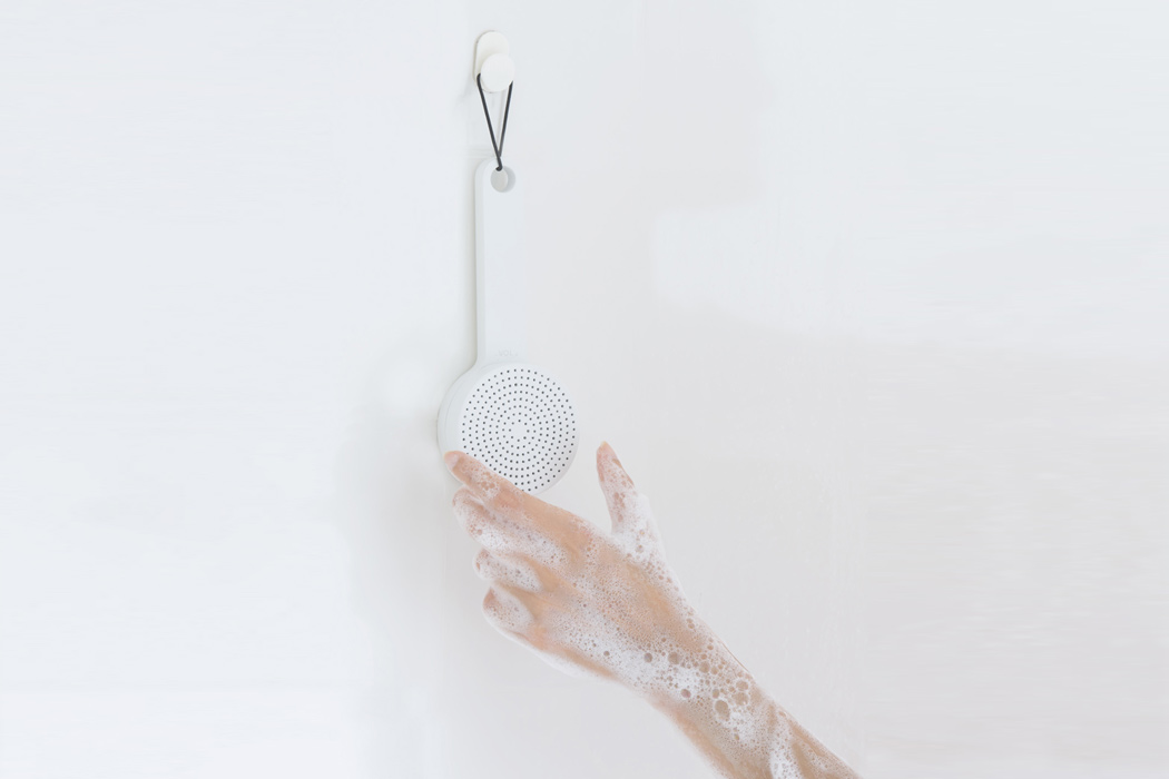
The ‘MUJI shower radio’ project was a case study project of working for one of the most unique and intriguing companies in the design world. Looking at MUJI as a Japanese brand that became universal, the students were to design the ‘German collection’ of MUJI. In the same way that MUJI offers general universal items mixed with more ‘Japanese items’, the aim was to adapt local (German) heritage and items into becoming universal Muji items. A shower and kitchen radio, inspired by the MUJI’s wooden brush was designed by Gerhardt Kellermann. The radio consists of a waterproof body with a built-in speaker and features intuitive tuning and volume control. In Europe, a lot of people turn on the radio for their morning shower or when cooking in the evening. This simple product is easy to use and fulfills the requirement without any additional frills.
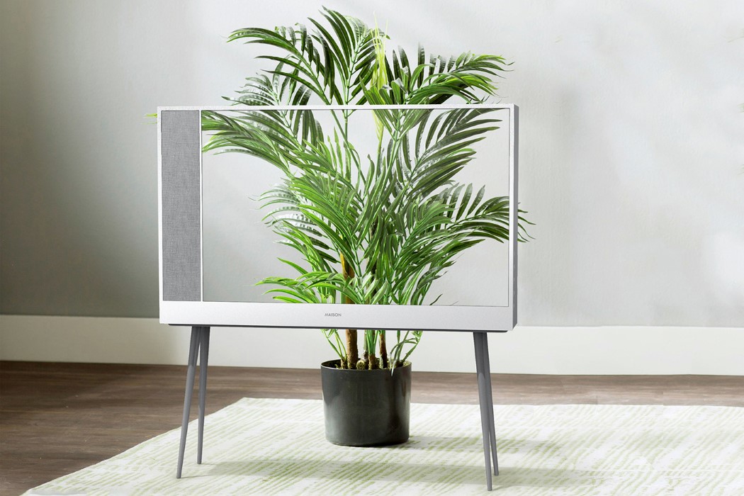
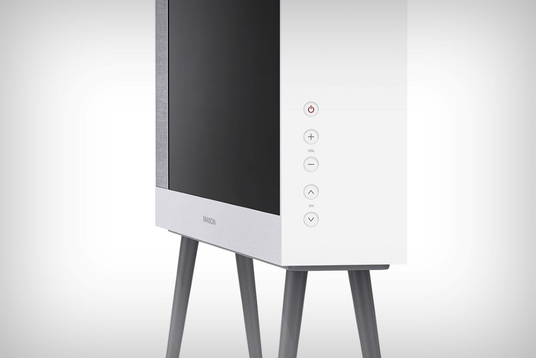

Absolutely pure in its design language, the Maison TV by Seongkyeong Son & PDF Haus looks like something Muji would build. The simple white block form with the four detachable legs gives the TV a certain elegance which makes the television look like an object fit for a home, rather than a showroom. The thickness of the TV stems from its inclusive design, which has empty spaces in the back for storing streaming boxes, and even for cable management so that you’re left with a TV that doesn’t have any odd boxes or wires corrupting its beauty. The Maison TV comes with beautiful flush controls on the side, along with a remote that echoes the same style that makes the Maison TV’s design language tick every single box in Rams’ ten commandments of good design!
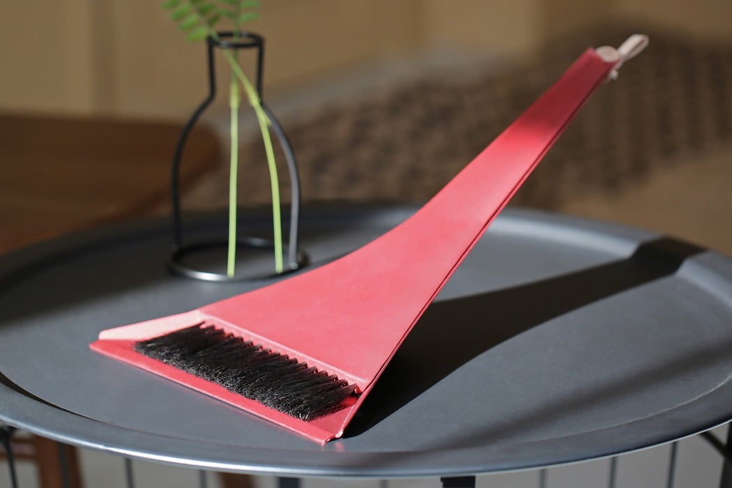
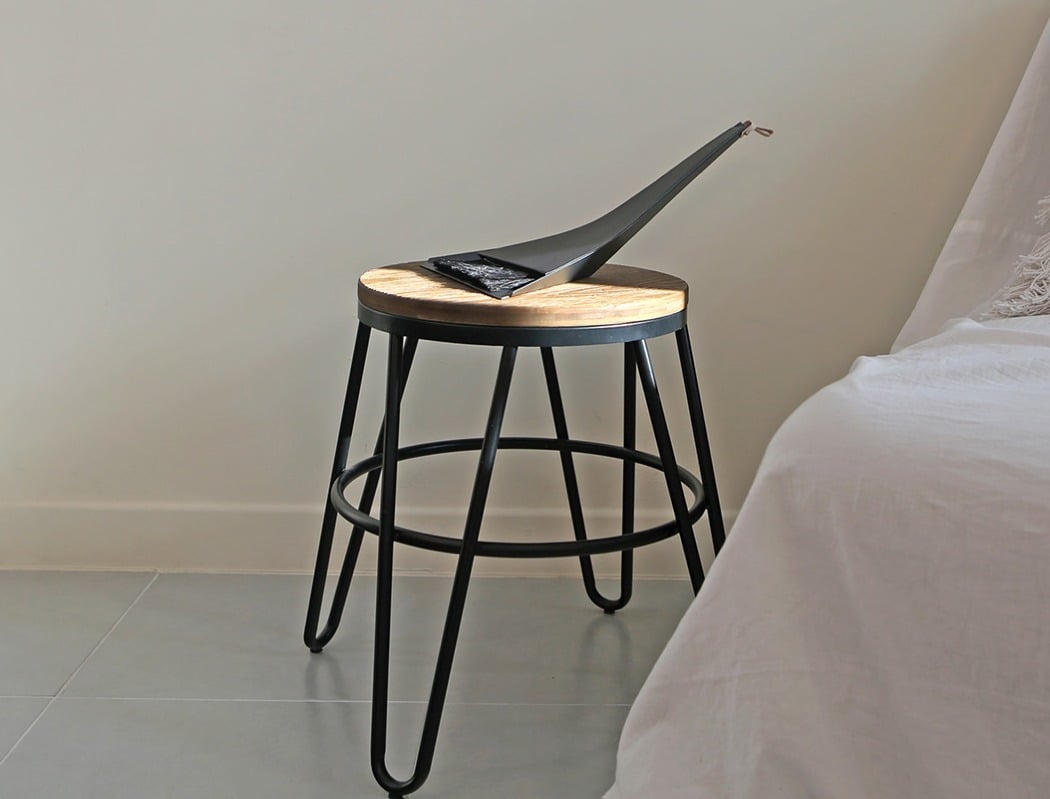
Nope, that’s not a new sculpture that you have put on your side table, it’s the Folded Cleaning Tool by Jinyoung Noh, Sua Jo & Boram Han. One of the reasons why I like brands like Muji is because they design everyday products that you don’t mind displaying in your living space – in plain view of every guest! This broom and dustpan set is something on these lines. Crafted from two sheets of aluminum, the design has clean lines and smooth curves, giving it the ‘extra appeal’ and worthy of being highlighted, when not in use.
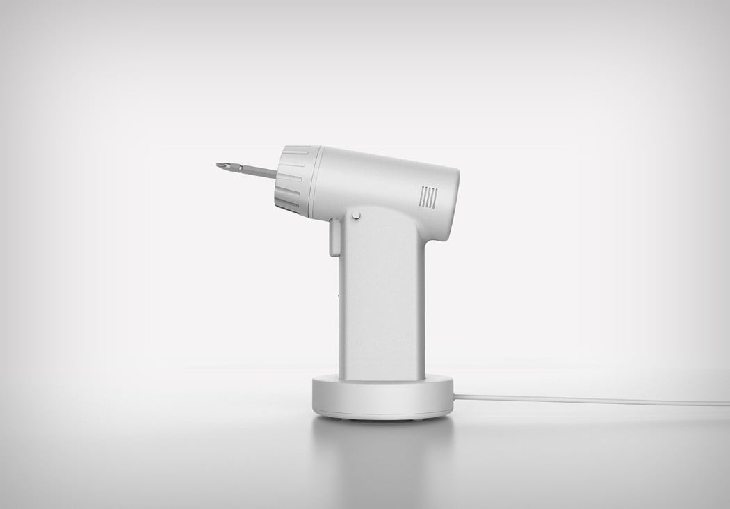
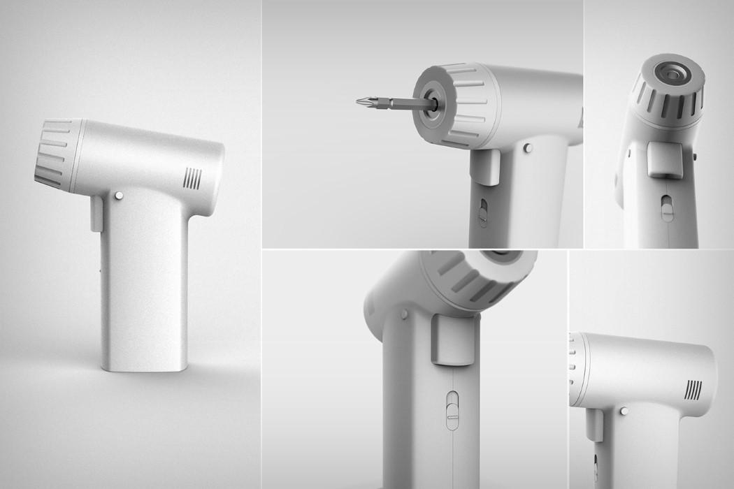
What would a Muji power tool look like? It would look like it meant business but still retain an aura of serenity. The Muji power drill concept by Changho Lee takes two contrasting things and wonderfully combines them. The drill’s aesthetic couldn’t embody Muji’s style any more than it already is. The white color scheme and the simple cuboid meets cylinder design brilliantly represents what the Japanese design house stands for. Absolute, unquestioned simplicity!

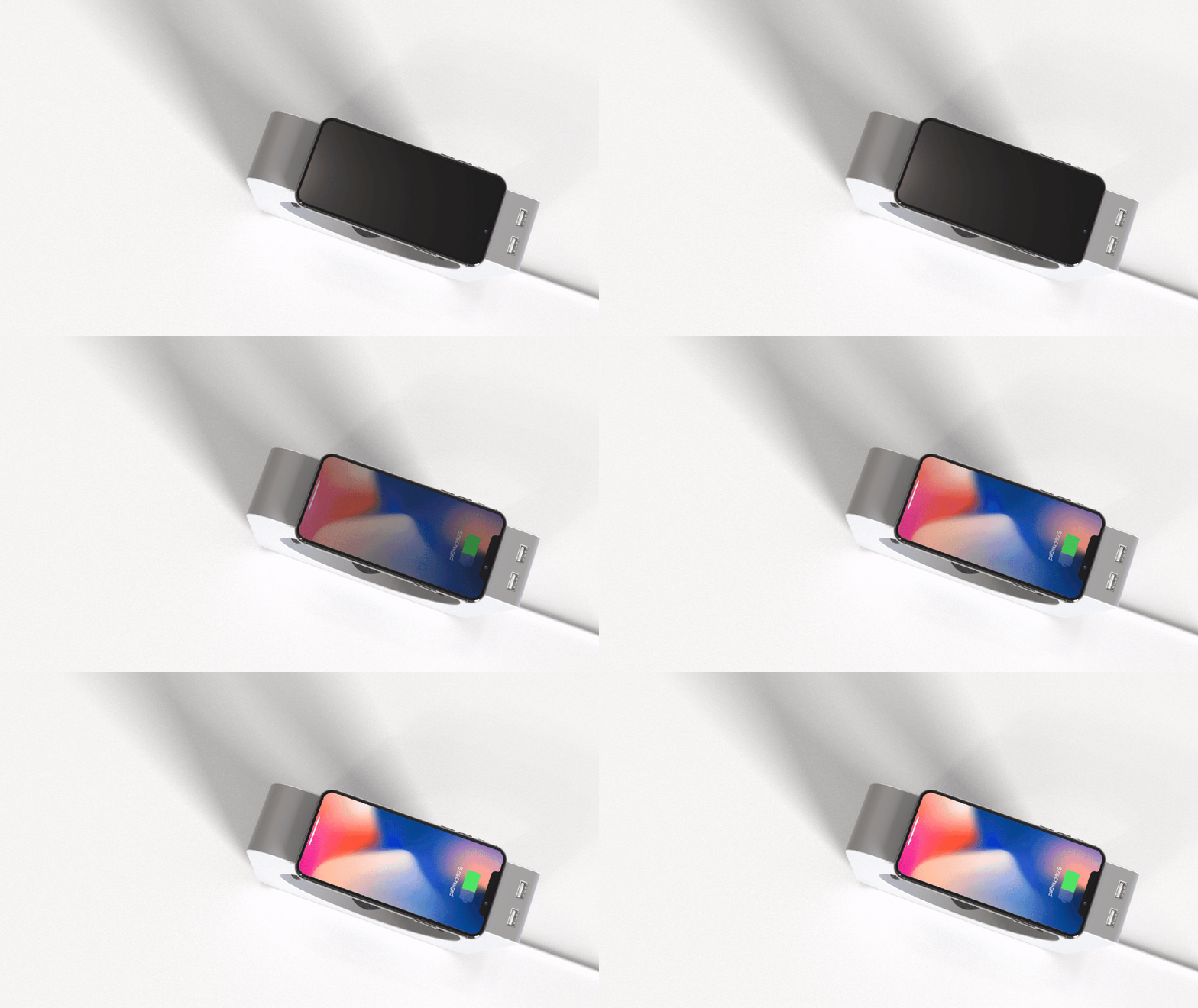
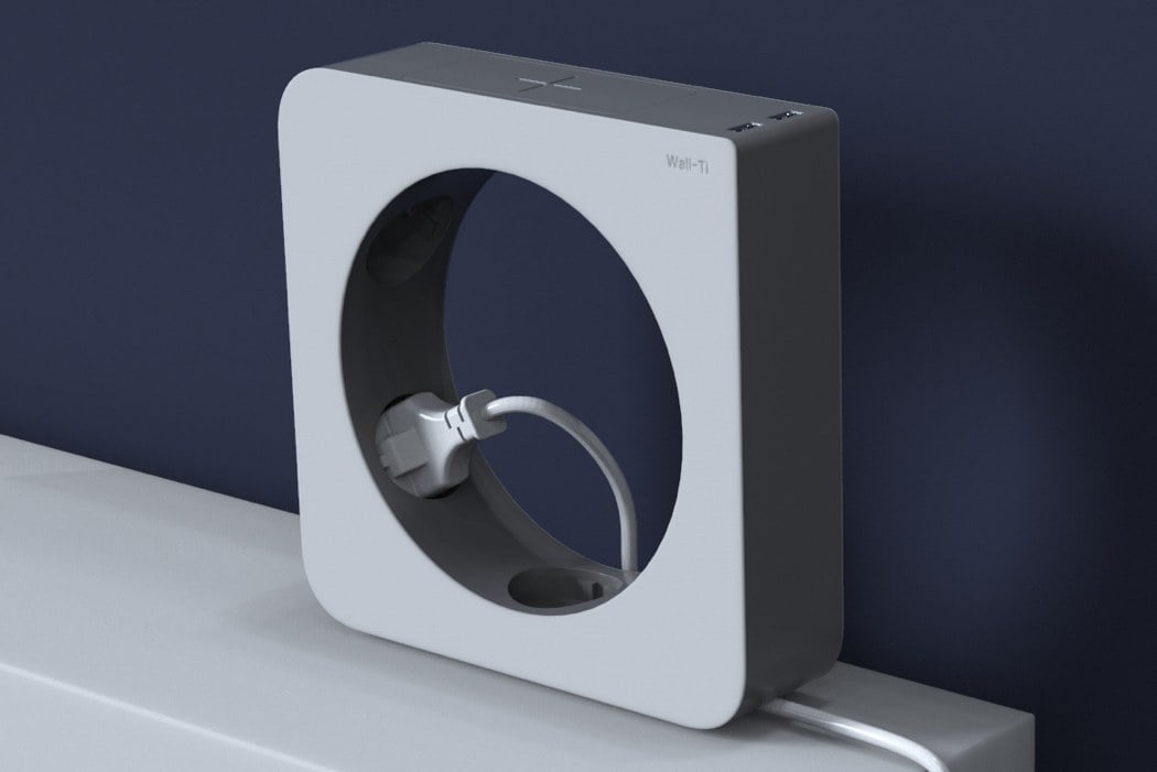
I forgive you for mistaking the Wall-Ti Tap Power Strip by Eunsang Lee as a famous CD player by Muji – let’s slide this by as inspiration – the purpose of the power strip is completely different than a music player. Typically, we see long devices with multiple sockets and switches, but the Wall-Ti Tap has an amusing donut form. You are expected to fit the plugs in the inner wall of the circle, while you can wirelessly charge your phone on top of the device. “Unlike the typical cuboid power strips, this power strip has a doughnut-shaped design. The round-shaped power strip can be put vertically, so it reduces the problems of dust getting into the sockets,” explained Eunsang Lee.
Muji’s clear-cut minimal design has garnered hard-core fans around the globe, you can check out more inspirational designs by IKEA here!

