When Google launched its first smart speaker, the Google Home, in 2016, the design team spoke about how they consciously chose materials and color palettes that complemented the home, rather than being too tech-driven. The Google Home came with a woven fabric clad, and pastel color options, allowing it to occupy space in your home without commanding too much attention. The rounded forms and the lack of edginess just helped it blend in further, making the home feel smart, rather than the product within the home. Jonas Daehnert (popularly known on the internet as Phone Designer) is taking that design philosophy a step further with his Smart Cactus speaker. Designed to blend into homes by looking like a potted plant, the Smart Cactus beautifully intersects tech and decor to create a speaker that’s a perfect fit for the coffee table, the mantelpiece, or the cabinet.
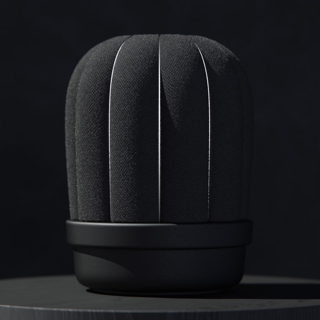
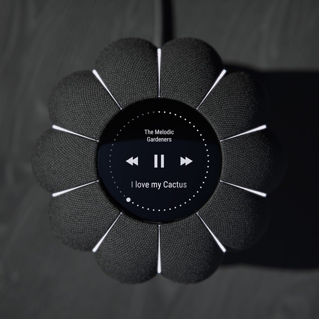
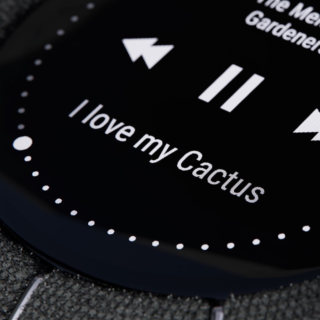
The Smart Cactus comes in a cylindrical format, quite similar to other smart speakers, but resembles a Parodia cactus with a fleshy stem and a planter-base. The stem comes with multiple segments, clad in fabric to look like the cactus’ body, and ditches the spikes for light-strips that run vertically. On the top is an OLED screen that serves as a display, allowing you to interact with it through touch (something you wouldn’t really do with a cactus without thinking twice!) Conversely, you could talk to the Smart Cactus and have it respond with audio as well as ever-changing LED lights. You could ask it to read you the latest headlines, play your favorite podcast, or have it stream music (they say Beethoven really helps nourish plants!) I just wish the Smart Cactus came in a nice olive-green though!
Designer: Jonas Daehnert
