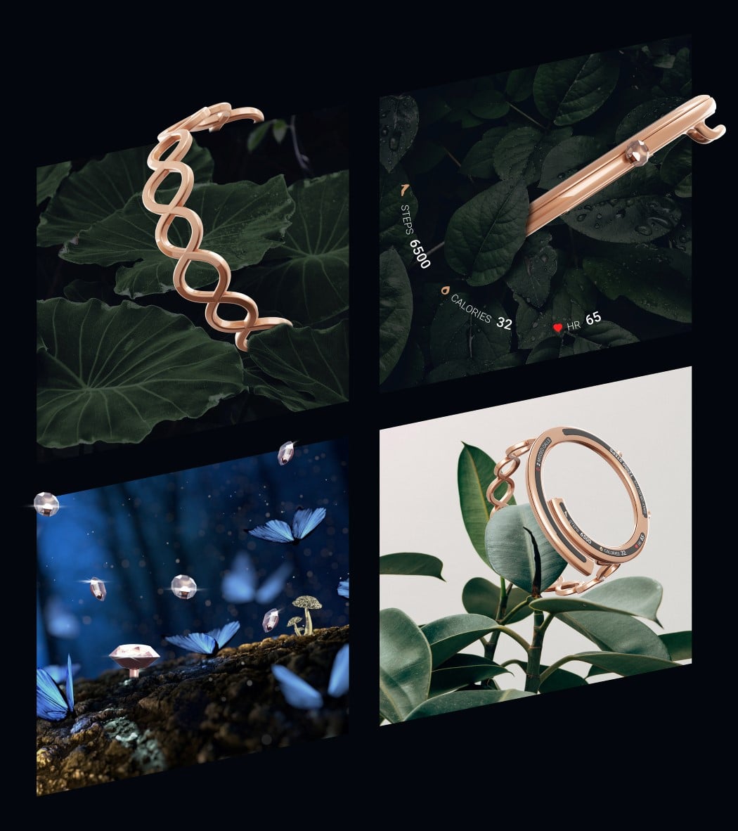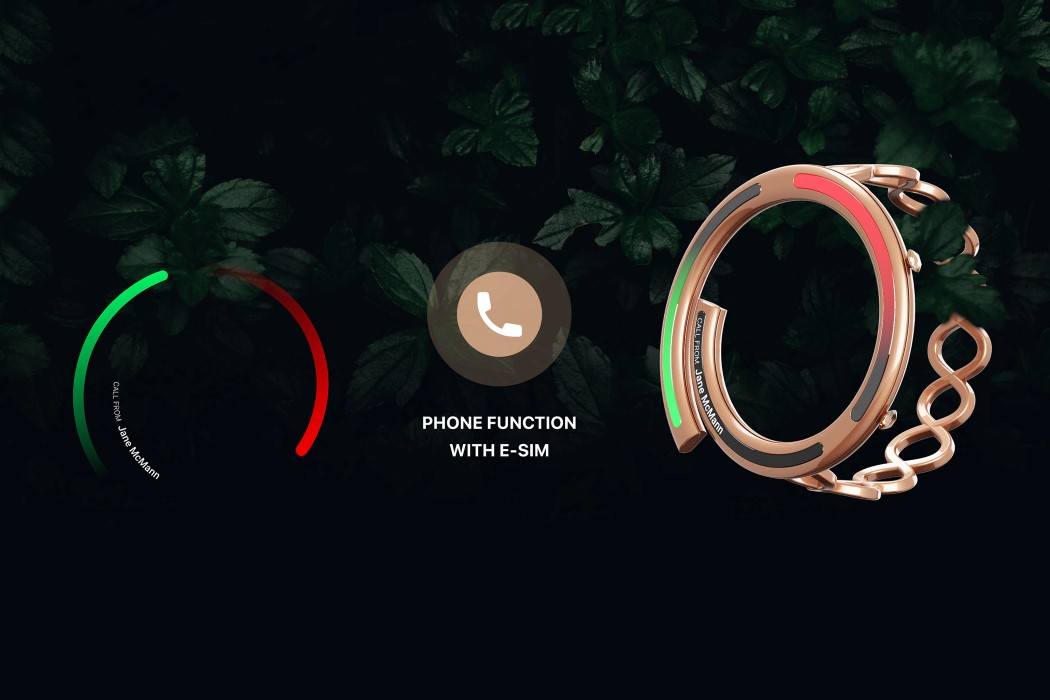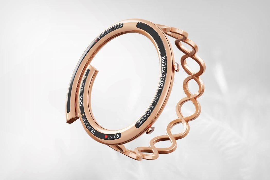
What if a smart-band didn’t look like a band? What if it assumed the roles of a smartwatch, but looked like a chic bracelet? Esiva makes the case that tech and fashion can coexist in a way where tech takes the back-seat and fashion shines through. If smart-jewelry were a term, the Esiva would fit perfectly into that category. It looks nothing like a traditional smartwatch, but does the job of one, delivering notifications, telling you the time, and tracking your fitness. The band comes with an all-metal design, featuring a minimal 3-part arc-shaped display.
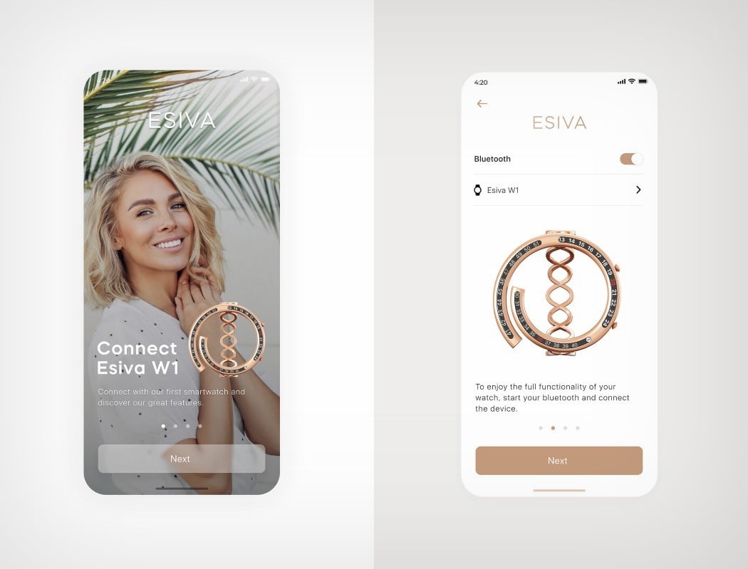
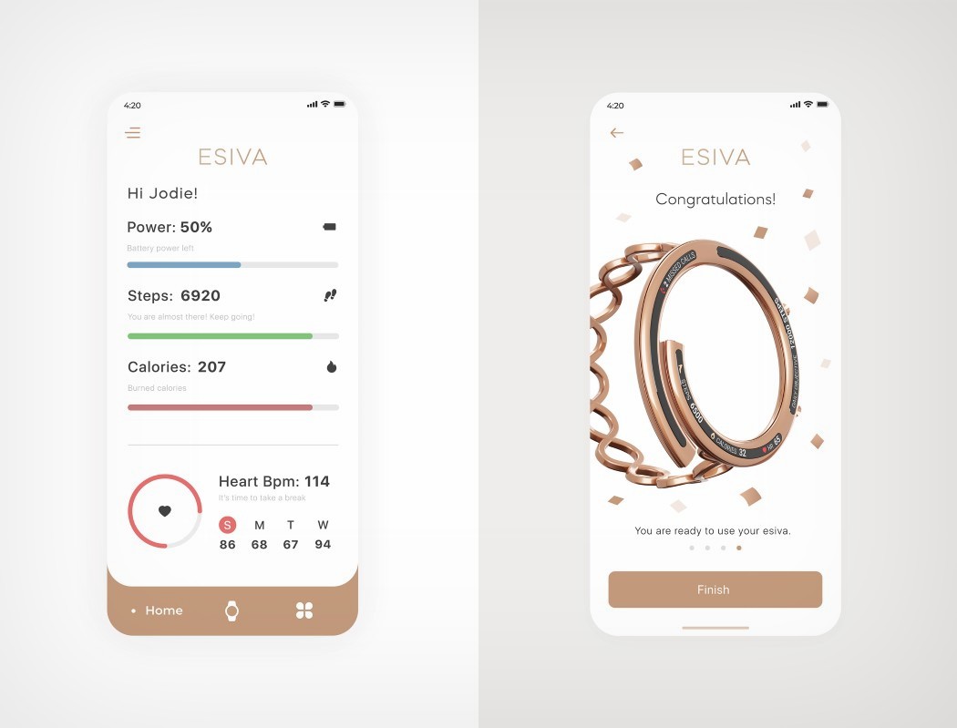
The display’s slim shape means a simple, bare-basics interface with only relevant information, along with a minimal interaction involving just tapping and swiping. Two crowns on the rim help you perform a host of other tasks like summoning your phone’s Voice AI. Ultimately, the Esiva forms an extension of your smartphone, delivering information to you in a crisp, concise, and charming manner… and even though it doesn’t have a large, square-shaped interface that you’d get lost in, its elegant design will ensure all eyes are on it!
Designer: Burzo Ciprian
