In today’s consumer-centric world, packaging designs hold a very important place! A unique and attractive packaging design is what captures the interest and attention of your consumer. It pulls the consumer towards the product and even drives them to purchase it. Hence, allocating time, effort, and energy to create an appealing packaging design is extremely crucial, and designers are leaving no tables unturned in doing this. The result is – innovative, interesting, and attention-grabbing packaging designs that are hard to miss, and we’ve collected a few for you to admire!
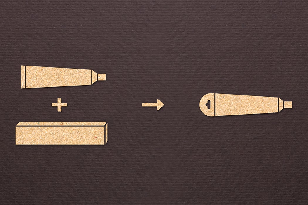
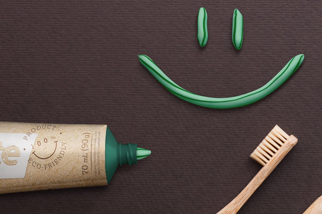
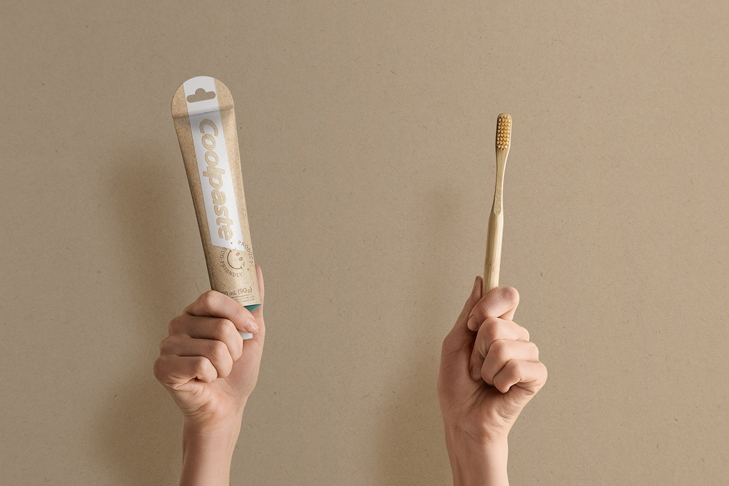
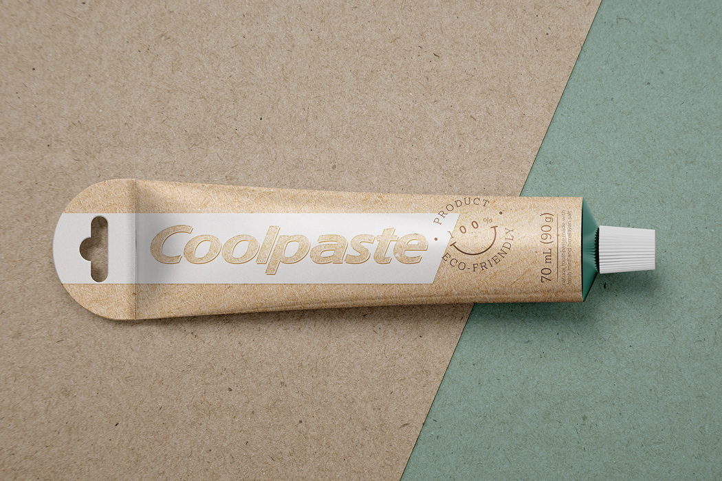
An academic project gave birth to Coolpaste – the eco-friendly alter ego of our trusty old toothpaste. The aim was to develop a sustainable packaging design for toothpaste in a way that didn’t affect their durability while being transported or stacked on shelves. For the purpose of the project, Colgate toothpaste was used as the object of study. Coolpaste not only got a physical makeover that was better for the environment, but the graphic elements of the product were also refreshed to reflect the goal of the project. The paper box was eliminated after an in-depth point-of-sale study without affecting the integrity of the toothpaste.
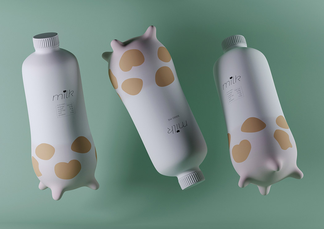
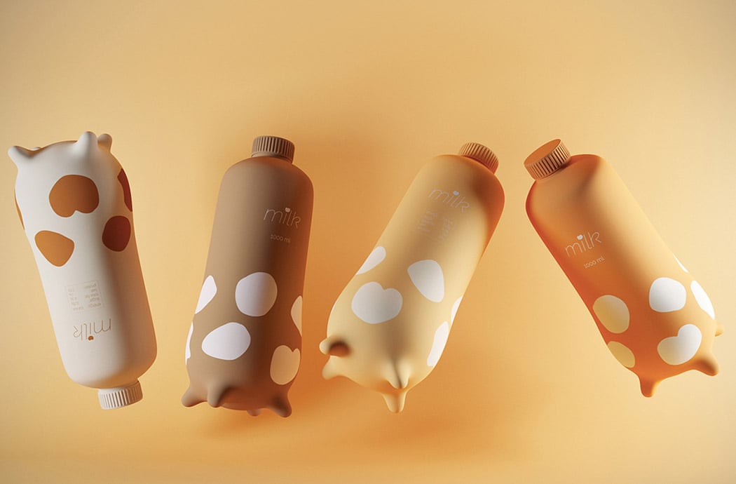
We’re always in the mooooood for a good packaging design and this one is udderly the best! Quite simply, it’s shaped like a cow’s udder which is not only freakin’ cute but ergonomic. Four little teats give it a little stability and something to hold on to when you’re pouring a cold glass of milk! Available in different cute shades, I honestly wouldn’t mind a glass of milk every morning, if I get to see this cow-inspired carton every day!
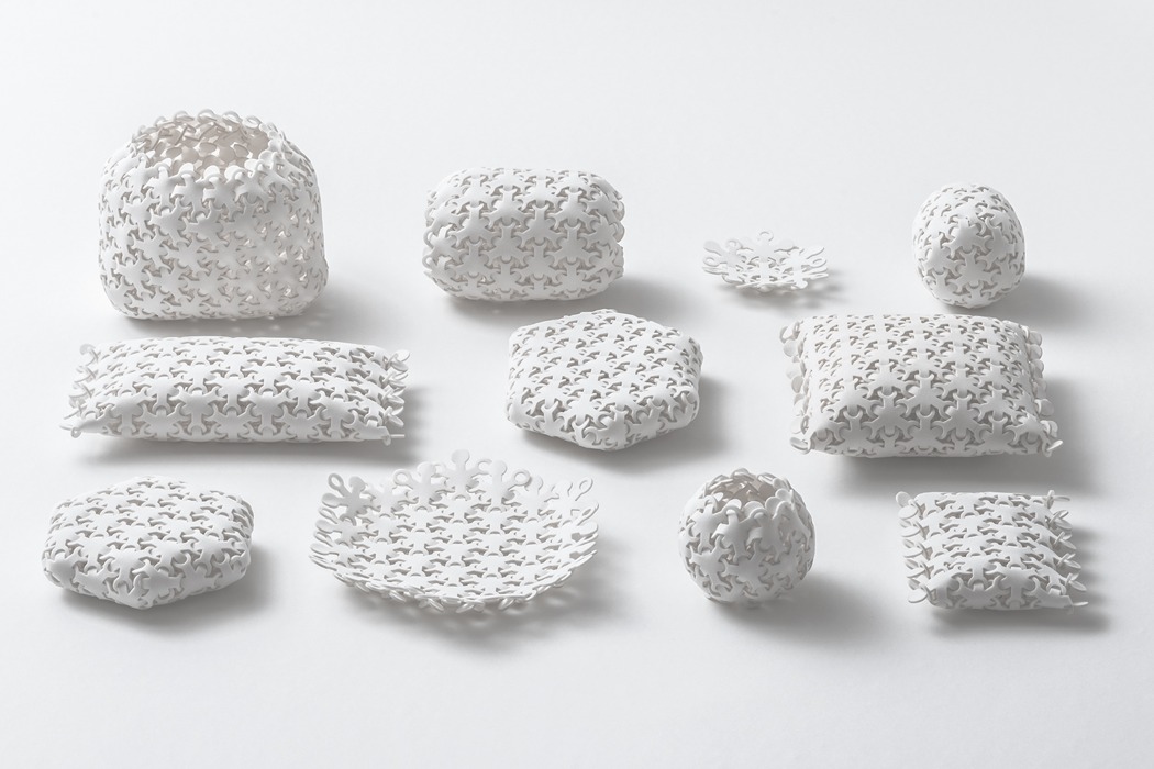
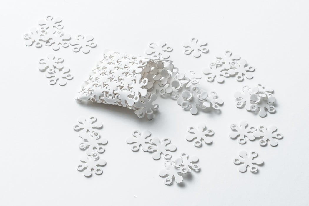
This series of distinctive forms have been created through the repetitive combination of the same six-pointed shape; by rearranging the shape in different configurations and patterns, a wide range of shapes and forms can be created! The hugely flexible, sponge-like form can be used to hold objects ranging from fruit and vegetables to protect them from drops, through to pens and pencils when it is configured into a striking pencil case!
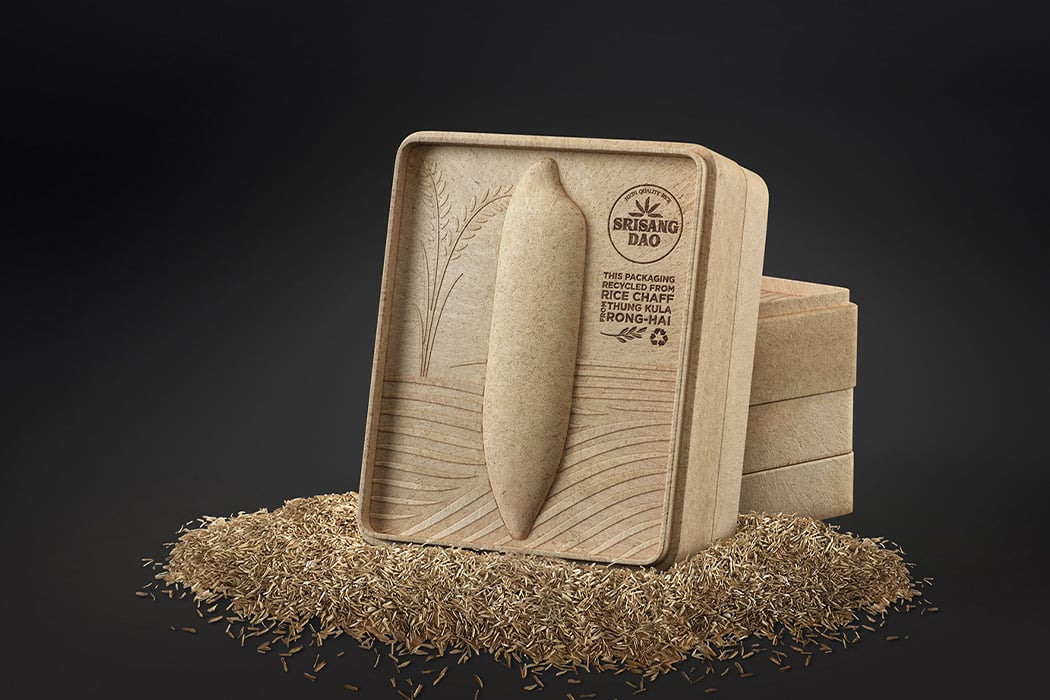
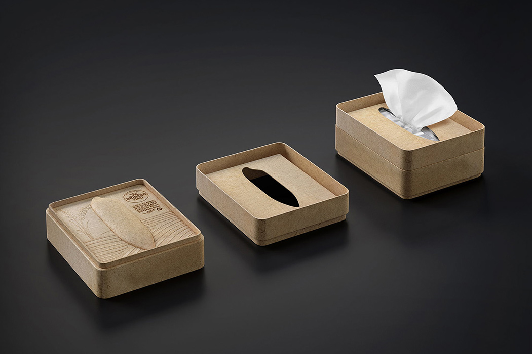
The Srisangdao rice grows in Thailand in a controlled environment and every year only a limited quality is produced. Because of how special the rice is, the environment where it grows and how it is stored is given the utmost care making sure there are no chemicals hampering the quality. To showcase Thung Kula Ronghai’s efforts of growing this gorgeous grain, a designer reimagined the packaging as a tribute to the process with a purpose that went beyond preserving rice. The packaging is created using chaffs, a natural waste product from husking, which very literally incorporates the process which the designers wanted to celebrate through this product. The box has simple yet meaningful art surrounding the Srisangdao rice – it is die-formed with an oversized rice grain embossed on it which is the main artistic element.
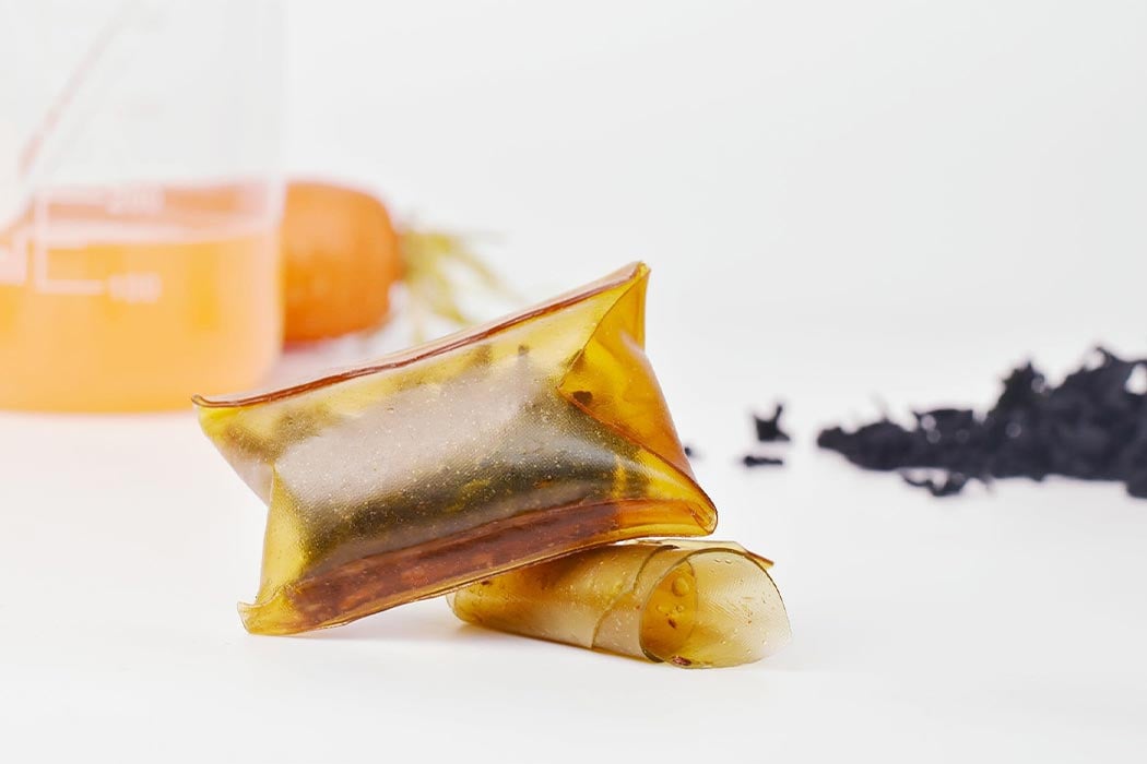
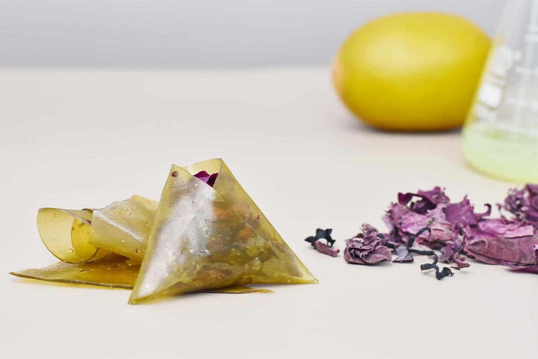
Made from seaweed and vegetable extracts, these low-cal wrappers can be used as edible packaging for snacks and dissolvable pouches that add extra nutritional value to your food like vitamins, minerals as well as polysaccharides that support your gut health. The seaweed extract is then dehydrated and the prototypes are examined in different temperature settings as well as tested for waterproof properties
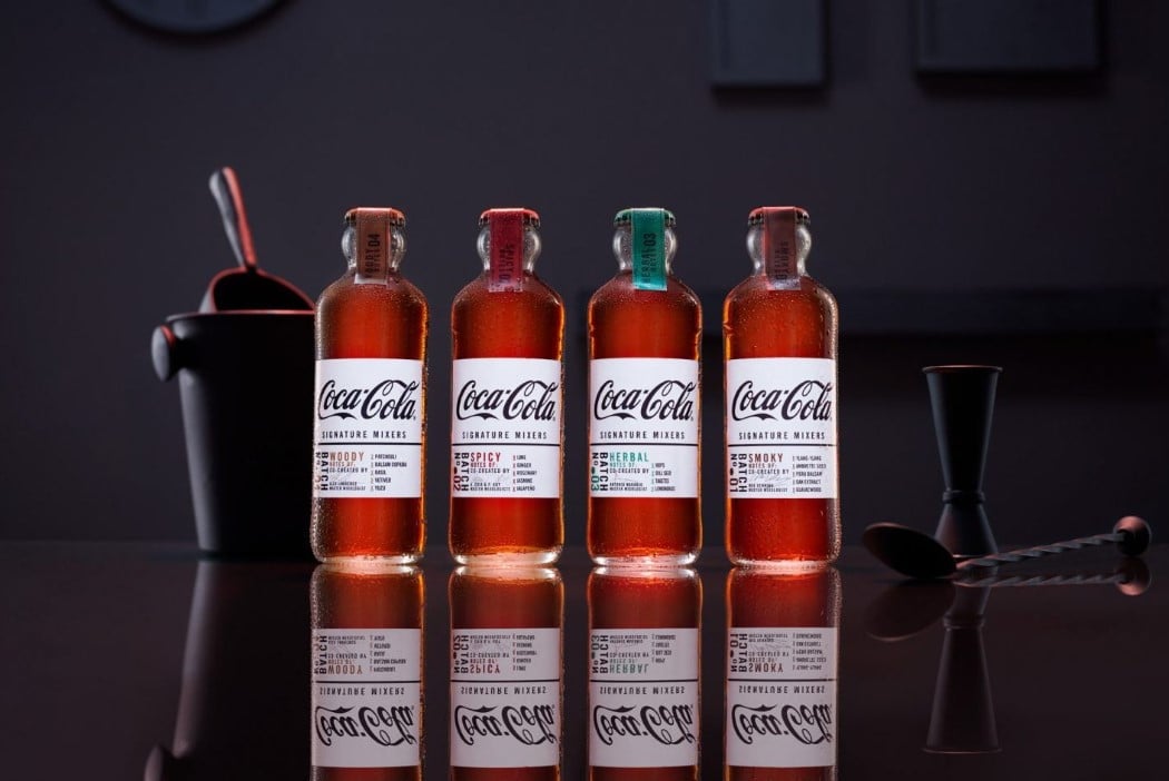
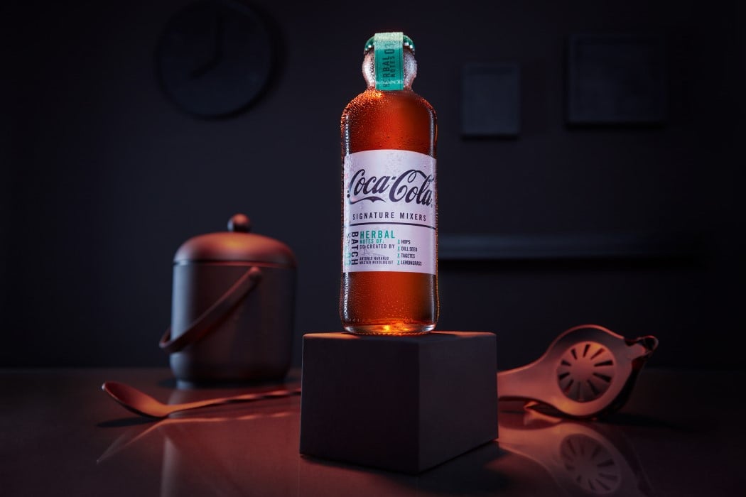
Referred to as the Hutchinson bottle (designed way back in 1894), the straight-sided bottle with a bulbous neck is now being reissued as the packaging for Coca-Cola’s series of mixers. The bottle design possesses an aesthetic that complements its bar-friendly category, making it the perfect choice. Available in four distinct flavor profiles, Woody, Spicy, Herbal, and Smoky, and designed to be used with dark spirits like whisky and dark rum, the bottles come with a white label and a taped cap, quite a deviation from the soft-drink’s otherwise red-heavy design, but more of a hat-tip to the drink’s association with mixology.

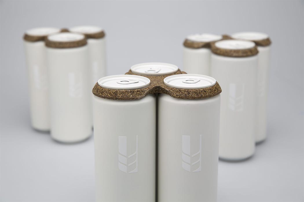
‘Trebodur’ is an organic material made entirely from brewers’ spent grain! Brewers’ spent grains are the residues that accumulate from barley malt during the process of lautering while making beer. So what binds the material to give it strength? The contained proteins in the spent grains act as a natural binder, now that’s a self-sufficient material! Creators Niko and Tillmann did extensive research and several experiments with natural fibers and binders. Being 100% biodegradable, Trebodur is a perfect choice for creating products that are used and thrown at large events or even in PR packages. It can be used for all kinds of packaging products and become a substitute material for paper and plastic packaging.
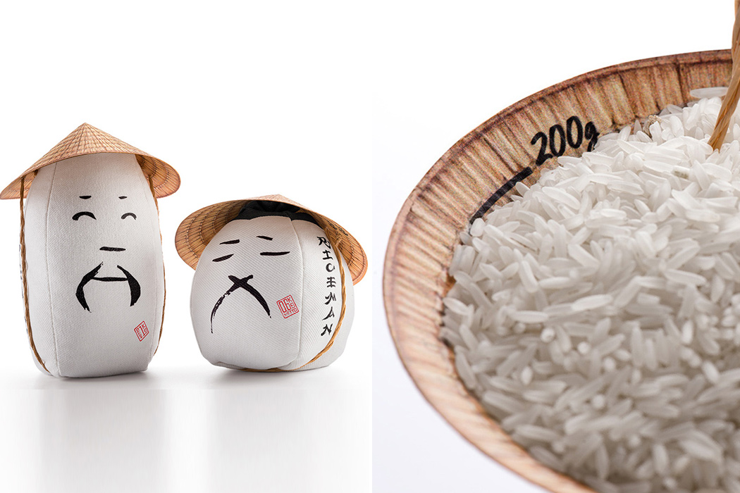
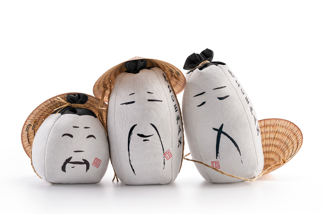
Rice is what home would feel like on a plate and that is what Backbone Branding conveyed with their reimagined packaging design. The goal was to evoke an emotional response for the rice farmers while also being functional as a product that is to be sold in health stores. The new design was minimal, familiar, and reminded us of the humans behind harvesting rice. With these elements at the core, the new packaging used minimal black graphic lines to show the different emotions one feels during the process – the faces radiate confidence, pride, satisfaction, empathy, and even tiredness.
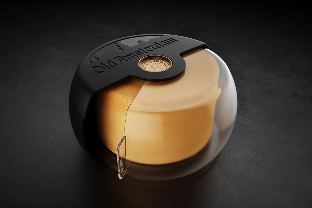
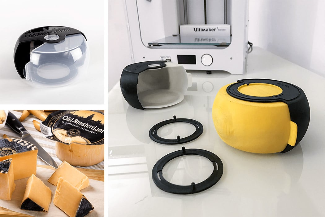
This old Amsterdam cheese cover brie-longs with your cheese because it understands the matters of the heart. No, it literally does – this cover is built in a way that showcases the heart of your cheese and also protects it. The conceptual cheese cover is appropriately named ‘El Corazon’ which translates into ‘the heart’. The center of the old Amsterdam cheese is usually served as tapas or aperitif and therefore deserves to be displayed like the showstopper of the snack bar that it is. The case also prolongs the cheese’s life in the refrigerator while turning into a functional showcase when needed.
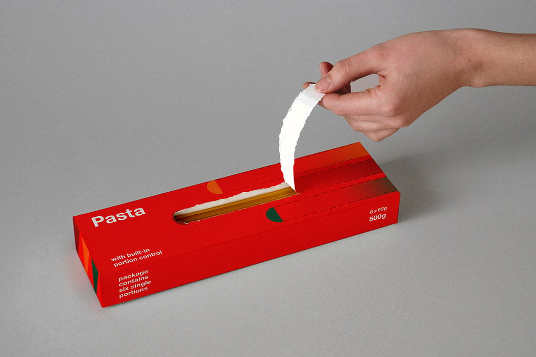
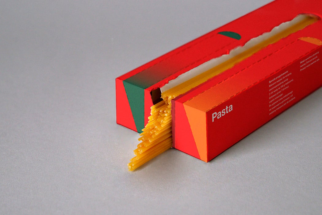
Lurtcevich took an ordinary rectangular box, the usual kind in which spaghetti is normally sold. However, she created six smart partitions using a single sheet of paper. The bright red pasta-filled box comes with six trapezoidal sections heaped with spaghetti, one section equates to one portion of spaghetti. So, Lurtcevich’s packaging holds six servings of pasta, enough for an intimate get-together you might have at your home! The opening of each measured section is outlined with perforations, three on the front and another three on the back of the box. Open the packaging along the perforated lines, by slowly pulling it towards you. Fish out the portion of spaghetti you need and get cooking!

