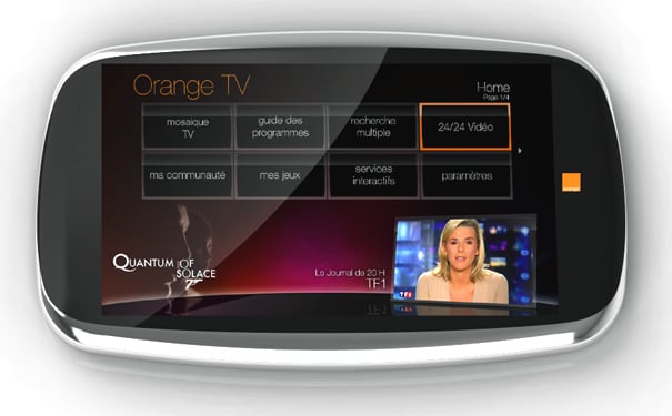
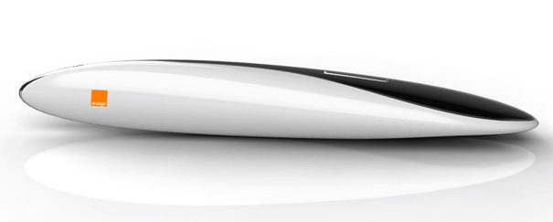
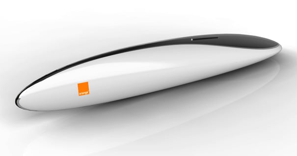
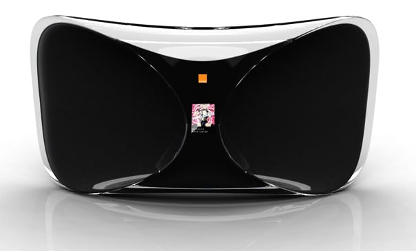
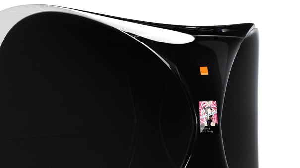
Media centers are supposed to be the hubs of our living rooms – at least that’s what many tech companies are hoping for but the overly complicated GUIs and slap dashed boxed components of computer parts makes them less than user friendly for the average consumer. The Magic Orange concept aims to simplify and organize all in a sculptural package that looks lifted out of some alien world.
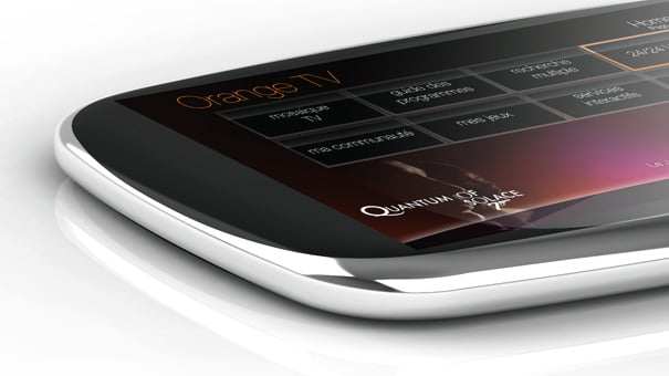
The system consists of 4 components. The SILVER is a pebble-shaped touchscreen to help you navigate content. The MAGIC is a wand of sorts using gyroscopes to elevate remote controls to dexterous gestures. The FLOWER is the multimedia box itself with a hidden camera underneath its transparent skin (for God only knows what). Lastly we have the CIRCLE which has three floating buttons on a round touch pad. It’s unclear how the four devices interact with each other but already, I’m a bit flustered at the complexity. What happened with just a box and a remote?
Designer: Jerome Olivet
