While the entire world hunts for the barest hint of an Apple leak, the source of this news is from the horse’s mouth, or the horse’s designed personal assistant – Siri! You read that right. I can easily imagine a tech reporter, after a long day of searching for the newest tech hits, decides to ask their personal assistant for some help – Hey Siri! “When is the next Apple Event?”, you actually get a reply saying “The special event is on Tuesday, April 20, at Apple Park in Cupertino, CA. You can get all the details on Apple.com.” This might be one of those rare moments when Siri’s reply managed to shock and awe us.
Now, Siri’s resourcefulness stops about here. As MacRumors first reported, Siri is providing information in some cases only, while most refer the user to Apple’s website for information on events. Rumors although have been abounding about the launch of a new 12.9-inch iPad Pro that boasts of a Mini LED screen and also the launch of long-speculated AirTags. While we patiently wait, here are some stellar Apple-inspired concept designs that take cues from their patents to designer’s innovation to satisfy our innate Apple-related wishful thinking – that maybe the next design they share proves to be the pivotal change our saturated tech space truly needs.
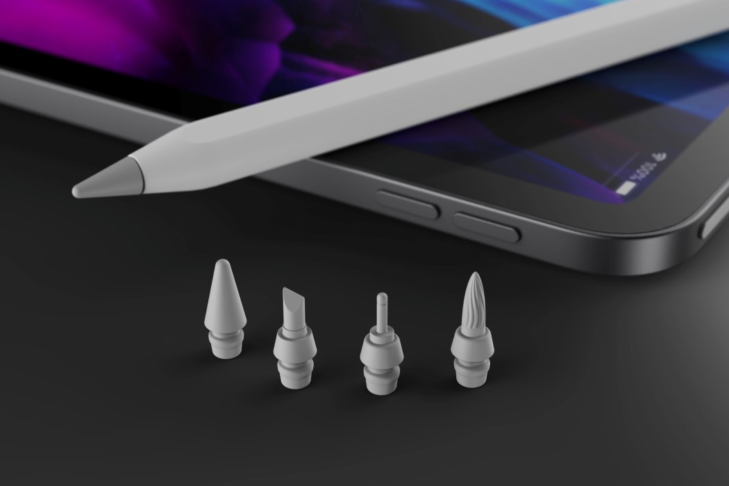
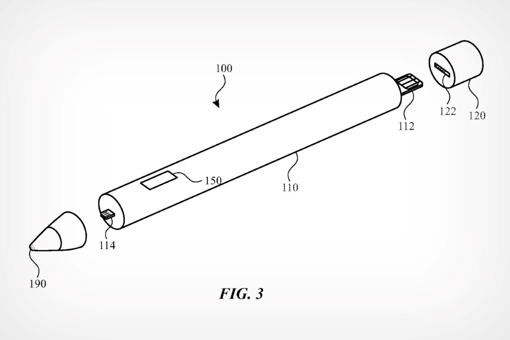
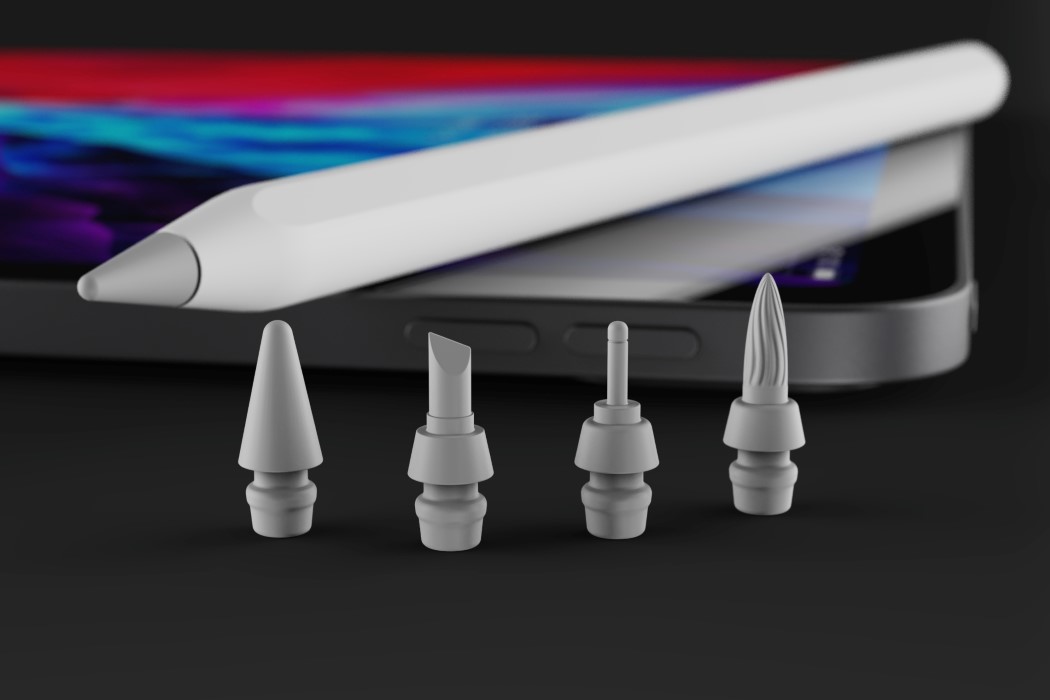
Apple patent reveals a new type of Pencil with replaceable nibs for different creative applications. Watch out, Wacom and Adobe! In a new patent granted to Apple by the US Patent and Trademark Office, the company is reportedly looking at a next-generation Apple Pencil with swappable nib modules. While the patent doesn’t exclusively outline what these nibs would look like or be used for, it focuses more on the underlying technology, which would allow nibs to connect to the pencil handle via a special lightning-style connector. The Apple Pencil is arguably the iPad Pro‘s secret sauce. Along with the Pencil, the iPad Pro becomes the ultimate creator’s setup (for both 2D as well as 3D creation). It would therefore make sense to explore how the Pencil could further become a ‘power-user tool, allowing creators to unlock new potentials. Yanko Design has imagined what these new nibs could look like, with explorations for more niche 2D uses. The interchangeable nibs include a fine-tip nib, a chisel nib, and a flexible brush-pen nib. Other nib styles could unlock 3D modeling features like being able to sculpt on the iPad. “The filing suggests the nib could contain several different sensors for varying purposes. The component list includes tactile sensors, contact sensors, capacitive and touch sensors, a camera, a piezoelectric sensor, a pressure sensor, or a photodiode”, reports Apple Insider.
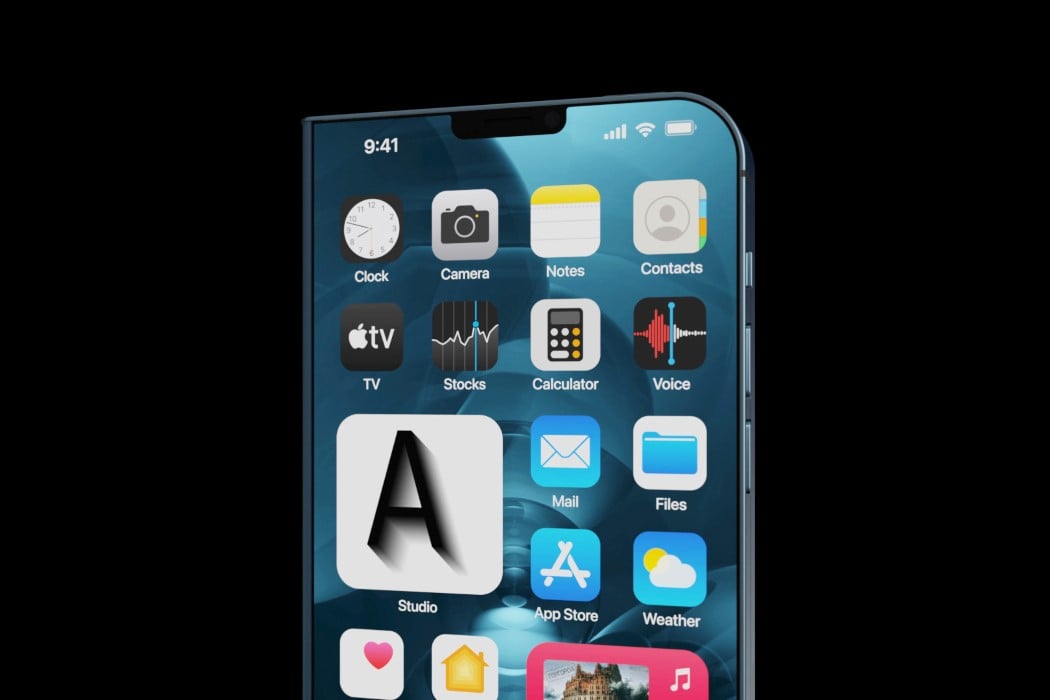
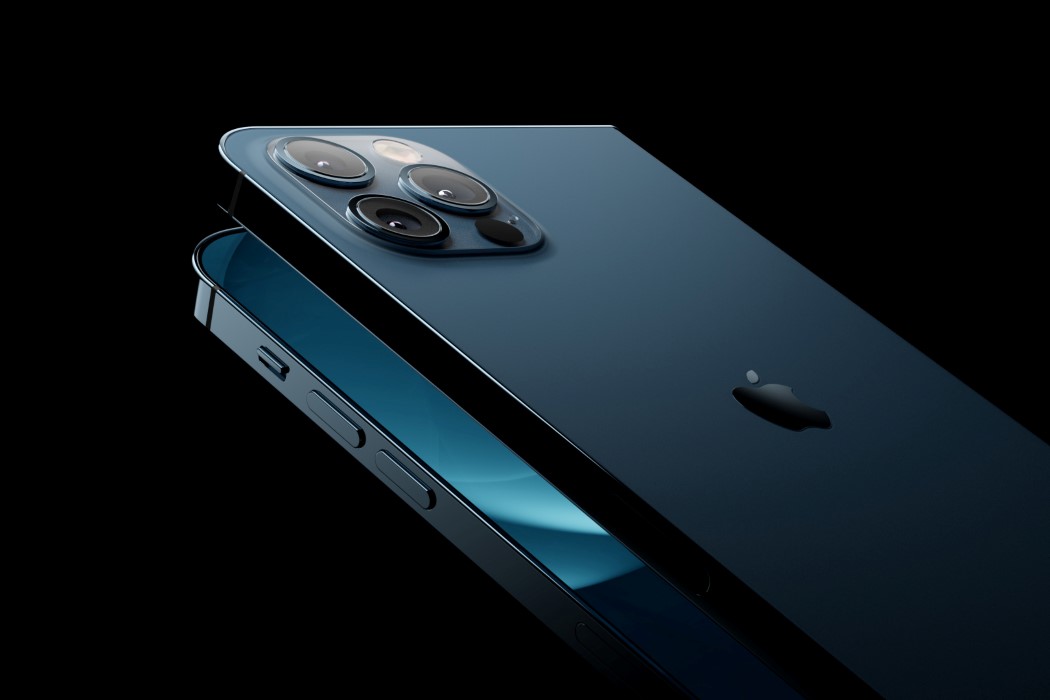
The iPhone Fold concept designed by Svyatoslav Alexandrov (for the YouTube channel ConceptsiPhone) comes in the familiar Galaxy Fold format, with a primary 6.3-inch screen on the outside, and a larger, 8-inch folding screen on the inside. It ditches FaceID for the reliable TouchID, and turns the entire primary display into a fingerprint sensor – so you can unlock your phone simply by swiping up. The lack of FaceID means a significantly smaller notch with just one front-facing camera for selfies. The back, however, comes with the iPhone 12 Pro’s entire camera setup, featuring wide, ultra-wide, and telephoto lenses, along with a flash and a LiDAR scanner. Open the iPhone up and it transforms into a squarish iPad Mini that’s designed to be perfectly portable.
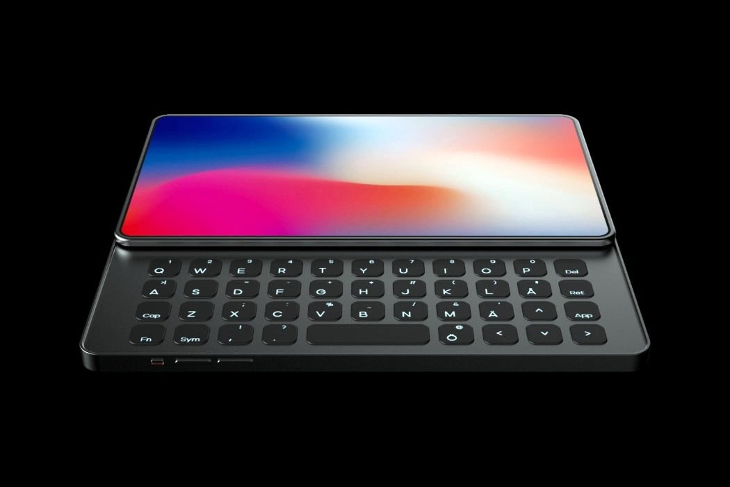
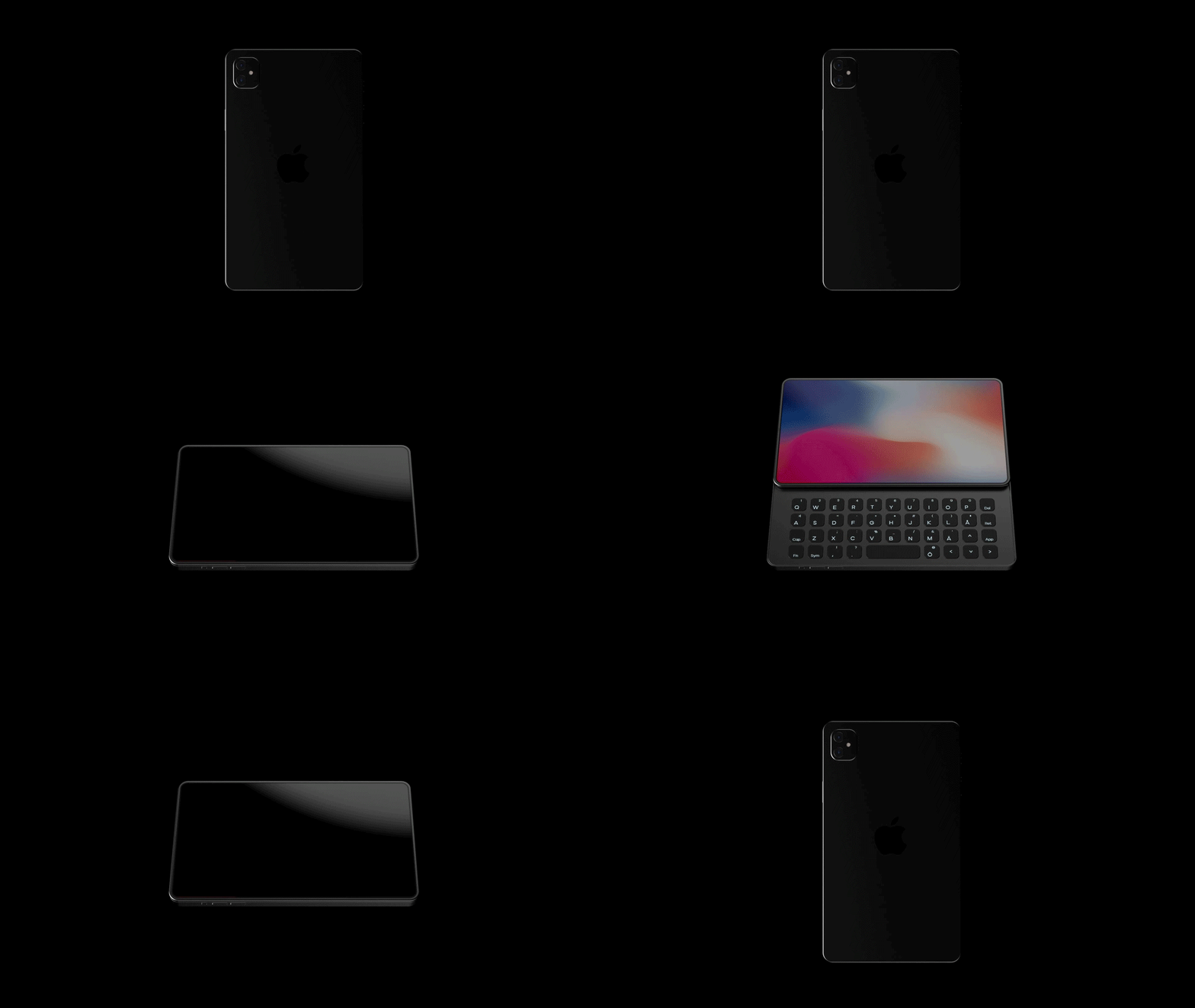
The iPhone Q by Johan Gustafsson (named after the fact that it comes with a dedicated QWERTY keyboard) presents a bold ‘new’ vision for the iPhone. I use the word ‘new’ in air-quotes because while adding a dedicated tactile keyboard to a phone isn’t new, it’s new for the iPhone, and more importantly, it presents a new format as smartphone companies desperately try to make their phones look less blockish and more gimmicky. In a world of folding phones with creased displays, pathetic battery lives, and clunky bodies, the iPhone Q feels like that perfect premium, enterprise-grade smartphone to pair with the iPad Pro or the MacBook Pro. The phone comes sans a notch but makes up for the lack of a front-facing camera with a complete tactile keyboard right underneath the screen.
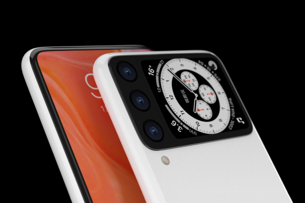
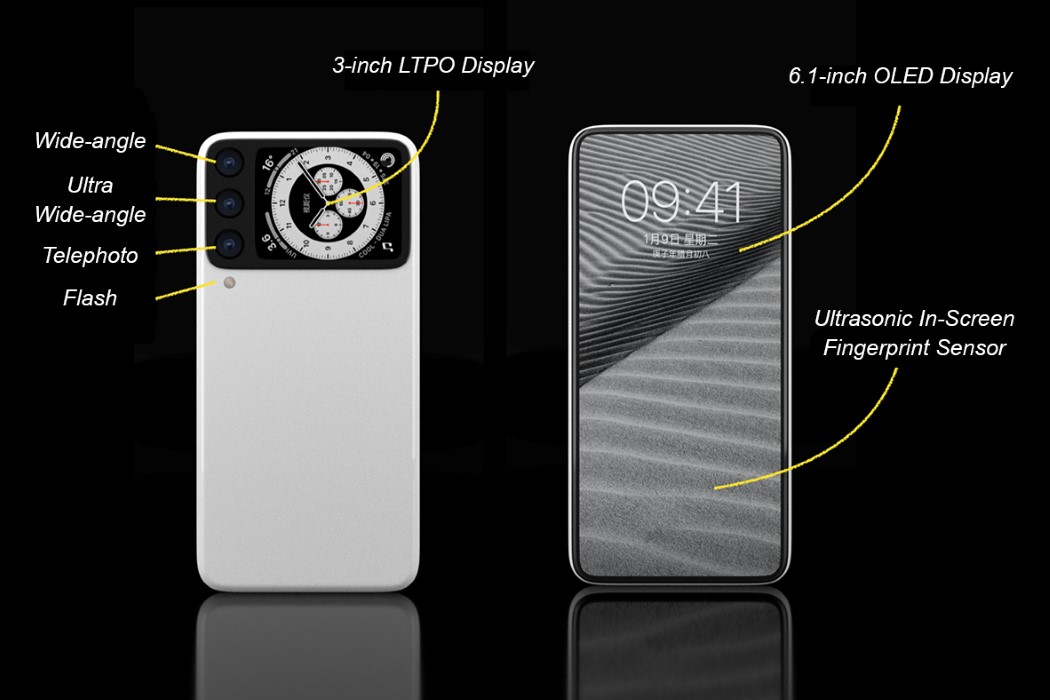
A better way to describe PS Design’s iPhone 13 concept is to compare the rear display to Apple’s closest product – the Apple Watch. The 3-inch always-on rear display practically mirrors the watch’s capabilities, allowing you to see the time, notifications, and a wide variety of other data on it. The display on the rear uses Apple’s low-temperature polycrystalline oxide (LTPO) technology to provide its always-on feature, and the fact that it sits right beside the main camera setup (and that it’s larger than the Mi 11 Ultra’s display), means the front of the phone can ditch the notch entirely, creating a beautifully bezel-less iPhone that leaves little to be desired.
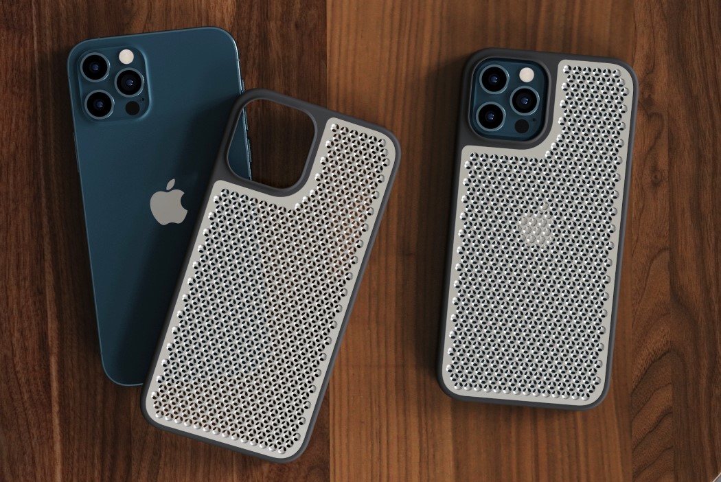
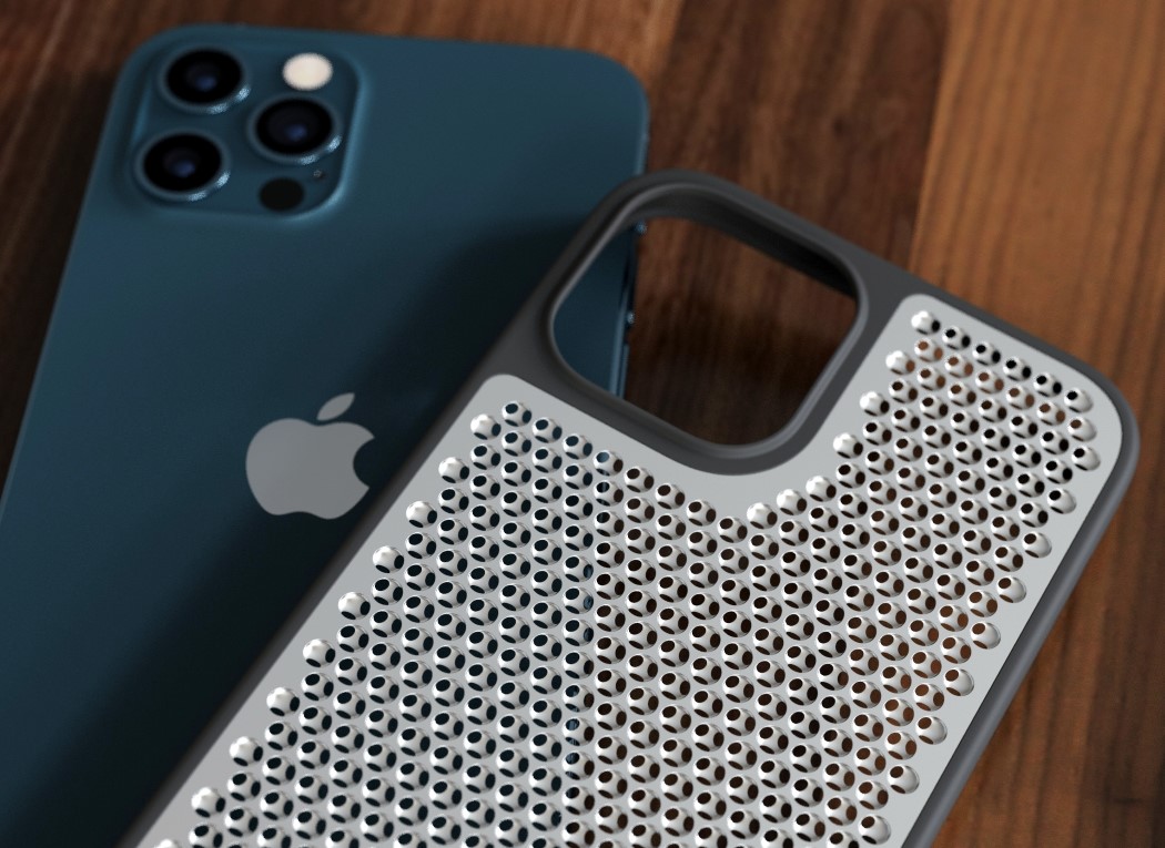
Presenting, the ‘Cheesegrater’ Case for the iPhone 12 Pro as visualized by Sarang Sheth. Made from a TPE bumper and a machined aluminum backplate, the case puts the familiar cheesegrater texture on the back of the iPhone to help it cool more efficiently (well at least in theory). In theory, it’s also perfectly suited to mince cloves of garlic or grate some Parmigiano Reggiano. Now that we have a (sort of) clear vision of what the cheesegrater texture would look like on an iPhone, let’s objectively and subjectively judge this. For starters, it just looks like a really bad idea. Objectively speaking, a textured metal body would most certainly trap dirt, dust, pieces of lint, aside from also preventing the phone from wirelessly charging. The current textured metal plate is 1mm thick, and for any sort of texture, you’d need 3D depth which adds unnecessary thickness to the phone – something Apple probably won’t want to do.
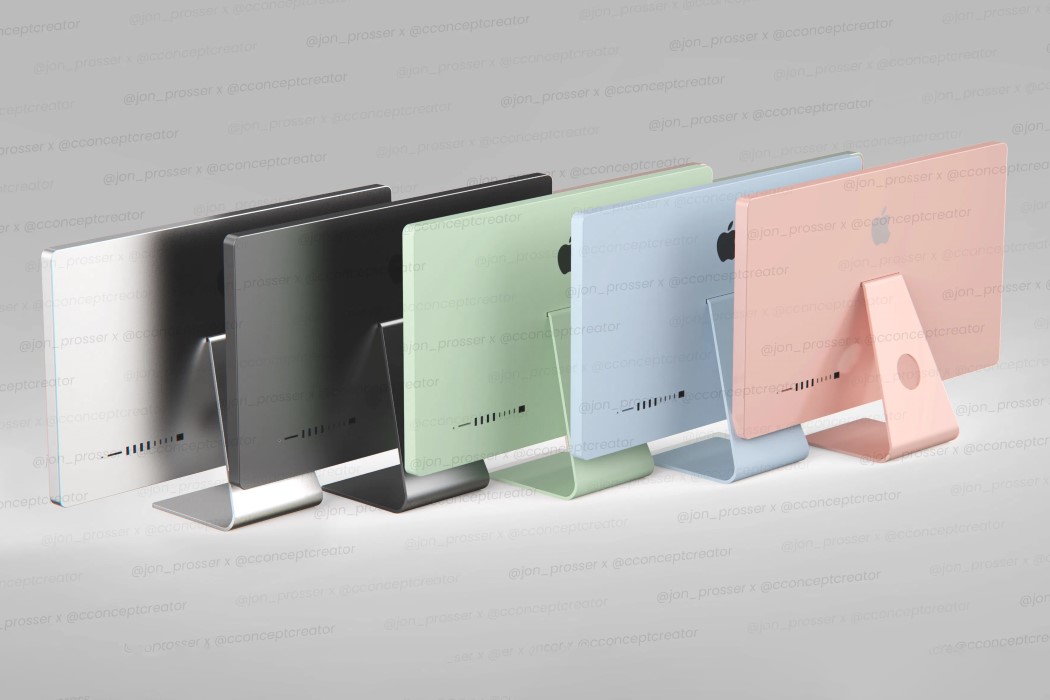
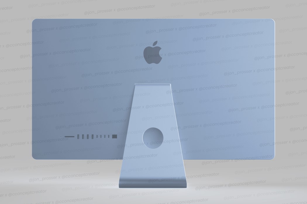
The colored iMacs are really a hat-tip to the candy-colored iMac G3 series from back in 2008. According to Jon Prosser, who collaborated with Concept Creator over the following images, the 2021 iMacs are likely to come in 5 colors – black, white, green, blue, and rose gold… just like the 2020 iPad Air. The colors will be much more subtle than the iMac G3’s, but they provide an interesting dynamic to the aluminum-clad all-in-one computers. When viewed from the front, the new iMacs tend to resemble the iPad too, with the bezel treatment. Unlike previous iMacs that came with a massive chin under the screen that sported the Apple logo, the new iMacs will have much more uniform bezels. It isn’t really apparent if they’ll also come with FaceID — although given they’ll be used indoors, in settings where masks aren’t really required!
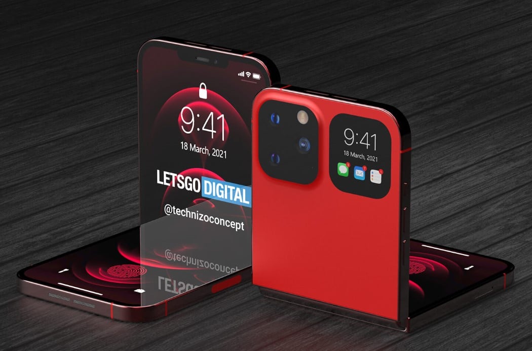
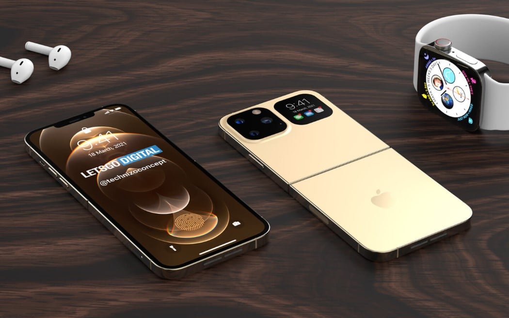
The iPhone Flip (created by Technizo Concept in collaboration with LetsGoDigital) shares the same nomenclature and folding format as the Galaxy Z Flip from Samsung, albeit with a few key differences. The device measures about the same size as your current iPhone 12 Pro Max, but it sports a folding line across its ‘waist’, which allows the iPhone to fold in half like a clamshell phone from the 90s. This folding structure allows the smartphone to become more compact and easier to carry (although the resulting folded form would be twice the thickness of the phone), while also giving you the option to use the iPhone as a miniature laptop by folding it halfway in an ‘L’ shape.
Love it, hate it, but for sure, you cannot ignore Apple. As these renders show, there are tons of innovation we look forward to from the powerhouse that is Apple.

