Most of us probably dream of eventually having paperless events or at least those that do not waste that much paper. Anyone who has ever been to a physical event, specifically conferences, exhibitions, and expositions has gone home with a bagful of pamphlets, brochures, and other paper materials that you probably will not use in the future and will just be thrown away. So a lot of exhibitors are now thinking of ways to lessen paper waste and one at the recent 2021 Guangzhou Design Week went an extra step.
If you were able to go to the Guangzhou design expo last month and visited the Netherlands booth, then you were able to experience the Paperless Pavilion showcasing the latest Dutch design strategies. But for those that are still stuck viewing expos and exhibits from the comfort of our own homes, this is what we missed, at least from the pavilion from the Dutch contingent. This was collaborated on by the Dutch Consulate, multimedia designer Shard Island, light innovator Signify, and Superimpose Architecture.
Designers: Carolyn Leung, Ben de Lange, Ruben Bergambagt and JunWei Loh
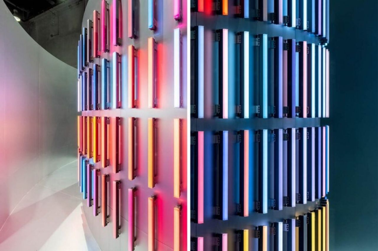
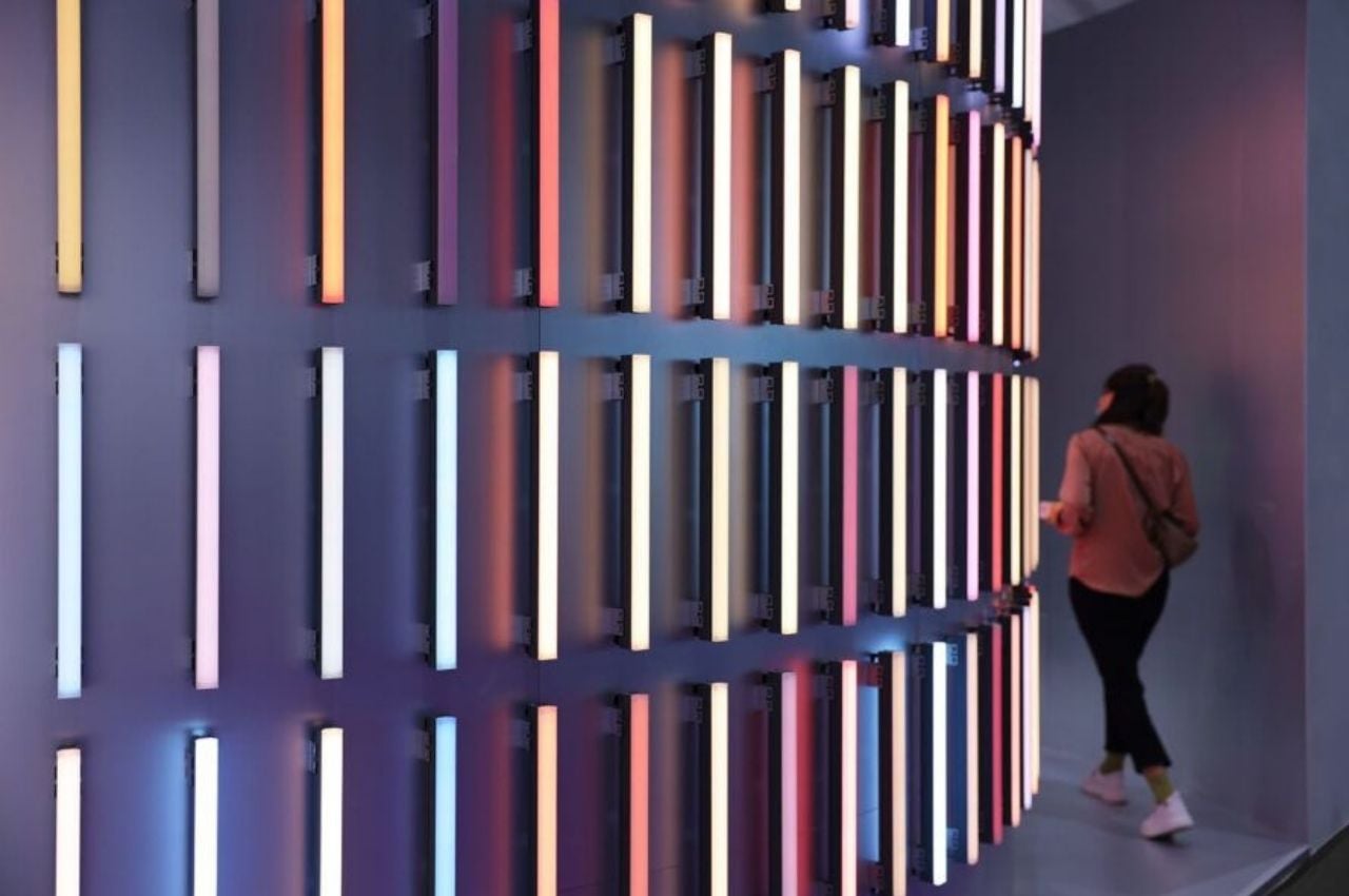
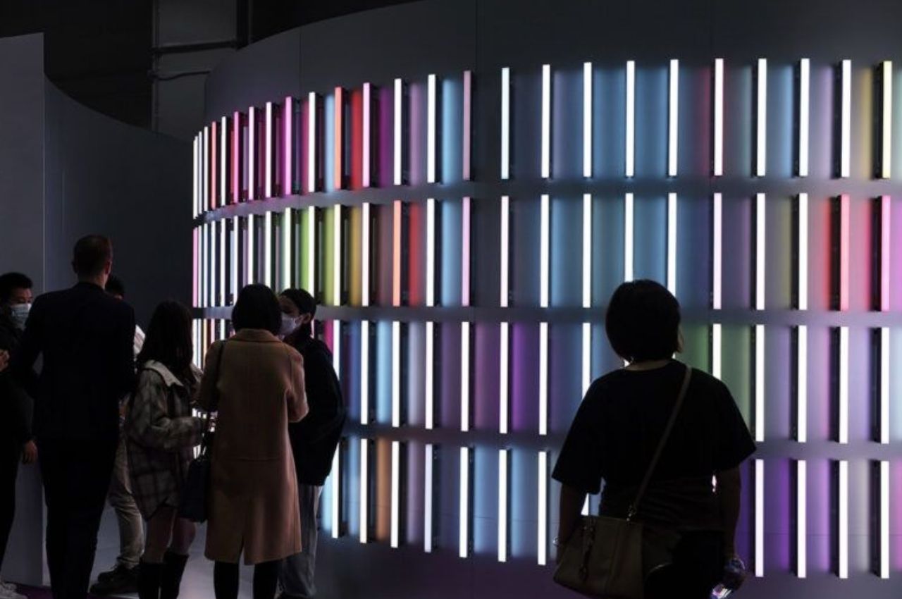
The main idea for the Paperless Pavilion is in the name itself. They wanted to minimize or do away with the use of the usual posters and pamphlets that booths normally have and instead create something that would still bring content to the visitors through live and digital presentations. But rather than just use the standard LCD screens, they came up with something to display innovative Dutch design. The whole area had plasterboard painted white with a brushed metallic veneer layer.
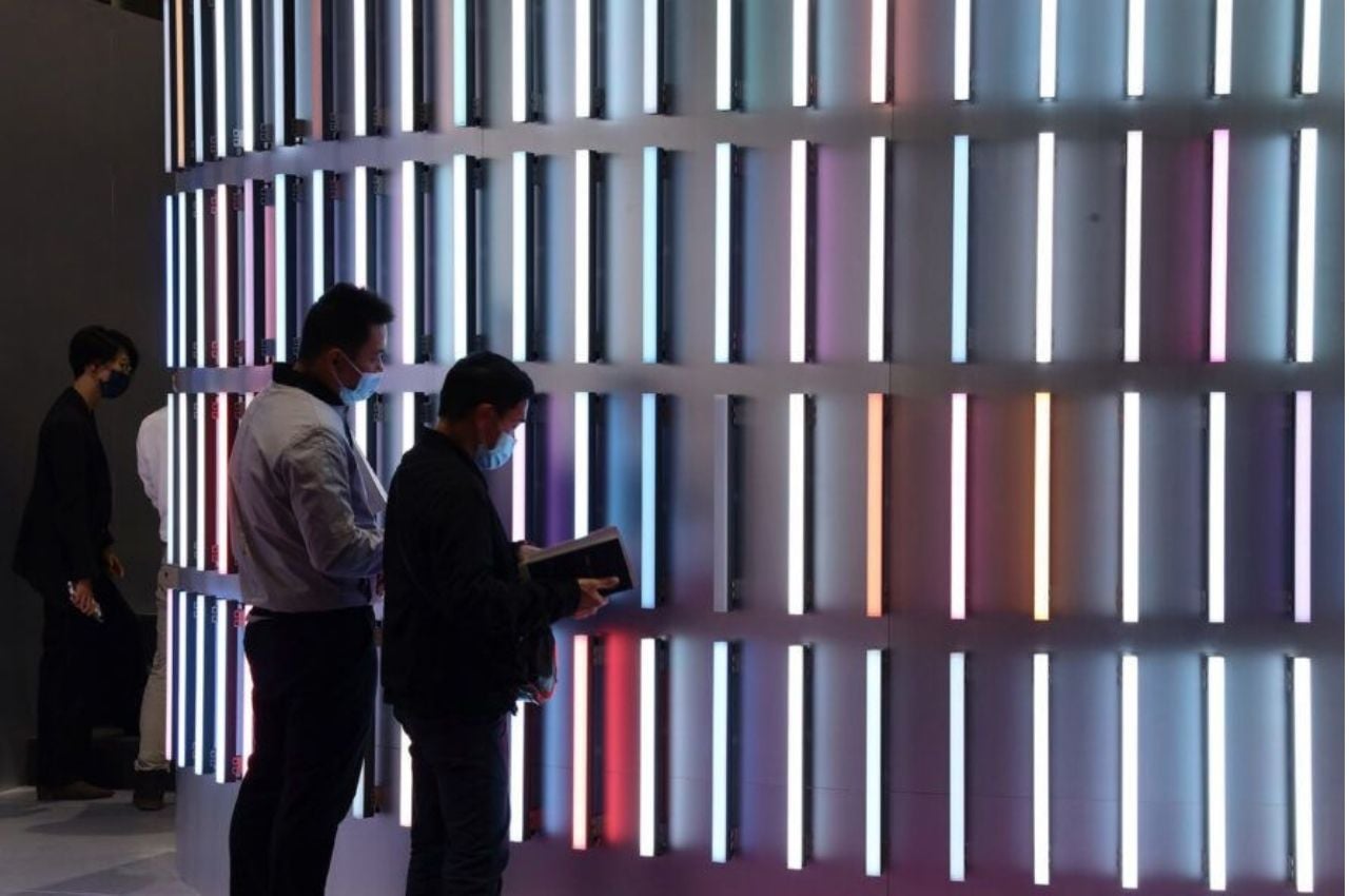
They also weren’t satisfied with just using typical LED lights but instead highlighted it with curved walls. Even the acoustics of the pavilion was incorporated into the design by using a special carpet to complement the curved outer wall and the entrance atriums to give better acoustics for the videos and other audio materials. If visitors want to “take home” the information that they got from the presentations, there’s a QR code where all the materials are saved and can be accessed.
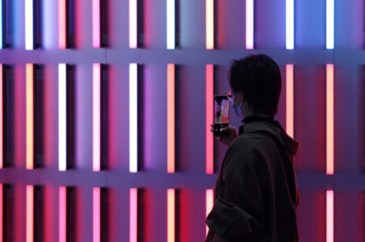
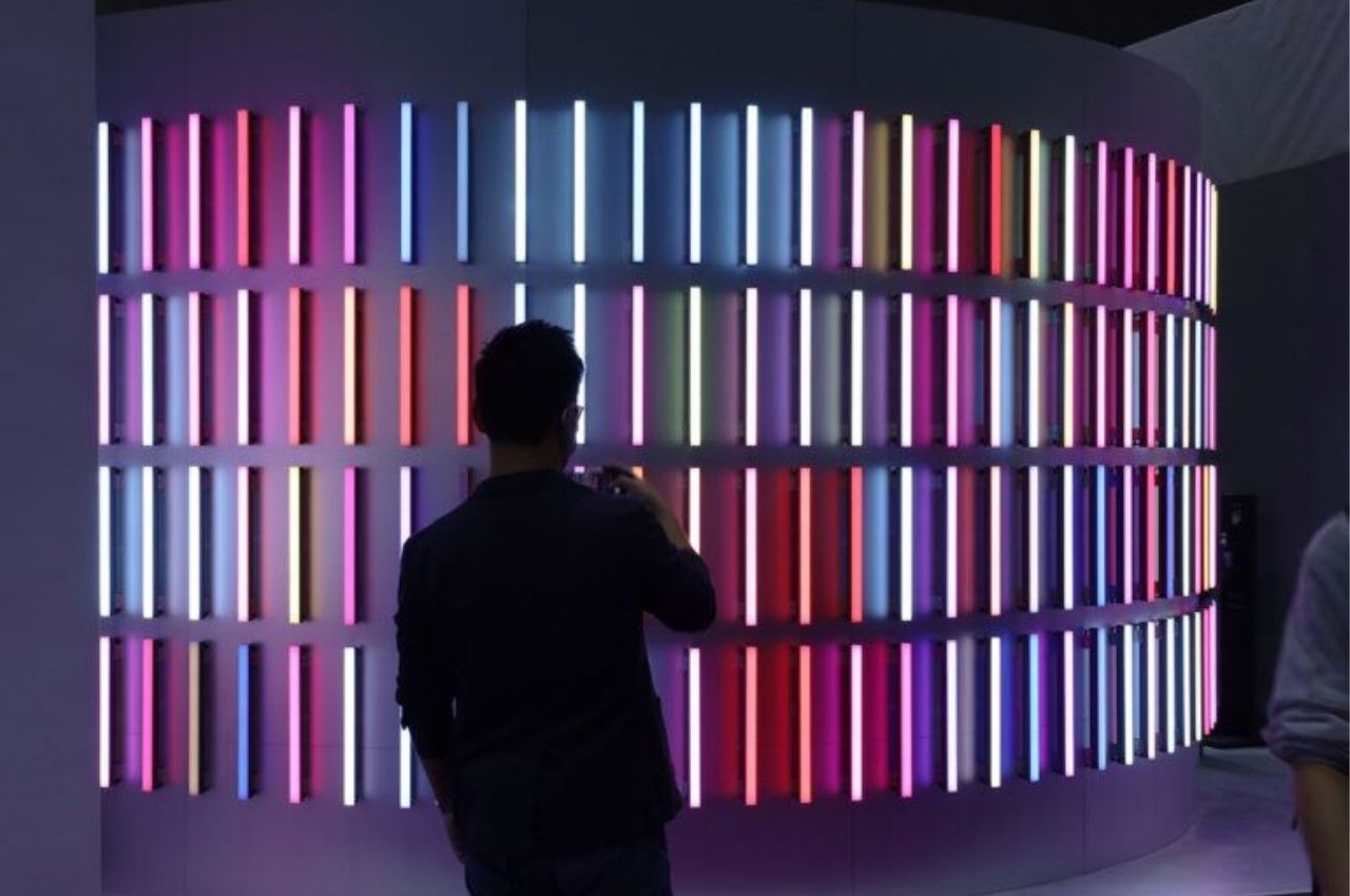
Expos usually have a ton of booths that you can visit so exhibitors will want to have a space that stands out to attract visitors. The Paperless Pavilion used 124 linear LED light fixtures arranged into colorful, horizontal bands. And because this is the Dutch pavilion, they were arranged like you were looking at tulip flower fields. And when there’s an event within the area, the lights are part of the presentations, reflecting into abstract colors on the walls.
Some may wonder if the materials used in the Paperless Pavilion actually cancel out the idea of becoming more sustainable by not using paper. Superimpose Architecture assures us that the LED lights will be reused after the exhibit so that should not really be a problem.
