If you’ve already had your fill of computer mouse designs advertised to be the ultimate answer to your ergonomic problems, then this contrarian concept might pique your curiosity at the expense of your hand.
Keyboards and mice are the most basic and most common ways people interact with computers, and yet they are also the most dangerous tools when it comes to the health of our fingers, hands, and wrists. There is no shortage of ergonomic mice that have popped up, whether as actual products or concept designs, and some of them even look completely out of this world. There are some people, however, who might actually prefer their mouse to look good, even if it means it isn’t that comfortable to use, and this mouse design seems to do just that, trading comfort for something that is unique, bold, and eye-catching.
Designer: J Gabe Rustia
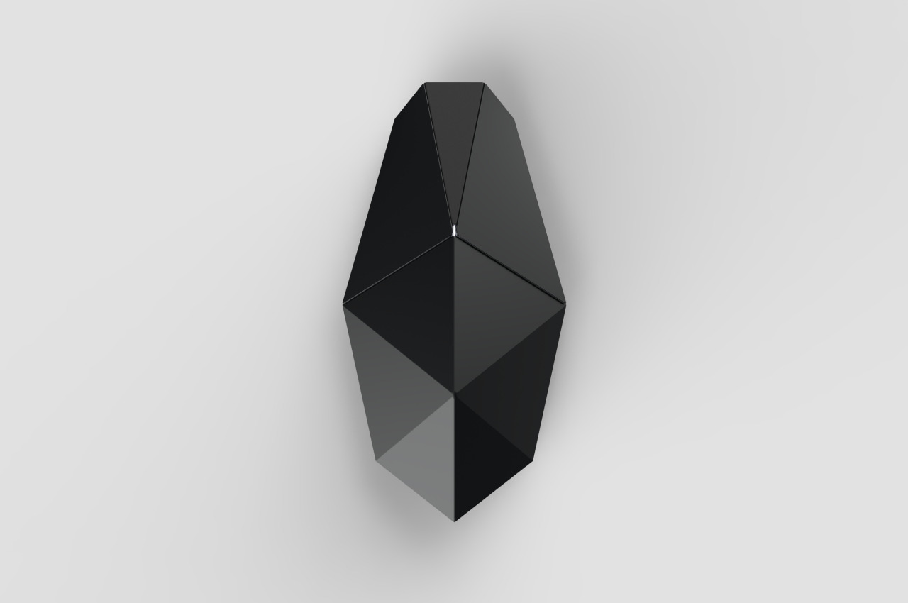
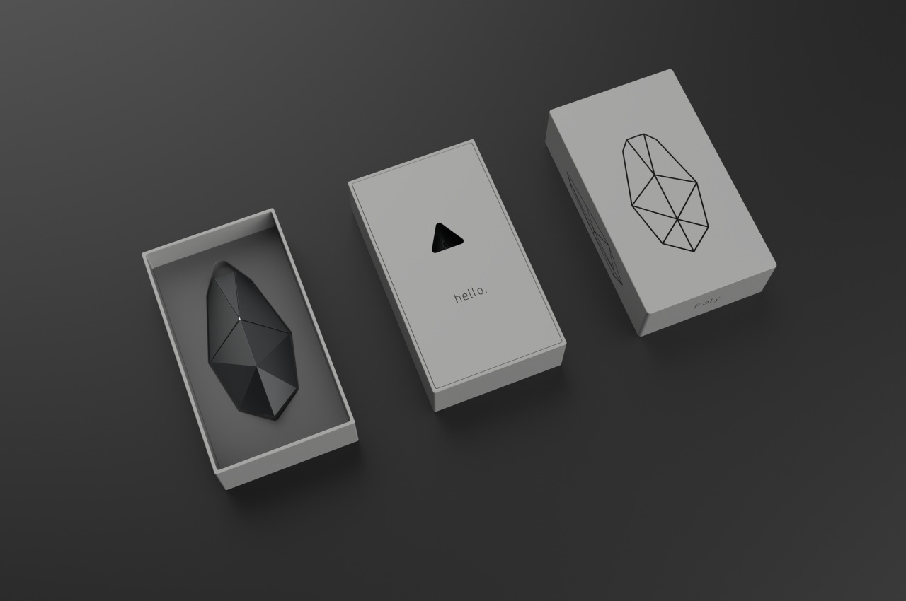
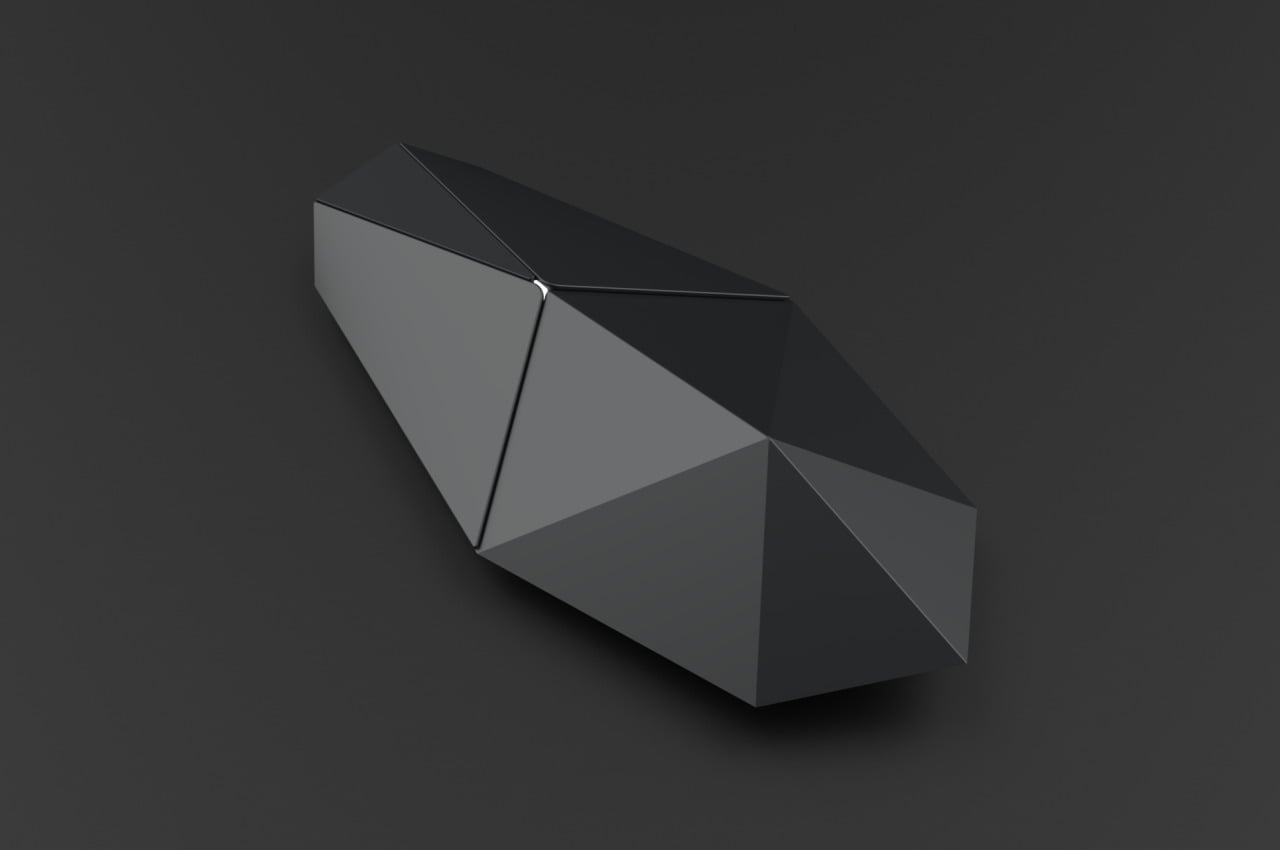
It’s almost ironic that this Poly Mouse concept was actually inspired by something that isn’t meant to be easily seen or detected. The designer took cues from both low poly 3D models as well as the F-117 Nighthawk stealth aircraft to design a mouse with a faceted surface that looks stunning, especially in black. It also looks a bit painful for your palm.
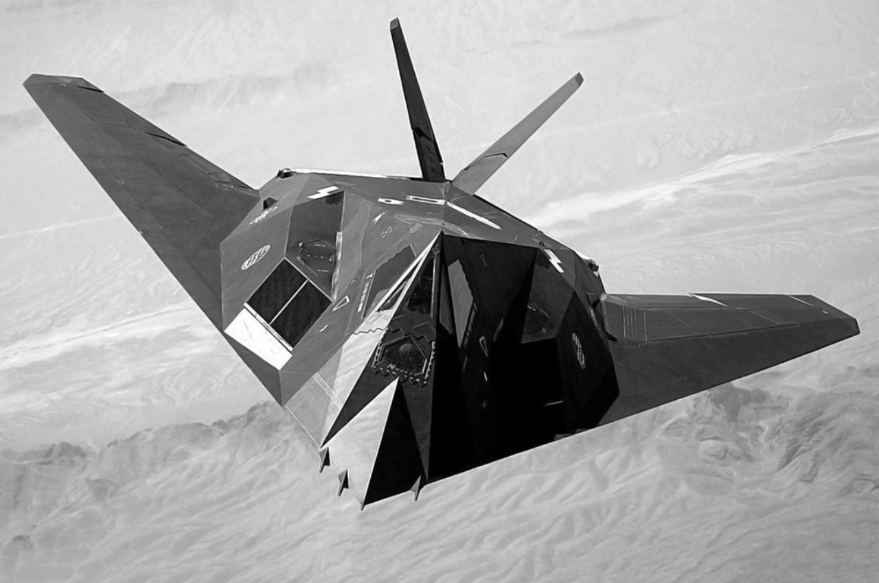
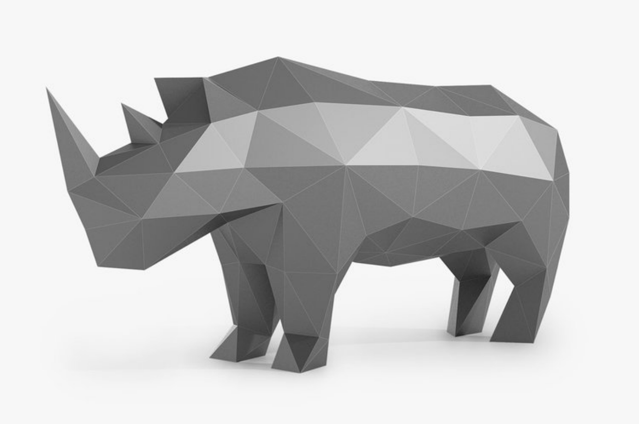
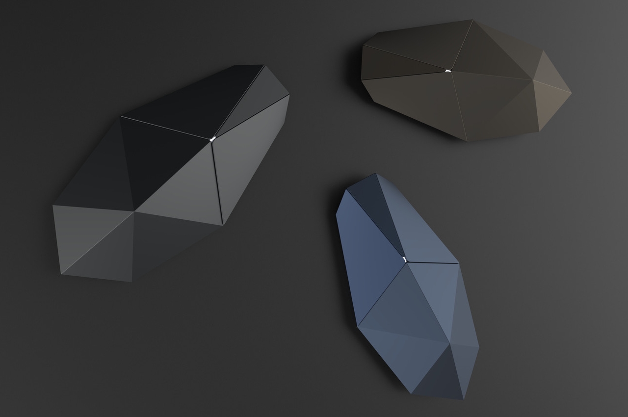
The concept uses geometric shapes, mostly triangles and two polygons for the buttons, to build the form of the mouse. This kind of design language isn’t just particular to stealth fighter jets and can be found in some sci-fi designs, like the more recent Deus Ex games, giving it a futuristic vibe. The way light reflects differently on different surfaces might also remind some people of diamonds, crystals, and some rocks.
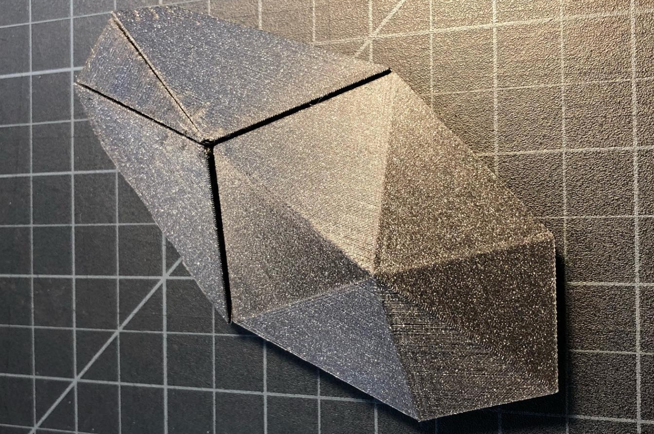
While it doesn’t look like a typical mouse, the Poly concept does have basic mouse functions. There are left and right mouse buttons, but the design eschews a scroll wheel for a triangular gesture pad in the middle. There’s also an LED light where these three buttons meet, serving as the indicator for the mouse’s power state.
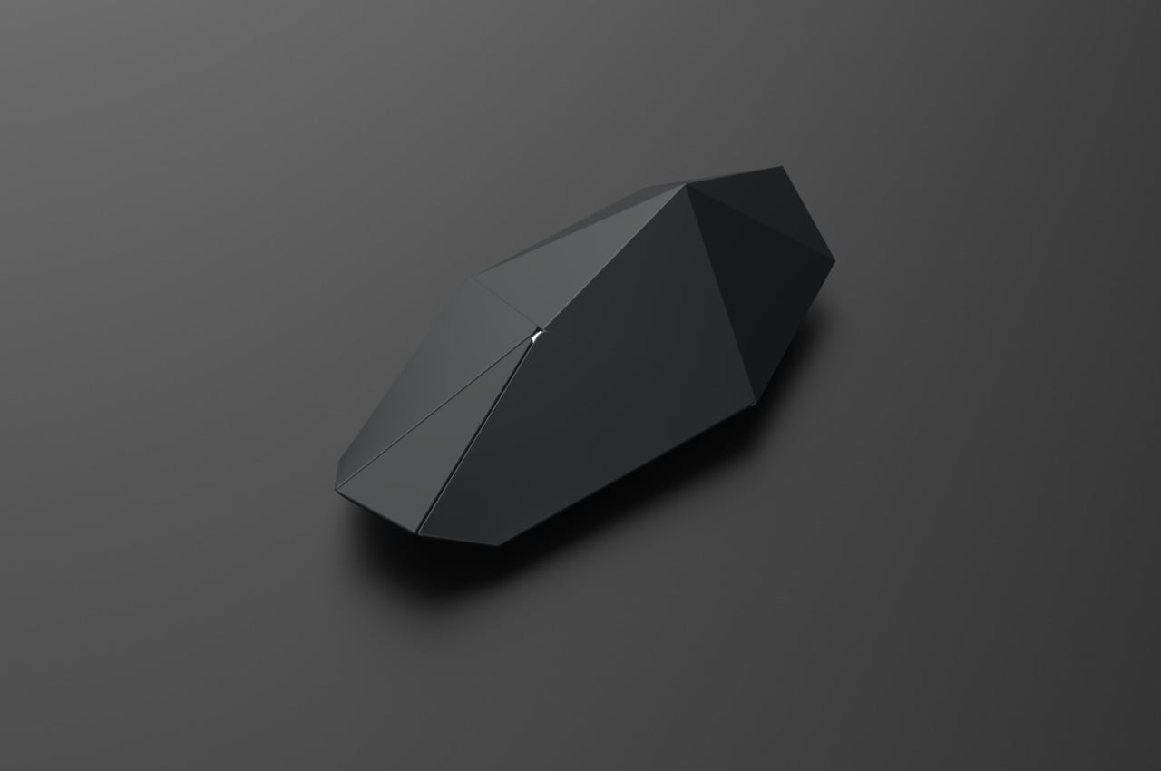
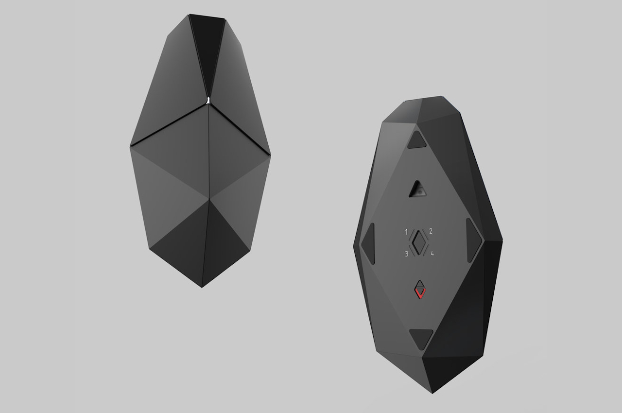
Industrial designer J Gabe Rustia makes no qualms that this mouse wasn’t designed for ergonomics. It was mode more as a thought experiment and design challenge that placed aesthetics above all else. It’s probably usable as well, just not for long periods of time, as all those sharp lines and points will most likely cut into your palm over time.
