Manhattan-based artist Bruce Edelstein started early in expressing himself through art. As the son of two artists, he grew up learning different mediums, forms, and styles. His portfolio includes various sculptures, paper art, figures, and even performances and collaborations.
Bruce Edelstein is also known for his passion for teaching art to children, specifically, sculpture. He has developed a curriculum to teach the kids, which has since succeeded. He has recently introduced a module for the grade three and grade four students of Trinity School in New York. The private school students were lucky to be under the tutelage of Edelstein.
Designers: Grade 3 and 4 Students of Bruce Edelstein at Trinity School
A hands-on wooden chair design project was introduced to the students. It was meant to teach the students to express their styles and personalities. This isn’t the first as the artist has been giving the students instruction to build a chair for themselves every year. The project is to create using pinewood planks and go through a process beginning with conceptualization, sketching, scale model building from paper, cutting, nailing wood, and actual decorating.
The Trinity School students made the chairs in autumn 2021. The project was considered special and memorable as kids are still struggling with remote learning due to the threat of the coronavirus. The workshop has been prepared for online learning and this means every step was done from home.
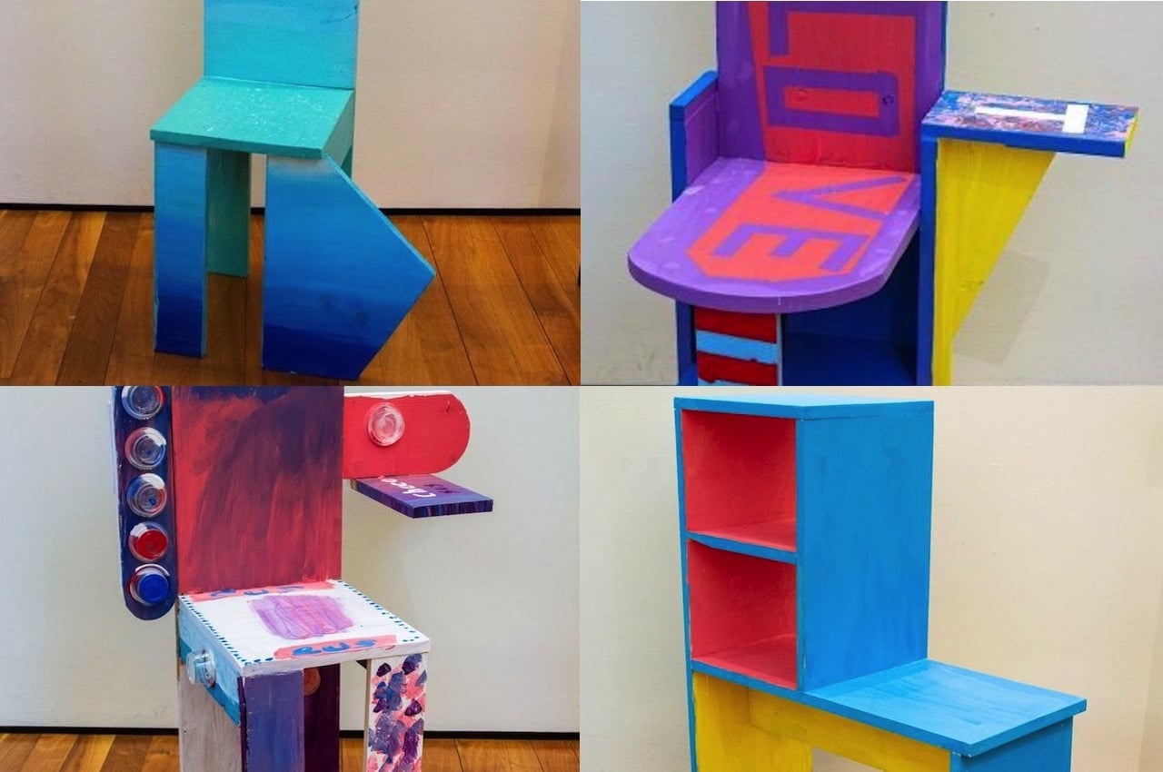
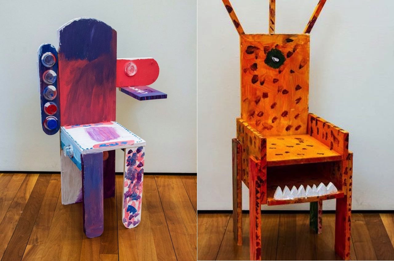
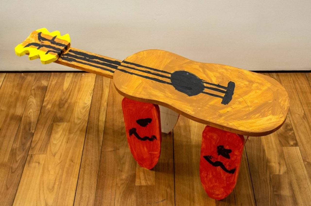
The woodworking project resulted in creative and quirky chair designs. It is challenging to figure out the look, but we see one looking like a guitar. Another chair combined some bookshelf for storage while another one is done as a masking tape art.
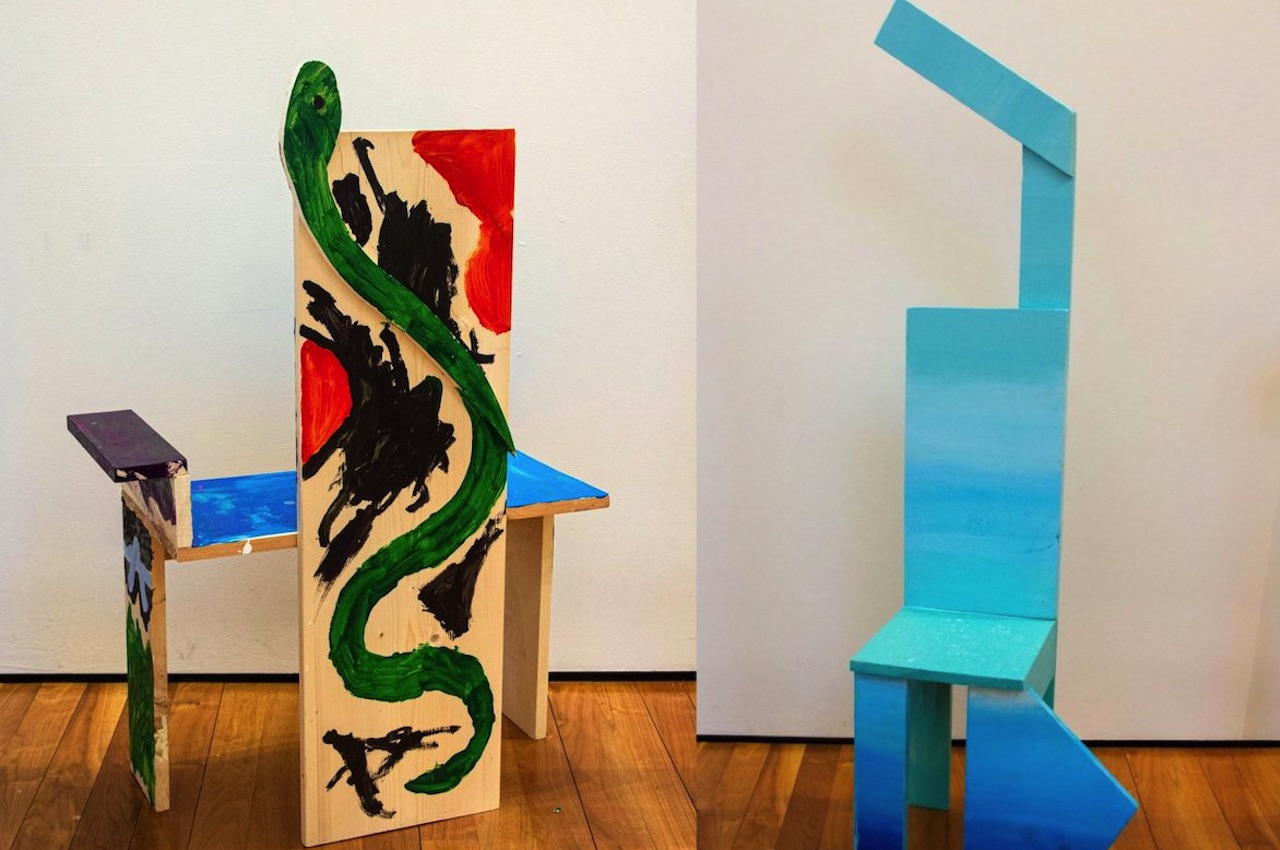
One kid designed his chair with a green snake on the back, giving off a fierce look, especially with red and black paint. There’s one chair painted in different shades of blue that reminded us of the ocean. A ballerina inspired its design with one arm in the air and a bent leg in triangular form. It appeared the chair was doing the 1st position or the Plié in ballet.
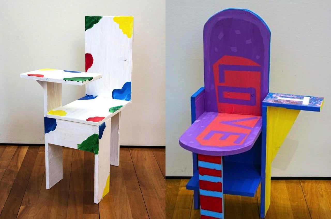
One chair presented a simple white background with what appeared like color splotches. Another had the word LOVE painted on the backrest and the seat. It’s as if telling us love is all you need, so take a seat.
A chair looked like an orange one-eyed monster with dark spots, three horns, and sharp white teeth. There’s another that looked abstract but looked fantastic with the combination of white, purple, blue, and pink. We can see in these creations that the primary schoolers were able to implement what they learned from their artist-teacher, including staining, use of different materials, and being able to be in touch with their feelings while designing.
