I truly feel a well-crafted piece of wooden furniture can add a magical touch to even the simplest of living spaces! Minimal, clean, and almost always soothing, beautifully designed wooden furniture helps a space radiate an aura of warmth and calmness. They instantly make you feel at home. And, today a lot of designers are adopting ‘Japandi’ aesthetics when designing wooden furniture. So, what is Japandi? It is an amalgamation of the words Japanese and Scandinavian and marries Japanese and Scandinavian aesthetics. It is the artful blending of both Japanese and Scandinavian design. Add wood as the material of choice to this mix, and you have furniture designs that are not only aesthetically but functionally pleasing as well! Incorporate this collection of Japandi-inspired wooden furniture designs into your home, to create a living space that will truly feel like a safe haven.
1. The Diag Desk
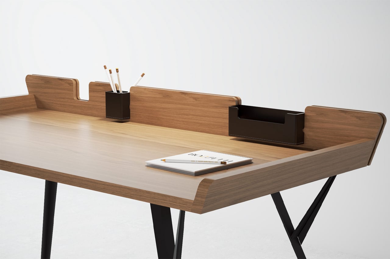
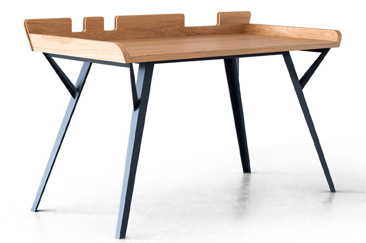
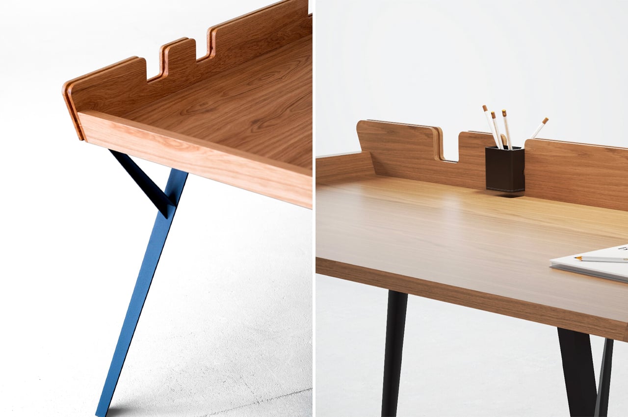
The Diag Desk is a minimalist, modern desk built to optimize desk space while incorporating storage elements like removable leather compartments. When it comes to desks, the simpler the better. Desks that are rooted in simplicity, either through a minimalist approach or by embracing Scandinavian aesthetics, typically offer a lot of practicality while maintaining a stripped-down design.
Why is it noteworthy?
Considering its minimalist build, more space can be devoted to the desk’s tabletop, where most of the desk’s purpose is reserved. The Diag Desk from Polish designer Marek Błażucki is one kind of minimalist design that integrates storage systems into its build, ensuring that users have ample desk space while still keeping their necessary stationery within arm’s reach.
What we like
- Integrates ample storage systems into its build
- Ensures stationery doesn’t fall off
What we dislike
- There are a lot of visually similar desks on the market
2. Acrobat
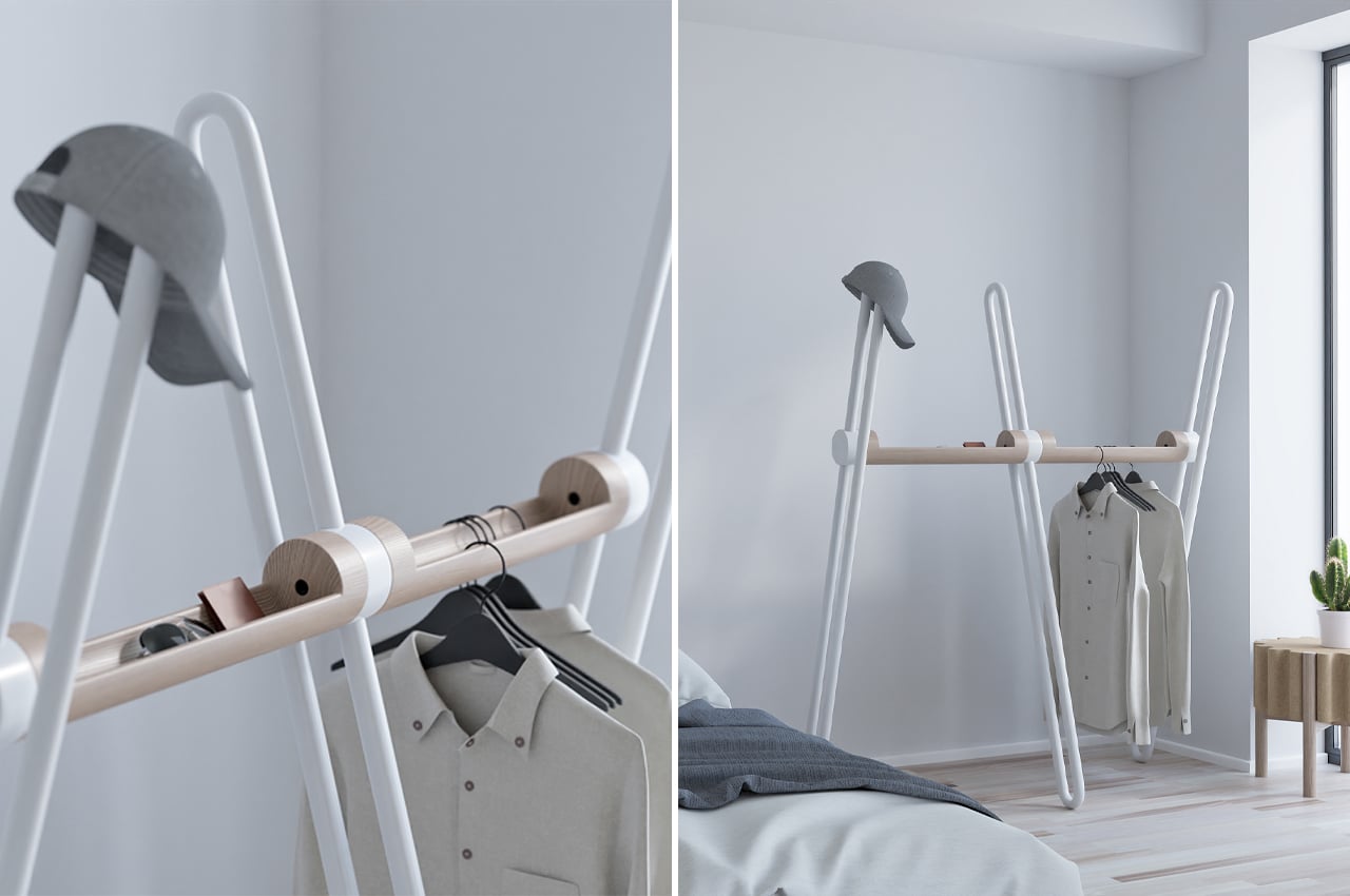
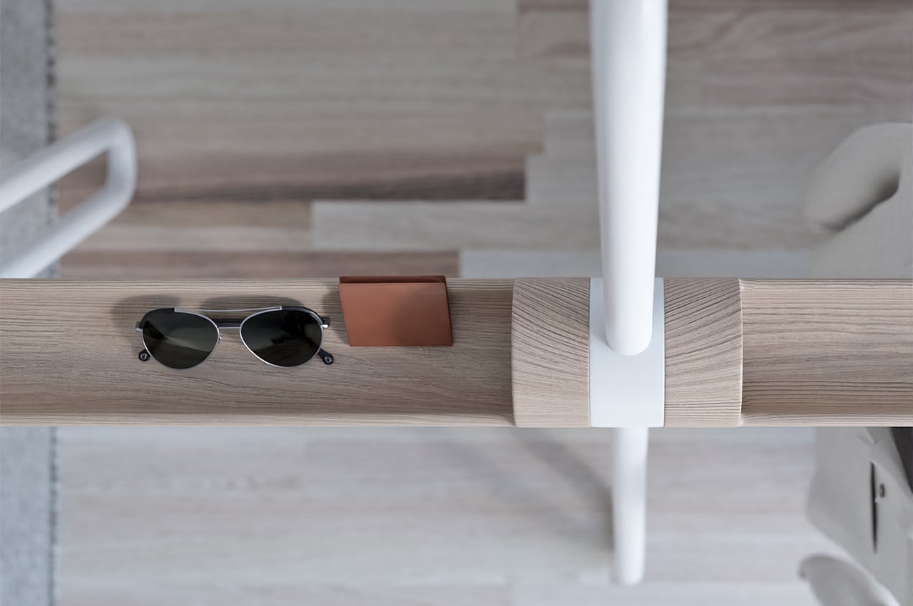
Acrobat is a multifunctional storage piece that combines the safekeeping components of an entryway table with the hanging function of a coatrack.
Why is it noteworthy?
As we continue to downsize our living spaces, the more multifunctional our furniture is, the better. Smaller spaces don’t necessarily have to mean less living space. Multifunctional furniture helps make more room for living while taking care of a lot of our household tasks. We usually have our own system of arranging EDC items like key rings, wallets, and phones. Entryway tables and coat racks usually take the brunt of those organizational needs, so finding multifunctionality in their design is key to keeping our homes decluttered. Acrobat, a multifunctional coat rack designed by João Teixeira, combines the storage components of an entryway table with those of a coat rack.
What we like
- The metal tube tops can also be used to hang clothes or hats without the need for a hanger
- The wooden hull that interlinks the beams offers a safe space to store EDC items like wallets, phones, and keyrings
What we dislike
- Can occupy a substantial amount of space
3. The 4PM Chaise Longue Chair
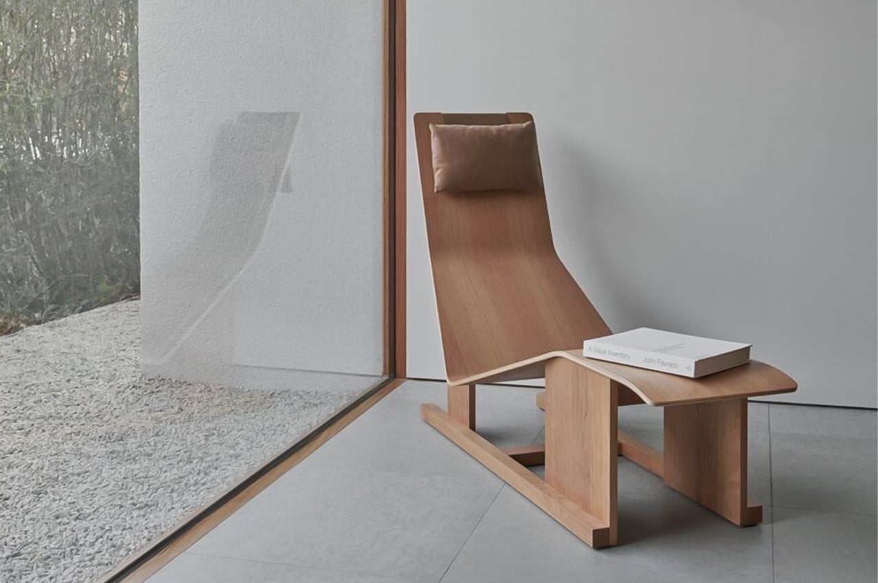
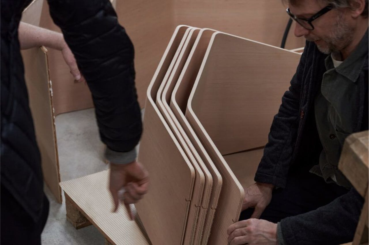
Comprised of flat and curved features, the 4PM Chaise Longue Chair is designed to create comfort out of hard material. Constructed in either Douglas fir or cherry wood, the only upholstered component of the 4PM Chaise Longue Chair is the leather headrest. Balanced on top of the backrest, Massproductions held the headrest in place with a steel weight.
Why is it noteworthy?
Massproductions is a slow furniture company, don’t let the name fool you. Since the furniture company only develops a few pieces every year, the ones that go into production guarantee a top-quality build and durable life span. Boasting an efficient, sustainable, and high-quality industrial production process, the company’s designers ensure the integrity of Massproductions’s vision. The company’s founder, Chris Martin, developed the 4PM Chaise Longue Chair to reinforce the company’s commitment to quality and produce an ergonomic, long-lasting chair for much-needed R&R.
What we like
- Sustainable production and design process
- Ergonomically designed
What we dislike
- Doesn’t seem very comfortable to sit on
- Space consuming
4. The Storm Lamp
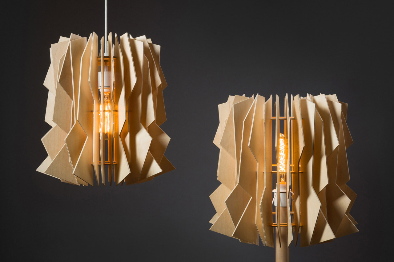
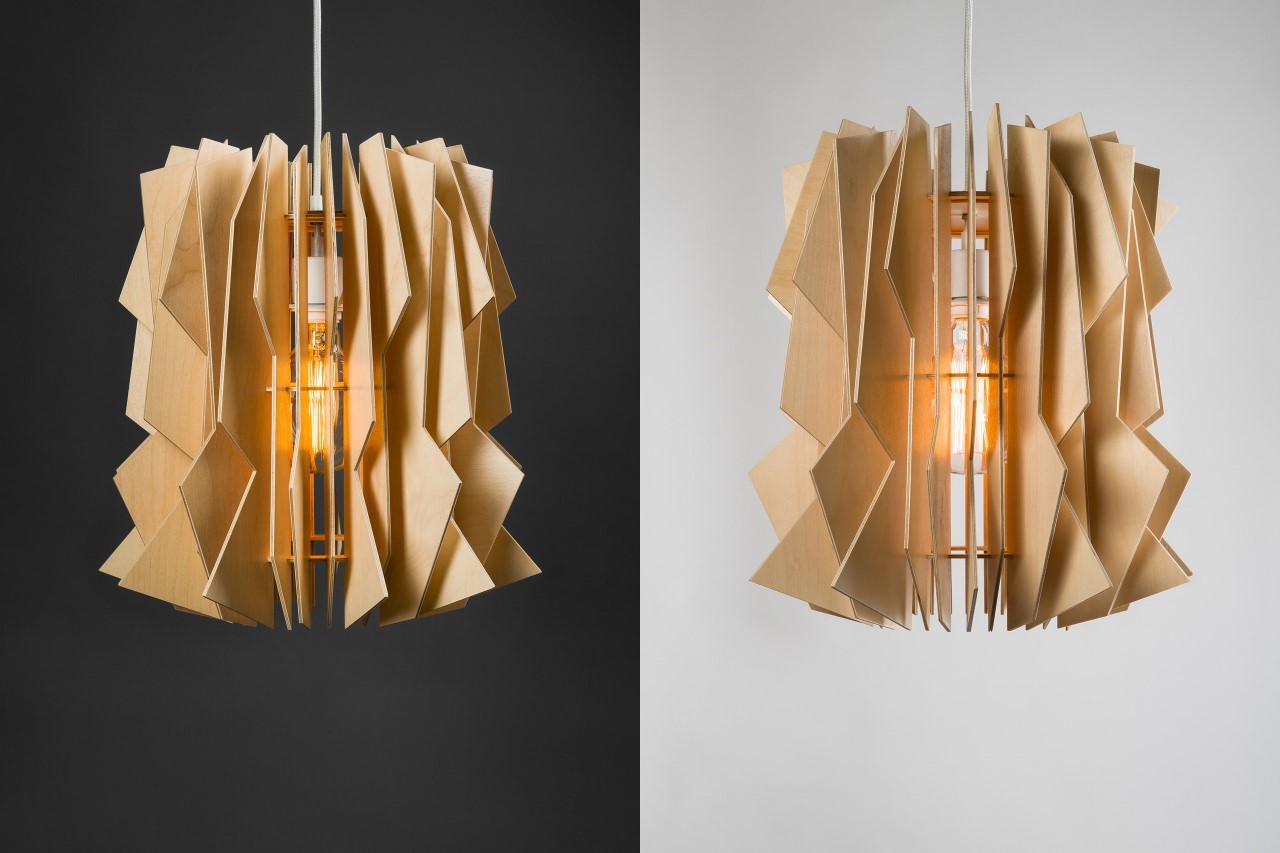
The beauty of the Storm Lamp by Julia Kononenko is that there isn’t any method to its mad design. The lamp comes with a variety of laser-cut wooden panels that can be arranged/oriented in any way you like because as its name suggests, the Storm Lamp is all about beauty in chaos. Looking almost like an abstract tornado, the lamp is entirely made from flat pieces of laser-cut plywood that are either left plain or painted black.
Why is it noteworthy?
When assembled together, they create a 3D form using the Gestalt visual law of continuity. Moreover, the jagged edges themselves illuminate to look like chaotic lightning strikes, reinforcing the product’s inspiration!
What we like
- The lamps are available in both hanging and floor formats
- The jagged edges themselves illuminate to look like chaotic lightning strikes
What we dislike
No complaints
5. Listón
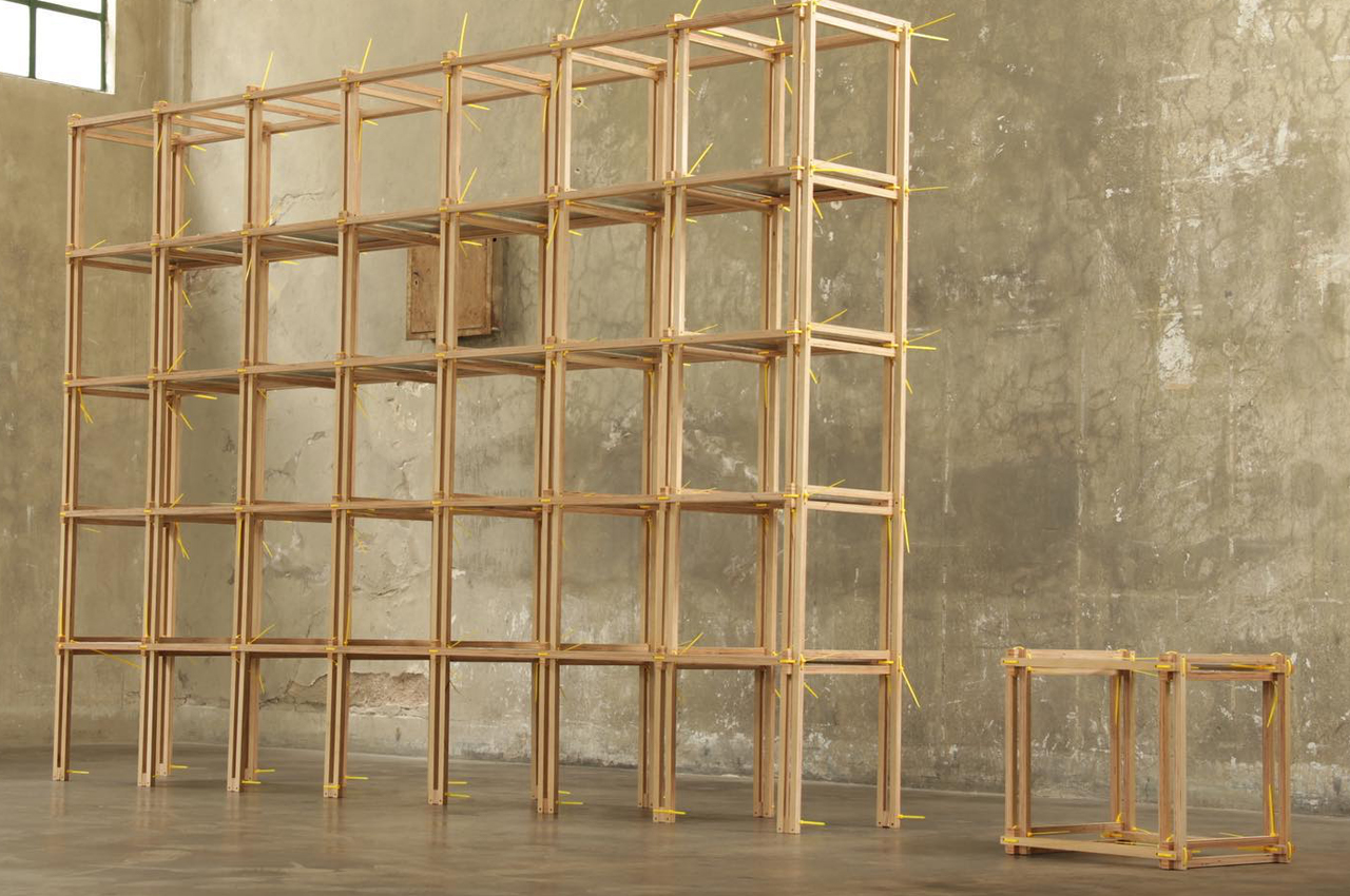
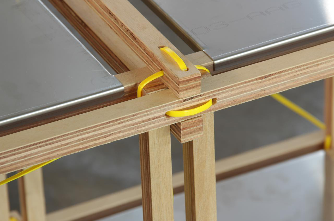
Listón is a modular shelving unit that uses a system of cable ties and wooden slats to form an endlessly re-configurable and sustainable furniture piece. The cable tie system allows users to create infinite configurations of varying sizes and shapes for essentialist shelving units that will look good in any room. Replacing hardware and tools, the cable ties systems provide secure fastening for each module that comes with Listón.
Why is it noteworthy?
With this in mind, many designers are approaching new furniture and appliance designs with sustainability being the driving force. Adding his design to the mix, architect, and designer Guille Cameron Mac Lean developed Listón, a new type of furniture system that uses cable ties and wooden slats to configure modular storage units.
What we like
- The system of cable ties and wooden slats significantly reduces the amount of packing goods needed to ship the furniture system by 18 times in comparison to other flatpack furniture
What we dislike
- The wooden slats and cable ties could break
- Not the most aesthetic furniture design to add to your living space
6. The Collapsible Wood Chair
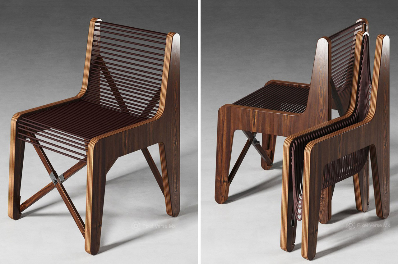
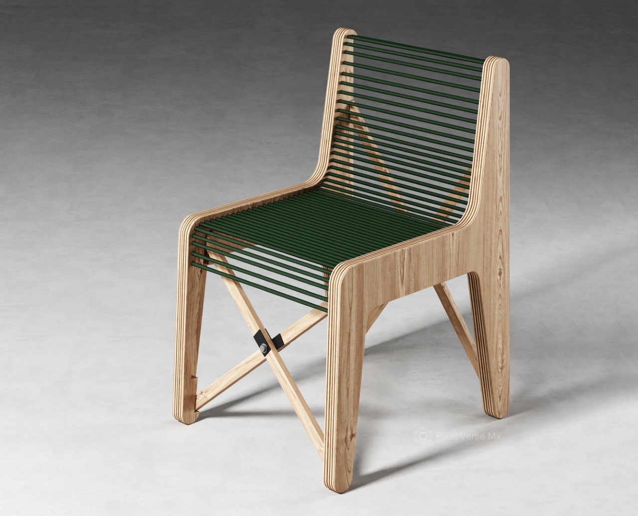
Quite unlike any of the folding chairs you may have seen around you, on the internet, or even on this website, this creative little number comes from Jon 117 SP, a designer based out of Léon, Mexico.
Why is it noteworthy?
Simply titled the Collapsible Wood Chair, the seating uses two almost-identical wooden profiles with a thick paracord weaving between the both of them to form the seat and backrest. The paracord does two essential things – not only does it make sitting feel comfortable (unlike wood or metal which feels rigid), but it also adds a flexible element to the seat where it folds together, allowing the chair to collapse flat when you’re not sitting on it.
What we like
- A unique take on a collapsible chair
What we dislike
- We’re not sure how comfortable it would be to sit on the paracord
7. The Cloth Coffee Table
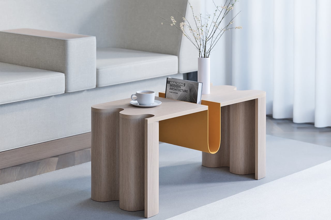
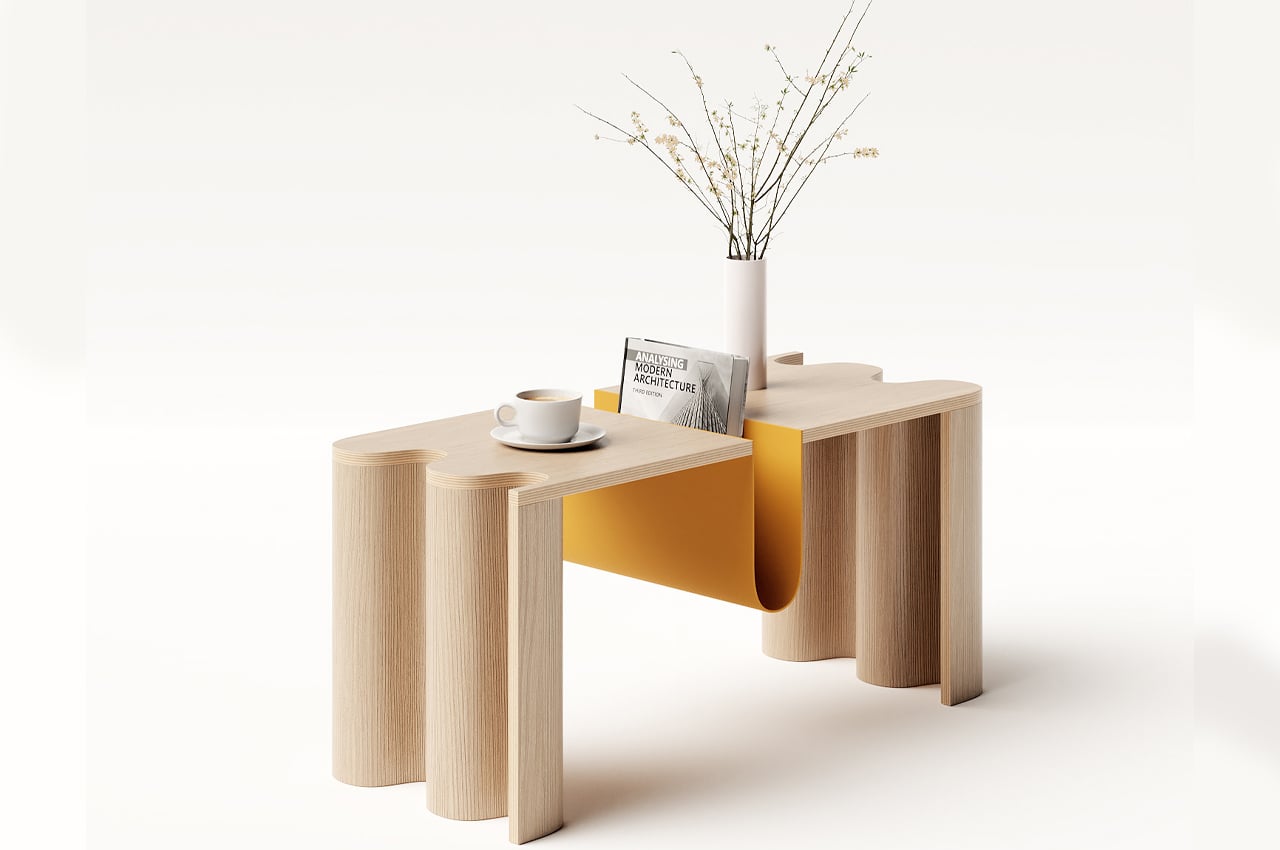
Characterized by its curved bookstand that works as the table’s centerpiece, the Cloth coffee table’s curvy personality is echoed throughout its build. The bookstand also finds a balance between boldness and elegance, offering a weighty centerpiece that helps ground the coffee table, without dominating the available tablespace. Featuring softly bold elements like an undulating table edge that mimics the look of a live edge, the Cloth coffee table keeps a dynamic profile without dominating the room.
Why is it noteworthy?
Doing minimalism before it was cool, Japanese and Scandinavian share a lot of common design principles, including a focus on warmth, groundedness, and a subdued color scheme for an overall calming effect. With aim of merging these principles together to design Cloth, Teixeira hoped to find a “balance between boldness and elegance, depending on the angle.”
What we like
- An artful blend of Japanese and Scandinavian design philosophies
- The curved bookstand is a distinguishing feature
What we dislike
- Weighty/bulky design
8. The Tie Stool
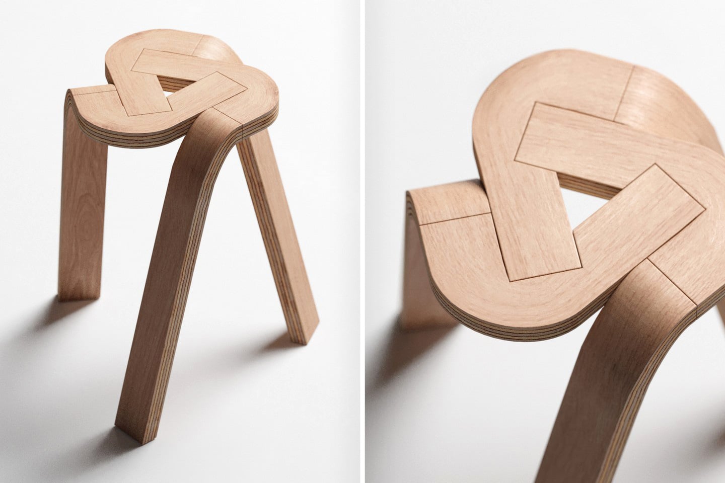
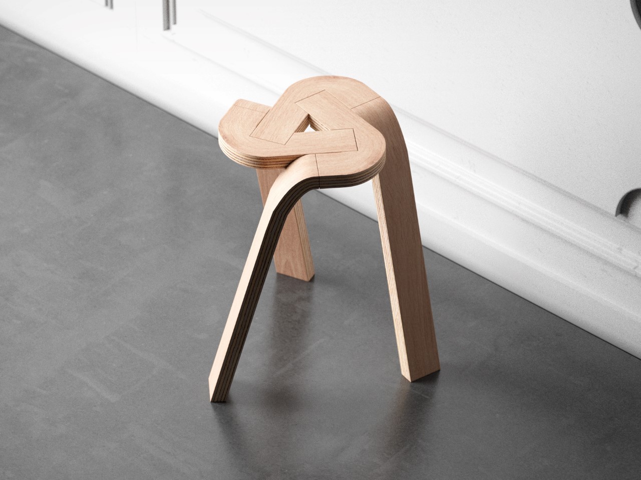
The Tie Stool’s beauty lies in its sheer simplicity – not just design but also materials. The stool comprises three bent plywood strips that conveniently lock into each other, creating a tripod form that you can easily sit on. The design could easily expand to accommodate more strips to create a 4-legged (or even 5-legged) stool, but the dynamic nature of having a tripod format really gives the Tie Stool its appeal. I don’t know about you, but I can’t unsee the Google Drive logo in the stool’s design!
Why is it noteworthy?
Fabricating the Tie Stool would require a few simple steps. The three plywood strips can, in fact, be split into 6 total parts (you can see the parting lines). The individual parts are formed using high pressure and temperatures that cause the plywood to bend and retain its shape, and cutting/finishing processes are performed on the parts to make them interlock into one another.
What we like
- The entire stool can potentially be flat-packed and shipped to customers
- It’s stackable
What we dislike
No complaints!
9. The Front Stool
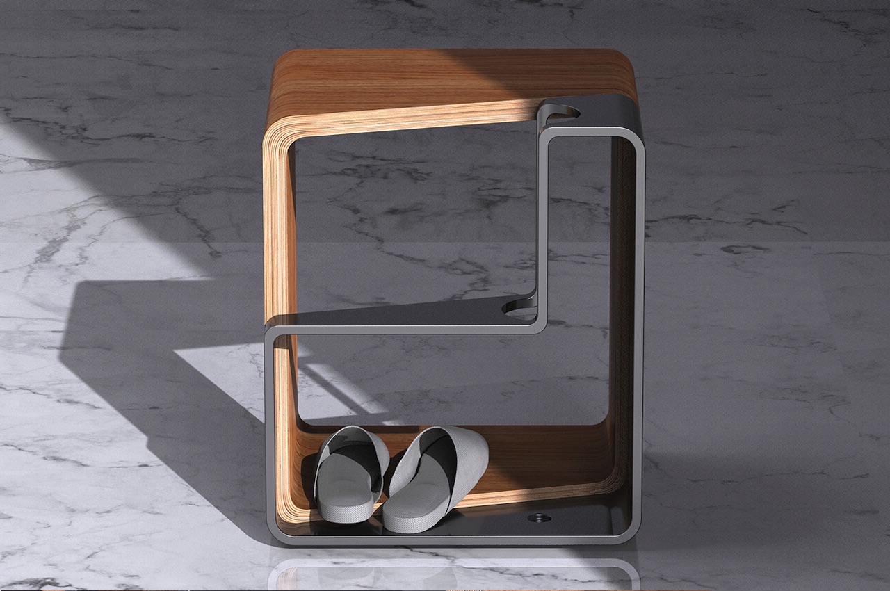
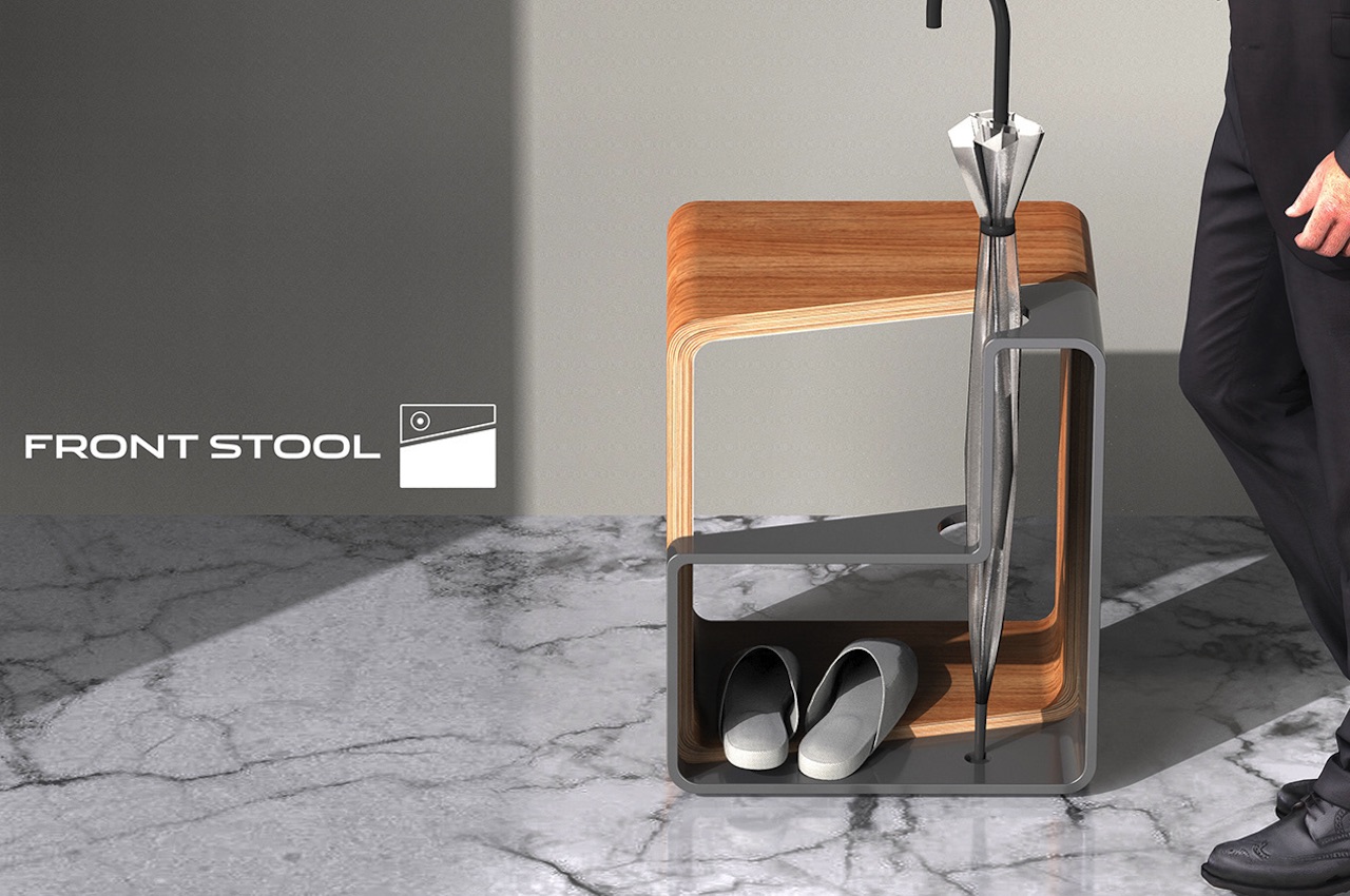
The Front Stool combines two stools in different materials and thicknesses. The wooden part can either be Walnut or Cypress while the other part is made of High-Density Poly Ethylene (HDPE) material comes in four color options—Light Gray, Crimson Red, Blue Green, or Dark Gray. It comes packed in a small rectangular box with separate pieces secured and organized.
Why is it noteworthy?
i Woong Cha noted the importance of designing for a smaller space. A small household cannot hold many items, so a functional shape is preferred. The Front Stool comes with a modern and intuitive design that fits right at the entrance. It’s more than just a stool as it also works as an umbrella stand and support for when you need to put on or take off your shoes.
What we like
- Functions as a stool, footrest, and umbrella stand
- You can easily assemble it yourself
What we dislike
- It’s still a concept!
10. Boersma’s furniture collection


Starting out with a rectangular block of wood, Boersma spins each piece into alternating patterns of round and square shapes. Boersma describes the process, “When making this series, the rectangular shape of the starting piece was used, and patterns were developed from this shape.” Spurred by the Netherlands’ specific love for and connection to the craft of woodturning, Boersma turned to traditional tools and cultural building methods for the foundation of “A different turn.”
Why is it noteworthy?
Beginning with a single, rectangular block of wood, Boersma creates undulating patterns to expose the wood block’s natural, unstained grooves and grains. In showcasing each block of wood’s natural grain, each piece of furniture is unique in its own light.
What we like
- Revisits the ancient art of woodturning
What we dislike
No complaints!

