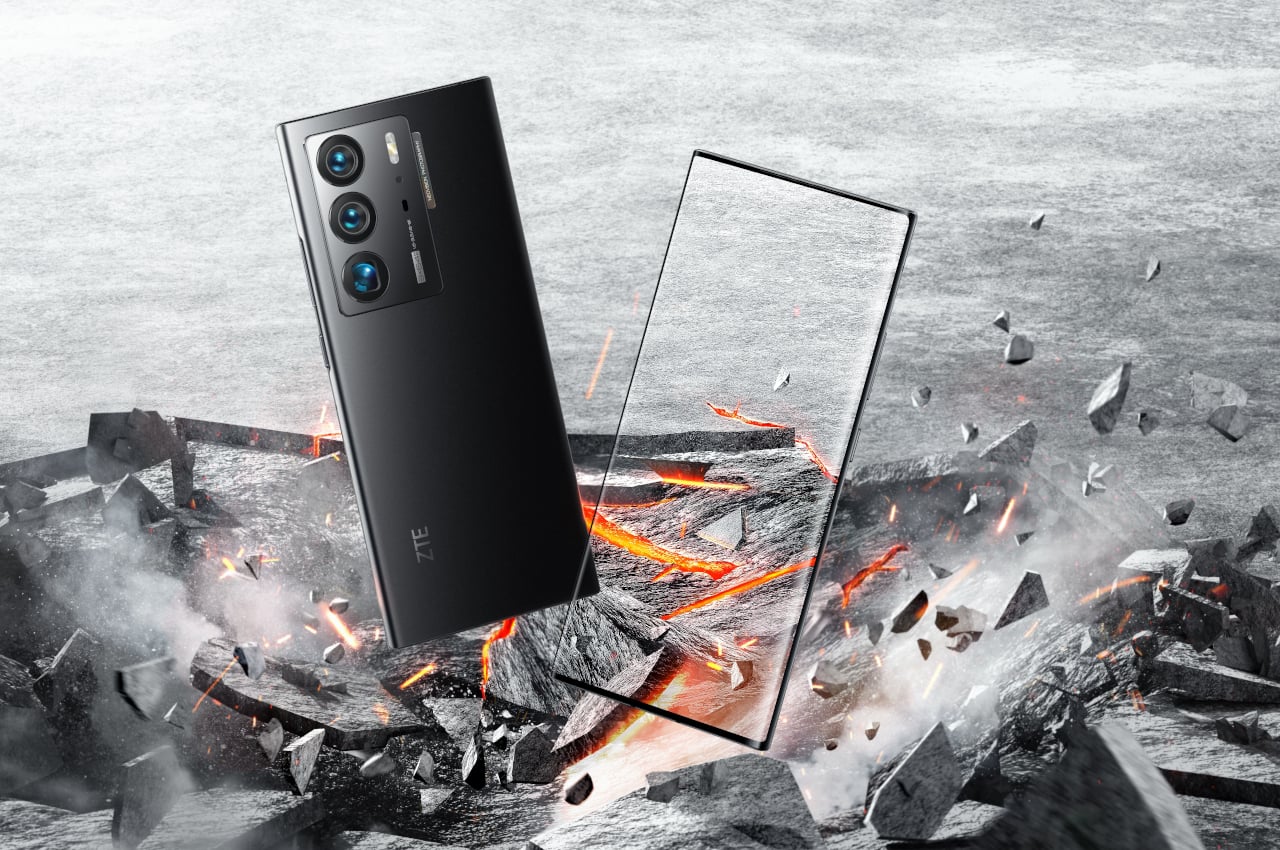
We might finally be close to reaching the point where there is little to no sacrifice needed just to hide that unavoidable selfie camera.
When we use our smartphones, 90% of the time, we spend it on the screen, either looking at it or touching it. Even when using the phone’s cameras, we still use the screen as a large viewfinder to frame the perfect shot. It’s not surprising, then, that almost all smartphone users and manufacturers want the front of the device to really be all about the screen and only about the screen. Due to limitations in technology and manufacturing, however, that wasn’t the case until recently. There is no shortage of attempts to banish any and all notches and holes from the phone’s face, but not all of them have ended happily. ZTE hasn’t given up yet, though, and the third time might really be the charm as it tries to prove that it has finally nailed down that elusive Under-Display Camera trick.
Designer: ZTE
There’s something almost disconcerting about seeing a hole or a cutout on your screen. Sure, your mind will eventually filter it out and become blind to it, part of the miracle of our human brains, but every now and then, it will call attention to itself and distract us. A lot of designers and engineers now want to wage war against those notches, but those didn’t exist until just a few years ago. It wasn’t really until smartphone makers tried to be smart and increase the space occupied by screens that they had to resort to cutouts.
Under-display cameras or UDCs are, to some extent, a solution to a problem of our own making. We wanted the best of both worlds, a full-screen phone with a good front-facing camera, but didn’t have the ability to deliver until recently. Even Samsung, a long-time player in this market, walked away with egg on its face for a disappointing first try, especially after ZTE has already seemingly perfected its UDC game.
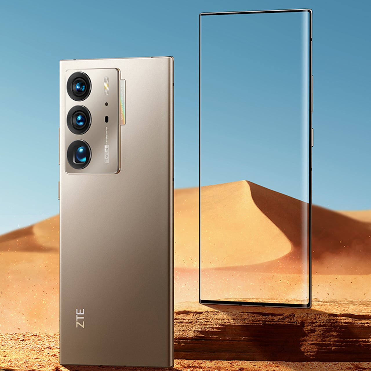
The newly announced ZTE Axon 40 Ultra, at first, looks almost like more of the same things, just with slight improvements that widen the brand’s lead in this department. The highlight is, of course, the fact that you can’t even see where the front camera is hiding underneath the screen, not unless you inspect it very closely. There is still some debate whether the output of that front-facing 16MP camera will be decent enough, but it definitely can’t do worse than what Samsung put underneath the Galaxy Z Fold 3’s flexible display.
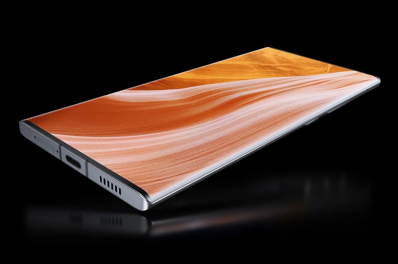
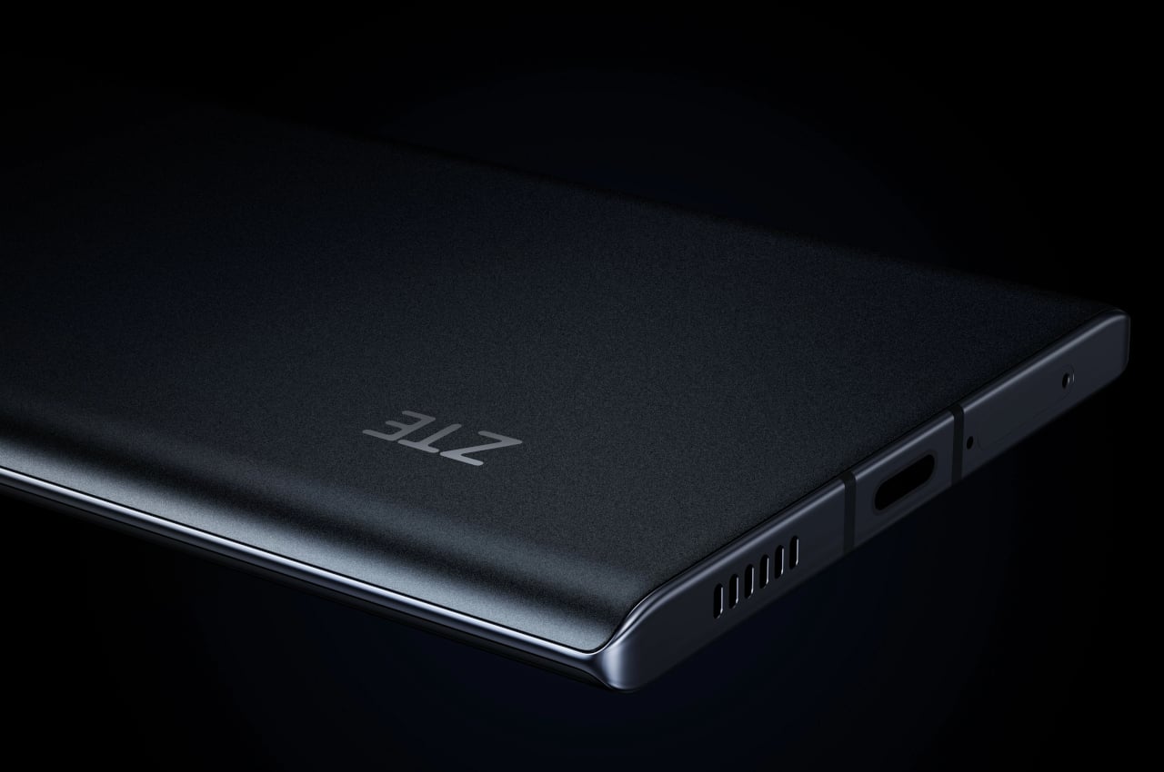
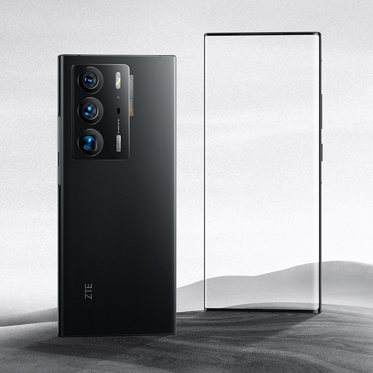
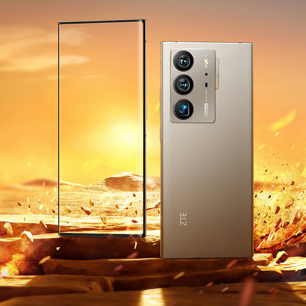
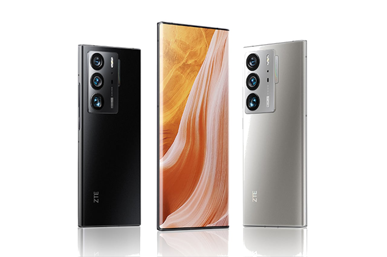
The Axon 40 Ultra isn’t just a rehash of the past two years, though, but you might find its new design oddly familiar at the same time. It finally says goodbye to the flat screens of its predecessors and makes its 6.8-inch AMOLED panel wrap to the sides with a gentle curve, meeting the equally curved edges of the back glass panel. The top and bottom edges, in contrast, are completely flat, so don’t be surprised if parallels to the Samsung Galaxy S22 Ultra are drawn, especially considering the same suffix.
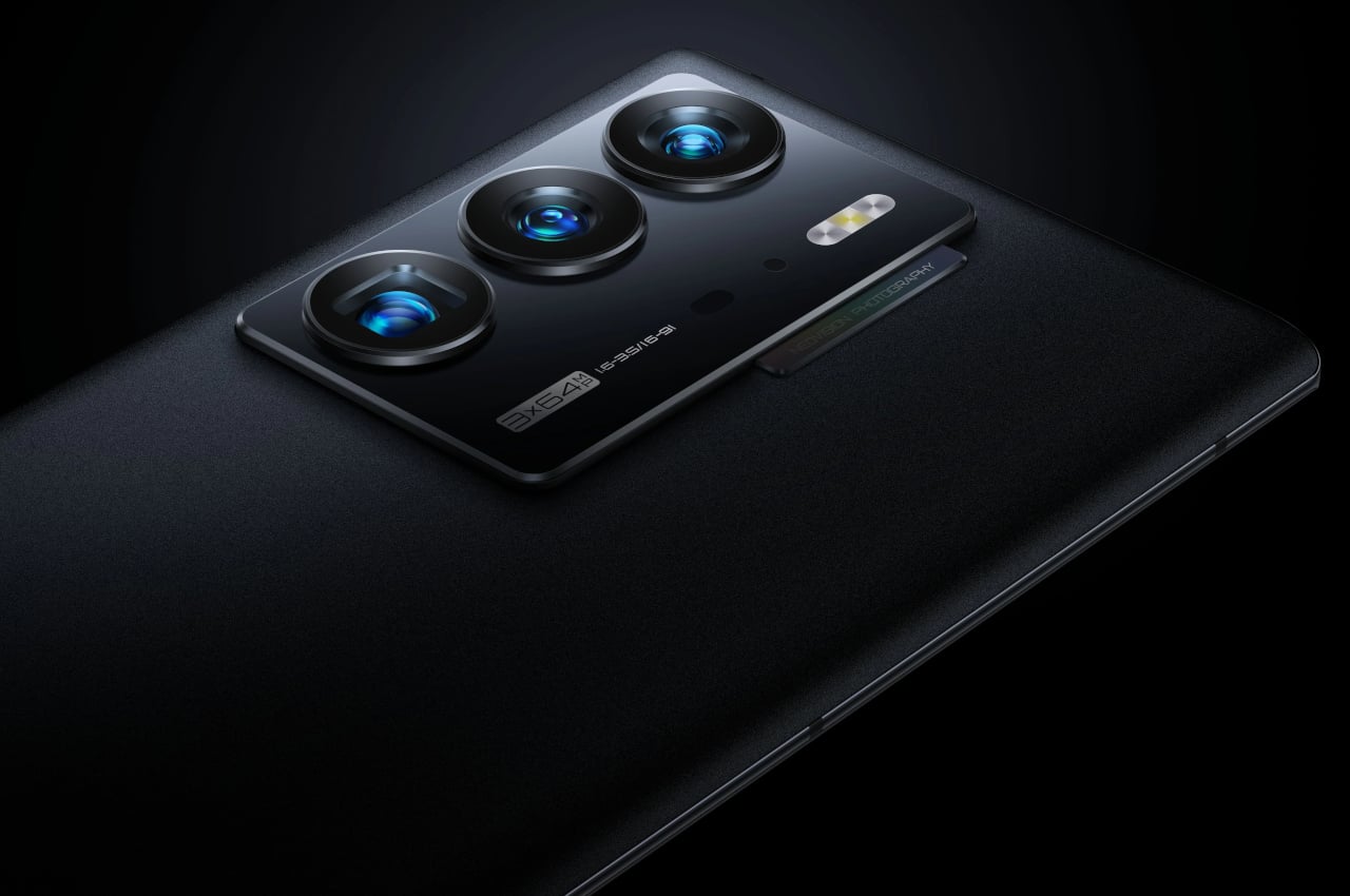
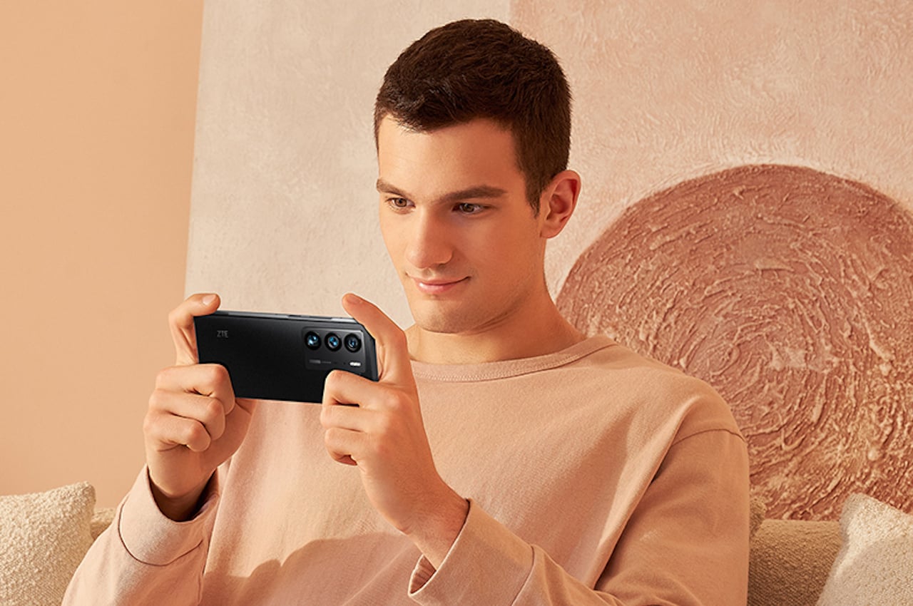
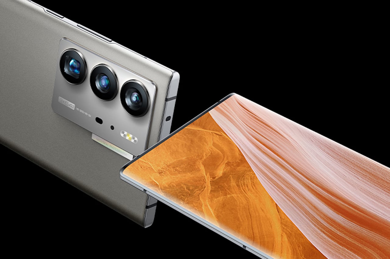
While the front of the phone is beautiful because of its clean and seamless surface, the same can’t be said of its back. The camera bump looks larger than it needs to be, with lots of empty space devoted to labels. Curiously, ZTE takes it even further with a small “tab” that peeks out of that structure, an embellishment with no other purpose than the have yet another area for branding. Then again, that’s not surprising given today’s smartphone design trends, and, thankfully, we spend most of our time looking at the front of our phones rather than their backs.
