The majority of us live in modern and urban homes, one distinguishing factor of such homes is that we have sufficient space, but (sadly) not an abundance of it. Hence space-saving becomes an important practice we need to follow. In such scenarios, modular furniture designs can come to our rescue! They are the space-saving solutions our modern millennial homes require. Furniture designs that cater to a number of our needs, while saving space, and also managing to be customized according to our requirements, can create an open and well-distributed home. And since we find ourselves in our homes more and more these days, it’s extremely critical to have a space wherein we can breathe, move around freely, and feel comfortable in. Here are a collection of modular furniture designs that promise to help you utilize your living space as efficiently and effectively as possible!
1. D-Tach
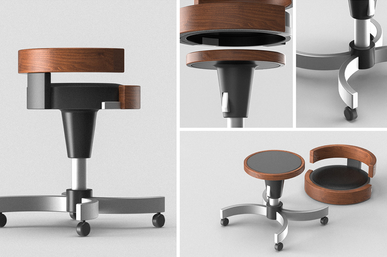
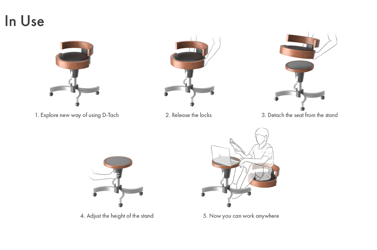
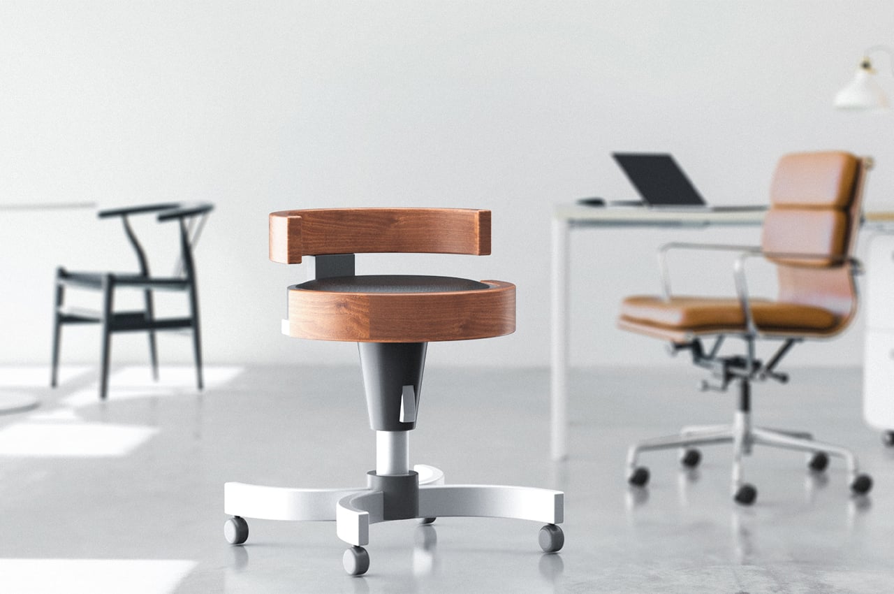
D-Tach is a versatile stool that transforms into a small workspace designed to accommodate today’s mobile work culture. With each day, our world seems to become more and more mobile. Mobile offices, working from home, and freelance careers are increasing in popularity as we move away from corporate offices. With work culture making such a big shift towards mobile lifestyles, our home offices and furniture should reflect that.
Why is it noteworthy?
Industrial design student Andrew Chang decided to create a chair that fits the bill. D-Tach is a modular stool design that functions as a traditional office chair, only to disassemble into parts that provide a small working space on the go.
What we like
- Transforms into a small workspace
- Fits into most modern offices
What we dislike
- We’re unsure how comfortable would the small workspace be to actually work in
2. Summit
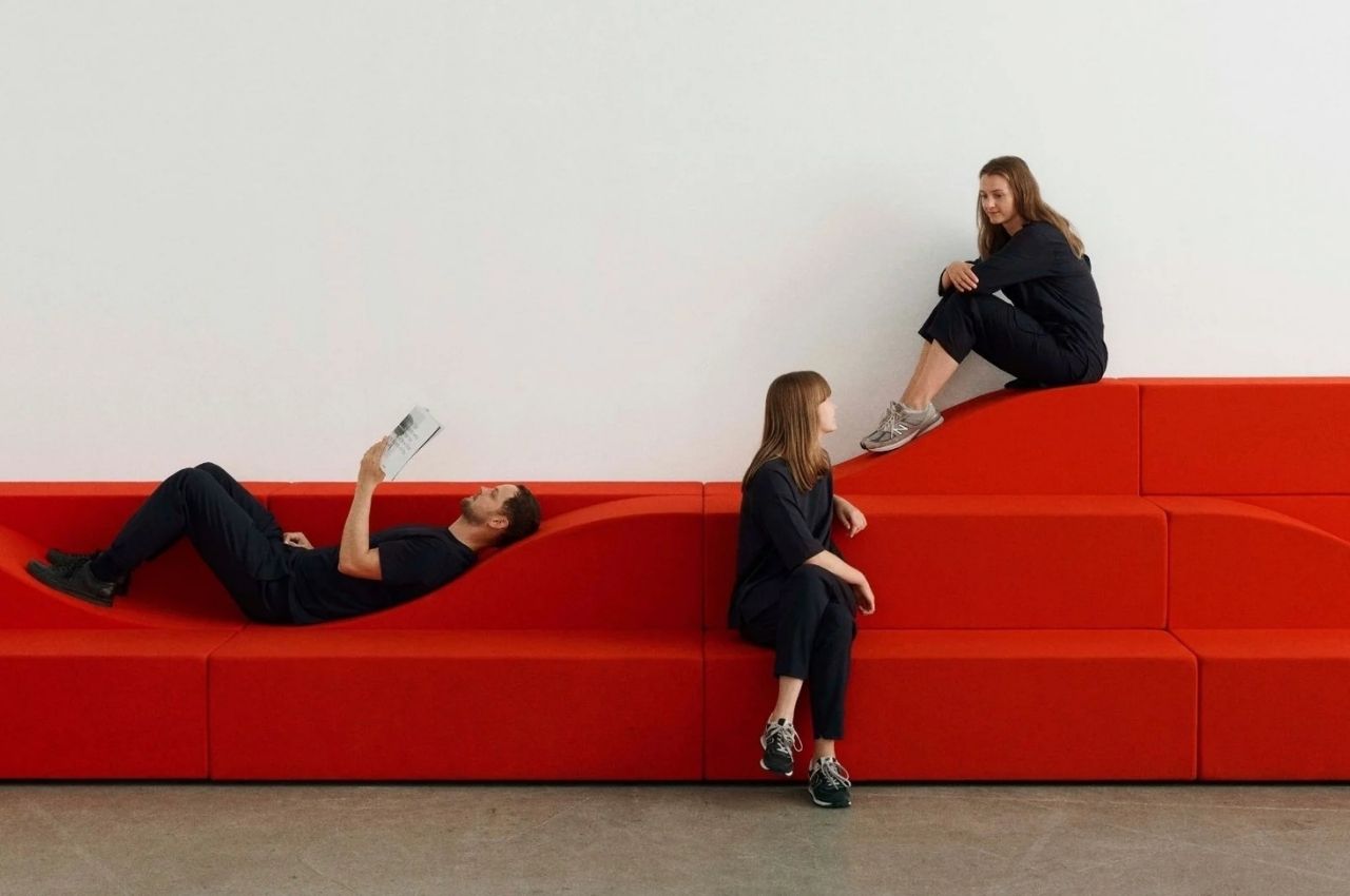
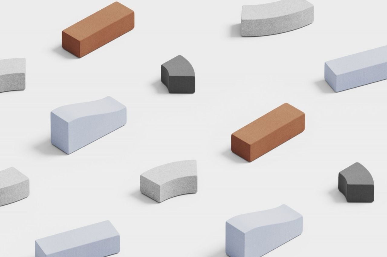
Summit is modular furniture that is designed using a geometric building block system that lets you turn it into a piece of furniture that would fit your needs. It is made up of five modules that can be assembled and re-assembled into various levels, curves, and directions, either in small or bigger installations. So whether you need furniture for a lecture, a meeting, or an office break where you can chat with your colleagues, this furniture can turn into what you need.
Why is it noteworthy?
The furniture is cushioned and comfortable enough, whatever you arrange it to be. The design can resemble those social amphitheaters that we see in open parks or even the Spanish Steps in Rome. You can also turn it into an “indoor mountain range” if you need something that is leveled. Summit lets you create an interior landscape that you can explore in your workspace without needing to bring in other pieces of furniture.
What we like
- Perfectly meets the varying needs of your home
- A minimalistic piece of furniture – from the upholstery to the stitching to the cushioning
What we dislike
- No complaints!
3. Sesame
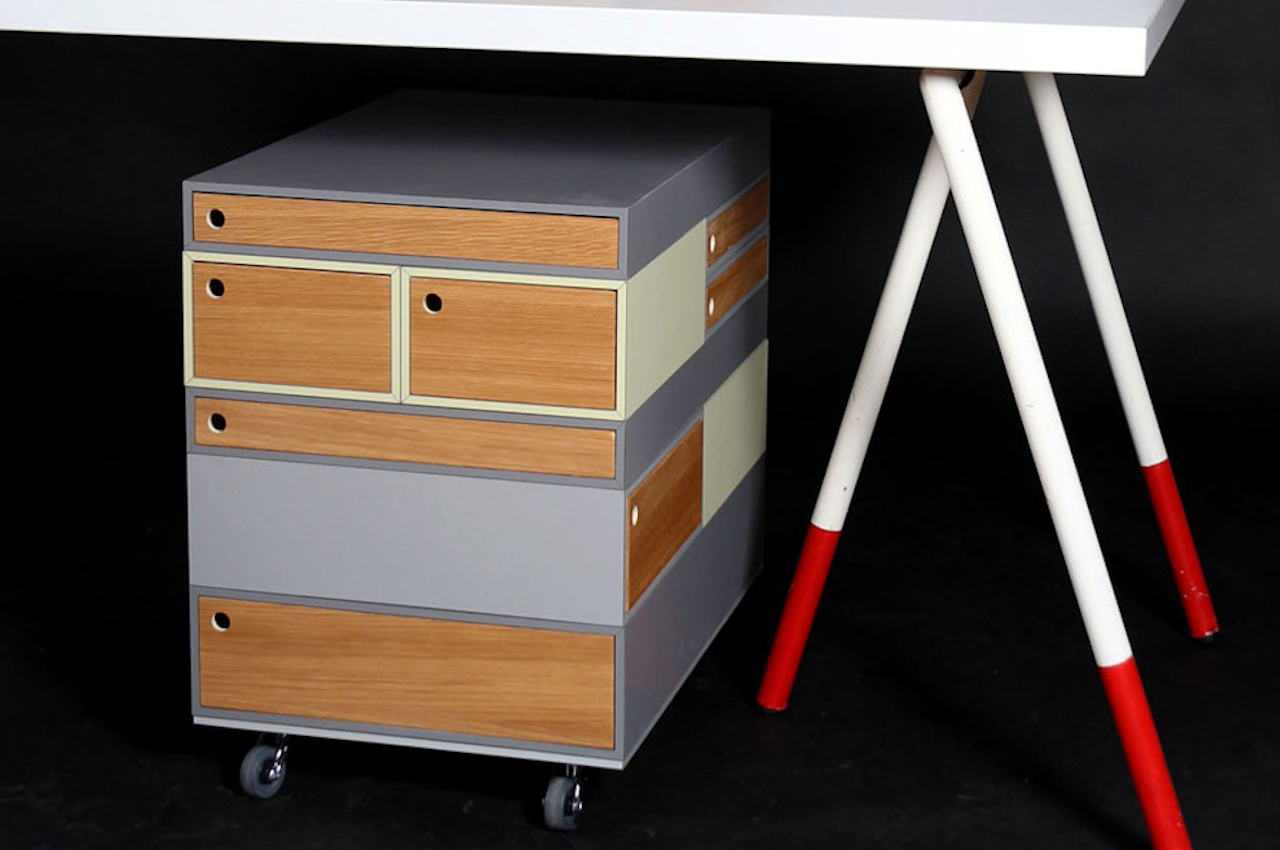
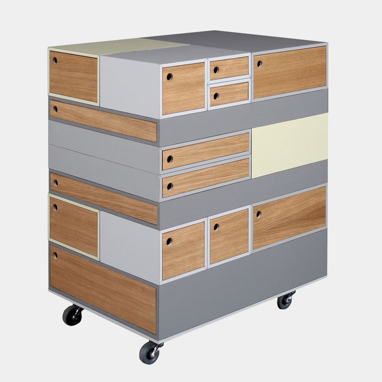
“Sesame” is almost a fitting name for this rolling container because of the way it opens up a magical world of space for your stuff. Every side, every face, and every level of this rectangular box can have a drawer to stash your tools, papers, work, and everything in between. And if you feel those weren’t enough, you can add even more drawers. But when the time comes that you feel those are too much, you can simply remove the ones you want.
Why is it noteworthy?
The secret to this modular system is magnets embedded in the top and bottom panels of these wooden drawers. That allows the easy addition and removal of panels, letting you place them in whatever position or orientation you want. The containers can be opened in both directions, so you aren’t restricted in how you arrange these puzzle pieces.
What we like
- Its size and mobility make it perfect for smaller spaces like home offices or studios
- The container itself is already an organization system, where you can devote one side to work and another to personal stuff
What we dislike
- No complaints!
4. The Console Desk
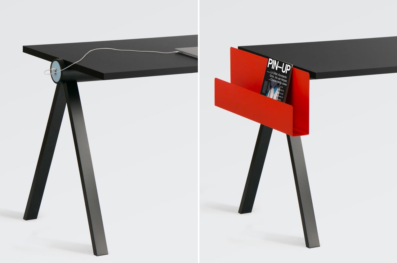
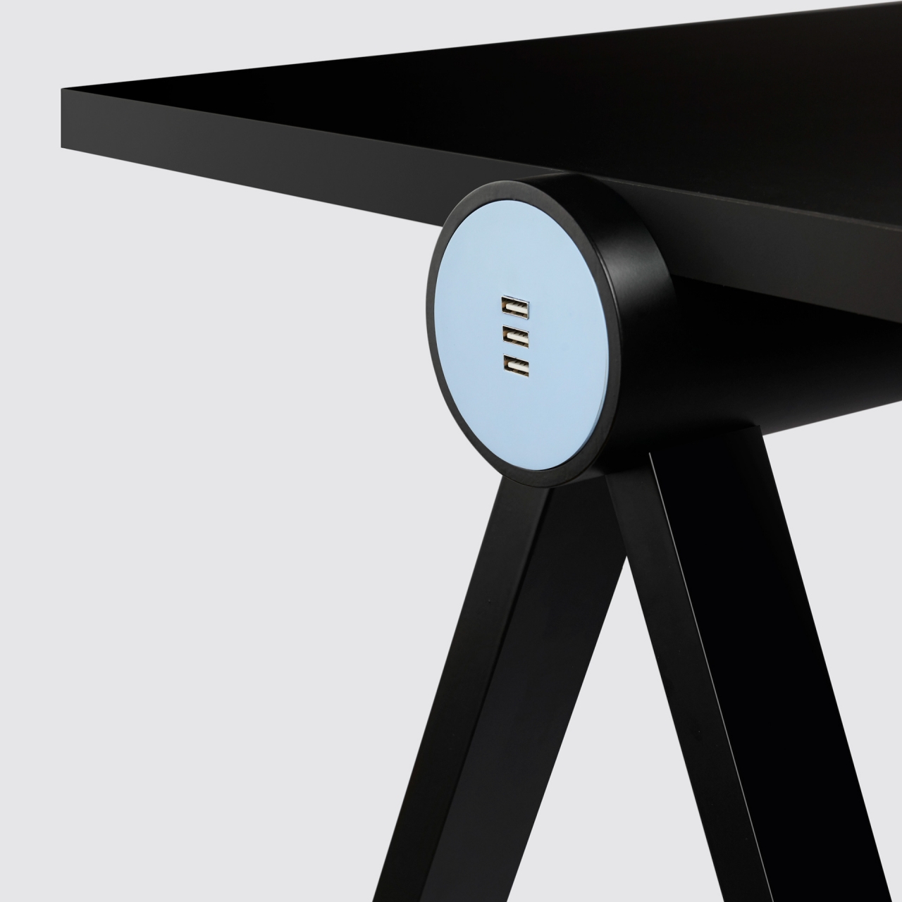
At first glance, the Console desk does look like a painfully plain wooden desk on metal legs, with nothing more to offer than a clear space to put your working tools on. As they say, there is more than meets the eye in this case, and this Console Desk is actually a modular workstation designed to meet the needs of computer users.
Why is it noteworthy?
A lot of desks come with their own pre-defined designs that often dictate how you can organize your stuff around them. Tables that are like completely blank slates, on the other hand, offer a lot of freedom but are often bereft of any other useful feature that modern workers would need these days. More often than not, you’ll be forced to add lots of cables, even just for charging, which means trying to come up with some clever cable management to hide those from view. This desk concept tries to bring the best of both worlds together and then some.
What we like
- The spine of the desk has space, however, for electrical cables to run through, creating built-in cable management, at least for USB-powered devices
- It is admittedly more like a blank canvas that gives you the freedom to paint your own masterpiece
What we dislike
- It’s still a concept!
- Might not be the most exciting table as far as visual design goes
5. Puffa
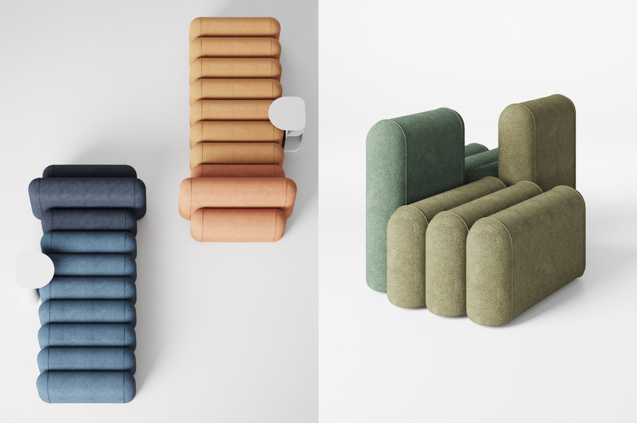

A pouf, however, often only accommodates one person, which means you might want to have more of them if you want to seat more. You could get a sofa, but that ties you into a fixed size that will forever take up a portion of the area, at least until you throw it out. Combining pouf and sofa, the “Puffa” tries to let you have the best of both worlds while leaving plenty of room to change your mind repeatedly later on.
Why is it noteworthy?
The Puffa is designed to be modular so that you can combine or remove segments as the need arises. You can have a single pouf-like arrangement with three standard size capsule-like cushions, or you can have a long sofa that combines a number of cushions with one extra tall piece for the backrest. You can even have two chairs if you don’t need a full sofa taking up a single stretch of floor space.
What we like
- Combines a pouf + sofa
- Puffa is envisioned to come in different colors, and you can mix and match them to your heart’s desires or aesthetic tastes
What we dislike
- Might not be the most comfortable thing to sit on!
6. FLUP
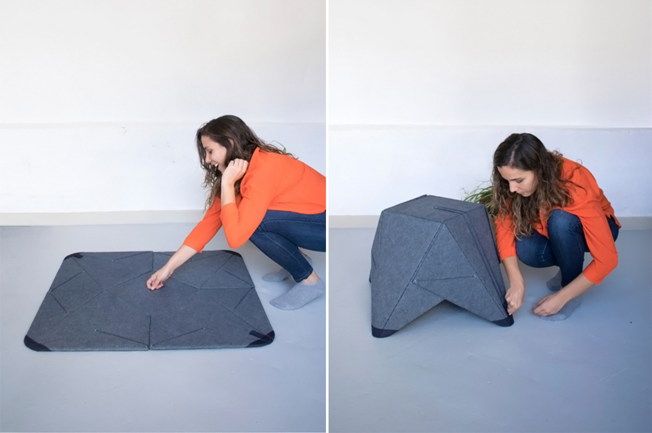
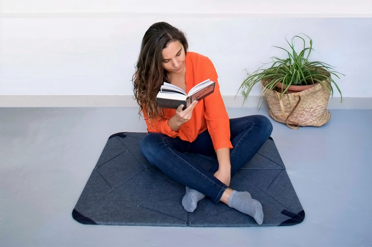
Who isn’t fascinated by transforming furniture designs? I love watching how furniture can serve multiple purposes by simple actions like a pull of a string or folding of a flap. My latest love in the realm of (furniture) transformers is FLUP – a multifunctional furniture piece that is both a rug and a seat! Furniture designs like FLUP are perfect for smaller living spaces, especially with the growing tiny house movement.
Why is it noteworthy?
In the unfolded position, FLUP works like a conventional mat or rug on which we can sit or step without interrupting the movement of people through the space. It transforms from plane to volume, from floor to space while changing the function with its shape. In the folded position, it works as a piece of minimal furniture – it can be used as a pouf, an auxiliary seat, a footrest, a nightstand, etc.
What we like
- Transforming design
- Space-saving
- Ideal for tiny homes
What we dislike
- Doesn’t rate high on aesthetics
7. Deku
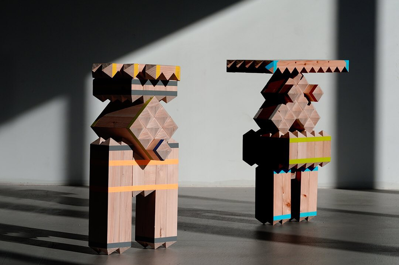
Deku is a modular furniture building system composed of wooden planks that fasten together at the planks’ 45-degree, pyramid-shaped edges.
Why is it noteworthy?
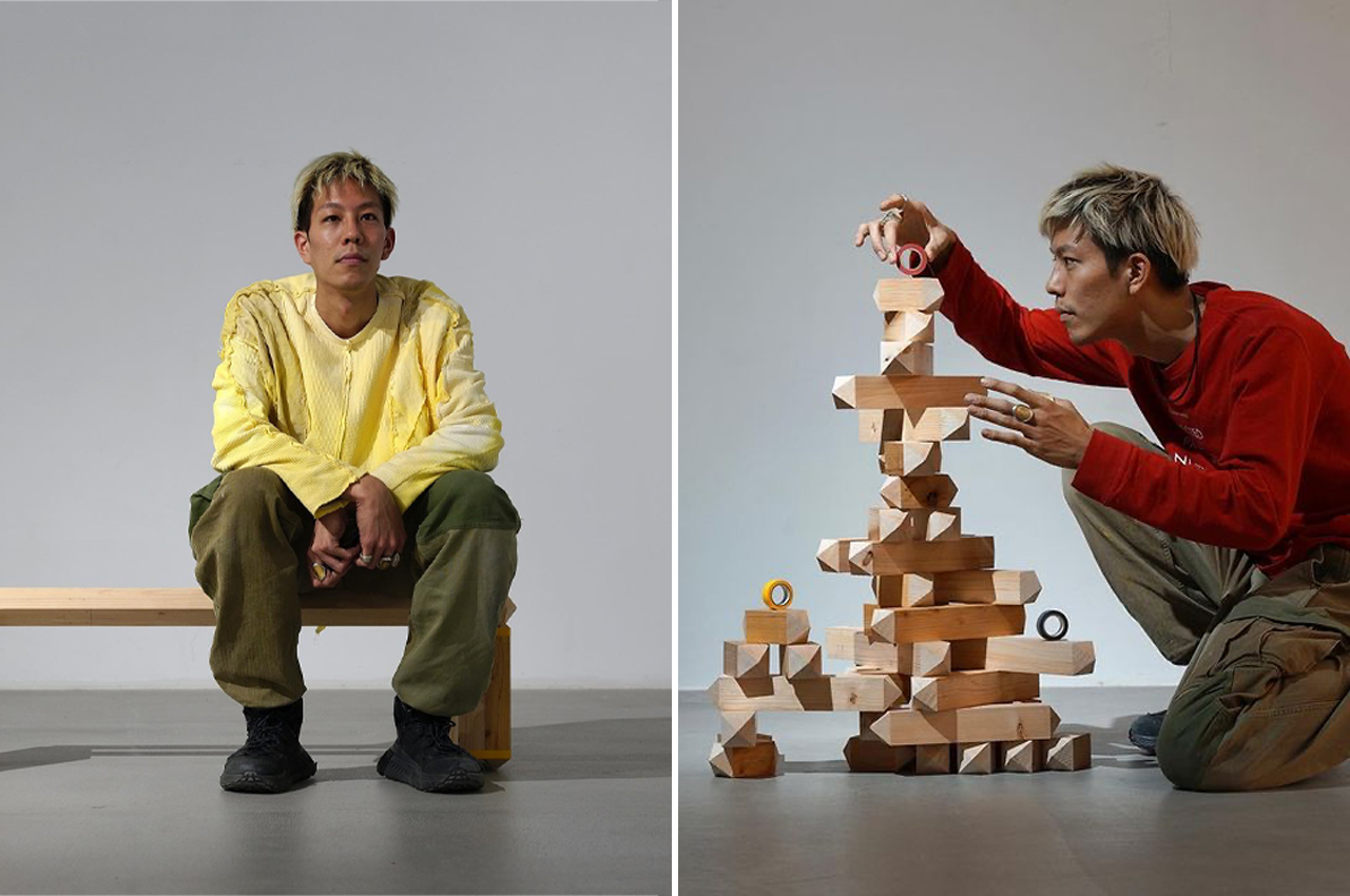
Combining their artistic skills with the practical edge of an industrial designer, Takuto Ohta designed Deku, a modular furniture system comprised of wooden planks that can be stacked and configured together to form numerous different furniture pieces, from tabletops to benches.
What we like
- Deku is inspired by the stone piles that wash ashore on riverbanks
- Ohta sharpened the ends of each wooden plank to form 45-degree angles, allowing each wooden plank to slink into one another with ease
What we dislike
- No complaints!
8. The Threefold
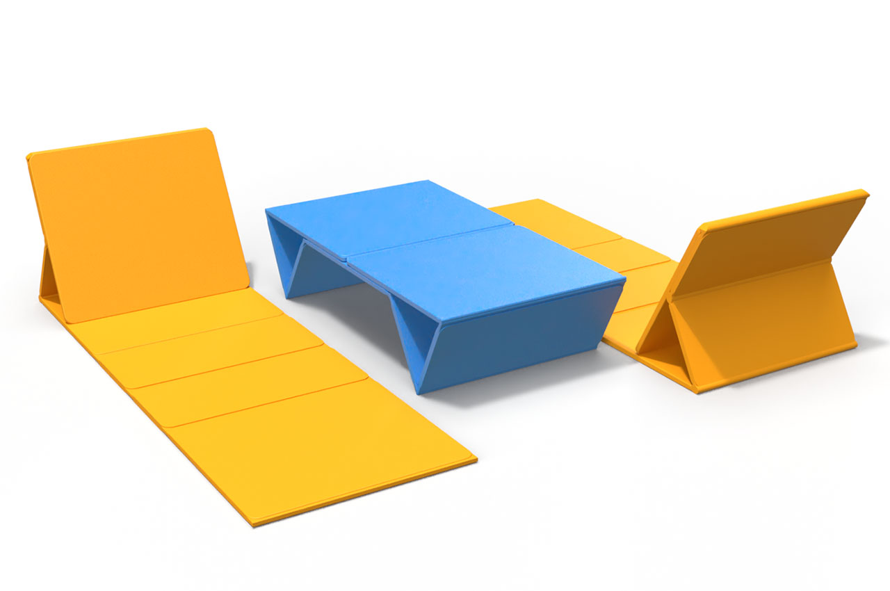
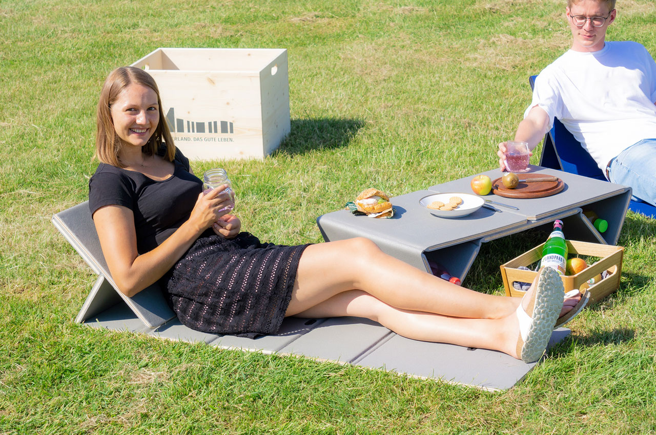
This modular furniture brings to the users a lounger they can lay back on with support, or it can instantly transform into a low stool for the aged who cannot sit cross-legged on the ground. And when you want to keep your food or a board game you’re carrying along, the Threefold can become a sturdy table. A perfect companion for picnics and camping, the Threefold construction is supported by stretchers and is safe and secure to use.
Why is it noteworthy?
There is frankly no dearth of adaptable furniture for picnics, camping, and outdoor events, but the Threefold presents its own use case, courtesy of its incredible versatility and effortless, timesaving flip in form. This is essentially true since the traditional mats we carry to the outdoors are limited in form. The fabric mats would offer more comfort, versus a semi-wooden mat as the Threefold, however, it has limited application. If you’d have realized, it excludes a section of users who cannot sit on the ground from convenience and comfort, compelling you to carry an additional folding chair. The conceptual Threefold outdoor furniture here extends adaptability to each individual’s needs in one useful unit.
What we like
- Transforms into a lounger, stool, and coffee table
- Safe + sturdy design
What we dislike
- Not very aesthetically pleasing
9. The Home Tool
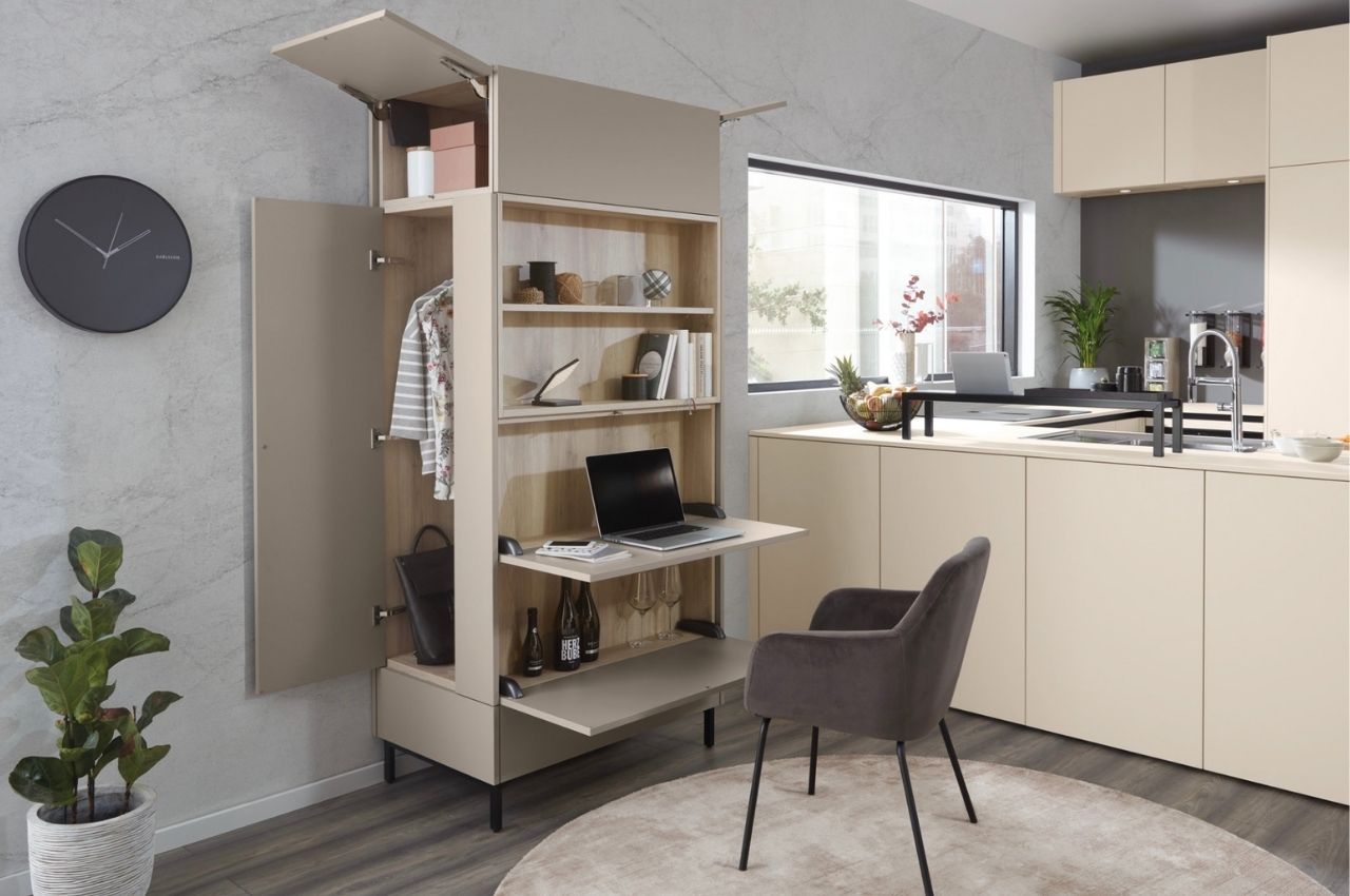
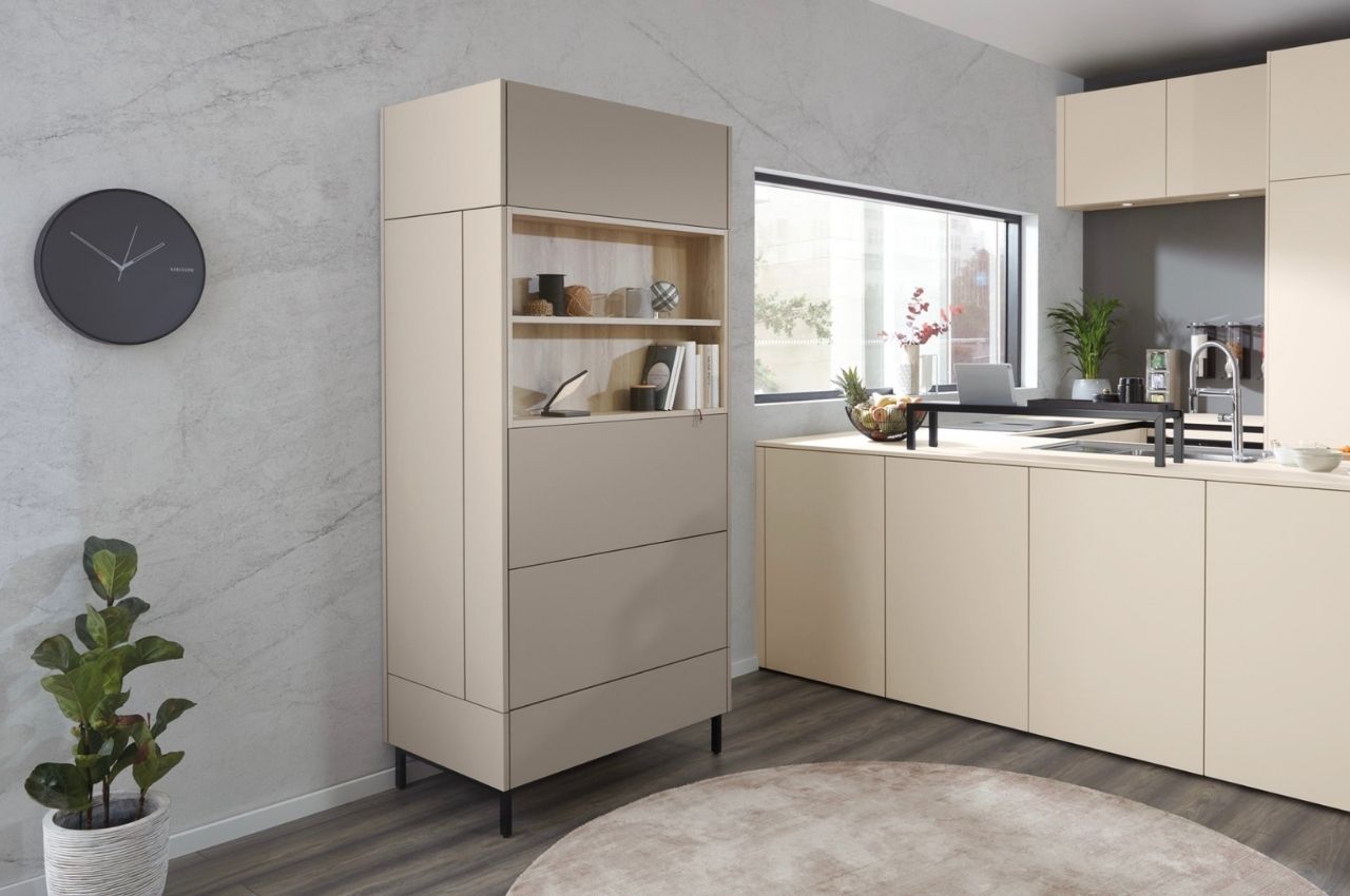
Normally when we see modular furniture, it’s meant for certain parts of the house. We’ve seen shelves and storage spaces for kitchen or work areas that also work as bookshelves and stationery storage space. There are also tons of closet space-saving furniture and systems out there. But this Home Tool seems to combine all of these things and more into a tiny package that will occupy just 0.45 square meters of your floor space.
Why is it noteworthy?
When “deactivated” or all the other panels are closed, you’re left with two open shelves where you can place books, decorations, or even jars of snacks that you’d want to have within reach. There’s a “desk” or work area that you can bring down where you can place your laptop or you can write or study on. Under that is another pullout type where you can place wine bottles. That way you can reward yourself instantly after you finish work or a task.
What we like
- The Home Tool has enough compartments and space to place various things that you need to be stored or displayed
What we dislike
- It’s still a concept!
10. Non Square
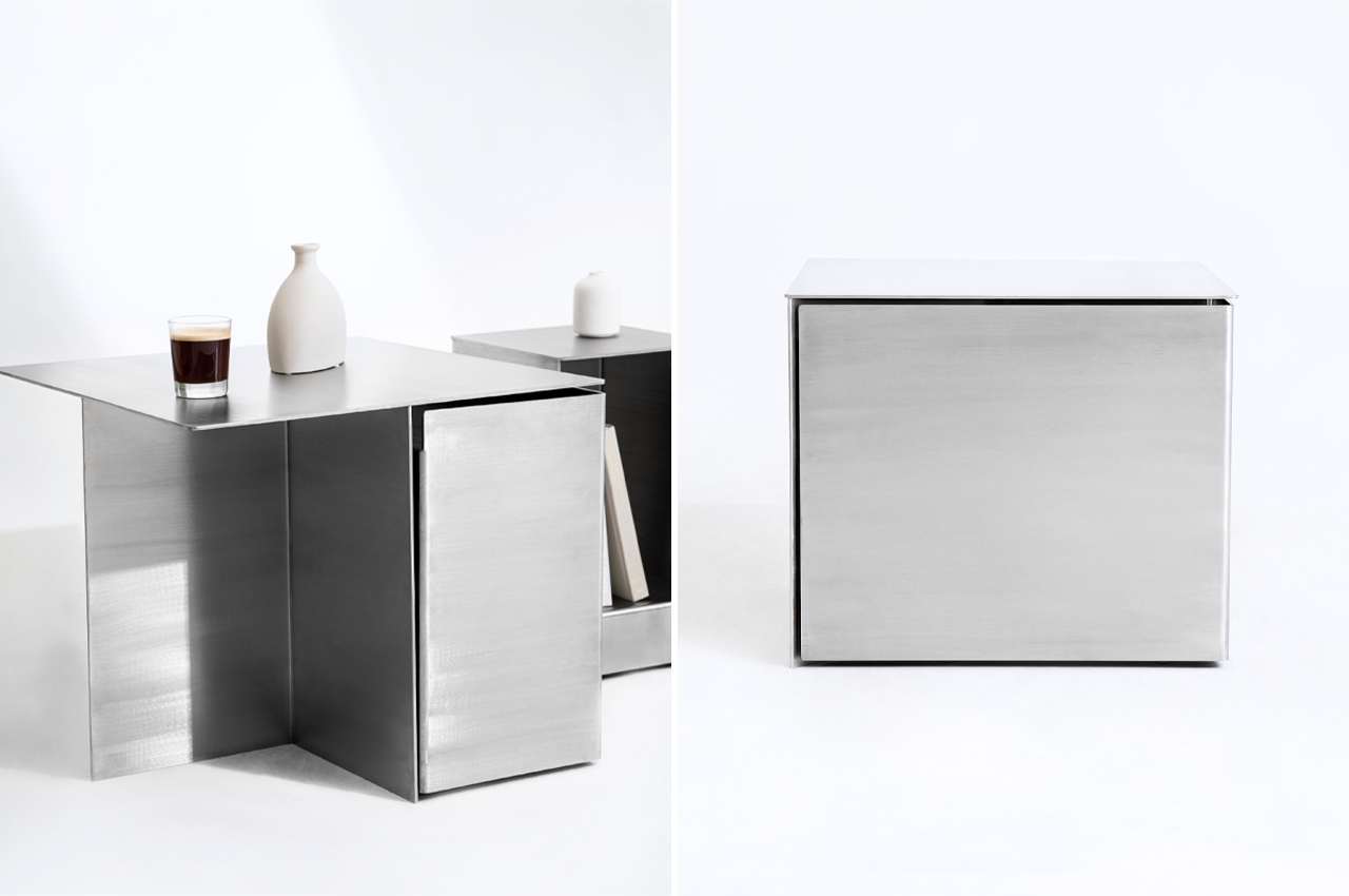
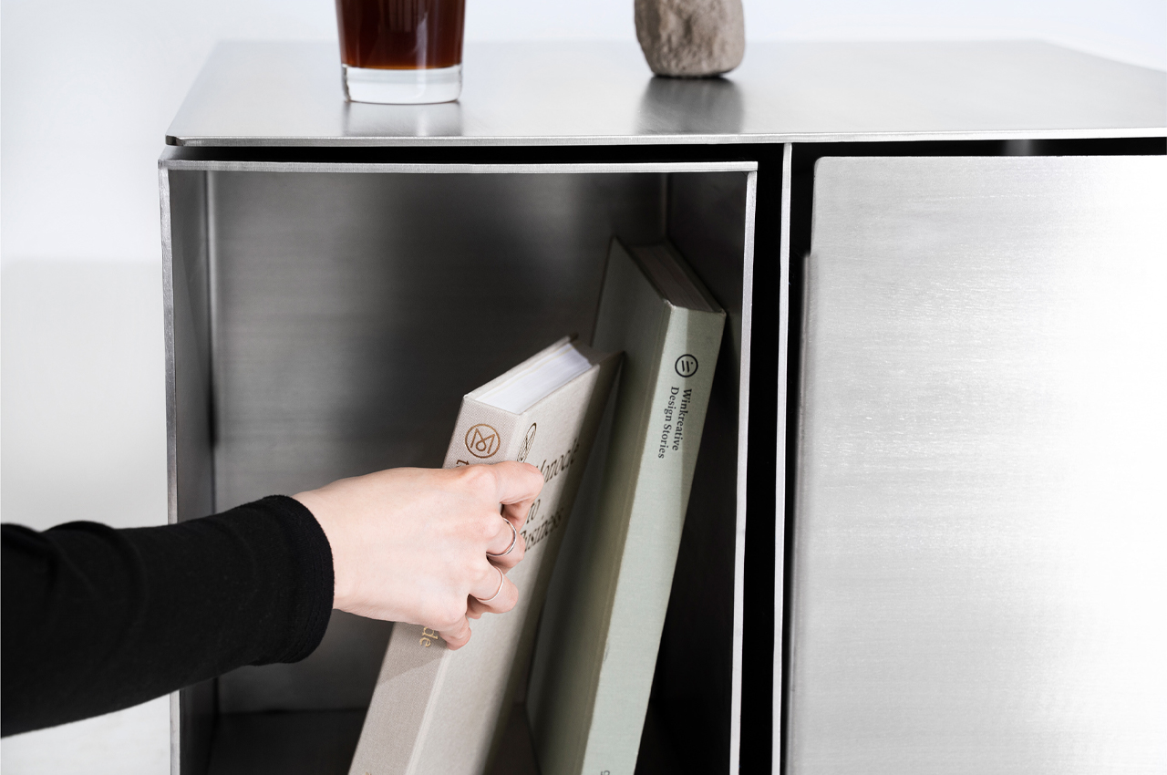
Introducing Non Square, the team of designers explains that, “It [pursues] the beauty of irregularity within, as opposed to regularity on the outside.” From the outside, Non Square sports a minimalist, stainless steel appearance that seems like a nondescript side table dressed as a cube. A closer look and Non Square’s larger purpose is revealed.
Why is it noteworthy?
Functionality typically stems from a product with a long shelf life and the ability to execute its primary purpose. Adding their design to the mix, Hyunjun Yu, Soojin Jung, Kyoungseo Park conceptualized Non Square, a furniture set that integrates side tables and stools within a stainless steel hexahedron structure.
What we like
- Hidden storage compartments
- Modular design
What we dislike
- The product’s bulky + metallic aesthetics may complement only certain living spaces

