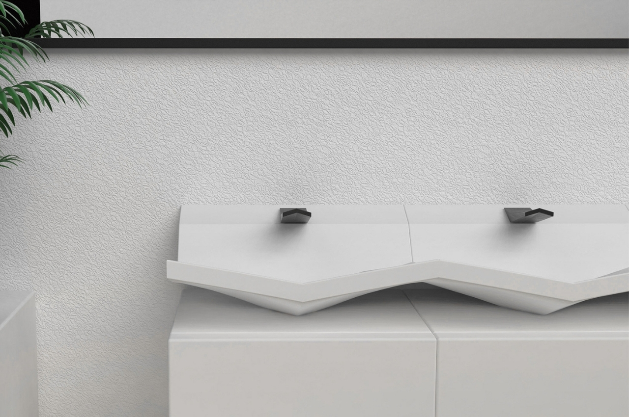
When you go to public restrooms, you don’t really notice if a washbasin is well-designed or not. All you need to know is that there is running water and the drain isn’t clogged and you’re good to go. But places like hotels, museums, and event spaces sometimes put a little more thought into the design of things like this so you get some pretty cool sinks, faucets, wash bowls, and other connected accessories to washing. This concept is another case of something functional and yet beautifully designed.
Designer: Elif Bulut
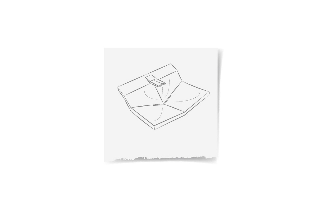
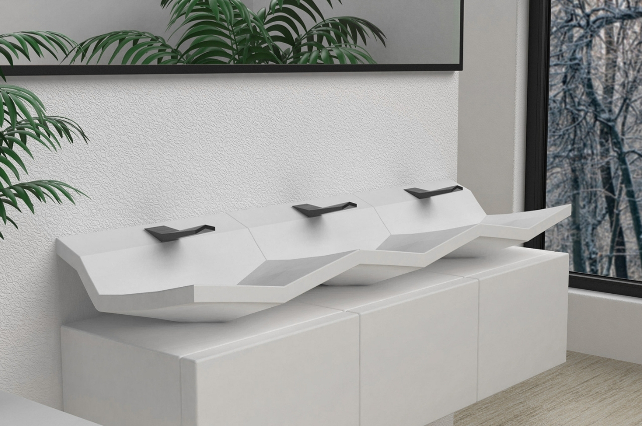
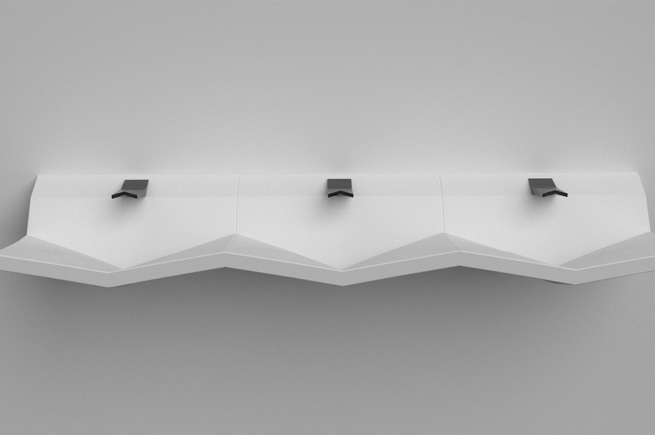
This concept for a ceramic washbasin is called Angle. It gives you a different look for a sink, one that shows off different angles through the combination of various shapes, mostly triangles. But this isn’t just something decorative as the design is actually to make it easier for the water to go down the drain. The drain itself is actually less visible and so you get a cleaner and more minimalist look without seeing the water actually going down.
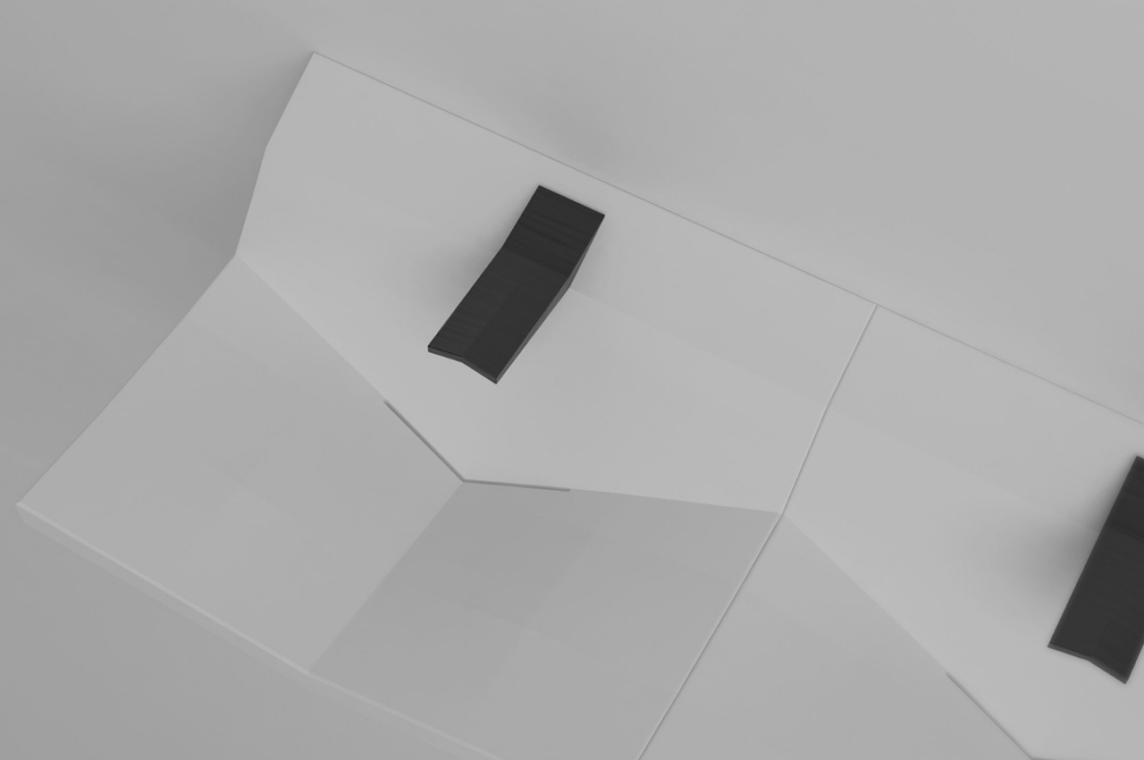
The washbasin uses curved and triangular surfaces from the faucet to the basin itself. The drain is actually a tiny opening at the corner of the basin so all the water that comes out of the faucet will just flow towards there without you having a visible drain. The V-shaped basin makes it easier to drain the water. However, I’m not so sure what will happen if there are some particles that will not slot through the pretty thin drain at the corner.
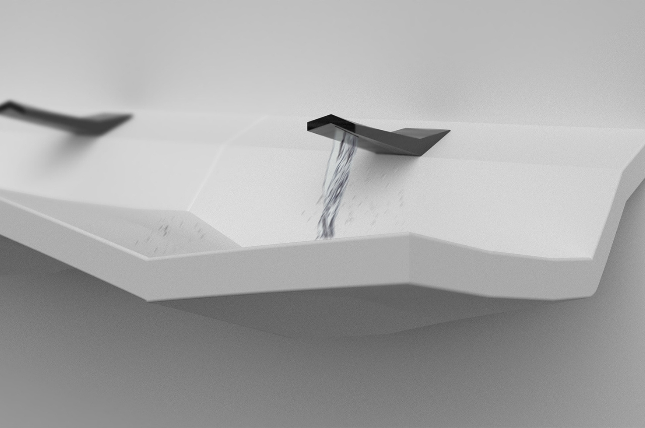
The washbasin is placed on a cabinet-like stand both made from ceramic and sporting a monochromatic white color, with the gray/black faucet being the only different color. The product render doesn’t really show how the drain will work but other than that, this seems to be a pretty nice design that would look right at home in a hotel, spa, or even a posh apartment.
