It’s not uncommon for design trends to swing back and forth like a pendulum, making what was once old new again or seeing old practices in a new light. That kind of back and forth seemingly applies to almost all facets of life and history that it became even part of major philosophies. All that it means is that what may be the prevalent style or mindset now could take a U-turn after a few decades, and all our obsession with advanced technologies could lead to a counter-movement that will bring us back to nature and the basics. The tech companies today won’t be the same decades from now, and some of them might even adopt a style that might even be perceived as devoid of tech completely, like this wooden chair that might be Google’s signature furniture 24 years from now.
Designer: Povilas Grigas

When it comes to tech companies, Google is definitely one of the big three, along with Microsoft and Apple. With its hands in so many different technological fields, you could almost say that it is the most popular icon of technology. The company has undergone so many changes since its birth, not least of which is splitting into different companies under Alphabet, but its biggest change is probably yet to come. Just as humans are wont to return to simpler and more natural things, so too Google’s design language might swing that way a few decades from now.
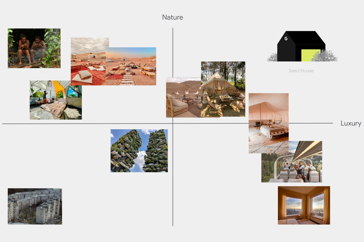
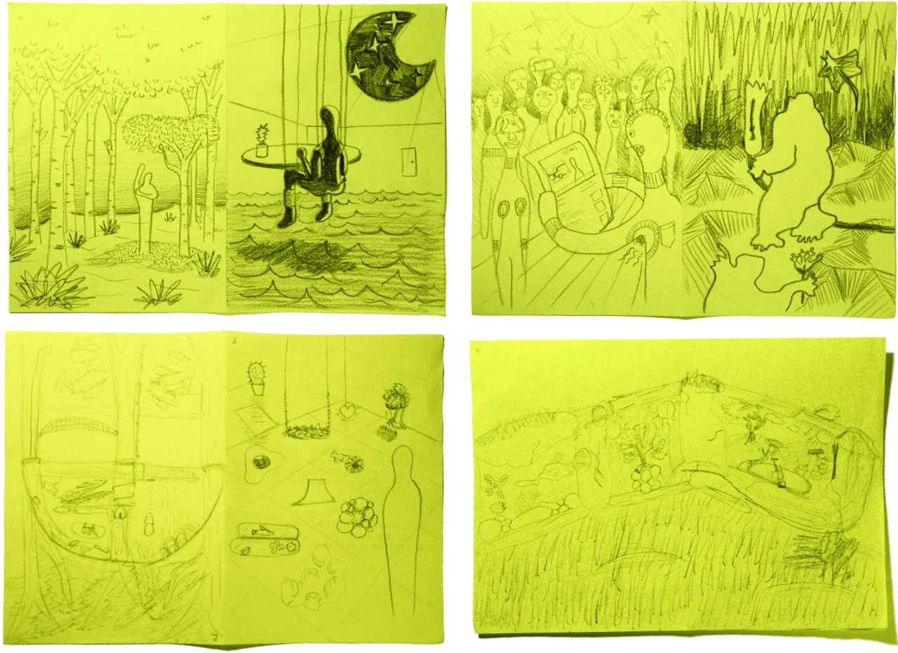
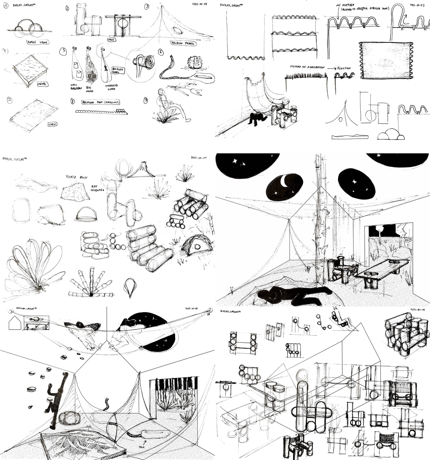
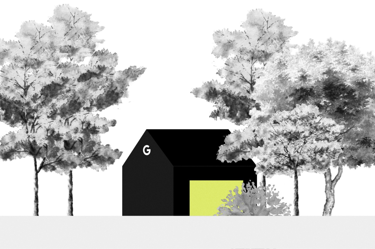
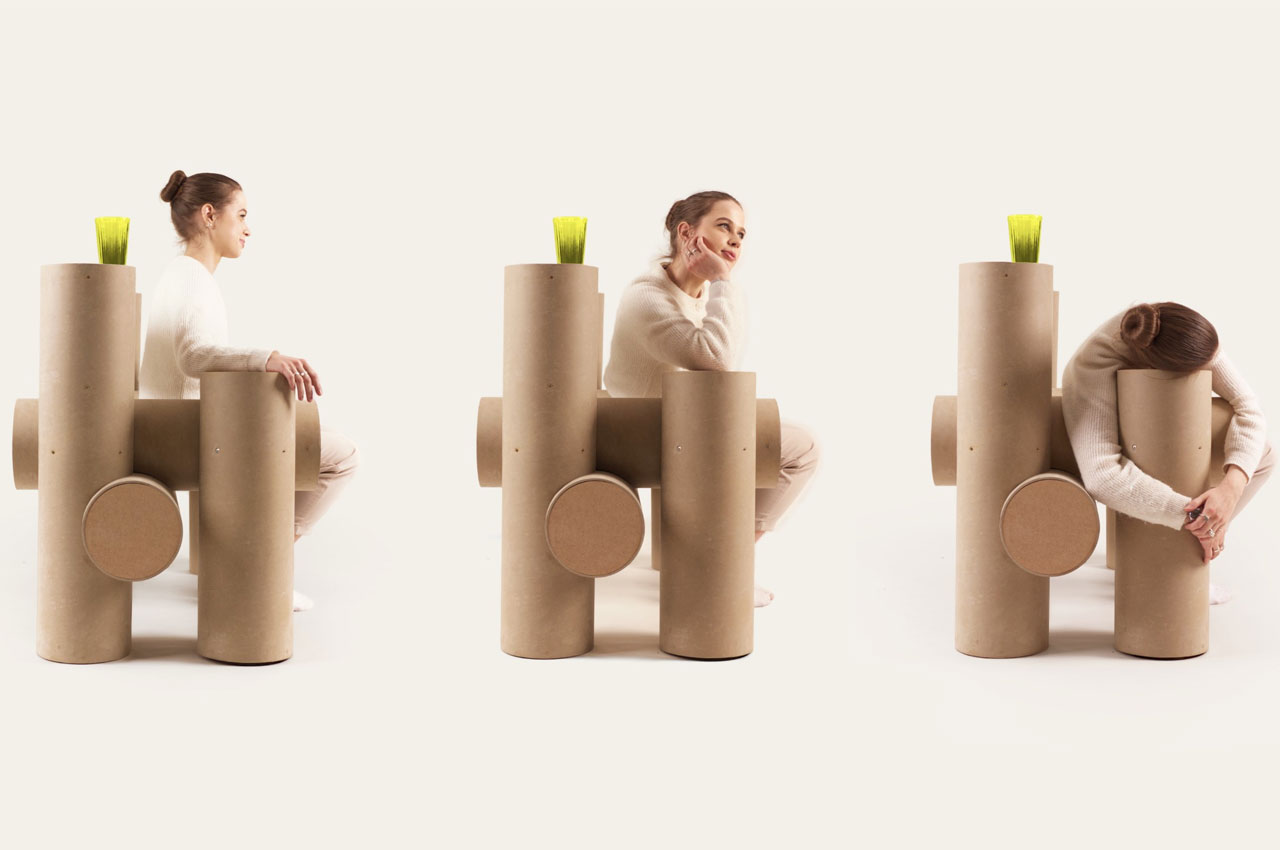
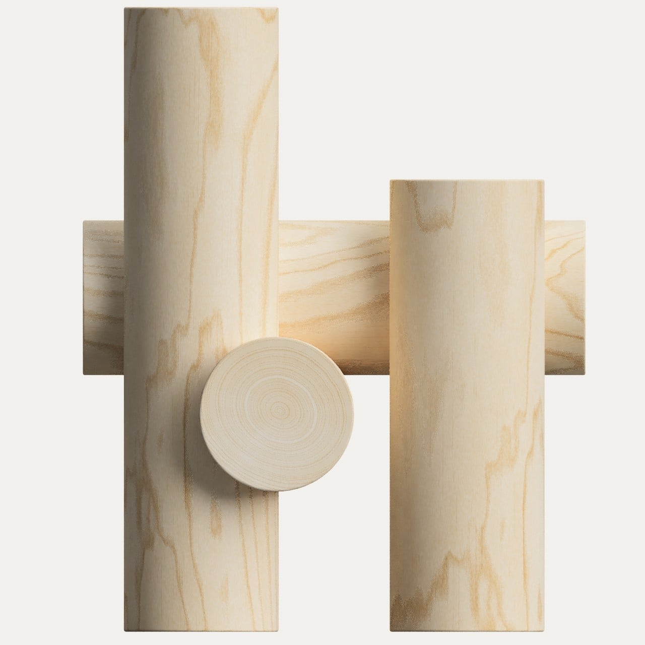
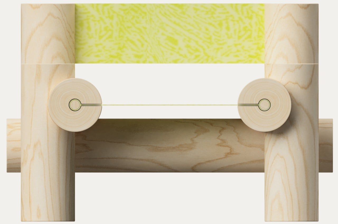
One speculative design project envisions what Google’s design language would be like by 2046 or so, based on the principle above as well as Google’s current design philosophy. Google has always had a penchant for minimalism, though the exact application of that design philosophy changes over time. And what could be more minimalist than pieces of furniture that are not only natural but are also inspired by nature’s more basic designs. The Seed Chair, for example, looks like nothing more than a few short logs joined together to form a seat, representing the most basic interaction between nature and man.

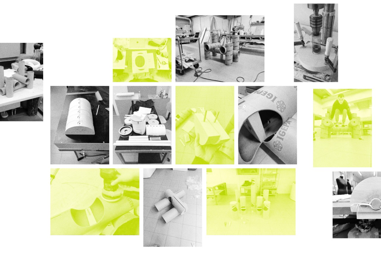

Admittedly, the Seed Chair doesn’t look like the most comfortable seat around, though it does embrace Google’s spartan aesthetics and preference for geometric shapes. At the same time, however, it is almost the complete opposite of Google’s spirit. The chair is large, heavy, and has plenty of friction, while Google’s culture is always associated with agility and fast-paced change, almost to a fault.
Of course, it is unlikely that Google will adopt this nature-centric design wholesale, at least not in the foreseeable future. It is, however, more likely to dip its toes into this area of product design, researching and experimenting with ways technology can make such designs possible, especially with a nod towards sustainability and the use of natural materials. That might be more in line with Google’s character and mindset, one that tries to inject technology everywhere, especially in places where data can be harvested, utilized, and maybe even turned into a profit.
