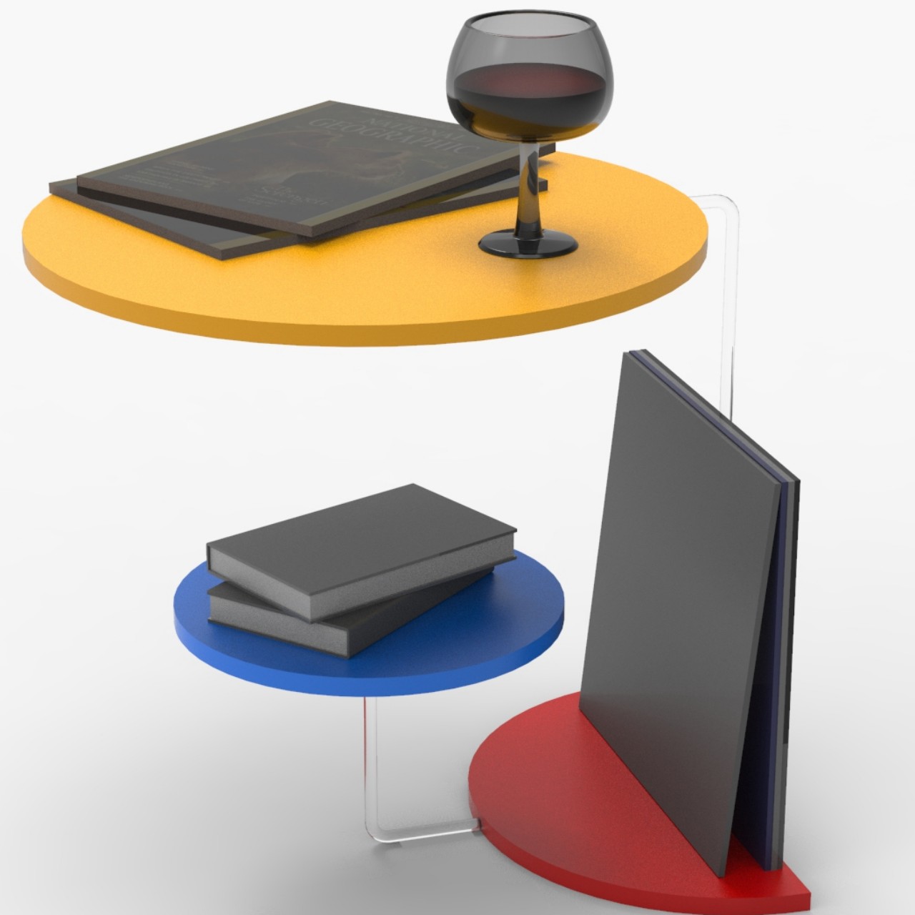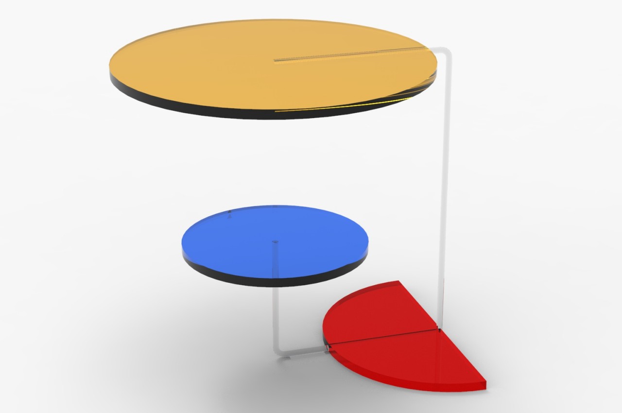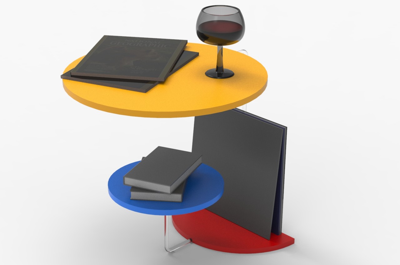
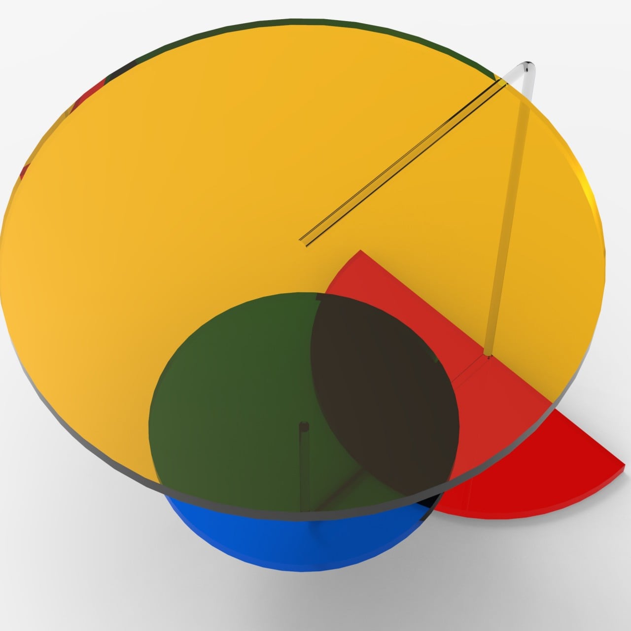
Coffee tables, sofas, side tables, and shelves have all become points of interest and pride these days. Since they usually become the visual centers of a room, owners take the opportunity to use furniture that either reflects their interests and personality or, at the very least, shows off their design tastes. The variety of designs for tables and chairs can range from the ultra-minimalist to the highly elaborate, each with its own advantages and disadvantages. You don’t have to go overboard, however, just to make a memorable impact. This table, for example, is nothing but a few circles, one of which isn’t even full, and three colors, but the asymmetric combination gives it a vibrant and playful character, especially once you start looking at it from different angles.
Designer: Miguel Pinheira
Rendered on KeyShot: Click Here to Download Your Free Trial Now!
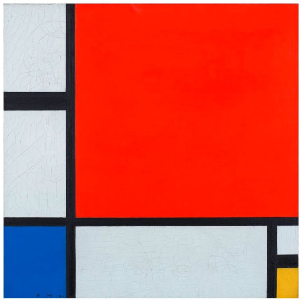
Dutch artist Pier Mondrian showed that it doesn’t take much to leave a lasting impression. His famed “Composition with Red, Blue and Yellow” simply used three colors, aside from black and white, and asymmetrical shapes to create a masterpiece that would be remembered for decades. This harmony of contrasts and economy of colors are what inspired this peculiar table design, resulting in a piece that, while artistic, also conveys some of that tension between elements in a lively manner.
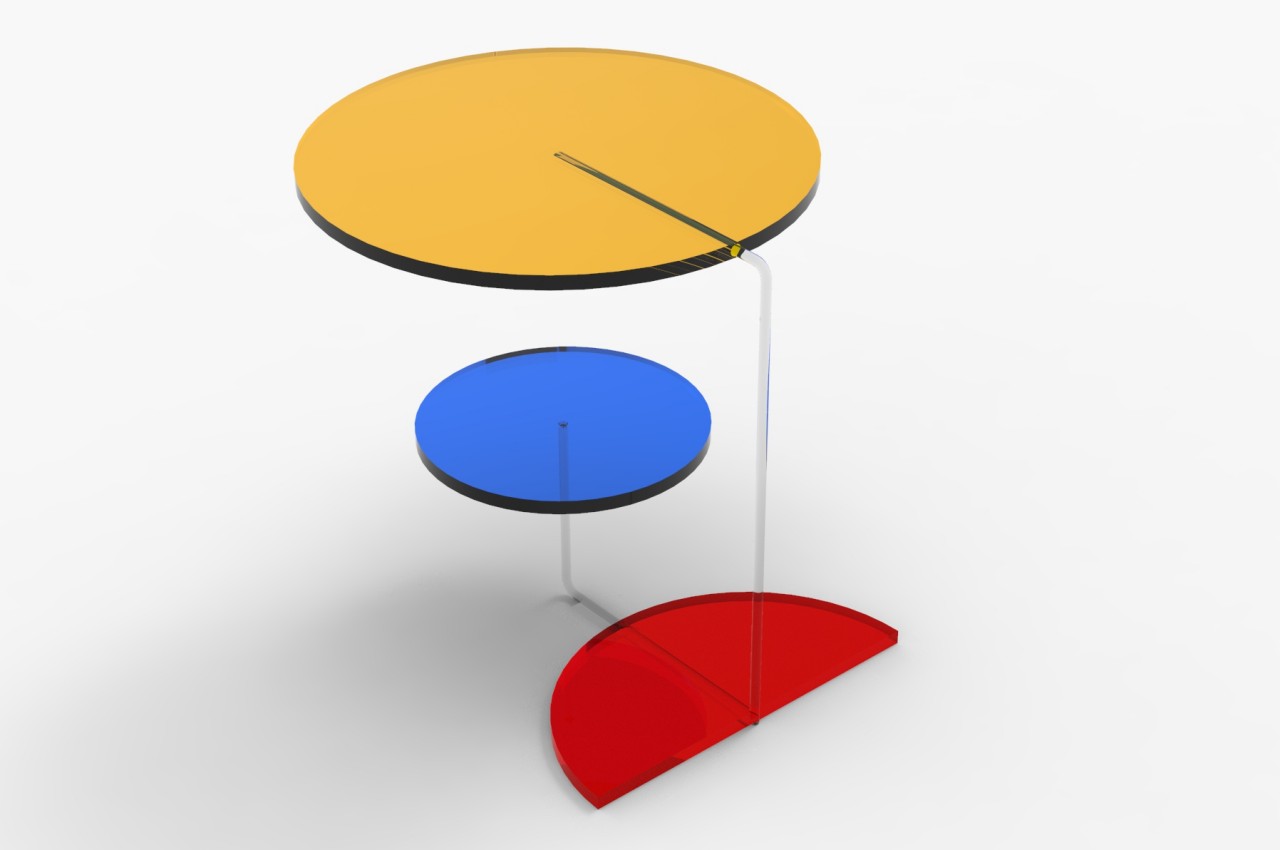
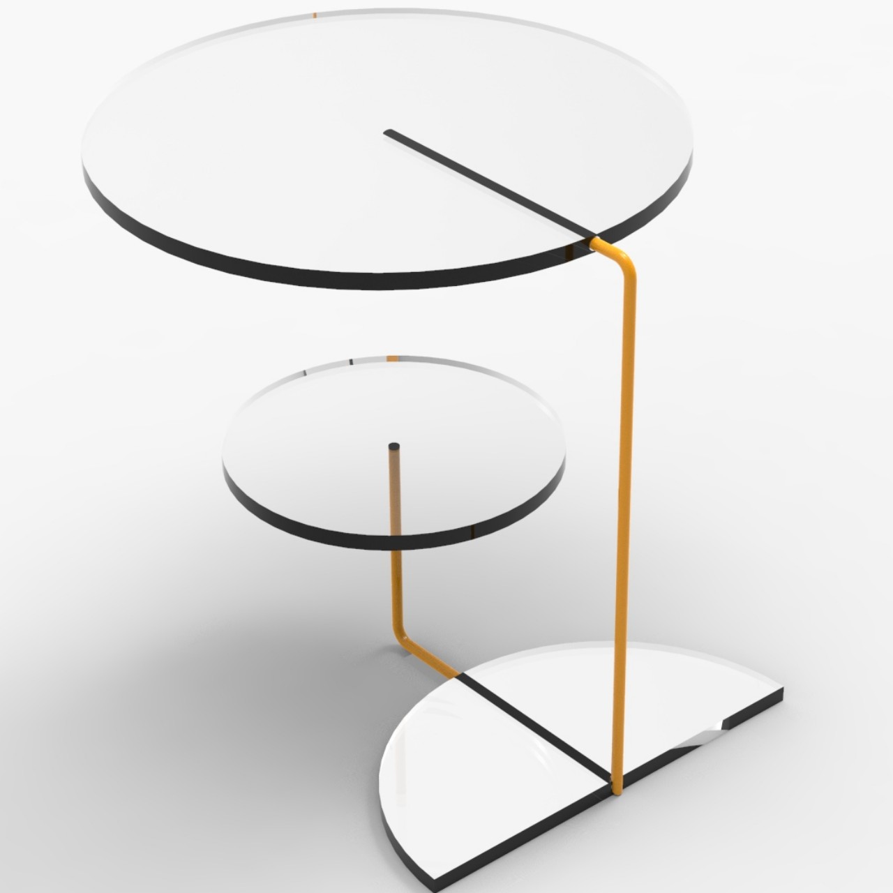
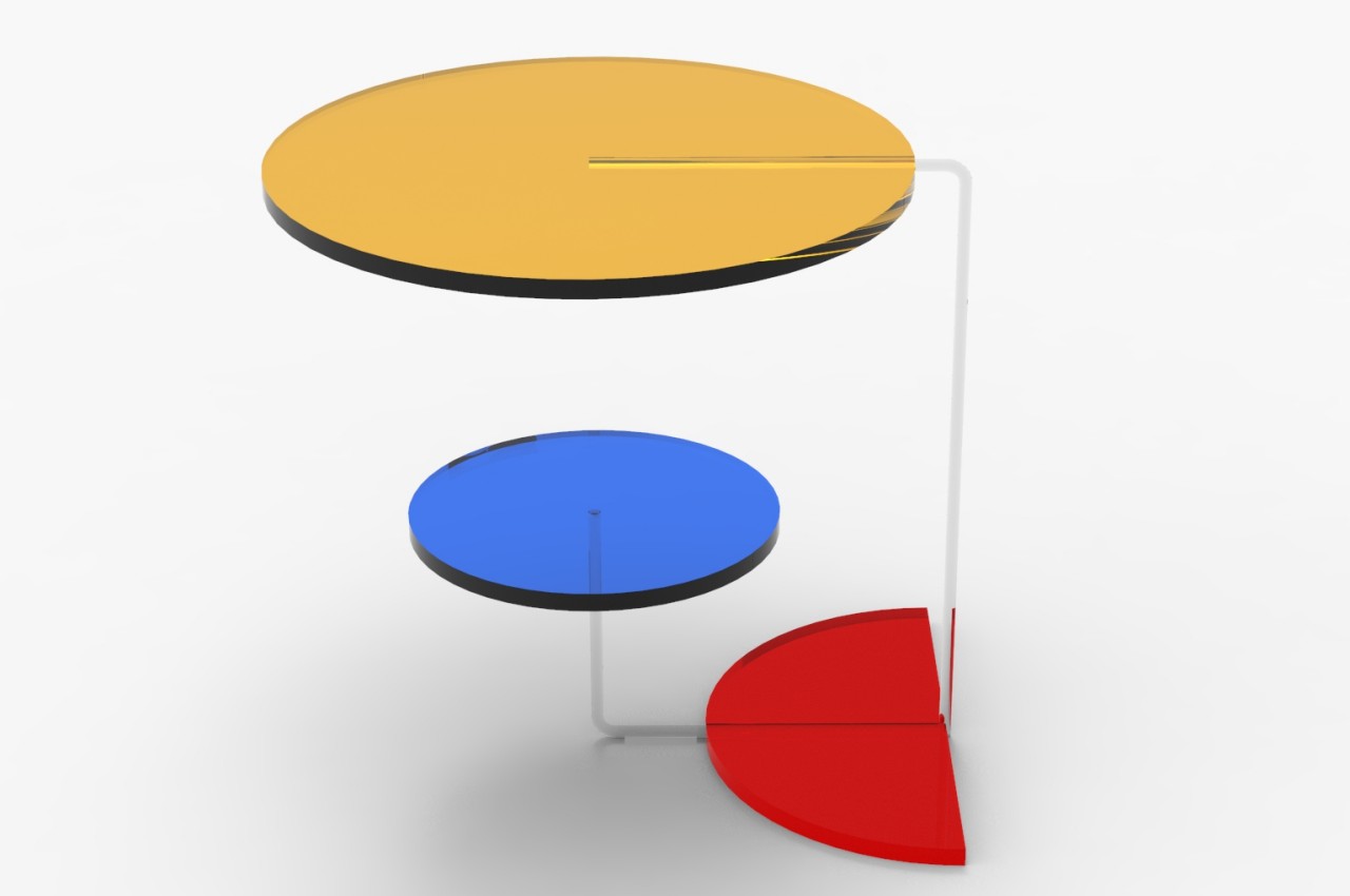
Instead of squares, the RYB Coffee Table uses two circles and a half circle joined by transparent rods that make the circles look as if they’re floating on air. The three pieces serve different functions, like a tabletop, a secondary table, and a magazine or vinyl record holder. The top circle can even be removed and placed in a different position, making the design a bit modular.
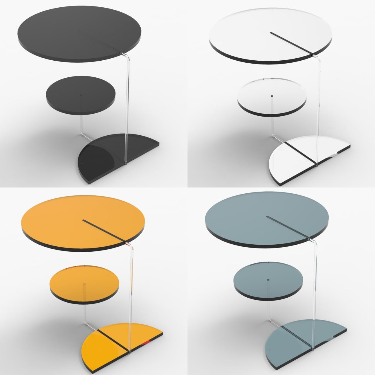
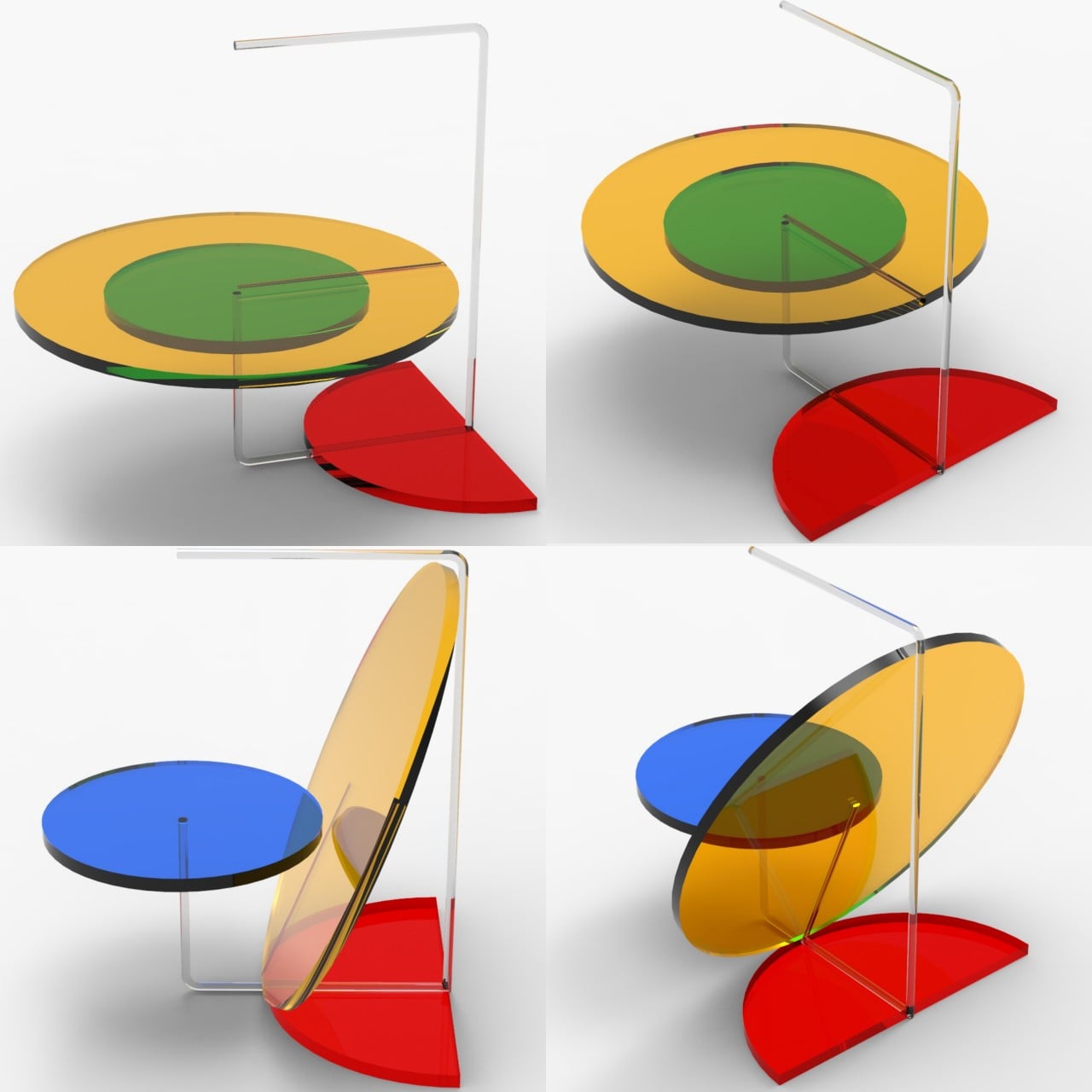
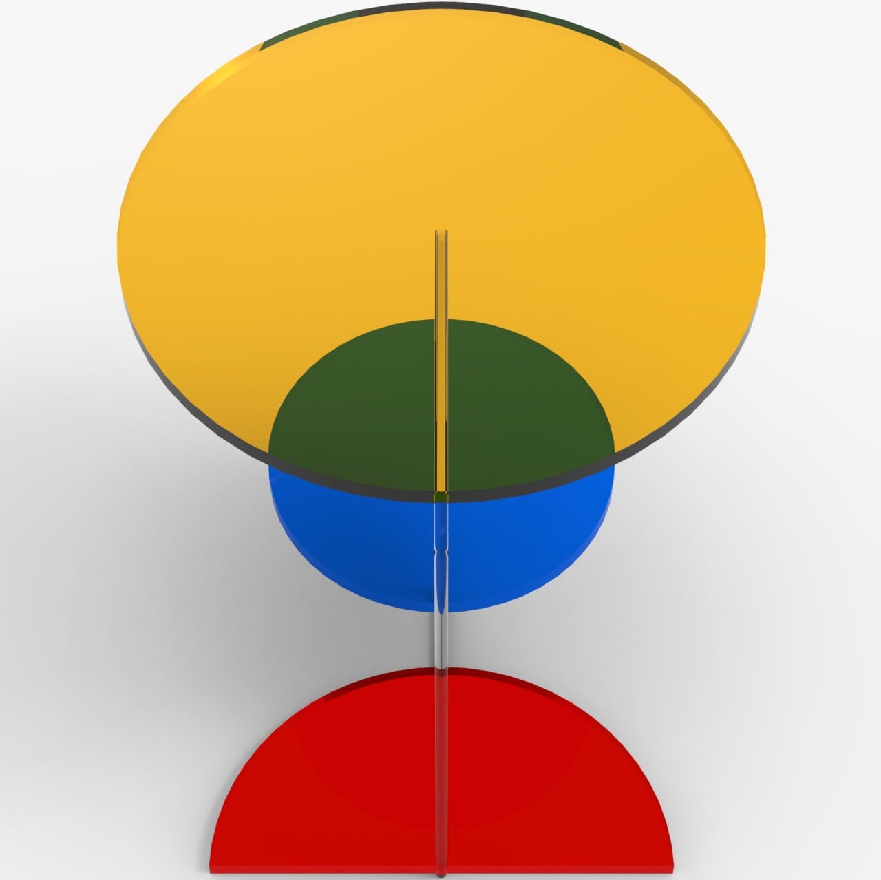
While the main parts can be made of different materials and use a monochromatic scheme, the best effect is achieved with translucent or transparent material and sticking to the original red, yellow, and blue triplet. This particular combination really brings out the table’s personality, making it look like hard candy or stained glass. Even better, looking at the different pieces through each other can bring out other colors, like green resulting from mixing yellow and blue.
In terms of functionality, however, the RYB Coffee Table is probably better as a side table, though it will still manage to grab anyone’s attention, regardless of its location. Its arrangement makes it look a little unbalanced visually, which could make some people hesitate to put anything fragile on top. That’s also why it’s probably better off to the side rather than as a centerpiece, lending a bit of vibrancy and life to the room without getting in the way.
