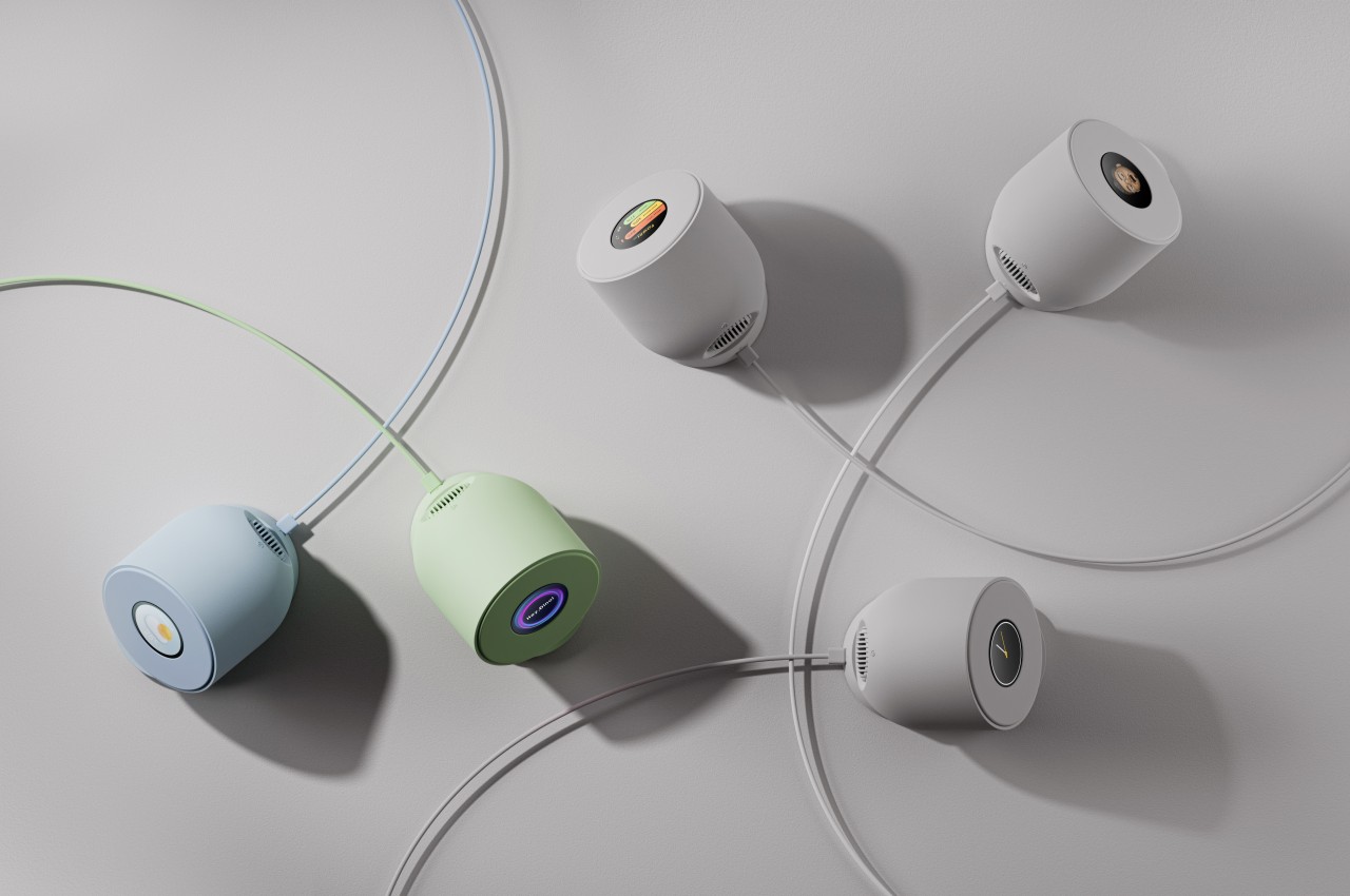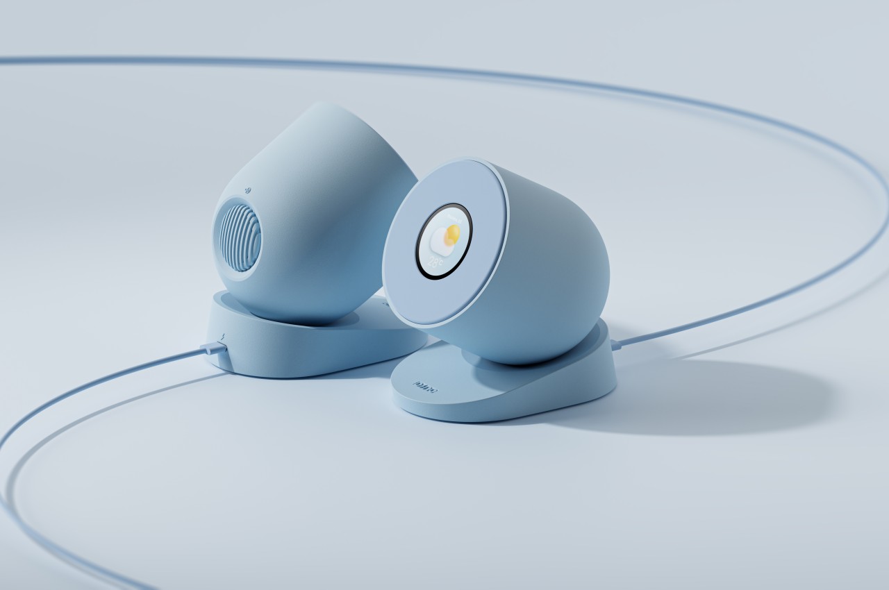
Wireless chargers are becoming more common, and there is also a growing number of designs for these accessories, some of them more interesting than others. Despite the different appearances and functionalities, all these chargers often become practically useless the moment you remove the smartphone from its surface. Some might look interesting and pretty on your desk or bedside table, but they remain passive objects that offer nothing more beyond decoration. There’s nothing wrong with that, of course, but that doesn’t mean there isn’t any room for improvement, especially when it comes to adding additional though unrelated functions. This design concept, for example, gives the wireless charger something else to do when nothing is charging on it, allowing it to provide added value in a way you might not have expected.
Designer: Jerry Kong
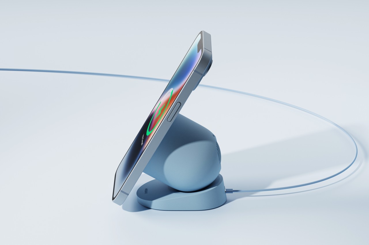
The earliest wireless chargers all came as flat horizontal pads because devices are required to stay still on a specific area right above the wireless charging coil. While the technology still remains limited that way, the introduction of magnets, courtesy of Apple, afforded a little more flexibility. You can now have chargers that are inclined at an angle or even raised a little above the base because they can hold the smartphone in the correct position all the time. What hasn’t changed, however, is that the charging surface remains flat and that this flat area remains unutilized when nothing’s charging on top of it.
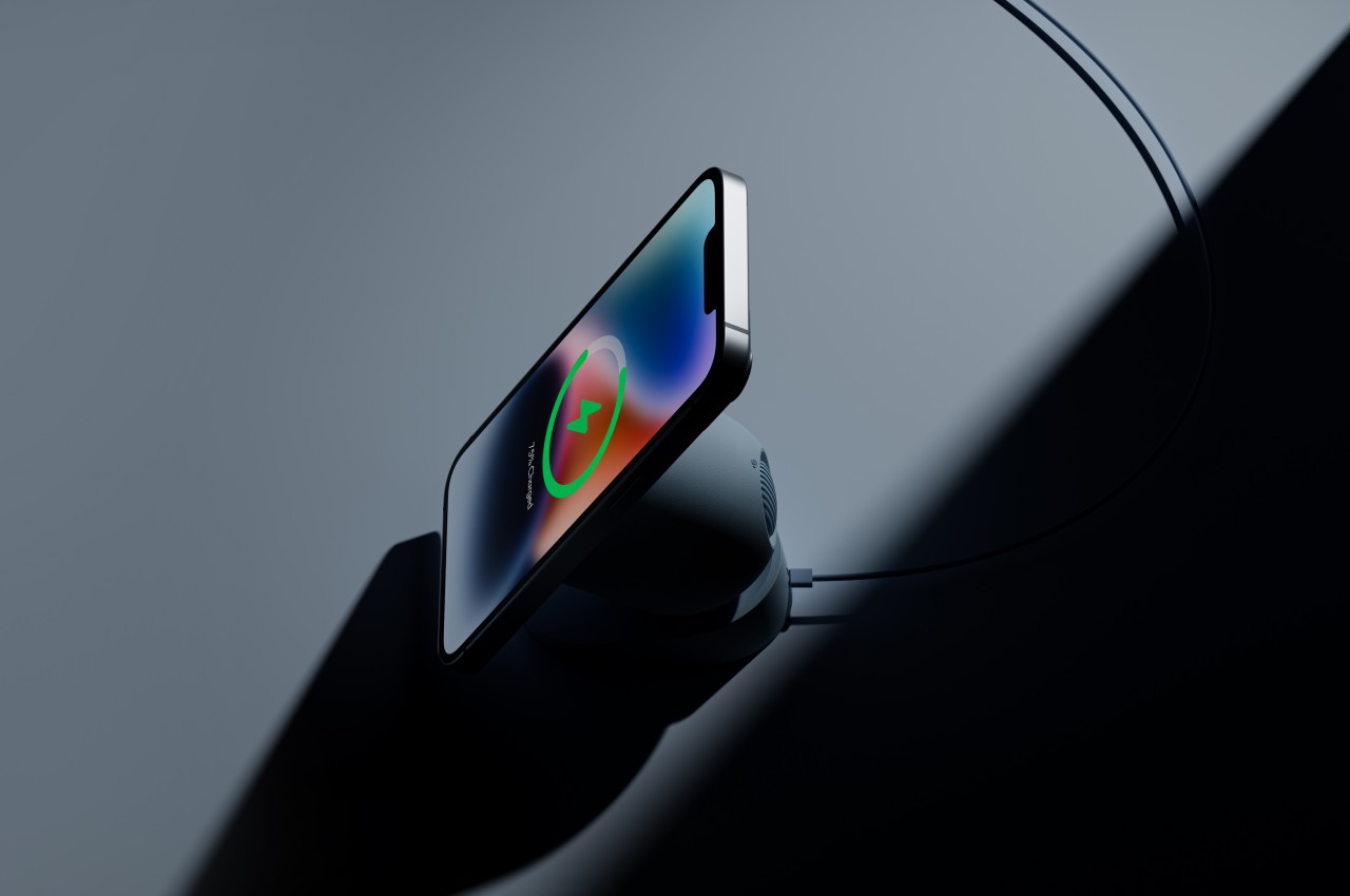
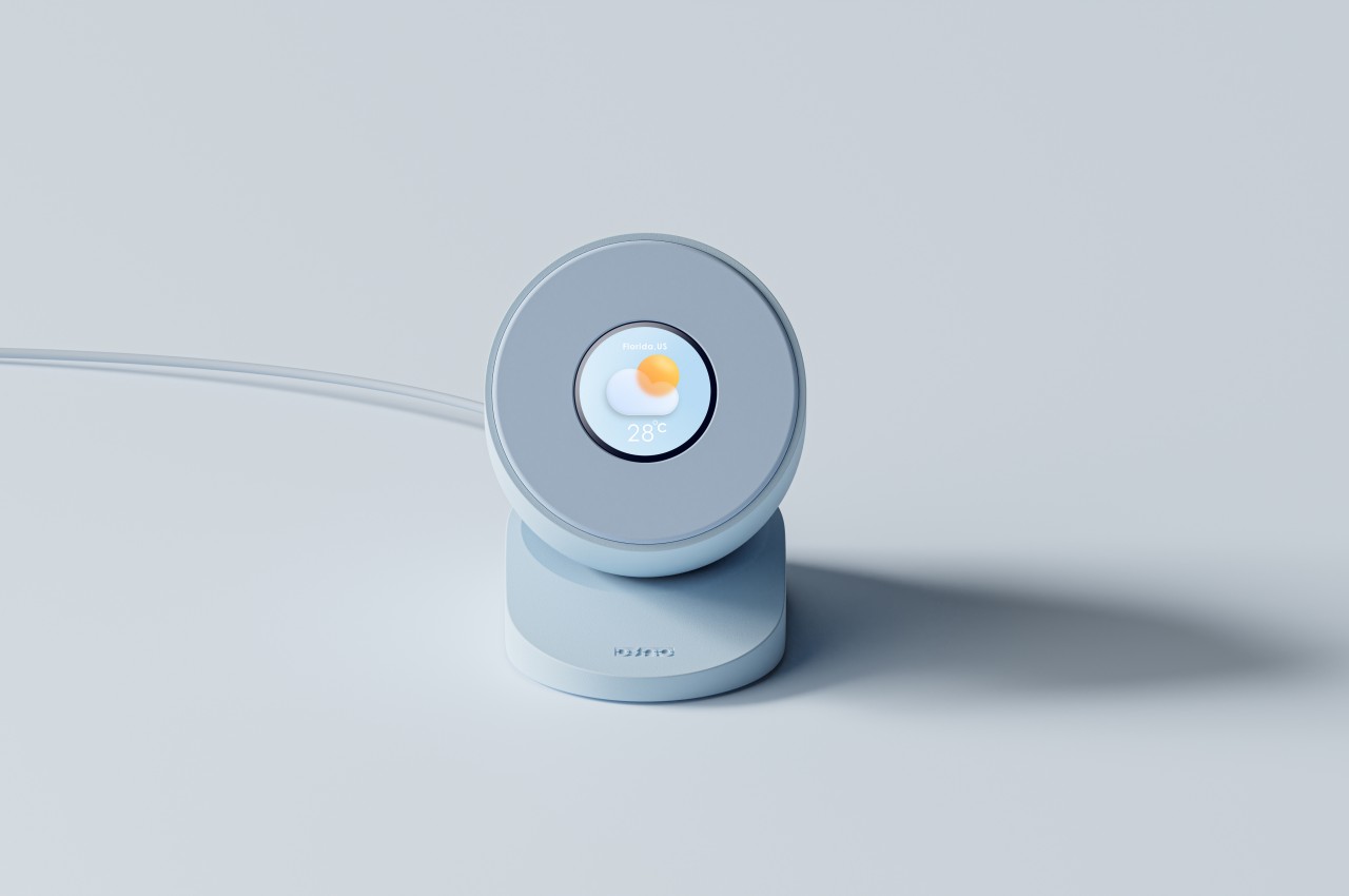
The Dino Charger changes the formula a bit by adding one small component to the charger. The charger itself looks a little typical, just a pill shape with one end chopped off to provide a flat surface for a phone to latch on. When that phone isn’t there, however, you will be able to see a small circular display in the middle of the area, and that is where the charger’s other life begins.

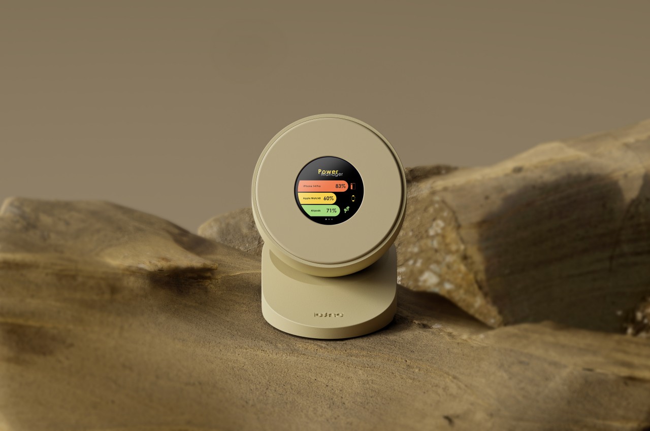
The screen is around the same size as a circular smartwatch, and it functions almost like one as well. Despite its small screen real estate, it can easily show a few pieces of data through icons and images, like the weather, battery levels, and, of course, the time. It can even show a Bitmoji (or Apple Memoji), though the exact use of that function is left up to the imagination. Of course, this circular display will be useless when there’s a phone charging on top, but it’s possible for the phone itself to provide those functions while it’s charging.
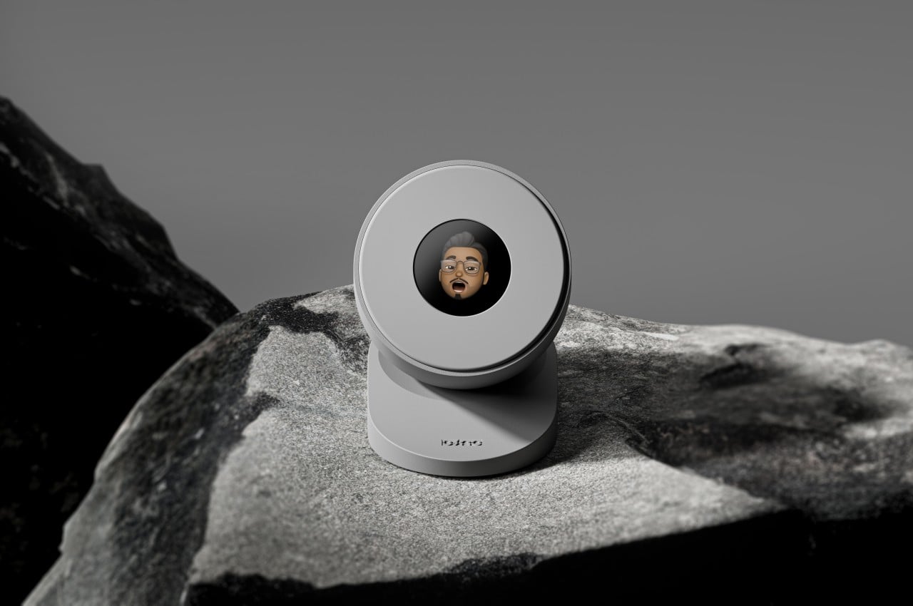
The Dino Charger concept doesn’t drastically change the wireless charger’s nature, but neither does it take anything away from it by adding an orthogonal feature. It’s a simple redesign that turns what looks like a normal and boring wireless charger into an exciting multi-functional device, one that can potentially add value to your digital life without taking up additional space.

