There’s something about metallic furniture that is completely undeniable. Although metallic furniture wasn’t always considered the ideal fit for residences and homes. The first piece of metal furniture dates back to 1820, and it was a round three-legged table designed by Karl Friedrich Schinkel of Berlin. With time this genre of furniture took over industrial buildings, outdoors/streets, and the kitchens of restaurants. However, it broke through its industrial and utilitarian stereotypes and eventually found a place in interior design by the 1950s. Today metallic furniture can be found in many homes and offices, since it is durable, strong, and functional, and can be finished in multiple ways. And, we’ve collected some excellent metallic furniture designs for you – from a coffee table inspired by the simple shape of a safety pin to a unique shelf that attempts to preserve your work-life balance.
1. The Morph Chair
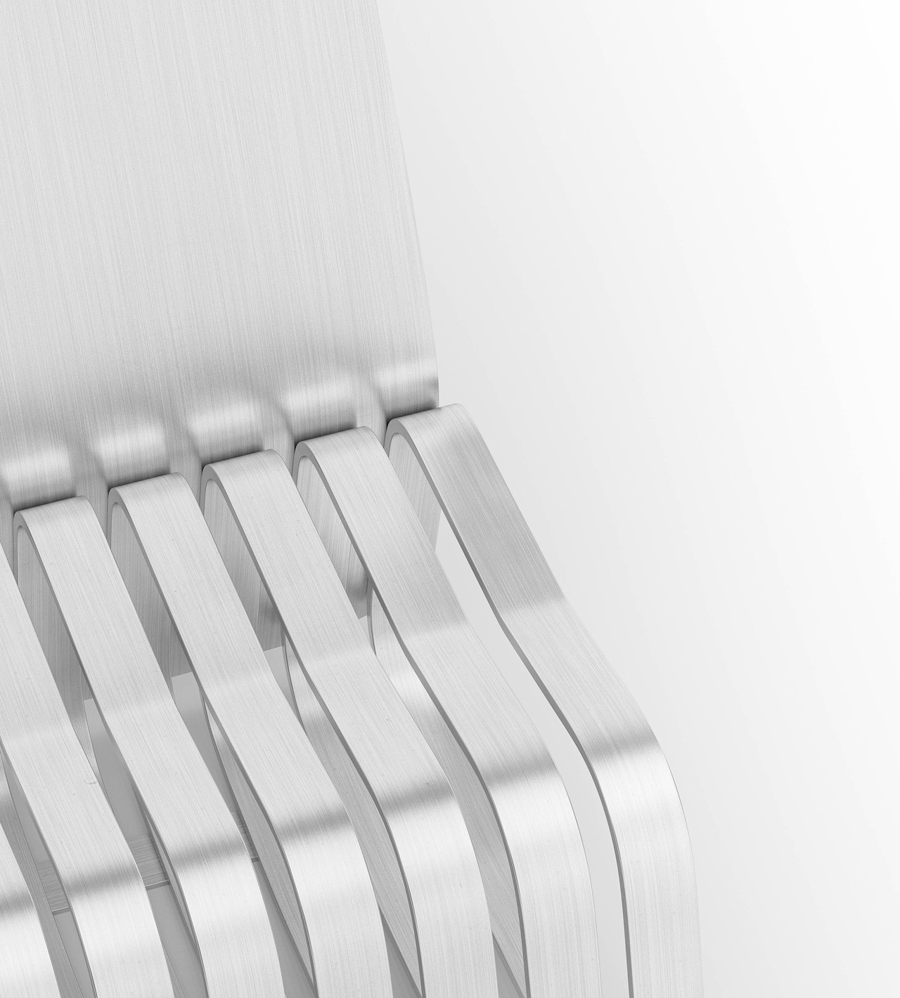
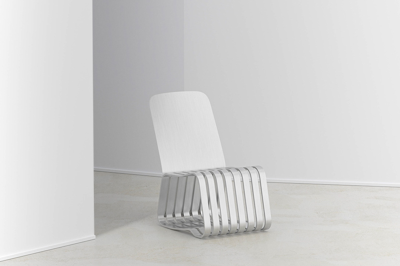
The Morph Chair was designed by Jiung Yun and Minji Kim for ‘quiet contemplation’ since our daily lives can be quite busy and tiring. The Morph Chair is created for those moments where we simply need to take a break and relax for a while.
Why is it noteworthy?
The Morph chair was designed for moments of peace when we can take a break, and simply lounge about on it. It attempts to function as a calm space for users to organize their chaotic thoughts and worries and take down their stress a notch or two.
What we like
- Features an integrated storage section beneath the seat, which can be used to store books and other miscellaneous items
What we dislike
- Aesthetics can be dull and stark for some people
2. The Tone Chair
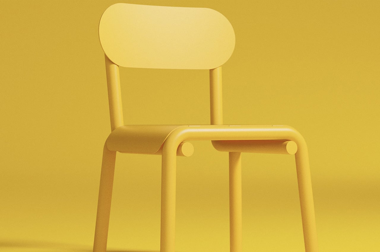
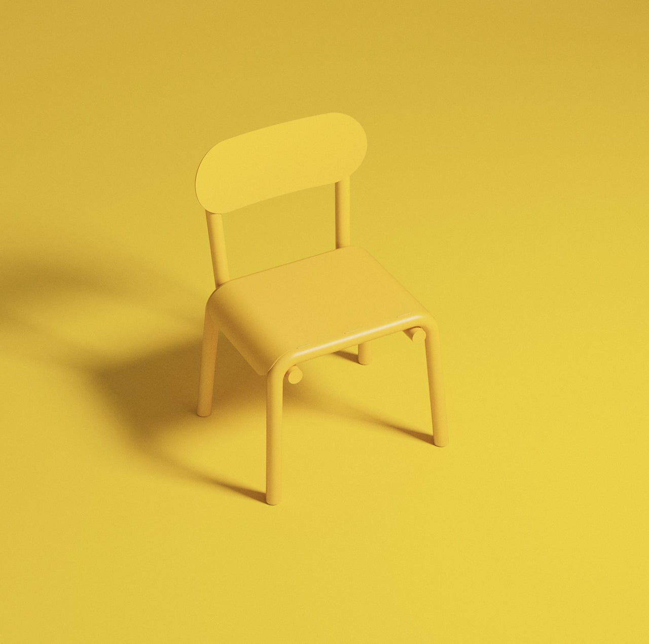
The Tone Chair has a minimalist oh-so-simple form and an extremely solid character to complement it. It is the result of the exploration of a simple metallic tube and an interesting bending process.
Why is it noteworthy?
Four tubes, and and two pieces of sheet metal were used to build the chair. The two pieces of sheet metal were used to form the seat and the backrest, while the four metallic tubes were utilized to construct the legs of the chair.
What we like
- Features a smooth and linear design with all the components effortlessly merging together
- Has a loud, colorful, and bold personality
What we dislike
- The form of the chair can be considered too simple and stark for some
- Doesn’t look comfortable to sit on for long durations
3. The Scissor Side Table
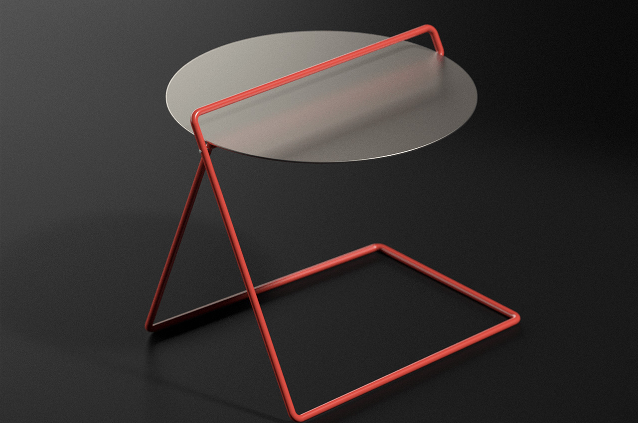
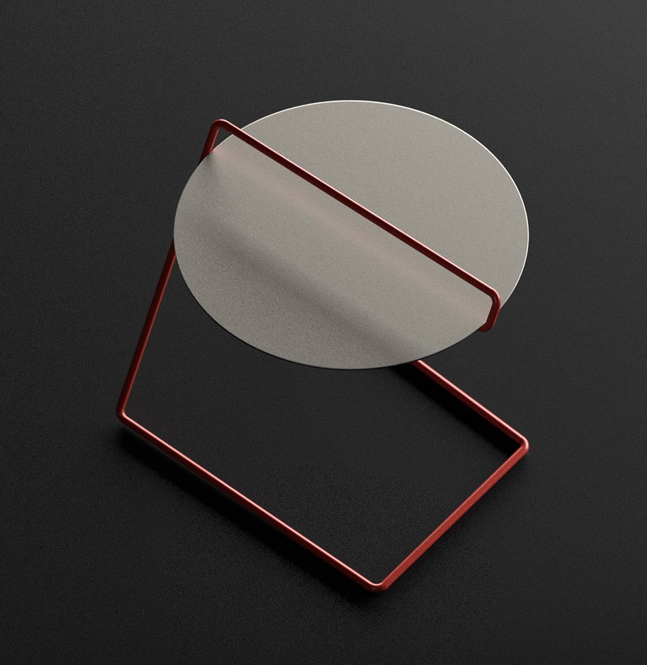
Designed by Deniz Aktay, the Scissor Side Table features a simple, clean, and matter-of-fact form that’ll instantly attract your attention. The highlight of the design is its simplicity!
Why is it noteworthy?
It features a round metallic tabletop that is supported by a bright red infinite metal tube. The metallic tube and its bold color instantly command attention, and the tube also functions as a useful handle to hold on to, if you want to move the table from one room to another.
What we like
- Portable + easy to carry around design
- Compact and space-saving form
What we dislike
- It’s still a concept so we don’t know how the actual product will turn out to be
4. Camber
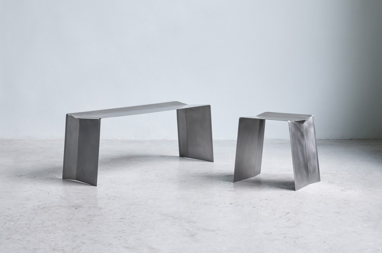
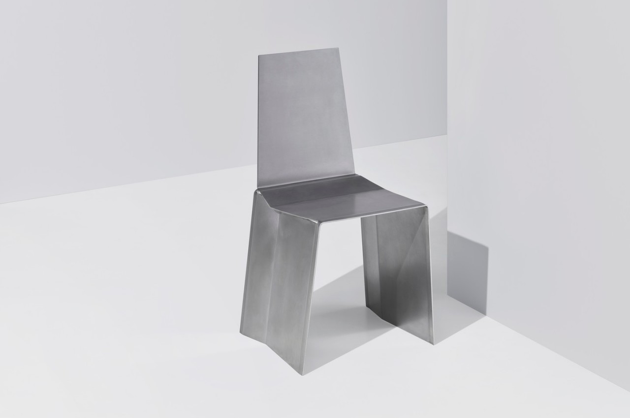
Camber is an innovative collection of seats that are created by cutting and bending a single sheet of stainless steel. The design involves making two angular cuts where the folds would happen if you would just bend the two ends to form legs.
Why is it noteworthy?
Camber is simple, almost brutalist in its appearance, but its appeal goes beyond looks, offering a design that isn’t only efficient but also, in some odd way, charming in its own right.
What we like
- The two angular cuts give the chair and stool some stability
- Simple, functional, and efficient design
What we dislike
- Stainless steel is not the most environment-friendly metal
5. Whisk Coffee Table
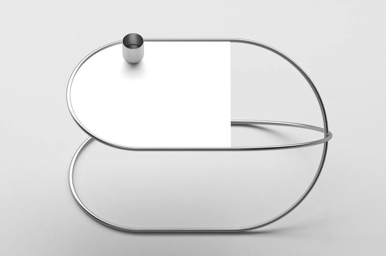
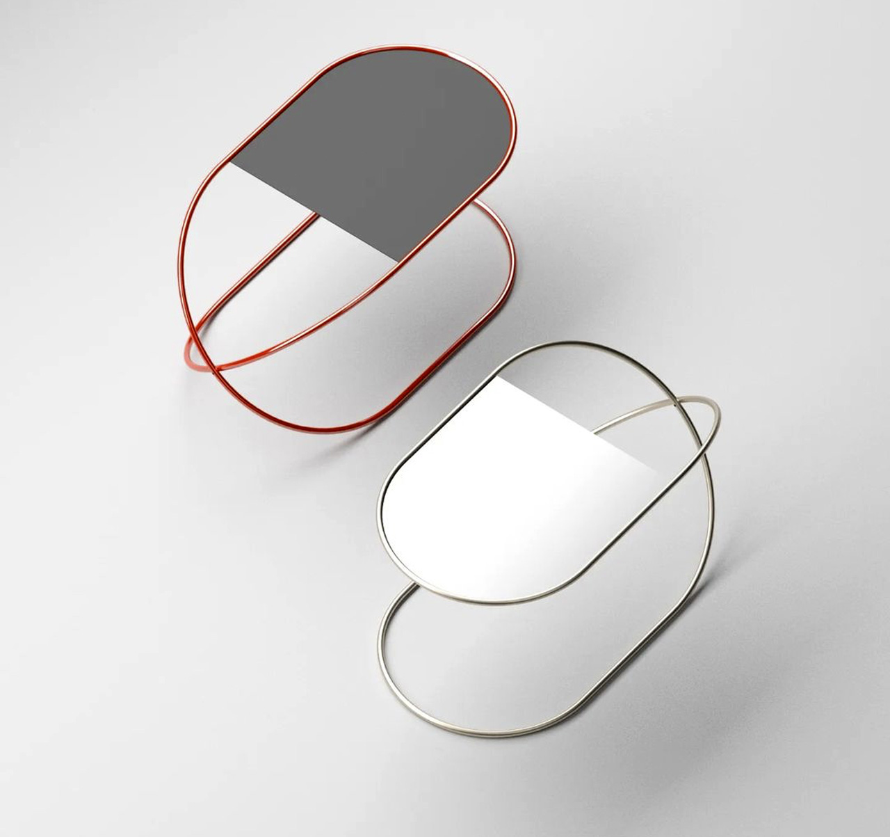
Designed by Deniz Aktay, the Whisk coffee table is made up of an artfully shaped metal tube that forms the major body of the design, and converts it into a major eye-catcher.
Why is it noteworthy?
The simple twisted metallic form of the coffee table brings to mind the image of a whisk, which could be why Aktay named the furniture piece the same. Or if you look closer it also looks like a contorted safety pin!
What we like
- Made up of interesting geometric elements that perfectly complement each other
- A great example of sharp form and metallic excellence
What we dislike
- The actual product could differ after manufacturing since currently, it is only a concept
6. Strap Furniture Collection

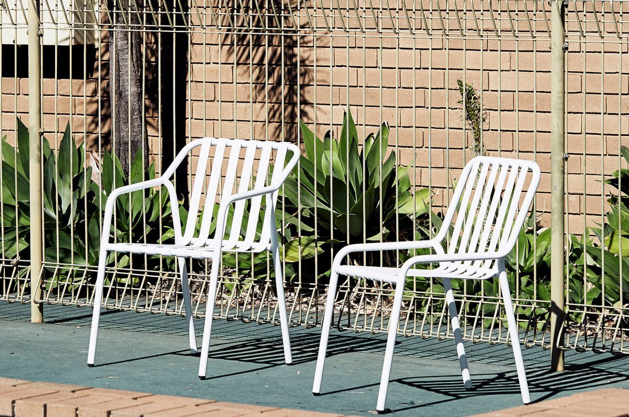
This intriguing collection of outdoor furniture is inspired by the 1970s poolside furniture. Dubbed the Strap furniture collection, it includes 11 seating designs such as armchairs, benches, stools, loungers, and stackable chairs.
Why is it noteworthy?
The chairs are made up of aluminum straps that seem to be tightly wound around simple tubular frames. The various furniture pieces are inspired by the designer’s childhood memories of the sun loungers placed around his local pool.
What we like
- Takes you on a trip down memory lane, evoking childhood nostalgia
- Not only limited to your backyard, can be used even in university campuses, shopping districts, and other urban spaces
What we dislike
- The aesthetics definitely need some work and innovation, as they are a bit dry and boring
7. The Tila Chair
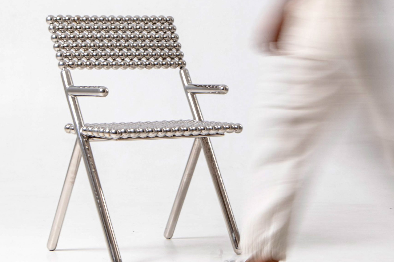
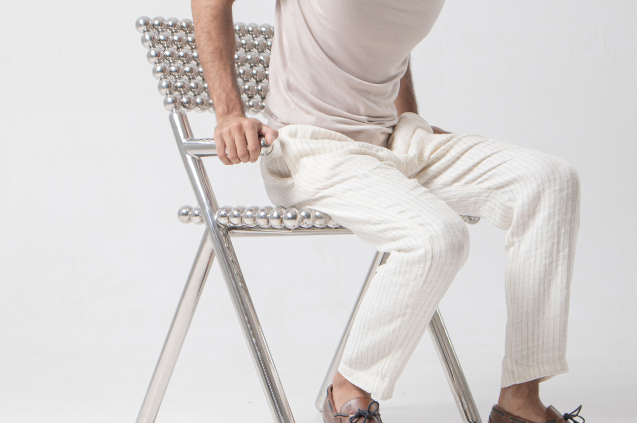
The Tila Chair is a unique and innovative chair designed by Shepherd Studio. It is built using hundreds of shiny spheres and is intended to be an exploration of density.
Why is it noteworthy?
The unique-looking chair is partially inspired by the traditional game of marbles (also called Tila), and truly the chair is built using 210 stainless steel spheres that are supported by a tubular frame.
What we like
- Features an attractive chrome finish that reflects the chair’s surroundings
- Produces a visually interesting interplay of light and shadow
What we dislike
- The little spheres could be difficult to clean and maintain if they get dirty
8. Criteria Bookshelf
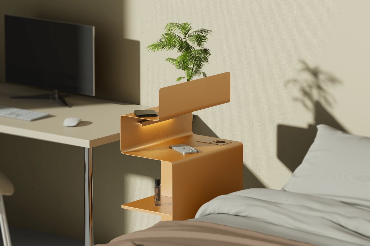
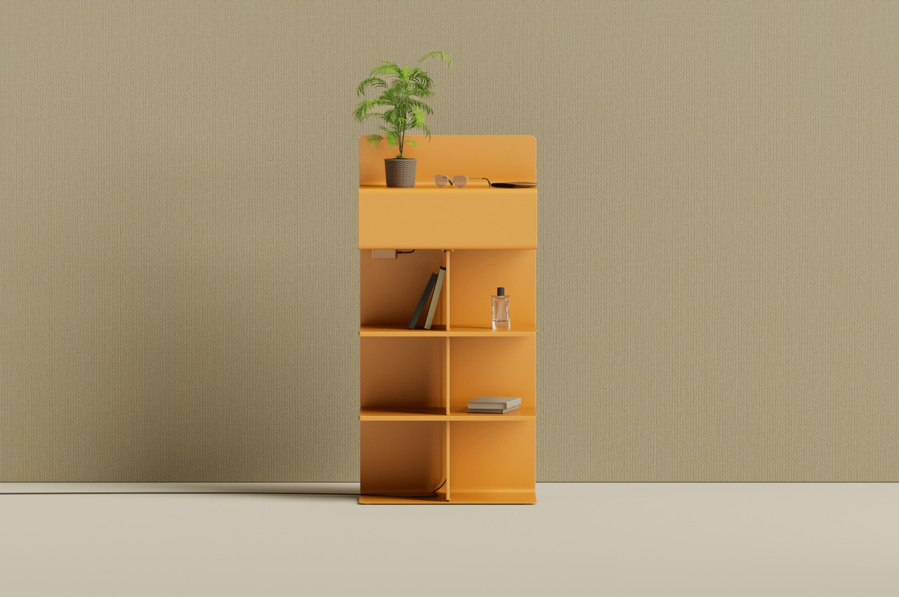
This unique metal shelf is designed to build a figurative and literal separation between work and rest, especially for those who have their desks placed beside their desk.
Why is it noteworthy?
Called the Criteria bookshelf, it blends two different parts of shelves for different parts of the day. One is a typical shelf to store books, stationery, desk accessories, decor, and other items you might need for work. The opposite side of this shelf, however, also has a shelf but with more limited space. It also has lighting that would be more useful at night.
What we like
- Multifunctional furniture design that serves two purposes
- Helps you maintain a work-life balance at home
What we dislike
- It’s a concept!
- The shelf has a quirky form and shape, so it could be difficult to place/fit it in your room
9. The Bello! Bench
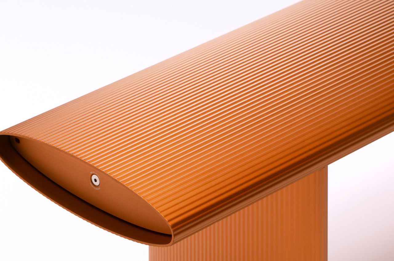
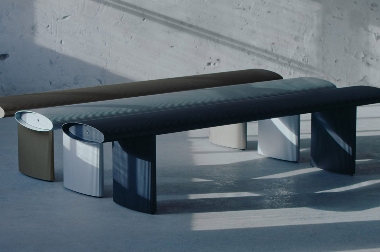
The Bello! bench was designed by Fjetland for the aluminum producer Hydro, by drawing inspiration from pasta, or more specifically penne rigate!
Why is it noteworthy?
Informed by the design and form of pasta, the Bello! bench is a versatile piece of furniture that can be used indoors and outdoors. It’s been created from nearly ninety percent recycled and one hundred percent recyclable aluminum.
What we like
- Aluminum makes the bench sturdy, durable, and lightweight
What we dislike
- The shape of the bench is opposite to what we usually have, ergonomically speaking, which makes it difficult to sit comfortably and could lead to a slipping sensation
10. Non-Square
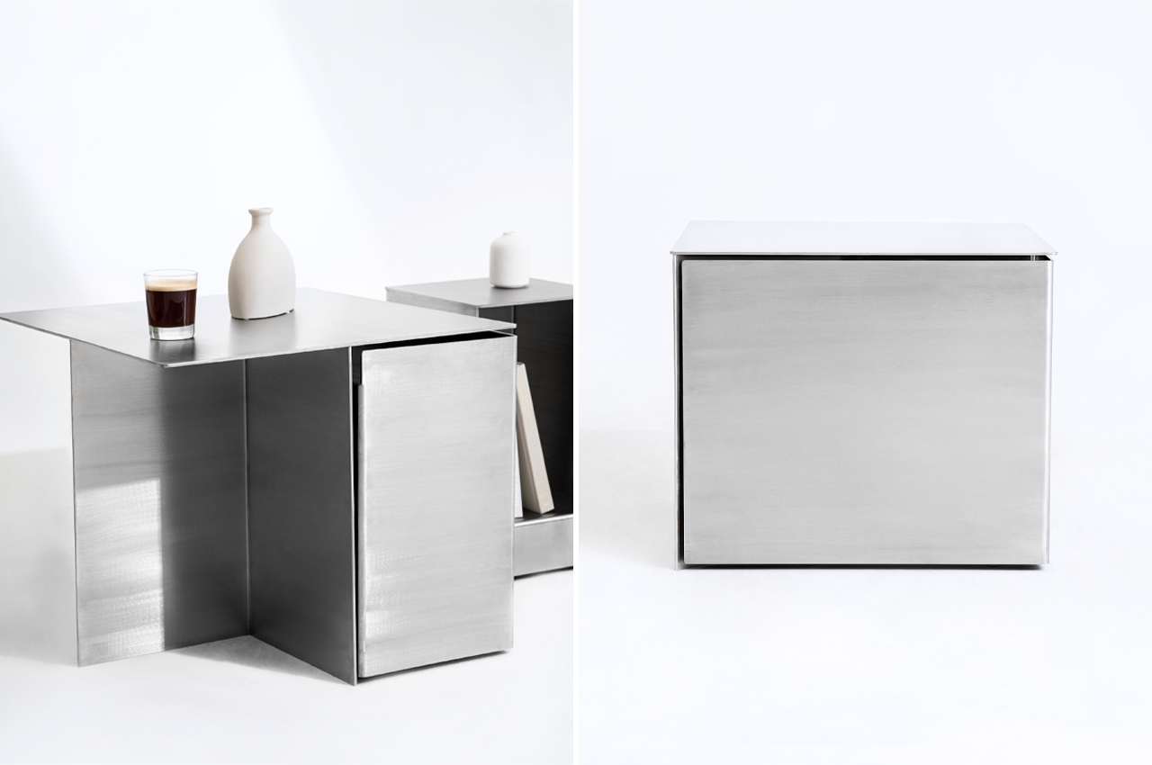
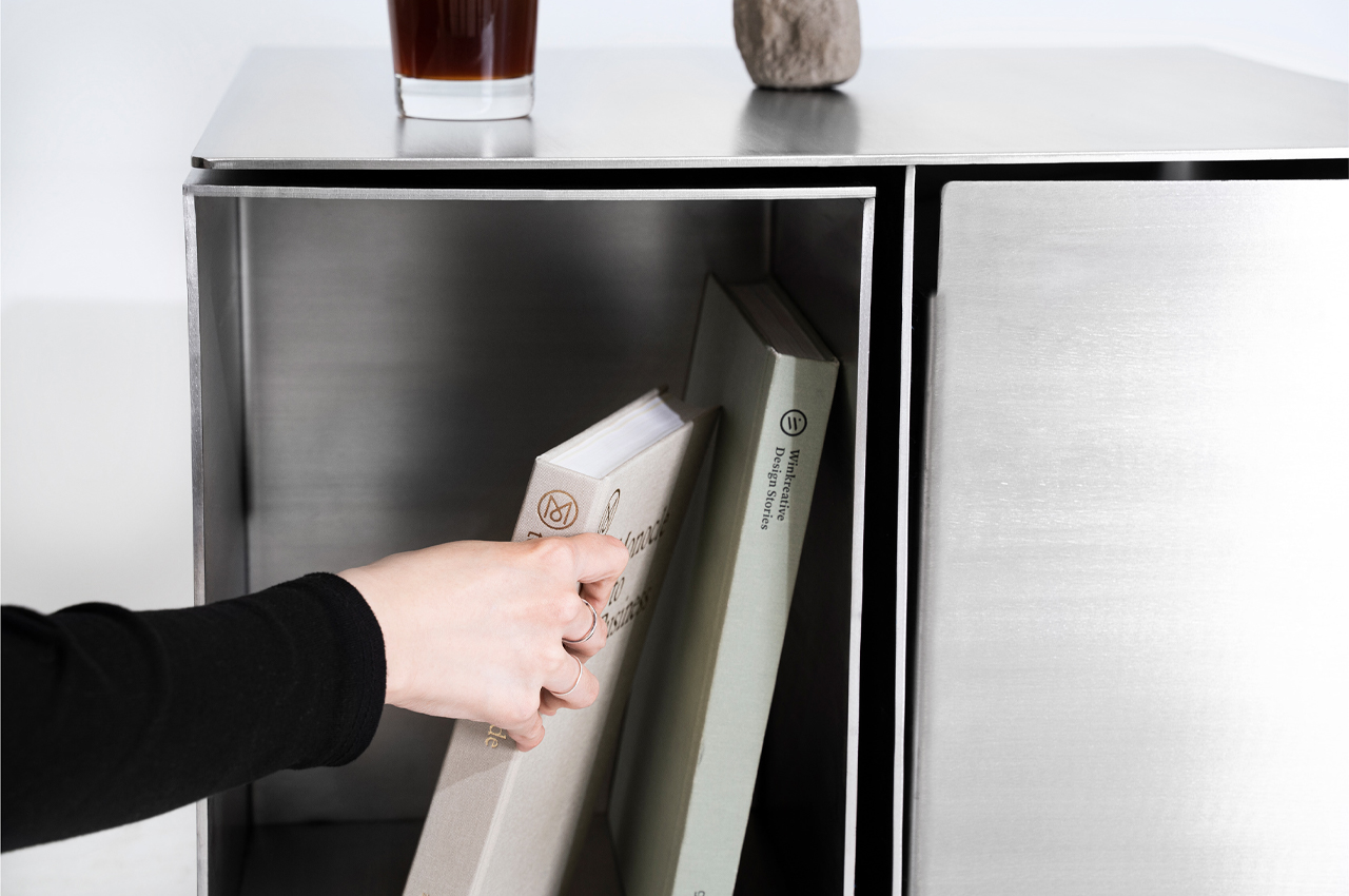
Meet the Non-Square! From the outside, Non-Square features a minimalist and stainless steel appearance that makes it look like an ordinary side table dressed as a cube. But, once you look at the side table closer, you realize it has a deeper purpose!
Why is it noteworthy?
Functionality typically stems from a product with a long shelf life and the ability to execute its primary purpose. Adding their design to the mix, Hyunjun Yu, Soojin Jung, and Kyoungseo Park conceptualized Non-Square, a furniture set that integrates side tables and stools within a stainless steel hexahedron structure.
What we like
- Hidden storage compartments
- Modular design
What we dislike
- Bulky & space-consuming design

