People buy and use alarm clocks to wake them up at the right time, but let’s face it, almost everyone ends up extending their sleep by five or ten more minutes or at least want to. With the advent of smartphones, that has become even easier with the built-in snooze functionality in apps. But just as reaching for your phone before bedtime can be bad for your health, doing the same when you just want to snooze your alarm could also end up keeping you from going back to sleep instantly. What you probably need is an alarm clock whose only purpose, ironically, is to get you to sleep longer, which is what this device concept offers in addition to looking like one of Apple’s stylishly minimalist products.
Designer: Antoine Brieux
Useful as they are, our smartphones are notorious for also being sources of distractions. At night, those incessant notifications and the screen’s blue light keep us awake, but our phones also prevent us from snoozing properly again in the morning. Few of us dare to slide the screen blindly for fear of pushing the phone over the edge and breaking it, so we’re forced to open our eyes, get blinded by the screen, and be tempted by the number of unread notifications. There goes your plan to continue that sweet dream!
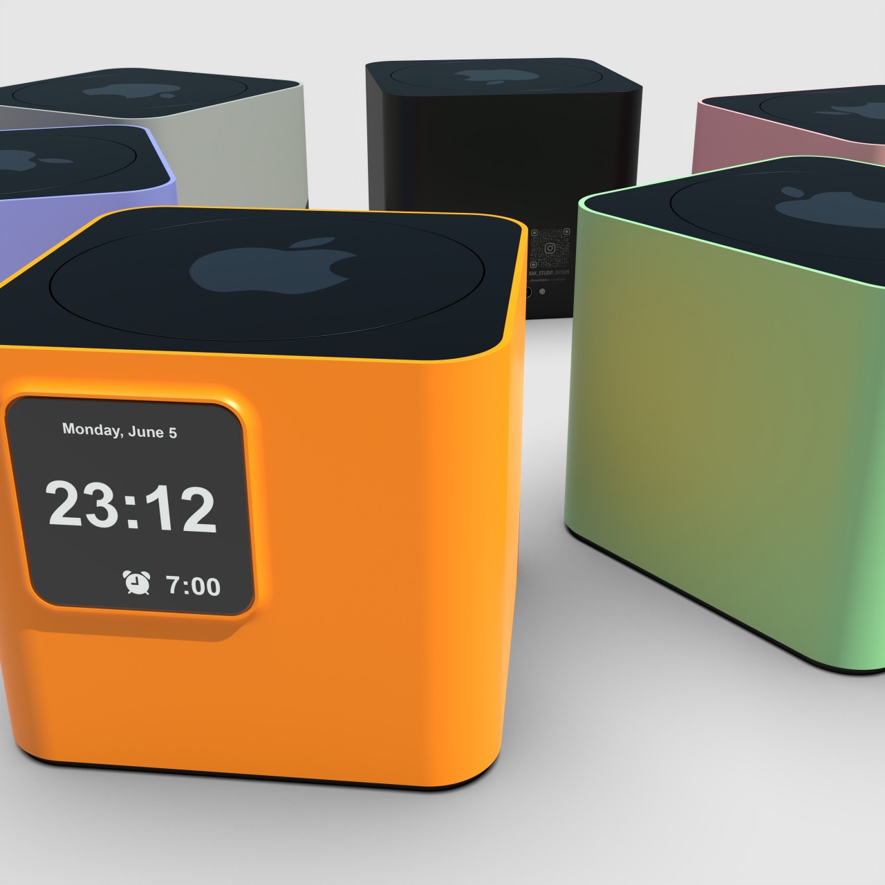
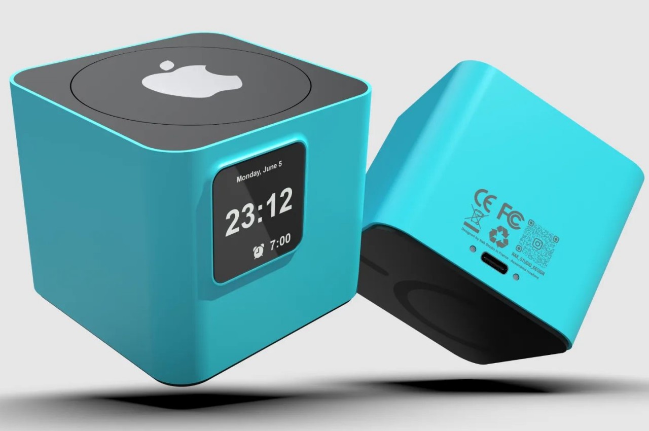
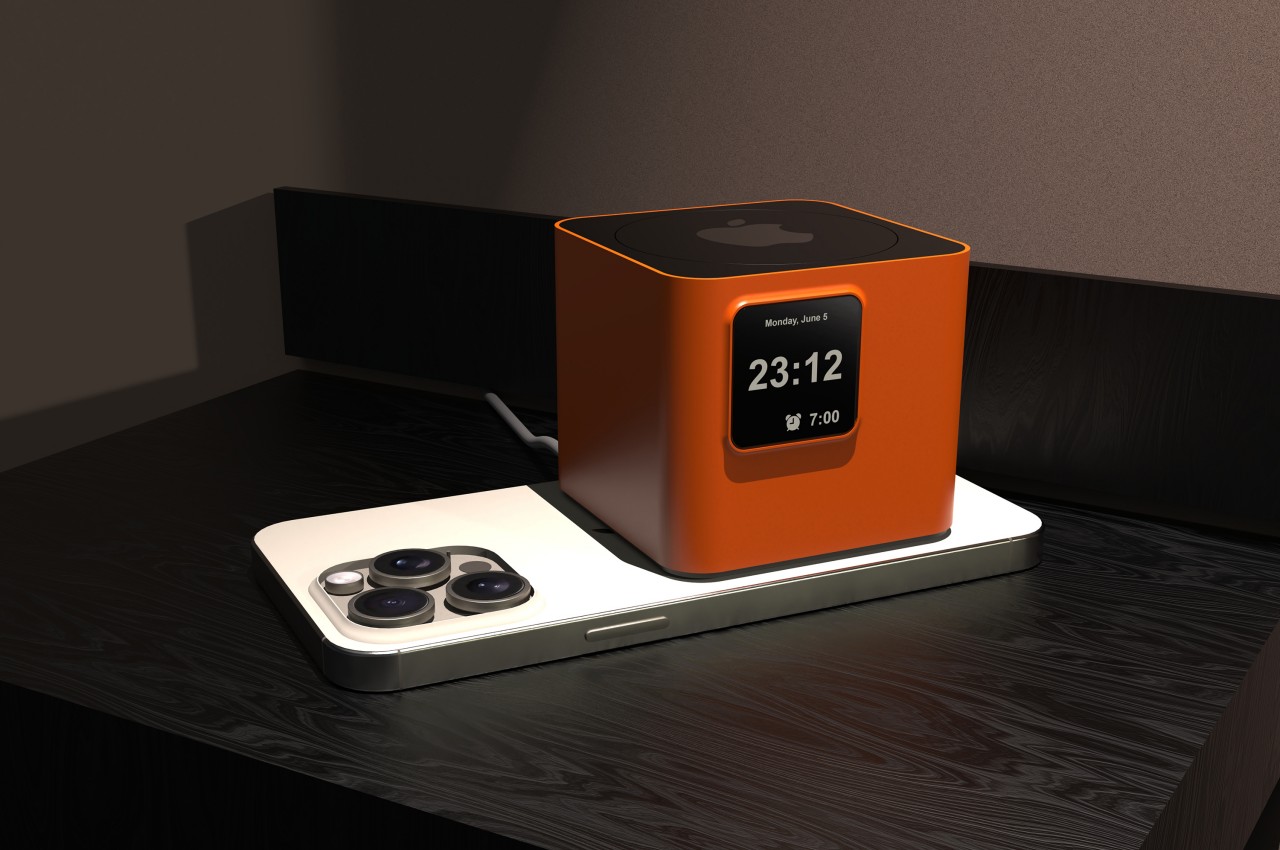
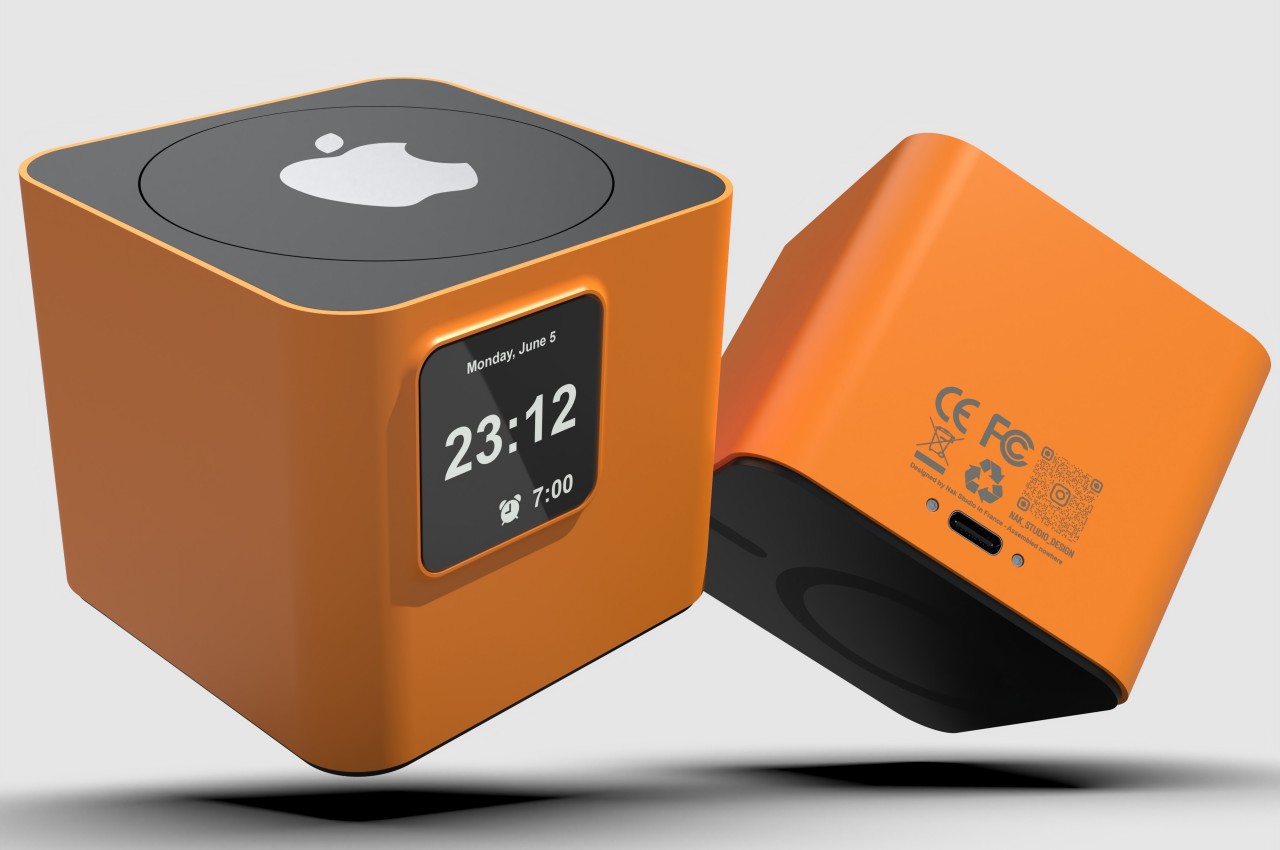
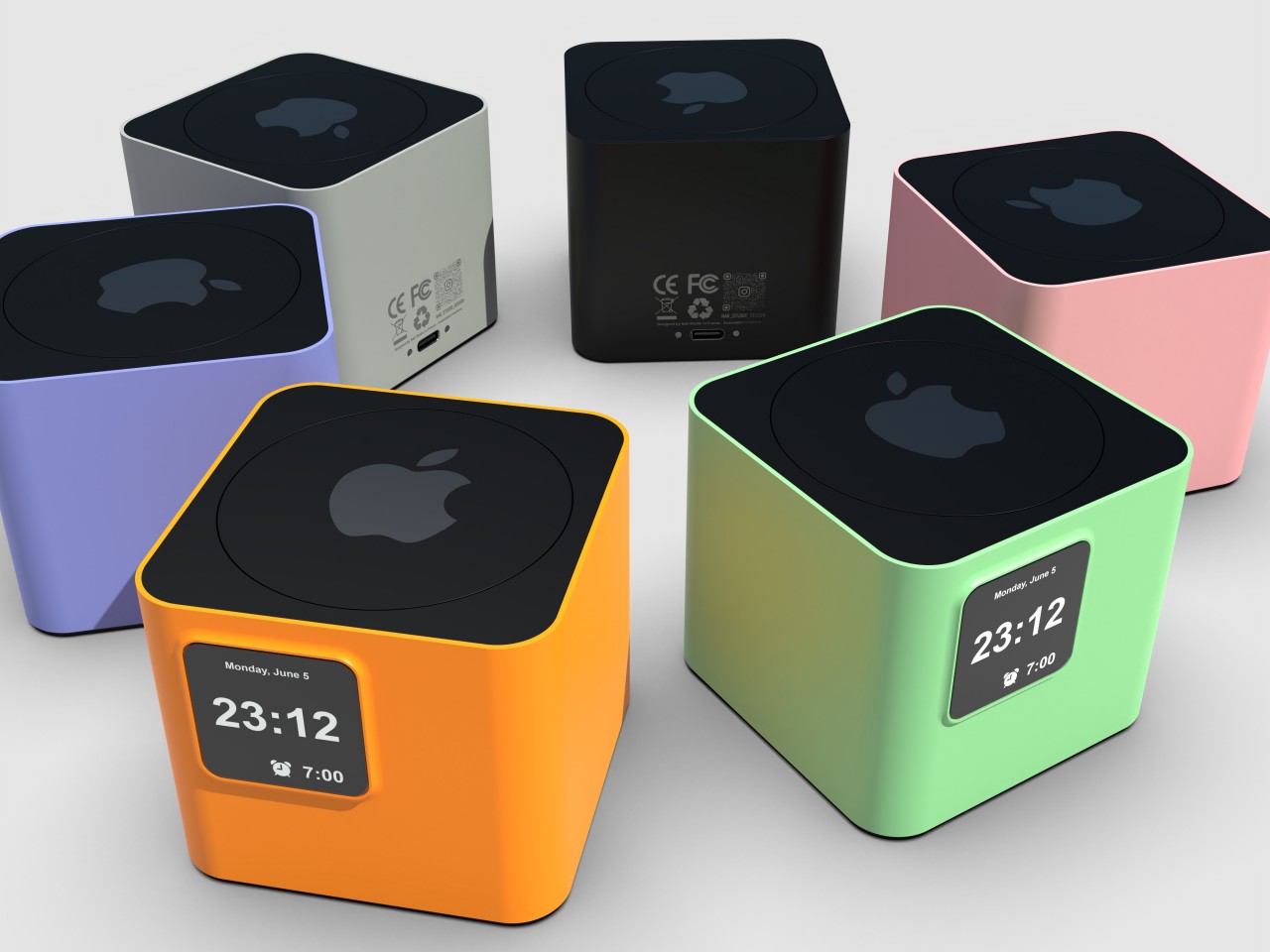
You know those shows or cartoons where people simply push or smash a button on their bedside clock to silence their alarms, all without even looking at the thing? Well, that’s what this alarm clock concept design also lets you do, except it doesn’t stop the alarm from sounding. The big, though flat, button on top of the small box has one and only one purpose: to snooze the alarm and let you extend your sleep, all without pulling you out of your slumbering state completely. No fumbling over which button to push. You can even hit it with your eyes closed, which is the point entirely.
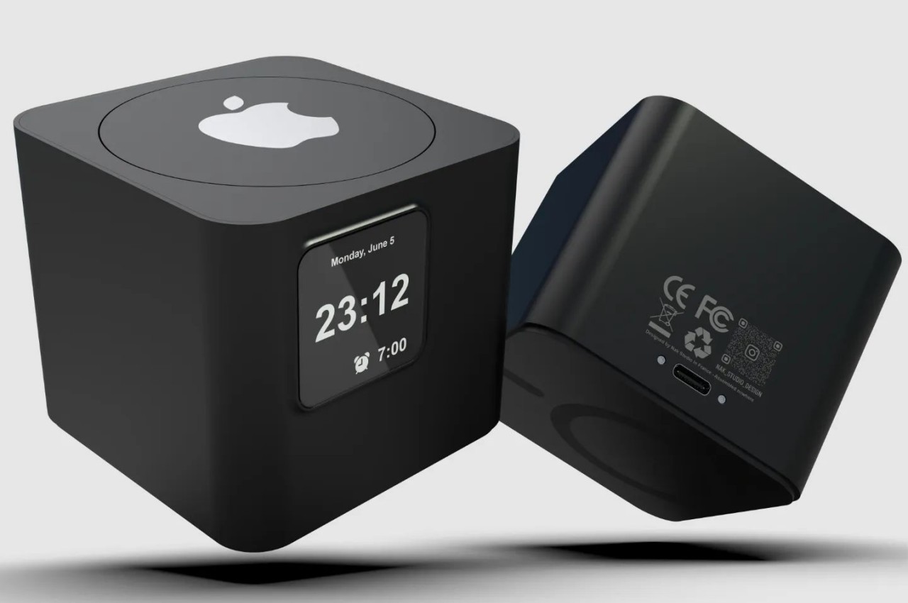
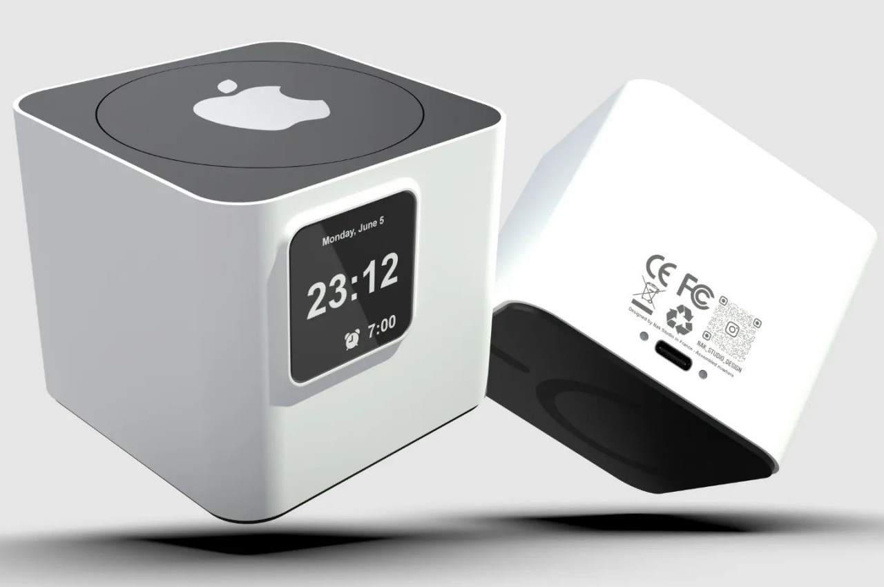
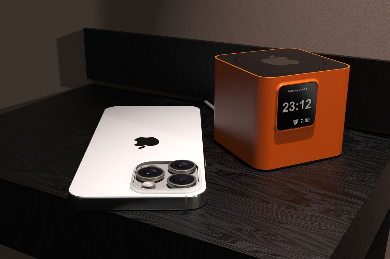
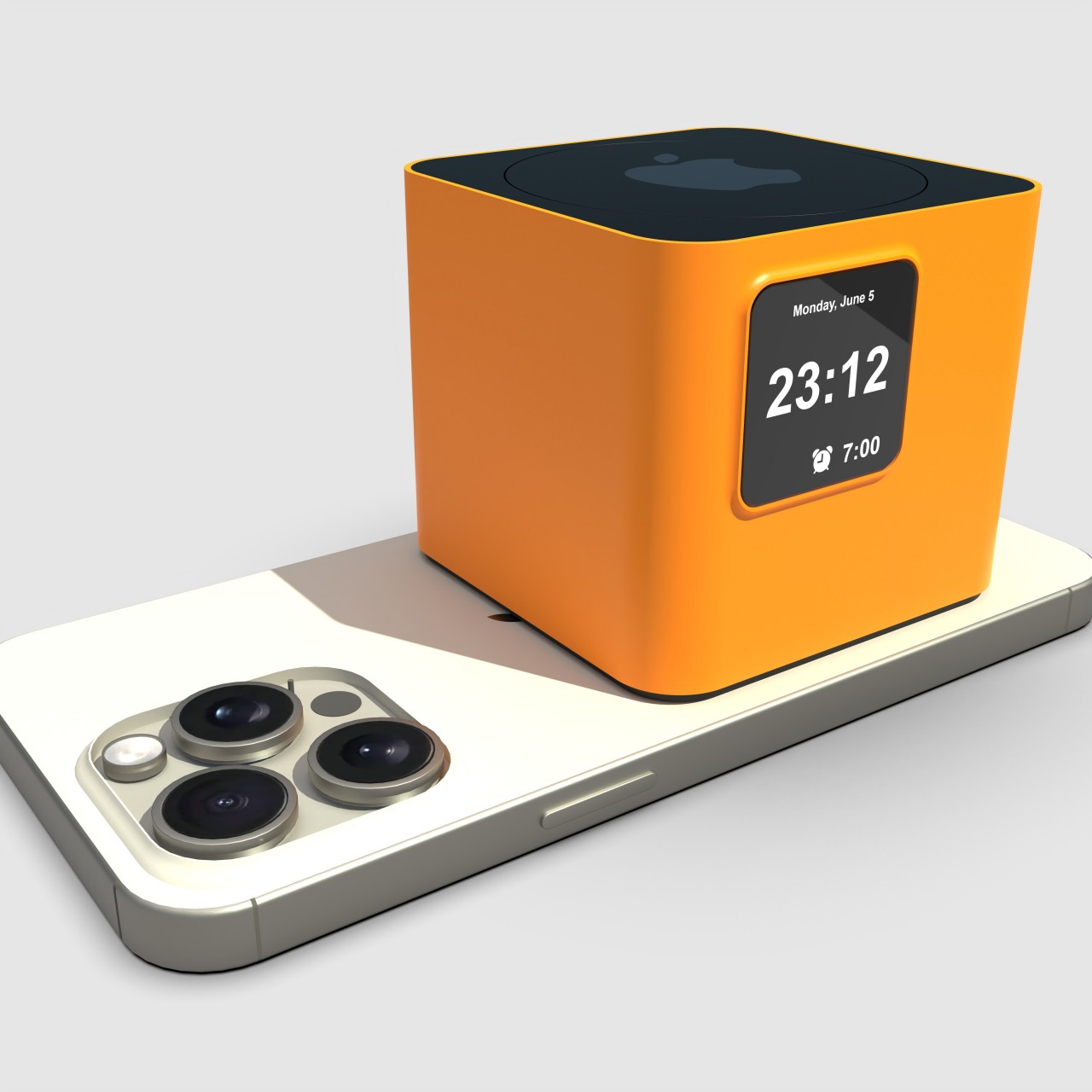
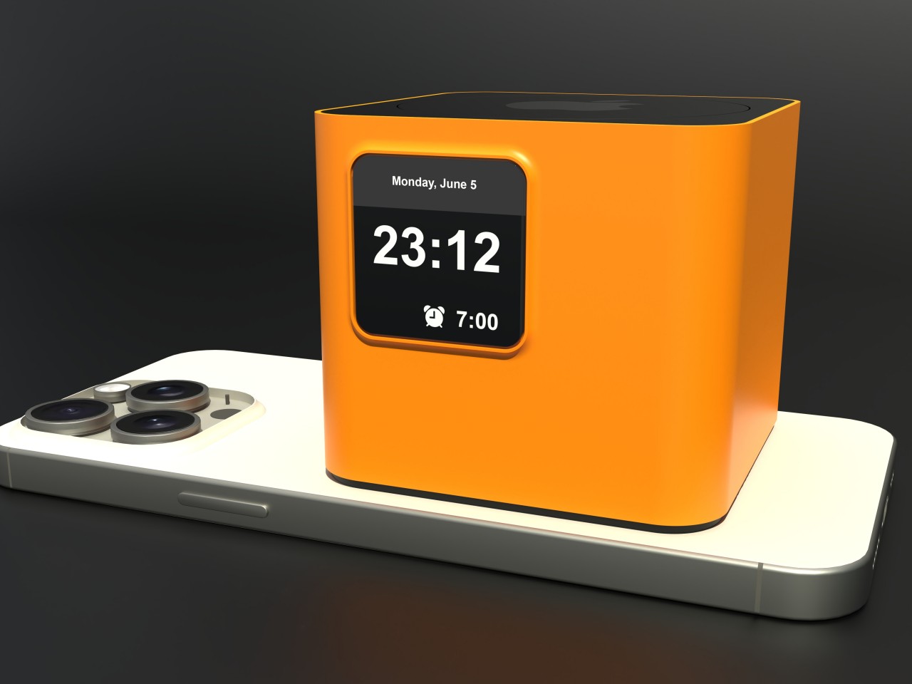
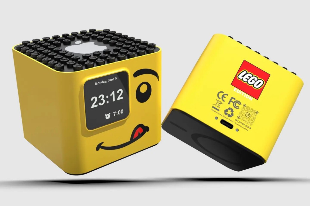
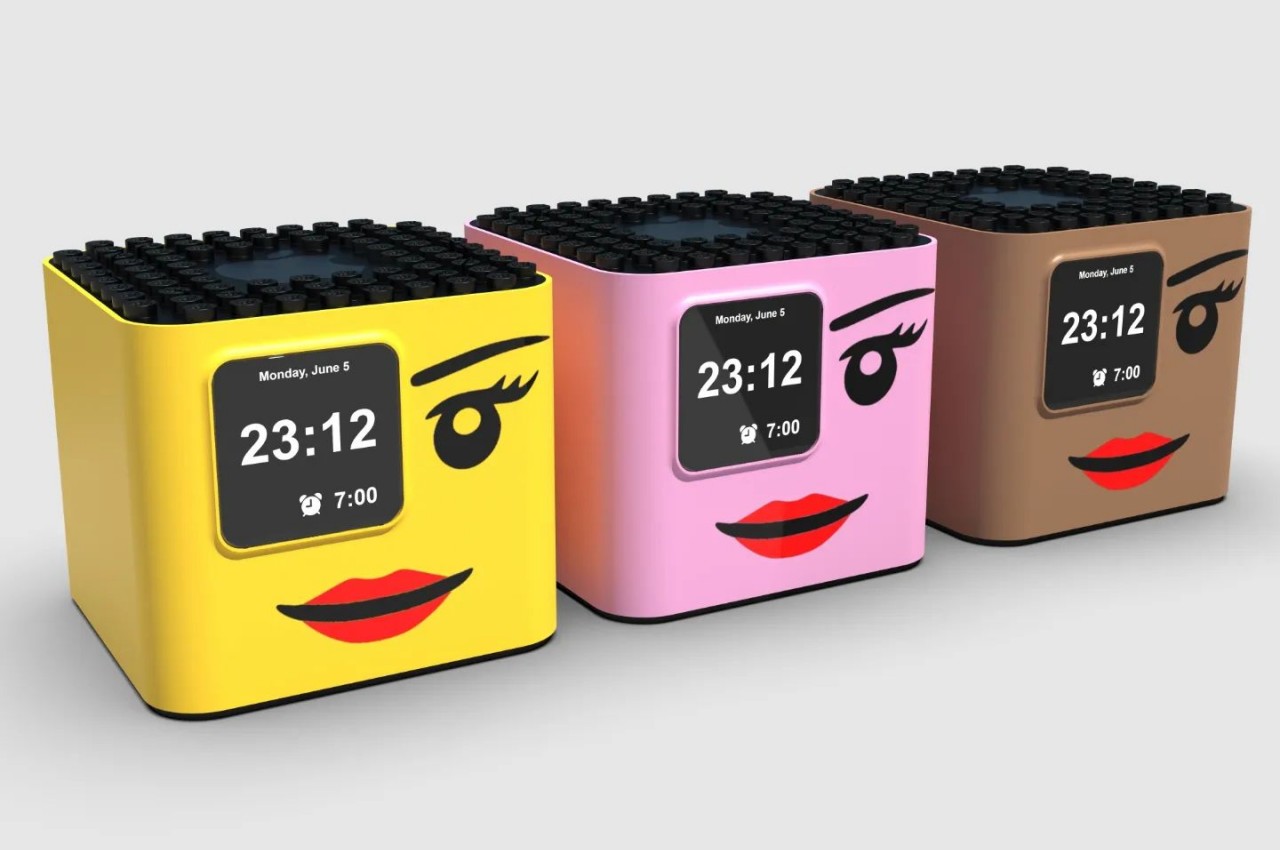
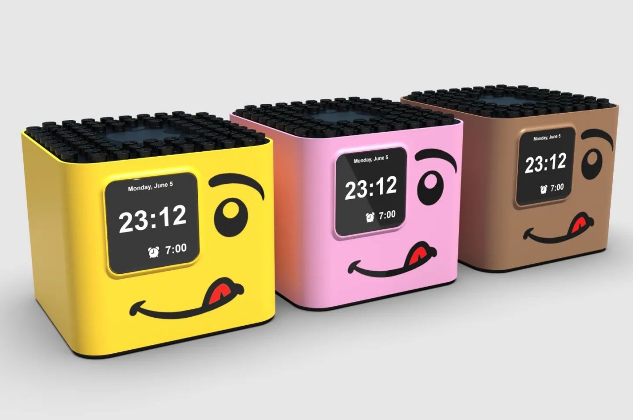
With such an extremely focused purpose, the design of the device can’t be any more complex than it needs to be. It’s a perfect opportunity to apply some of Apple’s famous minimalist design language, leaving a small cube that’s bereft of any unnecessary feature other than a small LCD screen on the front, a USB-C charging port on the back, and Apple’s iconic logo on top. That said, the design is also so simple that it can actually be easily used by other brands, for example, a LEGO-inspired yellow block.
The alarm clock does have another hidden functionality. It can charge your iPhone, but only if you place it on the iPhone’s back. It makes for an awkward position where the iPhone has to lie face down on a flat surface, which risks scratching its screen. Of course, the bigger question is whether there’s a real need for such a device that does only one thing, especially if that one thing encourages and even rewards sleeping in when you really should be getting up.
