These small tips will take your renders from average to awesome.
If you’re on this website reading this article, there’s a fair chance that you’re an Industrial Designer who 3D models and renders for a living, and if that’s true there’s an even fairer chance that you’ve heard of KeyShot. Touted by 88% of designers as the best software for realistic renders, KeyShot is known for two things, being intuitive and easy to use, and being great at creating good renders with low effort. However, just like how a great camera doesn’t make you a great photographer, a great software doesn’t automatically make your renders incredible. If you’ve used KeyShot for work, personal projects, or the occasional design competition, here are a few lesser-known tips that should completely revolutionize your rendering game. Use these tricks to upgrade your skill set, bookmark the article for later, and give KeyShot 2024 a download so you can put your new rendering skills to the test!
Click Here to Get Free KeyShot Pro + Keyshot Web
1. Perfection lies in imperfection
That might sound like a paradox, but look around you – nothing is perfect. Your phone has fingerprint marks on it, your table’s got a few scratches, the glass you’re drinking water from isn’t 100% geometrically perfect – its surface has marginal imperfections that cause light to reflect/refract in unique ways. If you want to look real, you have to embrace reality… and in reality, nothing’s perfect. Sure, your product render against a white background can be as perfect as possible, but if you’re looking for a photorealistic scenario render, obsess over the imperfections. Add dust and fingerprints to flat glossy surfaces, use bump maps pretty much anywhere you can, create scratches as a layer/label in your material, remove 100% sharp edges (everything is marginally rounded off), and most importantly, push objects out of alignment in your scene. No real-world scenario has stuff aligned perfectly. These settings alone should take you halfway to photorealism, because humans perceive imperfections as a part of reality.
2. Bokehs are everywhere
Your eyes are telescopic. They can’t focus on everything at the same time – you look at one thing and everything else blurs out. The blur is the key here, and it’s why portrait-mode photos on smartphones look great too. Seldom do you see photos of ANYTHING where every single item is in focus, and similarly, your renders need to ‘focus’ on that too. Go to the Camera tab on the top right and scroll down to the part that says Depth of Field. Activate it, adjust your focus distance, use the target button to click on the object you want to focus on, and set your F-stop to an appropriate number to ensure everything else is properly blurred. It’s easy to overdo the blurring, so once you find the right F-stop, raise it a little higher to err on the side of caution (don’t over-blur stuff, it’ll look fake). Remember, blurring takes a significant chunk of your rendering time, so if you DO use this tip, double or triple your rendering time per image. The results will come out fantastic.
3. Adjust your Image Settings
If you’ve ever used a camera, chances are you didn’t just point at a photo and hit the shutter button. You probably adjusted the exposure, aperture, ISO, and maybe played around with the white balance too. Think of the camera in KeyShot as a camera in real life – all it really does is capture the angle and focus… but there are still settings you need to tweak. Here, the Image Settings are your friend. Click on the Image tab on the top right corner and switch from Basic to Photographic. Now you can play with the exposure, contrast, white balance, highlights, shadows, midtones, and other parameters. You can even increase or decrease your image’s saturation to get you that perfect balance of colors, darkness, and light. Select ‘Linear’ in the Response Curve setting, enable the Curve editing feature below, and tinker away! It’s the secret sauce your renders need!
4. Beginners render, legends ‘Denoise’
Sometimes your renders just look grainy because you didn’t give them enough time to render out perfectly. Makes sense, you’re probably on a strict deadline and you don’t have 10-20 minutes to spare per render. Luckily, KeyShot’s Denoise feature in the Image Settings works like magic. They just blur out the grains in your renders, letting you ‘cheat’ your way through a quick render. Enable Denoise and watch as all the grains disappear miraculously. Set your Denoise level to around 0.6 for a balanced effect – setting it too high will give you weirdly blurry/smudgy renders, and setting it too low will give you grainy images. The Denoise feature works VERY well when you’re using the Depth of Field setting too, allowing you to easily cut down your rendering time without cutting down on quality.
5. Caustics are a headache, but they’re worth it
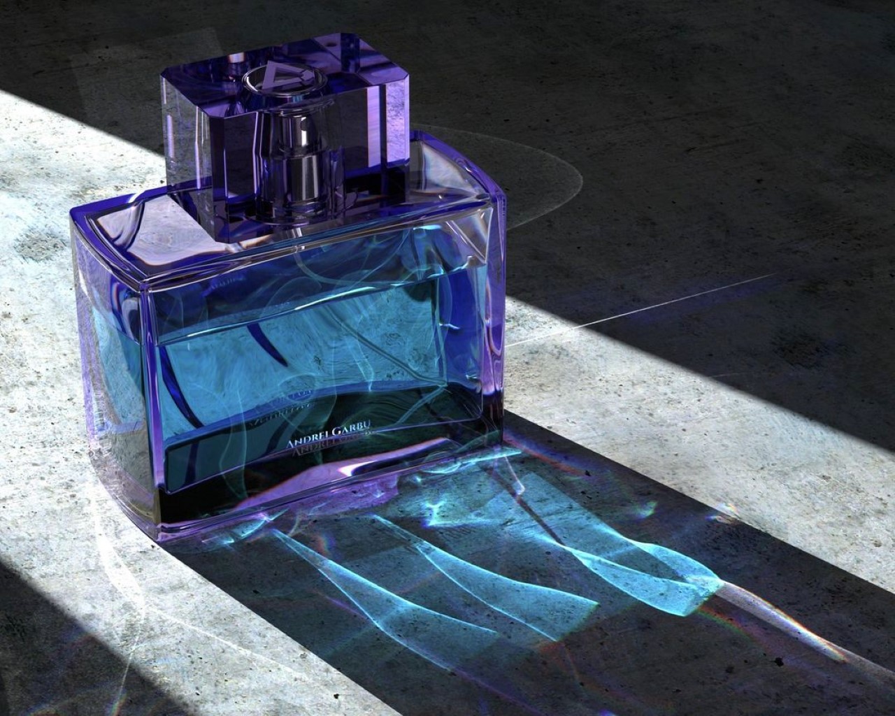
If there’s any transparent object in your render, chances are that it won’t just absorb or block light, it’ll bend light too. If you’ve ever looked at a reflection of a glass of water on a table, or those bright lines at the bottom of a swimming pool, those are caustics. They’re caused by light being manipulated by transparent/translucent objects. Caustics in KeyShot remain disabled by default, but that’s only because they’re kind of an absolute headache. They require a truckload of CPU/GPU power, take a LOT of time to perfect, and even more time to render. But if you nail your caustics, you’re guaranteed to get a few ‘wow’s from people who see your renders. The Caustics setting can be found in the Lighting tab in the top right corner. Enable it and also enable Global Illumination. Increase your ray bounces as well as your global illumination bounces, and if you’re using glass or plastic as a material, go to the material settings and increase the sample size. The problem here is that there will be a difference between what KeyShot shows you in the preview window, and what it actually renders, so the only way to really tell if you’ve done a good job is by rendering images, reviewing them, and then tweaking the settings. Rendering caustics also takes a LOT of time, and here Denoise won’t help you. You just need to trust the process and let KeyShot do its job simulating the bouncing of light to create those caustic refractions. Like I told you, it’s a bit of a headache, but the rewards pay off well.
6. If you’re thinking fabrics, think RealCloth™
Perhaps one of KeyShot’s most underrated materials, RealCloth adds unbelievably photorealistic cloth effects to any fabric in your scene. Whether it’s a tablecloth, the upholstery of a sofa, or even the strap of a camera, RealCloth’s one job is to mimic the woven effect of any kind of cloth. It adds depth, weave-patterns, and even lets you bake in imperfections like flyaway fibers and threads. If you’re simulating photorealism, chances are one of the objects in your scene has a fabric texture (it could be something as small as a cloth tag on a product). If it does, tap into the power of RealCloth to get that absolutely perfect cloth effect. Don’t rely on fabric bump maps online, trust me they won’t give you the precise control or sheer jaw-dropping dynamism that RealCloth will.
7. Shadows are just as important as lights
When you’re setting your scene, don’t focus all your energy on getting the right highlights. Focus also on getting great shadows. This means ditching the HDRI lighting settings and actually adding physical lights to your scene. Photorealism requires work, and those drag-and-drop environments won’t help you achieve it. Sure, you can use the environments to create realistic reflections, like a sky reflecting off a windshield of a car… but there’s NO way that environment will create the dramatic shadows you need. For those, you’ll require area lights, point lights, and/or spotlights. You’ll have to add these lights to your project by assigning them as materials to random spheres and planes within your scene. Unlike the HDRI environments, these lights will create actual shadows that are crisp at some edges, blurry at others, and more importantly, shadows that overlap, warp, and interact with each other. Take your smartphone flash and hold it against your hand. Move the flash closer and see the shadow grow bigger, move it farther and see the shadow get smaller – the shadow’s shape and behavior are determined by physical lights in your scene, not by the environment lights. So add physical lights to your scene and keep those shadows in mind because while the eyes don’t ever focus on shadows, they do register them. A render without accurate shadows will just look… off.


