As powerful and as useful as our smartphones might be, they can also be stumbling blocks not only for productivity but also for mental health. Incessant notifications and the fear of missing out (FOMO) add to the stress and anxiety of the modern world. Of course, ditching your smartphone is no longer an option these days, which is why several designs try to meet the problem halfway, many utilizing minimalist interfaces or drab gray screens to limit our smartphone interaction. Those, however, only solve one part of the problem, leaving many people still unused to taking breaks or relaxing. This concept design for a smartphone accessory tries to do exactly that, keeping your phone safely away from your reach while also helping you get into the habit of taking good breaks from time to time.
Designer: Jeongmin Ham
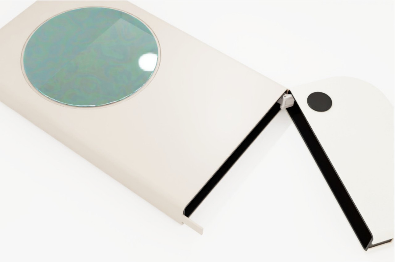
The most basic strategy people use to avoid distractions from their phones is to put it away, either at a distance or inside a drawer, creating some friction or obstacle to getting the phone instantly. While it can be an effective strategy for some, it’s also a missed opportunity for the smartphone to do something, well, smart. Short of using it as a timer, which can also lead to temptations, it can perhaps be utilized for some other function while keeping its normal distracting features at bay.
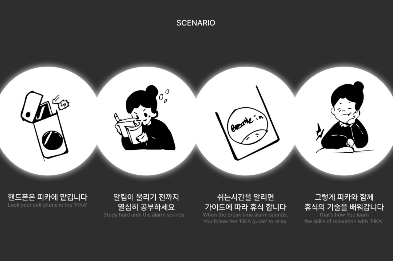
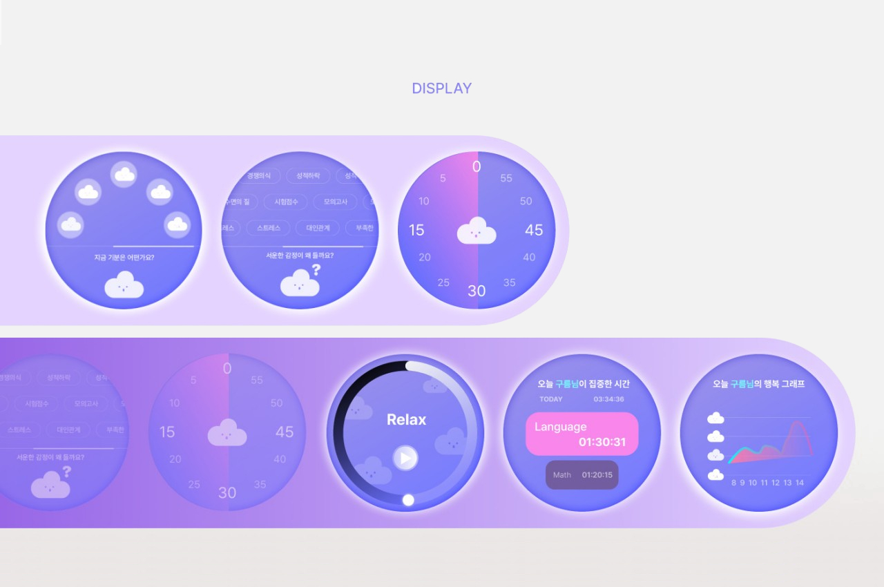
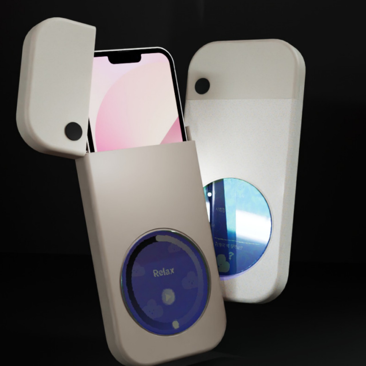
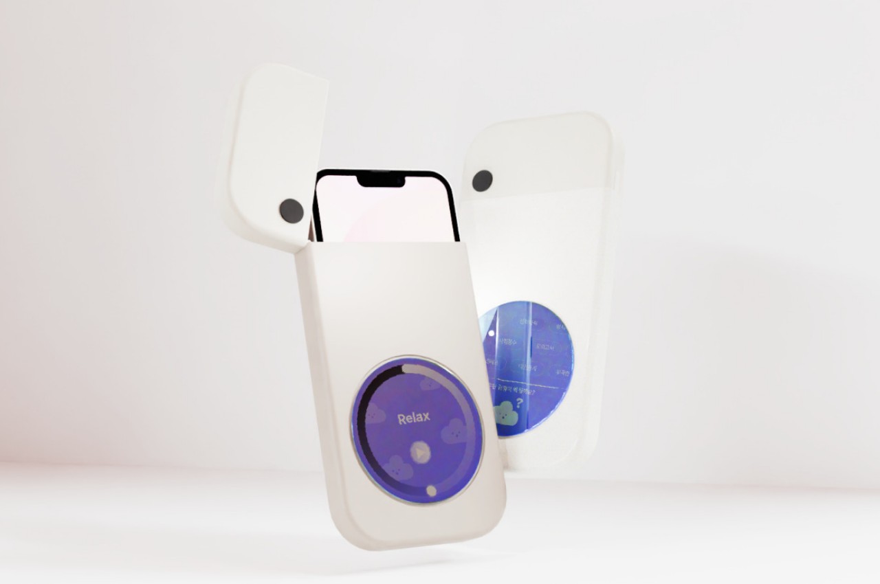
FIKA is a concept design for an accessory that does exactly that, keeping your smartphone from distracting you but also putting it to good use in training you to take breaks and use those breaks wisely. It is pretty much a cage or enclosure where you put the phone in, blocking complete use of the device except for a small circular window to a part of the screen. This is the only place where you’ll be able to see the phone’s guidance on how to take a break properly, somewhat like guided meditation apps that have become quite popular these days.
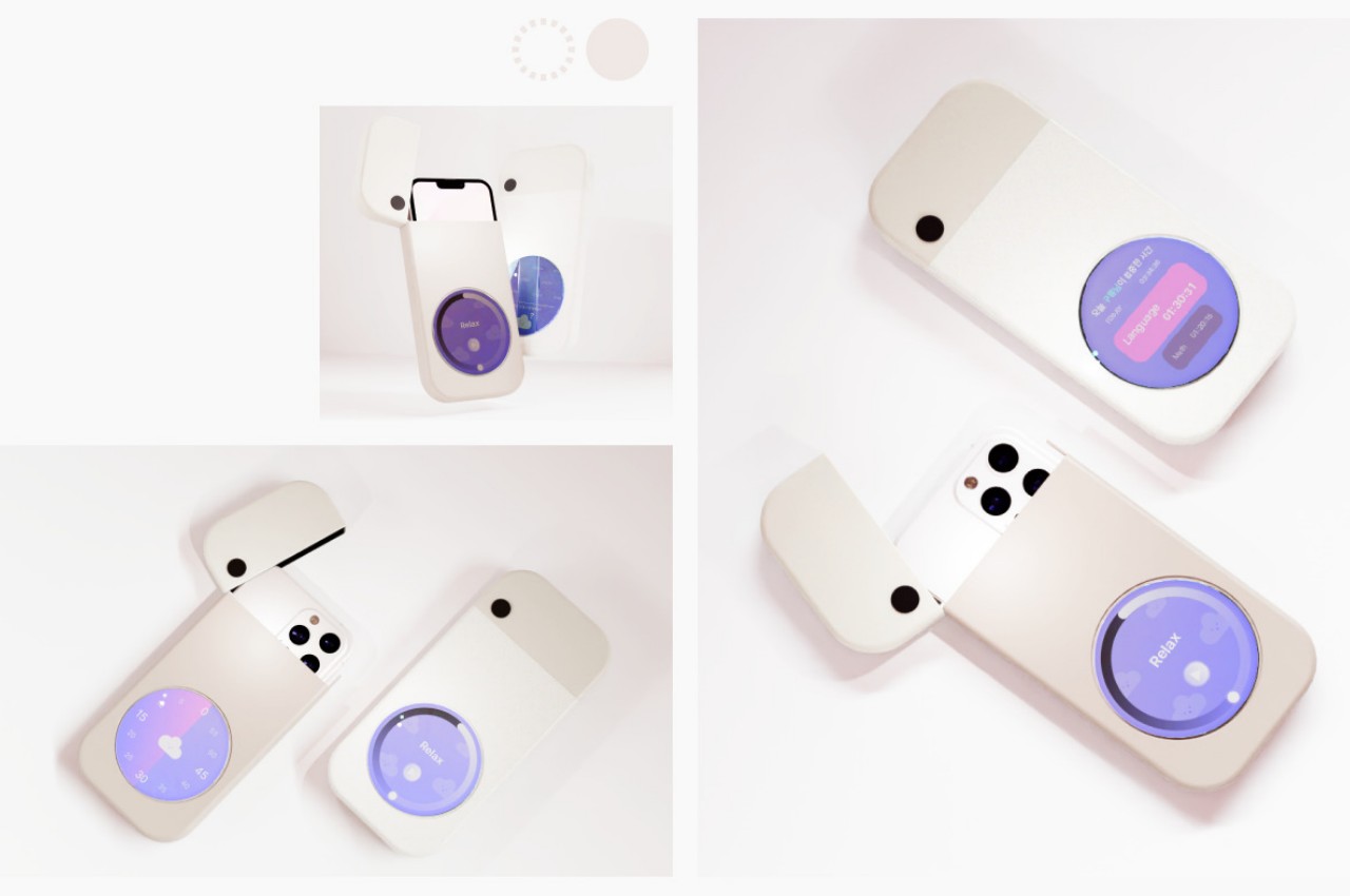
The idea for FIKA is to not just simply put your phone away to avoid distractions but also to develop good habits of taking breaks. And while different people take breaks differently, not everyone has an idea of how to do so properly, so FIKA can suggest certain actions like breathing exercises. Over time, the reminders and the case might not even be needed anymore, as you would have developed the habit and willpower to do it on your own.
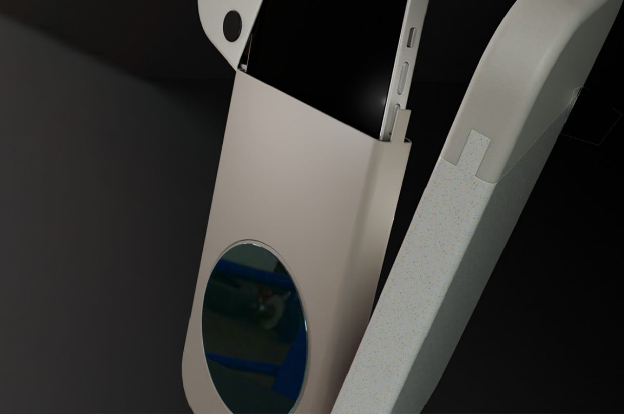
The concept design sadly leaves a lot of questions unanswered, like how one will be prevented from just fishing out the phone without some locking mechanism. It also doesn’t mention how the circular window actually works, whether it is just a hole that leaves a part of the phone’s screen exposed or if it’s a touch-sensitive surface that “passes” touches through to the phone inside. Still, the core idea is interesting enough to warrant further thought, especially in an age where people’s mental and physical health has been in decline due to smartphones and overworking.
