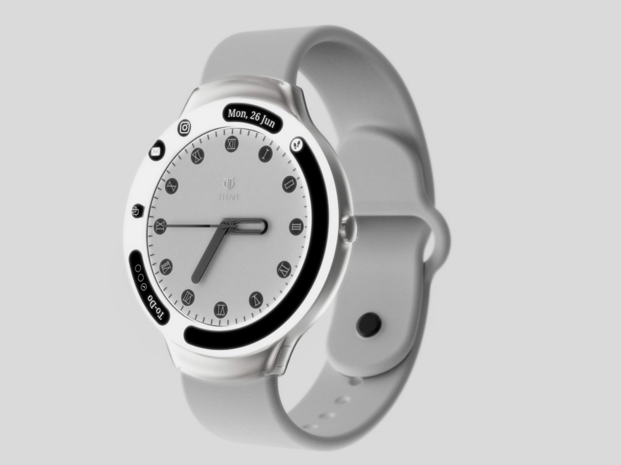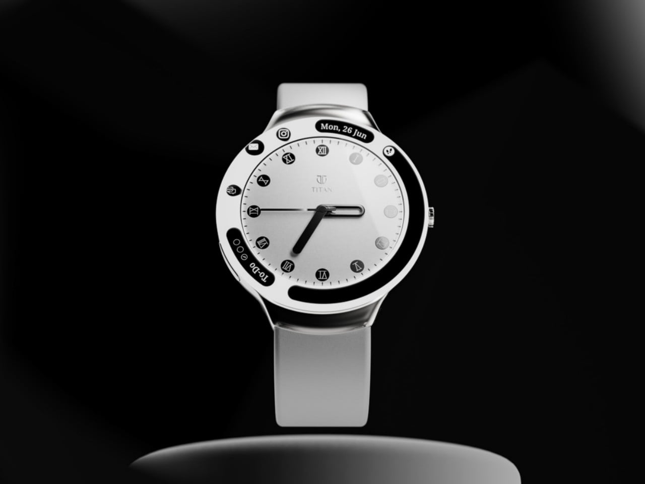
Smartwatches are now a staple of the tech market14, but the departure of several high-profile brands and the arrival of smart rings are making some reevaluate the wearable device. Just like with paper notebooks, there is a strong and large culture around analog, mechanical watches that find smartwatches unappealing, except for some features that aren’t totally unique to smartwatches, namely, health sensors. Hybrid smartwatches exist for this reason, trying to have the best of both analog and digital worlds, but they are not exactly that common nor are their designs well-established. There’s still plenty of room for exploration and experimentation, like this rather peculiar concept that cuts out a whole in the middle of a circular screen to make room for an elegant analog watch.
Designer: Priyanshu Jaiswal

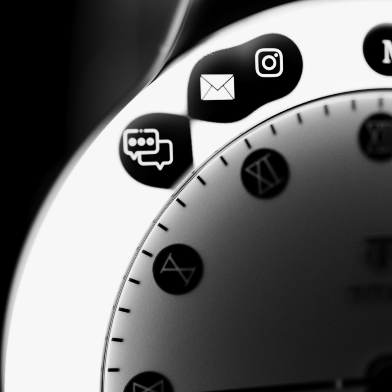
Inspired by the rather divisive notch or cutout on smartphone screens, the Lunar Eclipse hybrid smartwatch concept puts a mechanical watch in the middle of that hole instead of a camera. It might have been easier to have the display as an inset or restricted to a certain part of the watch face, but that presents some challenges as well, particularly when occluding the beauty of the analog timepiece itself. As weird as it may sound, this notch-based design actually has more benefits compared to a smartphone camera cutout.


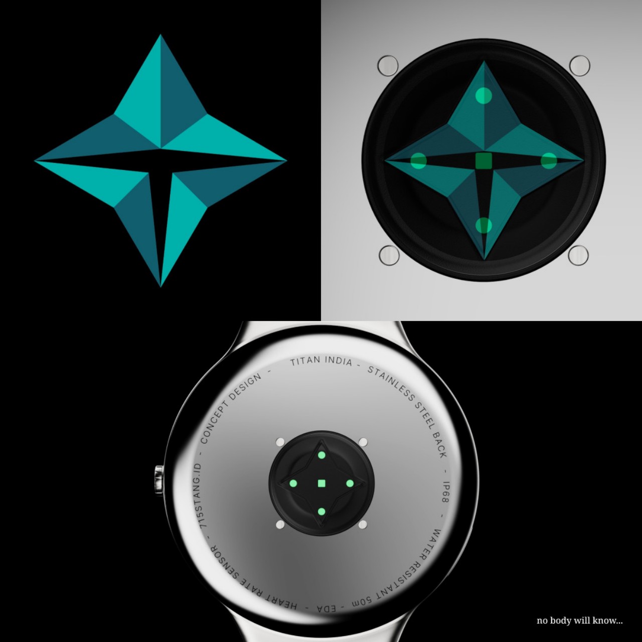
Because it is technically still a complete screen, with just the middle part rendered practically unusable and invisible, it is theoretically easier to design the user interface of the “digital bezel” around the watch face. You can have icons and text that curve around the border, and you can even have them animated to add more natural-looking visual feedback, like how notification icons can appear like they’re flowing from the center of the watch rather than just appearing out of nowhere.
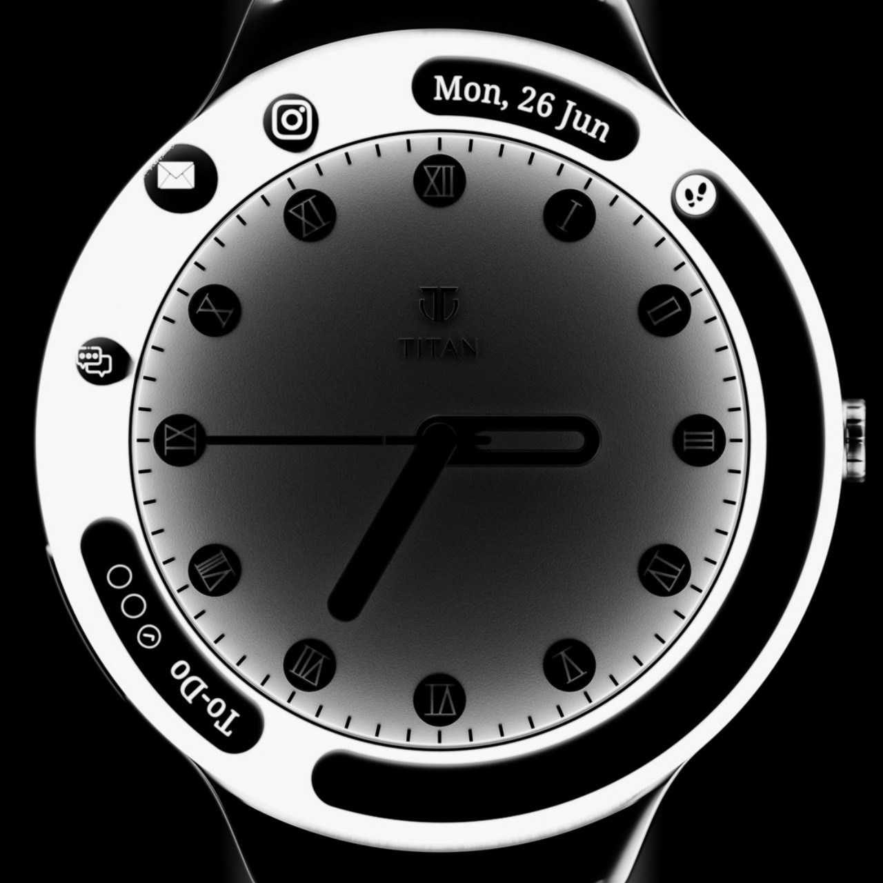
This gives Lunar Eclipse nearly the same benefits as having a smartwatch but with fewer opportunities for distractions. The bezel around the watch face is still just a small space that can only fit a few words and icons. You definitely won’t be using the watch to read those notifications or, worse, type out a response. You’ll be able to still see some of your health stats, presuming the watch has the sensors to track your steps, heart rate, and other biometrics.

One disadvantage that design has is that its battery life might not be that different from a regular smartwatch. The concept could use an E Ink screen, however, to help reduce that consumption, especially since the display won’t be changing as frequently as on a normal smartwatch. Another consideration is that with the electronics and battery inside, the room for the actual mechanical components would be very cramped, detracting from the inherent beauty of these timepieces that wristwatch fans are after in the first place.
