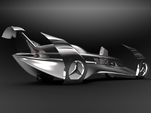
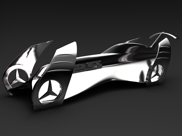
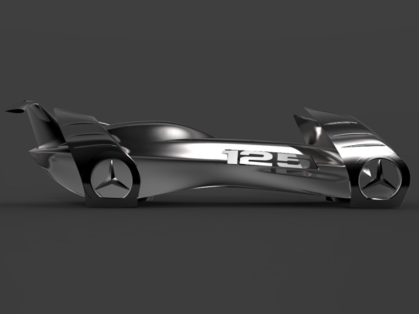
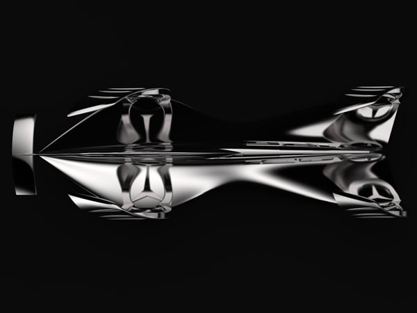
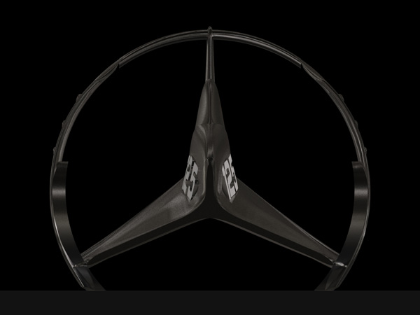
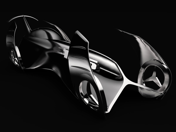
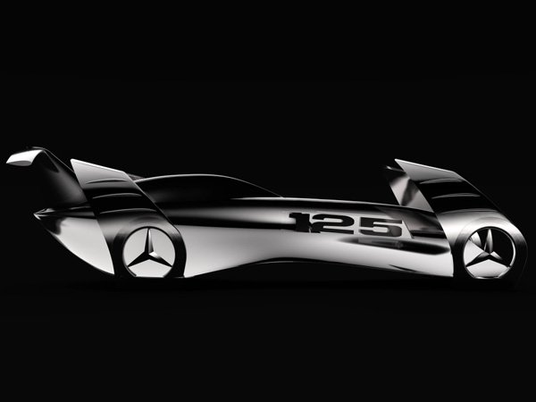
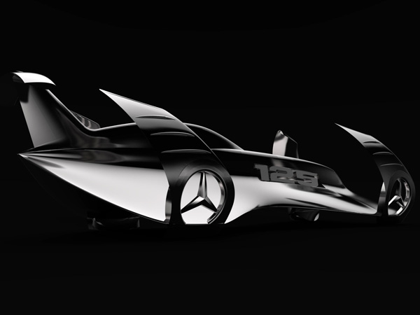
Mercedes Benz celebrated its 125th anniversary last year. There aren’t many motor companies that can lay claim to lasting longer than a centennial. It seems a creative light switch was turned on in Stuttgart because that A Class concept they released last year was absolutely stunning. Excuse me, my mind is still blown. On a completely related yet unrelated note (read: not an official Benz concept), designer Peter Verdai created this concept to celebrate 125 years of 3-pointed star awesomeness.
Fluidity, speed, dynamic and streamlined. That’s what I see. There’s a heavy influence from aircraft design. The wheels contain a 3-spoke/star assemblage because we all know how much bigger Benz’ logo has grown over the years. Quite garish but clever. The overall design is definitely polarizing but that’s why I’m posting this. I want to see more ideas like this. Like Peter’s idea and Mercedes Benz’ A Class concept, I want to see creative ideas that will have half the people screaming blooding sacrilege.
Designer: Peter Vardai
[youtube:http://www.youtube.com/watch?v=dwljXz5rzEE 600 451]
