Touchscreen interfaces; the delicate balance between technology and cost are slowly falling in unison and HP aims to be in the vanguard. The Touchsmart PCs have always tried to epitomize that future but the 1st gen machines weren’t exactly winners. We took the 2nd gen machines for a test drive and spoke to Randall Martin – HP’s Worldwide Director of Design for Commercial and Consumer Desktop PCs about the present and future of the Touchsmart PC line.
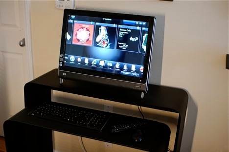
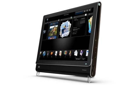
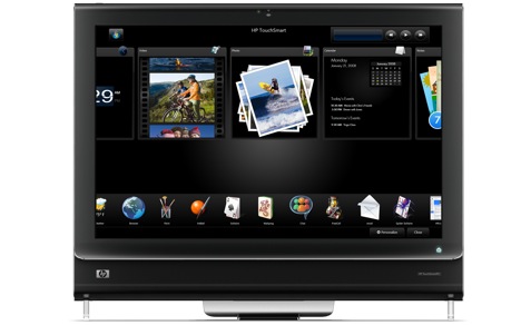
The meat and potatoes of the Touchsmart PC is the Touchsmart UI which overlays Windows Vista. Apps are neatly arranged in two rows; the often used ones are larger tiles on top with secondary apps below. You can rearrange them however you like. Most of the apps are right at home with your finger. Photos, videos, and music are all intuitively controlled by taps, swipes and flicks. It’s apps that require keyboard input that visibly break the whole Minority Report-esque experience. Some apps take you out of the Touchsmart UI into Windows but intelligently return when you close out of them. Good thing otherwise that quirk would be a totally annoyance.
Speaking of the Windows desktop, the touch interface works there too. Tho not as intuitive, you can open/close and move windows around. The touchscreen isn’t a capacitive touchscreen. Instead it uses camera technology to accurately pinpoint the position of your finger(s). Be it design or cost – the decision is a mistake. Sometimes it doesn’t register my finger and other times it’s hypersensitive. The key to successfully using it is to go slow and pace yourself. This isn’t the iPhone where you can wildly flick your fingers. This takes precise taps and swipes to control and manipulate.
Once you get past the whole “touch” gloss. You realize it’s a decently powered multimedia computer. You’re not going to be playing Quake or Spore on maximum settings but surfing the internet and watching HD videos are a breeze. There’s even a built-in QAM tuner for those with compatible cable. We couldn’t test this feature since we have digital optical cable but if you’re familiar with Windows Media Center, then you don’t need us to cover it here.
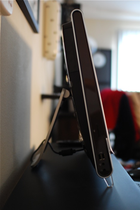
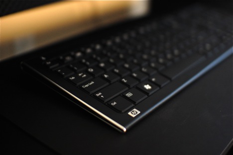
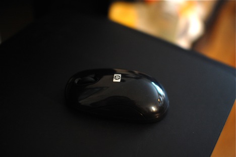
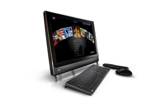
I couldn’t resist the opportunity to speak with HP’s head honcho of design, Randall Martin. The 2nd gen Touchsmart PCs are a huge improvement. They’re sleeker, sexier and they even look thinner. Careful attention was paid to the footprint. Minimalism was key. The face is devoid of any buttons. The keyboard and mouse are wireless without the barrage of multimedia buttons found on PC counterparts. There’s a single cable in the rear and that’s it. You turn the computer on by touching a “home” button near the bottom right of the frame. Greeted by a satisfying humm, it’s almost as if I was in some parallel universe where Mac’s were black.
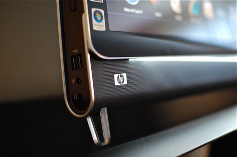
The most surprisingly thing Randall told me was the loose inspiration – the idea of a messenger bag. The ubiquitous icon of storage and utilitarian function; a fitting metaphor for the computer. After all a computer is a place where one stores all their data. A place that holds the key to communicating externally with others. It’s valued and cared for. To translate those esoteric ideas. the Touchsmart sorta looks like a messenger bag. The rounded frame is bisected at the bottom right above the speaker grill – like the flap of a messenger bag. A light illuminates underneath functionally shedding light on the all black keyboard and yet the aesthetic remains clean and unobtrusive.
Perhaps the most reassuring thing was Randall’s commitment to evolving the Touchsmart line. He wants to see it thinner, cleaner, even more minimal. He wants to see more focus on the touch interface and the software behind the UI. As with any good product – if the designer can see room for improvement, then we’re all in for a treat. The HP Touchsmart PC is a good computer, don’t get me wrong. Priced around $1,500, it gives you a lot of bang for your buck but the interface is laggy. It’s not quite ready for prime time but so close. Thankfully the bells and whistles aren’t there to hide a crappy computer. Either way – be it for novel use or real computing, I think you’d be happy to come home to a piano black computer ready for your every touch and whim.
Specs:
- 22 inch LCD display with touchscreen (1680 x 1050)
- Intel Core 2 Duo 2.16 GHz processor
- 4 GB RAM
- 500 GB SATA hard drive
- SuperMulti 8x Slimslot DVD Drive
- Wireless USB module with 802/11 b/g/n PCI Wireless Mini Card
- GeForce 9300M GS 256 MB DDR2 memory
- PCI Express x1 mini-card TV tuner card
- Integrated High Definition audio
- Integrated LAN
- Memory card reader
- Wireless keyboard and mouse
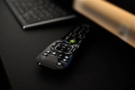
- Remote Control
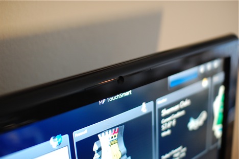
- Web cam
- Windows Vista Home Premium
Company: HP Designer: Randall Martin [ Buy It Here ]
HP Touchsmart PC from Long Tran on Vimeo.
